Time series lends itself naturally to visualization.
Line plots of observations over time are popular, but there is a suite of other plots that you can use to learn more about your problem.
The more you learn about your data, the more likely you are to develop a better forecasting model.
In this tutorial, you will discover 6 different types of plots that you can use to visualize time series data with Python.
Specifically, after completing this tutorial, you will know:
How to explore the temporal structure of time series with line plots, lag plots, and autocorrelation plots.
How to understand the distribution of observations using histograms and density plots.
How to tease out the change in distribution over intervals using box and whisker plots and heat map plots.
Kick-start your project with my new book Time Series Forecasting With Python, including step-by-step tutorials and the Python source code files for all examples.
Let’s get started.
Updated Apr/2019: Updated the link to dataset.
Updated Aug/2019: Updated data loading and grouping to use new API.
Updated Sep/2019: Fixed bugs in examples that use the Grouper and old tools API.
Time Series Visualization
Visualization plays an important role in time series analysis and forecasting.
Plots of the raw sample data can provide valuable diagnostics to identify temporal structures like trends, cycles, and seasonality that can influence the choice of model.
A problem is that many novices in the field of time series forecasting stop with line plots.
In this tutorial, we will take a look at 6 different types of visualizations that you can use on your own time series data. They are:
Line Plots.
Histograms and Density Plots.
Box and Whisker Plots.
Heat Maps.
Lag Plots or Scatter Plots.
Autocorrelation Plots.
The focus is on univariate time series, but the techniques are just as applicable to multivariate time series, when you have more than one observation at each time step.
Next, let’s take a look at the dataset we will use to demonstrate time series visualization in this tutorial.
Stop learning Time Series Forecasting the slow way!
Take my free 7-day email course and discover how to get started (with sample code).
Click to sign-up and also get a free PDF Ebook version of the course.
Minimum Daily Temperatures Dataset
This dataset describes the minimum daily temperatures over 10 years (1981-1990) in the city Melbourne, Australia.
The units are in degrees Celsius and there are 3,650 observations. The source of the data is credited as the Australian Bureau of Meteorology.
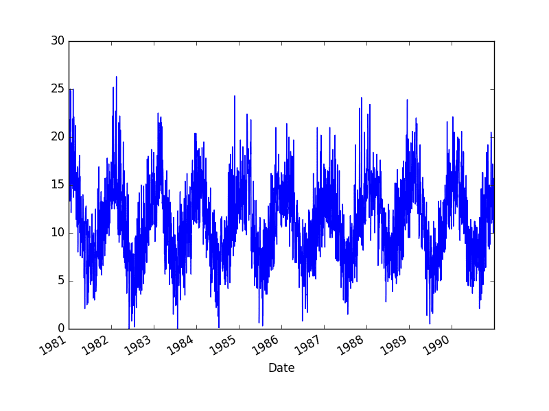
Running the example creates 10 line plots, one for each year from 1981 at the top and 1990 at the bottom, where each line plot is 365 days in length.
Minimum Daily Temperature Yearly Line Plots
2. Time Series Histogram and Density Plots
Another important visualization is of the distribution of observations themselves.
This means a plot of the values without the temporal ordering.
Some linear time series forecasting methods assume a well-behaved distribution of observations (i.e. a bell curve or normal distribution). This can be explicitly checked using tools like statistical hypothesis tests. But plots can provide a useful first check of the distribution of observations both on raw observations and after any type of data transform has been performed.
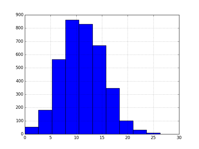
The example below creates a histogram plot of the observations in the Minimum Daily Temperatures dataset. A histogram groups values into bins, and the frequency or count of observations in each bin can provide insight into the underlying distribution of the observations.
Running the example shows a distribution that looks strongly Gaussian. The plotting function automatically selects the size of the bins based on the spread of values in the data.
Minimum Daily Temperature Histogram Plot
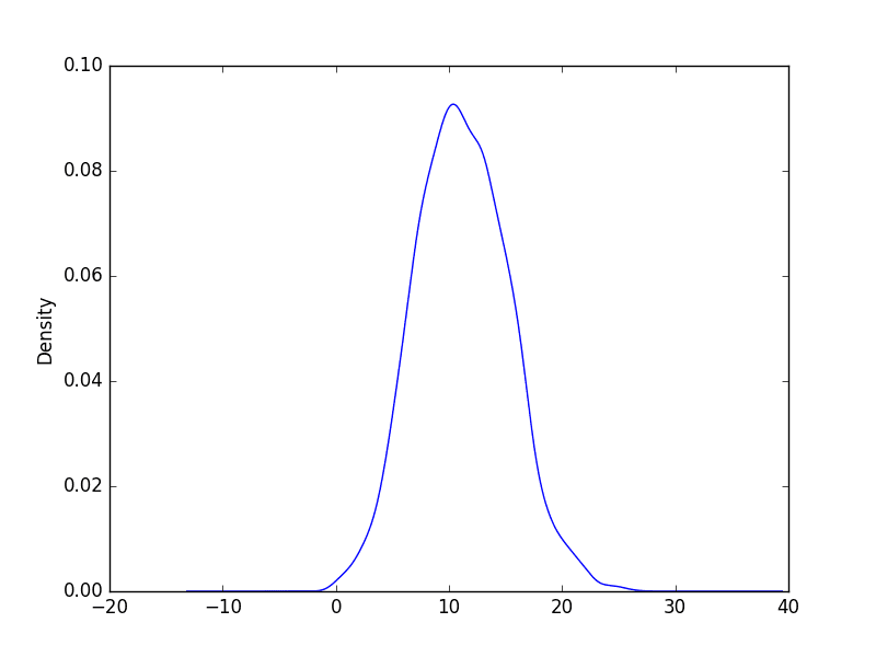
We can get a better idea of the shape of the distribution of observations by using a density plot.
This is like the histogram, except a function is used to fit the distribution of observations and a nice, smooth line is used to summarize this distribution.
Below is an example of a density plot of the Minimum Daily Temperatures dataset.
Running the example creates a plot that provides a clearer summary of the distribution of observations. We can see that perhaps the distribution is a little asymmetrical and perhaps a little pointy to be Gaussian.
Seeing a distribution like this may suggest later exploring statistical hypothesis tests to formally check if the distribution is Gaussian and perhaps data preparation techniques to reshape the distribution, like the Box-Cox transform.
Minimum Daily Temperature Density Plot
3. Time Series Box and Whisker Plots by Interval
Histograms and density plots provide insight into the distribution of all observations, but we may be interested in the distribution of values by time interval.
Another type of plot that is useful to summarize the distribution of observations is the box and whisker plot. This plot draws a box around the 25th and 75th percentiles of the data that captures the middle 50% of observations. A line is drawn at the 50th percentile (the median) and whiskers are drawn above and below the box to summarize the general extents of the observations. Dots are drawn for outliers outside the whiskers or extents of the data.
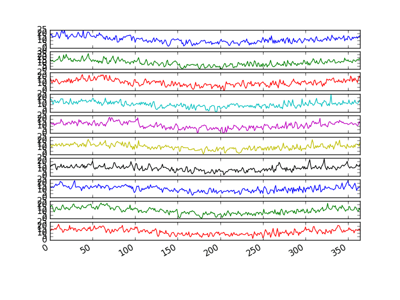
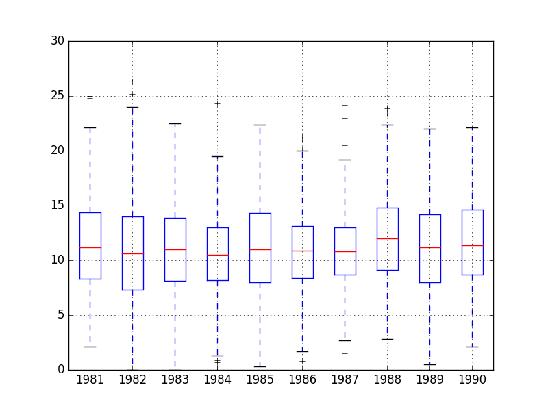
Box and whisker plots can be created and compared for each interval in a time series, such as years, months, or days.
Below is an example of grouping the Minimum Daily Temperatures dataset by years, as was done above in the plot example. A box and whisker plot is then created for each year and lined up side-by-side for direct comparison.
Comparing box and whisker plots by consistent intervals is a useful tool. Within an interval, it can help to spot outliers (dots above or below the whiskers).
Across intervals, in this case years, we can look for multiple year trends, seasonality, and other structural information that could be modeled.
Minimum Daily Temperature Yearly Box and Whisker Plots
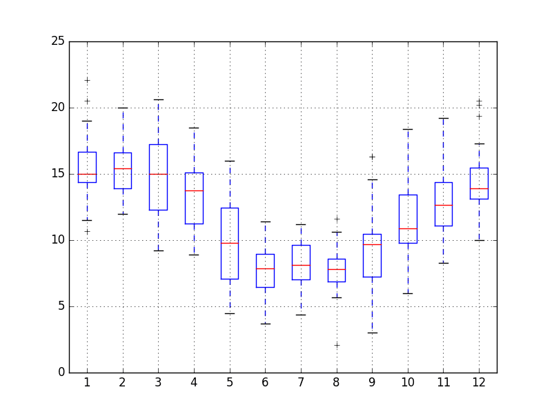
We may also be interested in the distribution of values across months within a year.
The example below creates 12 box and whisker plots, one for each month of 1990, the last year in the dataset.
In the example, first, only observations from 1990 are extracted.
Then, the observations are grouped by month, and each month is added to a new DataFrame as a column.
Finally, a box and whisker plot is created for each month-column in the newly constructed DataFrame.
Running the example creates 12 box and whisker plots, showing the significant change in distribution of minimum temperatures across the months of the year from the Southern Hemisphere summer in January to the Southern Hemisphere winter in the middle of the year, and back to summer again.
Minimum Daily Temperature Monthly Box and Whisker Plots
4. Time Series Heat Maps
A matrix of numbers can be plotted as a surface, where the values in each cell of the matrix are assigned a unique color.
This is called a heatmap, as larger values can be drawn with warmer colors (yellows and reds) and smaller values can be drawn with cooler colors (blues and greens).
Like the box and whisker plots, we can compare observations between intervals using a heat map.
In the case of the Minimum Daily Temperatures, the observations can be arranged into a matrix of year-columns and day-rows, with minimum temperature in the cell for each day. A heat map of this matrix can then be plotted.
Below is an example of creating a heatmap of the Minimum Daily Temperatures data. The matshow() function from the matplotlib library is used as no heatmap support is provided directly in Pandas.
For convenience, the matrix is rotation (transposed) so that each row represents one year and each column one day. This provides a more intuitive, left-to-right layout of the data.
The plot shows the cooler minimum temperatures in the middle days of the years and the warmer minimum temperatures in the start and ends of the years, and all the fading and complexity in between.
Minimum Daily Temperature Yearly Heat Map Plot
As with the box and whisker plot example above, we can also compare the months within a year.
Below is an example of a heat map comparing the months of the year in 1990. Each column represents one month, with rows representing the days of the month from 1 to 31.
Running the example shows the same macro trend seen for each year on the zoomed level of month-to-month.
We can also see some white patches at the bottom of the plot. This is missing data for those months that have fewer than 31 days, with February being quite an outlier with 28 days in 1990.
Minimum Daily Temperature Monthly Heat Map Plot
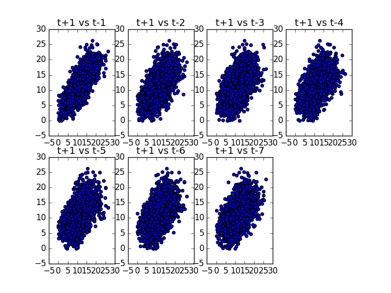
5. Time Series Lag Scatter Plots
Time series modeling assumes a relationship between an observation and the previous observation.
Previous observations in a time series are called lags, with the observation at the previous time step called lag1, the observation at two time steps ago lag2, and so on.
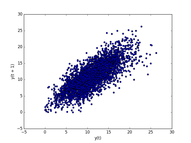
A useful type of plot to explore the relationship between each observation and a lag of that observation is called the scatter plot.
Pandas has a built-in function for exactly this called the lag plot. It plots the observation at time t on the x-axis and the lag1 observation (t-1) on the y-axis.
If the points cluster along a diagonal line from the bottom-left to the top-right of the plot, it suggests a positive correlation relationship.
If the points cluster along a diagonal line from the top-left to the bottom-right, it suggests a negative correlation relationship.
Either relationship is good as they can be modeled.
More points tighter in to the diagonal line suggests a stronger relationship and more spread from the line suggests a weaker relationship.
A ball in the middle or a spread across the plot suggests a weak or no relationship.
Below is an example of a lag plot for the Minimum Daily Temperatures dataset.
The plot created from running the example shows a relatively strong positive correlation between observations and their lag1 values.
Minimum Daily Temperature Lag Plot
We can repeat this process for an observation and any lag values. Perhaps with the observation at the same time last week, last month, or last year, or any other domain-specific knowledge we may wish to explore.
For example, we can create a scatter plot for the observation with each value in the previous seven days. Below is an example of this for the Minimum Daily Temperatures dataset.
First, a new DataFrame is created with the lag values as new columns. The columns are named appropriately. Then a new subplot is created that plots each observation with a different lag value.
Running the example suggests the strongest relationship between an observation with its lag1 value, but generally a good positive correlation with each value in the last week.
Minimum Daily Temperature Scatter Plots
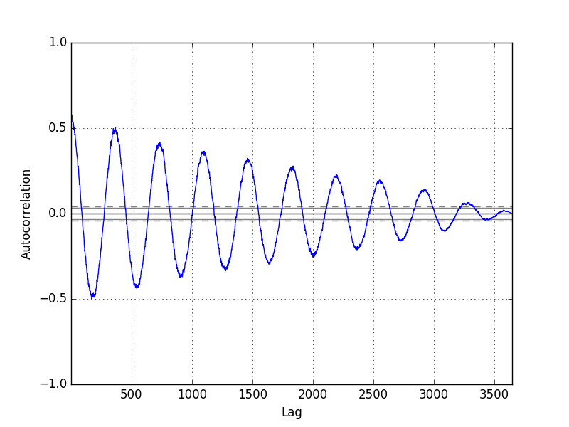
6. Time Series Autocorrelation Plots
We can quantify the strength and type of relationship between observations and their lags.
In statistics, this is called correlation, and when calculated against lag values in time series, it is called autocorrelation (self-correlation).
A correlation value calculated between two groups of numbers, such as observations and their lag1 values, results in a number between -1 and 1. The sign of this number indicates a negative or positive correlation respectively. A value close to zero suggests a weak correlation, whereas a value closer to -1 or 1 indicates a strong correlation.
Correlation values, called correlation coefficients, can be calculated for each observation and different lag values. Once calculated, a plot can be created to help better understand how this relationship changes over the lag.
This type of plot is called an autocorrelation plot and Pandas provides this capability built in, called the autocorrelation_plot() function.
The example below creates an autocorrelation plot for the Minimum Daily Temperatures dataset:
The resulting plot shows lag along the x-axis and the correlation on the y-axis. Dotted lines are provided that indicate any correlation values above those lines are statistically significant (meaningful).
We can see that for the Minimum Daily Temperatures dataset we see cycles of strong negative and positive correlation. This captures the relationship of an observation with past observations in the same and opposite seasons or times of year. Sine waves like those seen in this example are a strong sign of seasonality in the dataset.
Minimum Daily Temperature Autocorrelation Plot
Further Reading
This section provides some resources for further reading on plotting time series and on the Pandas and Matplotlib functions used in this tutorial.
Great post och blog, thanks! My conclusion from this is that the autocorrelation plot can be used as a starting point to decide how many previous time steps should be used in a LSTM model for example. Can we use this information in any other way? How can we make use of knowledge about seasonality in a LSTM model for example?
Great question Sebastian, I am working on examples of this that will appear on the blog and in an upcoming book/s.
The autocorrelation plot can help in configuring linear models like ARIMA.
Knowledge of seasonality is useful for removing the seasonal component (making the series stationary for linear models) and for season-specific feature engineering. These new features can be used as inputs for nonlinear models like LSTM.
Brilliant report! Thank you very much for that.
You were talking about implementing the linear ARIMA output as another Feature into a nonlinear LSTM model (To predict the temperature).
Did you happen to explain this procedure in another report or book?
Hi, thanks for the nice summary, on a minor note: I find the mathshow visualisation a bit confusing because of the visual interpolation.
From the documentation of matshow “If interpolation is None, default to rc image.interpolation. See also the filternorm and filterrad parameters. If interpolation is ‘none’, then no interpolation is performed on the Agg, ps and pdf backends. Other backends will fall back to ‘nearest’ ”
so setting the interpolation explicitly to ‘nearest’ should make the plot much more clear.
Hi! I just found that the lag_plot function can be called with a lag parameter specifying the lag. So you do not need to write a function yourself. You just do: lag_plot(series,lag=3) for a lag of 3. Though it might be worth to know.
Adding transparency, highlights the overlapped points, makes the second dotted plot more interesting.
min_temp.plot(style=’k.’, alpha=0.4)
As always, nice post.
Great work, thanks.
What if I have a small set of words (which represents changes of topics) per year?
How to get those “words” visualized per year, to visualize the changes in topics exist in a given text corpus per year?
Thus, my input would be a list of years and their corresponding topic-words. (say a python dict)
Thanks.
Cannot plot stocked line plots. # create stacked line plots. I only have data for 1 year, so I’d like to plot stacked line plots for weeks from cc datagframe. I run this code.
# create stacked line plots
from pandas import TimeGrouper
groups = cc.groupby(TimeGrouper(“M”))
AttributeError Traceback (most recent call last)
in ()
8 for name, group in groups:
9
—> 10 years.at[name.year] = groups.values
11 years.plot(subplots=True, legend=False)
12 pyplot.show()
C:\Users\ggg\Anaconda3\lib\site-packages\pandas\core\groupby.py in __getattr__(self, attr)
546 return self[attr]
547 if hasattr(self.obj, attr):
–> 548 return self._make_wrapper(attr)
549
550 raise AttributeError(“%r object has no attribute %r” %
C:\Users\ggg\Anaconda3\lib\site-packages\pandas\core\groupby.py in _make_wrapper(self, name)
560 “using the ‘apply’ method”.format(kind, name,
561 type(self).__name__))
–> 562 raise AttributeError(msg)
563
564 # need to setup the selection
AttributeError: Cannot access attribute ‘values’ of ‘DataFrameGroupBy’ objects, try using the ‘apply’ method
How to plot multiple line plots for weeks and months instead of years?
I want to create heat maps for a 30 year period for temperature (no leap years are accounted for).
I keep recieving the following errors:
TypeError: Only valid with DatetimeIndex, TimedeltaIndex or PeriodIndex, but got an instance of ‘Int64Index’
Where
File “C:\ProgramData\Anaconda3\lib\site-packages\pandas\core\resample.py”, line 1085, in _get_resampler
“but got an instance of %r” % type(ax).__name__)
Hello!
This post is very useful. Thanks. However, I did not manage to adjust it for what I want. I have a dataframe running for 6 years at half hourly frequency. I want to make a box whiskers plot for each month for all years…. and to see it on the same graph.
Hii,
I want to ask that if I am having a series of zeros(In your example lets assume temperature goes to zero for some time) in the data then how to plot the count of zeros week wise or month wise.
Thanks for sharing the descriptive information on Python course. It’s really helpful to me since I’m taking Python training. Keep doing the good work and if you are interested to know more on Python, do check this Python tutorial.https://www.youtube.com/watch?v=XmfgjNoY9PQ
Unable to plot the multi-line graphs ..
This is the code after adding grouper..
Code:
df= read_csv(‘D:\\daily-minimum-temperatures.csv’,header=0)
groups = df.groupby(Grouper(key=’Date’))
years = DataFrame()
for n, g in groups:
years[n.year] = g.values
years.boxplot()
pyplot.show()
Can you comment where to correct?
Hello, thanx for shared this amazing tutorial with us 😉
I’m just starting to explore data science and specialy timeseries exploration. When trying to run your code with my data set i have this error when trying to plot my series:
“ValueError: view limit minimum -36850.1 is less than 1 and is an invalid Matplotlib date value. This often happens if you pass a non-datetime value to an axis that has datetime units”
My code without plot:
series = Data[[‘date_mesure’,’valeur_mesure’]]
print(series.head())
series.info()
print(series.describe())
However, I have one comment about the “lag section : 5. Time Series Lag Scatter Plots”, you mentioned t+1-vs t-1, t+1-vs t-2 … t+1vs t-7 whereas it should be t vs t-1,t vs t-2,…t vs t-7, is this correct ? Have I missed something ?
Having trouble getting the multiple plot working:
from pandas import Series
from pandas import DataFrame
from pandas import TimeGrouper
from matplotlib import pyplot
series = Series.from_csv(‘daily-minimum-temperatures.csv’, header=0)
Sorry! Typical – as soon as I post the problem I fix it…
There was a one-line gap in my data for some reason. It occurred where I had cleaned the question marks out. I took the gap out and it worked.
Thanks,
Hi. Thank you for publishing this blog. This was very helpful. I am running into the below problem with the for loop of groups. My pandas version is 0.23.4. I do get warnings about Series and TimeGrouper being deprecated and I ignored them. But this part of the code, particularly the line assigning values to years[] throws the error:
1
2
3
4
groups=series.groupby(TimeGrouper('A'))
years=DataFrame()
forname,group ingroups:
years[name.year]=group.values
ValueError: Length of values does not match length of index
My series is ok as I am able to plot the earlier line or scatter graphs with it. Can you please advise? Grouping by time period is an important function I wanted to apply somewhere else with my data.
It’s probably too late to help Milind, but maybe someone else runs into this. I had the same or a very similar issue. The issue, in my case, was that the assignment inside the for loop requires the group.values list to be of the same length for each year. I had data that started mid-year 1994, and ended mid-year 2019. So for those two years, I had not the full number of records. I solved the issue by excluding the first and last year of my time series (ts) like so: firstyear = str(ts.index.year[1])
lastyear = str(ts.index.year[-2])
groups = ts[firstyear:lastyear].groupby(pd.Grouper(freq='A'))
years = pd.DataFrame()
for name, group in groups:
#print(f'name: {name}\tgroup: {group.values}')
years[name.year] = group.values
If the problem is related to boxplot(), it can easily be fixed by using the seaborn version of the function, which includes the ability to do the grouping on the fly: import seaborn
seaborn.boxplot(series.index.year, series)
plt.show()
Hi.
Thank you very much for your amazing work! It is a great help to learn Python and conduct time-series analysis.
I just wanted to leave a little remark:
It appears that read_csv() should be used, since my enviorment gives me the feedback:
C:\ProgramData\Anaconda3\lib\site-packages\pandas\core\series.py:3727: FutureWarning: from_csv is deprecated. Please use read_csv(…) instead. Note that some of the default arguments are different, so please refer to the documentation for from_csv when changing your function calls
hi Jason,when i go to: years[name.year]=group.values,i got an error: Cannot set a frame with no defined index and a value that cannot be converted to a Series
i solve this by group.values.tolist()
but when i go years.plot()
i got an error,Empty ‘DataFrame’: no numeric data to plot site.
i check on the internet ,and use years.astype(‘float’),
but i got another error,’setting an array element with a sequence.’,lol,can you tell me how to solve this
how do we solve a problem with typically deposits considered in a bank each year as a feature and there is a prediction made to be for the next year, what method do we employ in cases we have deposits for say 5 years continuously and we have to predict deposits for the 6th year including datetime as one of the feature and location details typically state, city and county how do we solve such a time series problem, can we still rely on OLS methods, if not how do we make sure there is a considerable amount of variance added by columns like state, county and also city information along with the year of deposits
Your blog has been helping as always, keep doing it!
I tried the code for 1)Time Series Line Plot for my data and its working except that it plots my -ve value to 0. The actual value is -20 but then it’s plotted at 0. May I know why? Doest Matplotlib cannot plot -ve value? Any solution for this?
My code:
import pandas as pd
import numpy as np
import matplotlib.pylab as plt
%matplotlib inline
data = pd.read_csv(‘r6.csv’)
data.head()
data.dtypes
from datetime import datetime
con=data[‘Time’]
data[‘Time’]=pd.to_datetime(data[‘Time’])
data.set_index(‘Time’, inplace=True)
#check datatype of index
data.index
#convert to time series:
ts = data[‘Reading’]
ts [:’2018-01-06′]
plt.plot(ts)
Also, my data is recorded for few milisec as below;
Hi Jason,
thanks a lot for this helpful tutorial!
Unfortunately I got the same error as Milind and I am not able to find the reason.
After downloading the data and eliminating the footer and every line containing (W10, notepad++) I got the error:
…
File “C:\Program Files\Python36\lib\site-packages\pandas\core\internals\construction.py”, line 519, in sanitize_index
raise ValueError(‘Length of values does not match length of index’)
thrown by the >groups = series.groupby(TimeGrouper(‘A’))< statement.
I checked every line by a regex, that demonstrated, that every line in the data file had the form:
"yyyy-mm-dd",float
.
Are you able to confirm that you downloaded the CVS version of the dataset?
=> Yes, I am. No question marks, no footer.
Are you able to confirm that the dataset was loaded as a series correctly?
=> Yes. I think so – because ‘Minimum Daily Temperature Line Plot’ and ‘Minimum Daily Temperature Dot Plot’ worked fine – I hope that proves my confirmation.
…
BTW; When executing both plot examples a warning is issued:
“FutureWarning: from_csv is deprecated. Please use read_csv(…) instead. Note that some of the default arguments are different, so please refer to the documentation for from_csv when changing your function calls infer_datetime_format=infer_datetime_format)”
…
Running the 10 lines plot example this warning appears again, followed by another one:
FutureWarning: pd.TimeGrouper is deprecated and will be removed; Please use pd.Grouper(freq=…) referring to the line: >groups = series.groupby(TimeGrouper(‘A’))TimeGrouper(‘A’)< because I can't the docs, especially about the 'A' – parameter.
Hope that helps to help!
wm
… and another BTW:
The DataMarket website states: "After April 15th, DataMarket.com will no longer be available".
Very comprehensive visualization!
Some minor code changes are needed on this code to avoid some errors – I take note based on my own experience of running them as is at least on Python 2.7 here:
Replace the .csv filename with daily-min-temperatures.csv because that the actual downloadable file as of this writing
from pandas.tools.plotting import lag_plot should be written as
pandas.plotting import lag_plot instead to make it work in Python 2.7
for Pandas version 0.25
Will probably better to rewrite all the Pandas call to a very recent version and in Python 3.X as many are depreciated and by 2021 all Python 2.7 support will cease at least that is what I saw in one of the messages
Hi all having errors. I used the following code…(Pandas version ‘0.24.2’)
series = read_csv(testroot + ‘daily-min-temperatures.csv’, header=0, index_col=0, parse_dates=[‘Date’])
years = DataFrame()
groups = series.groupby(Grouper(freq=’A’))
for name, group in groups:
years[name.year] = [i[0] for i in group.values]
Hi Jason, it’s very informative, helpful post. I greatly appreciate it. Thank you.
I agree Nadine. I encountered two errors, which are solved by Nadine’s way (or another way as follows). Pandas version ‘0.25.1’, numpy version ‘1.17.1’.
Problem 1. read_csv without explicit parse_dates=[‘Date’] causes error:
TypeError: Only valid with DatetimeIndex, TimedeltaIndex or PeriodIndex, but got an instance of ‘Index’
Solution 1.1. read_csv with explicit parse_dates=[‘Date’]
series = read_csv(‘daily-minimum-temperatures.csv’, header=0, index_col=0, parse_dates=[‘Date’])
Solution 1.2. Alternatively, following works.
import pandas as pd
series = pd.read_csv(‘daily-minimum-temperatures.csv’, header=0, index_col=0)
series.index = pd.to_datetime(series.index)
Hi Jason.
Thanks for the great tutorial. Please Help with this Error. I can’t plot Box and Whisker. I don’t know what to do.
the dataset is “shampoo-sales.csv”
series = read_csv(‘shampoo-sales.csv’, header=0, index_col=0, parse_dates=True, squeeze=True)
print(series.head())
Thanks for the tutorial Jason. As soon as i want to explore data a bit more with Matplotlib it really… challenges me. Can you suggest any alternatives which are not browser based? I like Bokeh but for data exploration and model building i want to be able to use a tool within Spyder rather than out to a browser.
1) How can we get an export of the data points that were plotted in the autocorrelation graph?
2) in the aurocorrelation plot in Section 6, the auto correlation for a lag of 730 (2 years) is around 0.4, but if I try to calculate it manually I get number above 0.5 as can be seen below:


")


Great post och blog, thanks! My conclusion from this is that the autocorrelation plot can be used as a starting point to decide how many previous time steps should be used in a LSTM model for example. Can we use this information in any other way? How can we make use of knowledge about seasonality in a LSTM model for example?
Great question Sebastian, I am working on examples of this that will appear on the blog and in an upcoming book/s.
The autocorrelation plot can help in configuring linear models like ARIMA.
Knowledge of seasonality is useful for removing the seasonal component (making the series stationary for linear models) and for season-specific feature engineering. These new features can be used as inputs for nonlinear models like LSTM.
Thanks for the answer!
Hi, Jason.
Brilliant report! Thank you very much for that.
You were talking about implementing the linear ARIMA output as another Feature into a nonlinear LSTM model (To predict the temperature).
Did you happen to explain this procedure in another report or book?
Best regards
Stephan
I don’t have an example of that, I may prepare an example in the future.
Hi, thanks for the nice summary, on a minor note: I find the mathshow visualisation a bit confusing because of the visual interpolation.
From the documentation of matshow “If interpolation is None, default to rc image.interpolation. See also the filternorm and filterrad parameters. If interpolation is ‘none’, then no interpolation is performed on the Agg, ps and pdf backends. Other backends will fall back to ‘nearest’ ”
so setting the interpolation explicitly to ‘nearest’ should make the plot much more clear.
Thnaks Luca.
Again, the data source has ?, Series.from_csv() load data as str , instead of float. So can’t be plot.
7/20/1982 ?0.2
7/21/1982 ?0.8
I would recommend opening the file and removing the “?” characters before running the example.
I have updated the tutorial to suggest doing this.
Hi! I just found that the lag_plot function can be called with a lag parameter specifying the lag. So you do not need to write a function yourself. You just do: lag_plot(series,lag=3) for a lag of 3. Though it might be worth to know.
Wonderful, thanks for the tip Sebastian.
Nice work Jason. Do you have any introductory first time series walk through like you have for ML here https://machinelearningmastery.com/machine-learning-in-python-step-by-step/#comment-384184?
Something like an end to end small project
I will have some examples in my upcoming book on time series forecasting.
will you share some for free on your blog? Or do I have to buy the book to access it?
Hi Raphael, I may share some on the blog. The book will be the best source of material on the topic.
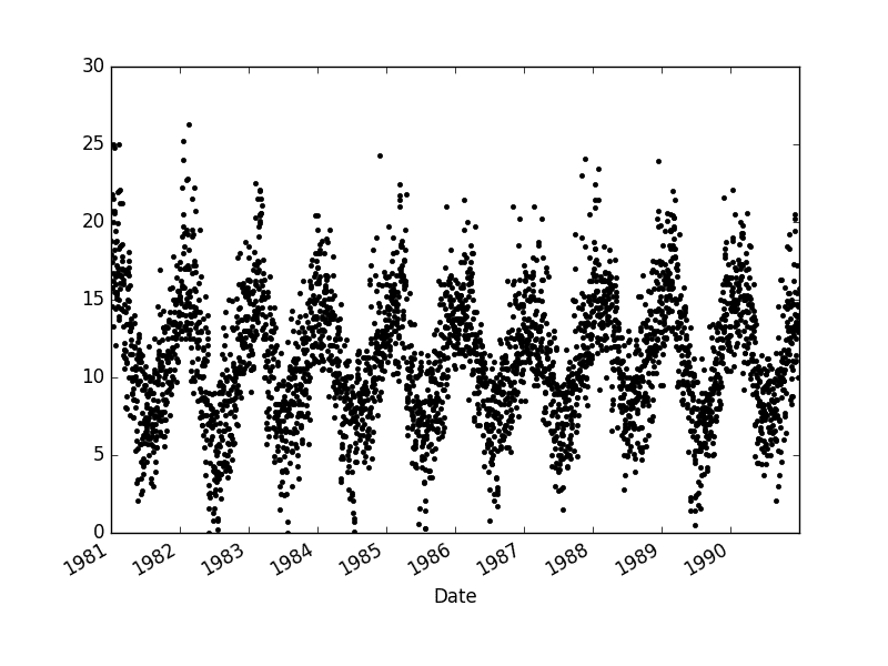
Adding transparency, highlights the overlapped points, makes the second dotted plot more interesting.
min_temp.plot(style=’k.’, alpha=0.4)
As always, nice post.
Great work, thanks.
What if I have a small set of words (which represents changes of topics) per year?
How to get those “words” visualized per year, to visualize the changes in topics exist in a given text corpus per year?
Thus, my input would be a list of years and their corresponding topic-words. (say a python dict)
Thanks.
You will have to develop some code to make this plot.
Cannot plot stocked line plots. # create stacked line plots. I only have data for 1 year, so I’d like to plot stacked line plots for weeks from cc datagframe. I run this code.
# create stacked line plots
from pandas import TimeGrouper
groups = cc.groupby(TimeGrouper(“M”))
years = DataFrame()
for name, group in groups:
years.at[name.year] = groups.values
years.plot(subplots=True, legend=False)
pyplot.show()
I receive this message
AttributeError Traceback (most recent call last)
in ()
8 for name, group in groups:
9
—> 10 years.at[name.year] = groups.values
11 years.plot(subplots=True, legend=False)
12 pyplot.show()
C:\Users\ggg\Anaconda3\lib\site-packages\pandas\core\groupby.py in __getattr__(self, attr)
546 return self[attr]
547 if hasattr(self.obj, attr):
–> 548 return self._make_wrapper(attr)
549
550 raise AttributeError(“%r object has no attribute %r” %
C:\Users\ggg\Anaconda3\lib\site-packages\pandas\core\groupby.py in _make_wrapper(self, name)
560 “using the ‘apply’ method”.format(kind, name,
561 type(self).__name__))
–> 562 raise AttributeError(msg)
563
564 # need to setup the selection
AttributeError: Cannot access attribute ‘values’ of ‘DataFrameGroupBy’ objects, try using the ‘apply’ method
How to plot multiple line plots for weeks and months instead of years?
I’m sorry to hear that, is your Pandas library up to date?
Thank you so much for providing this.
I want to create heat maps for a 30 year period for temperature (no leap years are accounted for).
I keep recieving the following errors:
TypeError: Only valid with DatetimeIndex, TimedeltaIndex or PeriodIndex, but got an instance of ‘Int64Index’
Where
File “C:\ProgramData\Anaconda3\lib\site-packages\pandas\core\resample.py”, line 1085, in _get_resampler
“but got an instance of %r” % type(ax).__name__)
Can you help me create a plot through this error?
John
I’ve not seen this error. Perhaps you could try posting all of your code and data to stackoverflow?
Hello!
This post is very useful. Thanks. However, I did not manage to adjust it for what I want. I have a dataframe running for 6 years at half hourly frequency. I want to make a box whiskers plot for each month for all years…. and to see it on the same graph.
Could you advice on this?
Thanks
SBB
The examples in the post will provide a useful starting point for you. I cannot write code for you sorry.
Hii,
I want to ask that if I am having a series of zeros(In your example lets assume temperature goes to zero for some time) in the data then how to plot the count of zeros week wise or month wise.
You can use the Pandas library and the Grouper:
https://pandas.pydata.org/pandas-docs/stable/generated/pandas.Grouper.html
Thanks for sharing the descriptive information on Python course. It’s really helpful to me since I’m taking Python training. Keep doing the good work and if you are interested to know more on Python, do check this Python tutorial.https://www.youtube.com/watch?v=XmfgjNoY9PQ
Thanks for sharing.
Unable to plot the multi-line graphs ..
This is the code after adding grouper..
Code:
df= read_csv(‘D:\\daily-minimum-temperatures.csv’,header=0)
groups = df.groupby(Grouper(key=’Date’))
years = DataFrame()
for n, g in groups:
years[n.year] = g.values
years.boxplot()
pyplot.show()
Can you comment where to correct?
What problem are you having exactly?
Hello, thanx for shared this amazing tutorial with us 😉
I’m just starting to explore data science and specialy timeseries exploration. When trying to run your code with my data set i have this error when trying to plot my series:
“ValueError: view limit minimum -36850.1 is less than 1 and is an invalid Matplotlib date value. This often happens if you pass a non-datetime value to an axis that has datetime units”
My code without plot:
series = Data[[‘date_mesure’,’valeur_mesure’]]
print(series.head())
series.info()
print(series.describe())
Code with plot:
series.plot()
plt.show()
My Data info:
***********Test timeseries plot***********
date_mesure valeur_mesure
0 2011-01-07 1.6
1 2011-01-12 4.0
2 2011-01-13 0.9
3 2011-01-17 100.0
4 2011-01-18 10.0
RangeIndex: 999 entries, 0 to 998
Data columns (total 2 columns):
date_mesure 999 non-null datetime64[ns]
valeur_mesure 999 non-null float64
dtypes: datetime64[ns](1), float64(1)
memory usage: 15.7 KB
valeur_mesure
count 999.000000
mean 16.516672
std 40.553837
min 0.000000
25% 1.000000
50% 3.000000
75% 10.000000
max 500.000000
Can be the date type in origin of the error?
I have some suggestions here that might help:
https://machinelearningmastery.com/faq/single-faq/why-does-the-code-in-the-tutorial-not-work-for-me
Code needs update for latest Panda
Thanks.
Hi Jason,
As always, thanks for sharing with us this tremendous work ! It is extraordinarily useful.
I did the same with the shampoo dataset :
https://datamarket.com/data/set/22r0/sales-of-shampoo-over-a-three-year-period#!ds=22r0&display=line
However, I have one comment about the “lag section : 5. Time Series Lag Scatter Plots”, you mentioned t+1-vs t-1, t+1-vs t-2 … t+1vs t-7 whereas it should be t vs t-1,t vs t-2,…t vs t-7, is this correct ? Have I missed something ?
Thanks again,
Reda
Yes, it is a matter of the chosen notation.
Thanks Jason for your quick reply.
Hi Jason,
Having trouble getting the multiple plot working:
from pandas import Series
from pandas import DataFrame
from pandas import TimeGrouper
from matplotlib import pyplot
series = Series.from_csv(‘daily-minimum-temperatures.csv’, header=0)
#series.index = pd.to_datetime(series.index, unit=’D’)
groups = series.groupby(TimeGrouper(‘A’))
Error:
TypeError: Only valid with DatetimeIndex, TimedeltaIndex or PeriodIndex, but got an instance of ‘Index’.
I’ve been Googling all morning but no idea how to fix this.
p.s:
Pandas version:
pd.__version__
u’0.18.0′
Many thanks,
Gary
Perhaps update Pandas?
Try 0.23.4
Sorry! Typical – as soon as I post the problem I fix it…
There was a one-line gap in my data for some reason. It occurred where I had cleaned the question marks out. I took the gap out and it worked.
Thanks,
Gary
Happy to hear that.
Hi. Thank you for publishing this blog. This was very helpful. I am running into the below problem with the for loop of groups. My pandas version is 0.23.4. I do get warnings about Series and TimeGrouper being deprecated and I ignored them. But this part of the code, particularly the line assigning values to years[] throws the error:
ValueError: Length of values does not match length of index
My series is ok as I am able to plot the earlier line or scatter graphs with it. Can you please advise? Grouping by time period is an important function I wanted to apply somewhere else with my data.
Perhaps confirm that date-time in your dataset was parsed correctly?
It’s probably too late to help Milind, but maybe someone else runs into this. I had the same or a very similar issue. The issue, in my case, was that the assignment inside the for loop requires the group.values list to be of the same length for each year. I had data that started mid-year 1994, and ended mid-year 2019. So for those two years, I had not the full number of records. I solved the issue by excluding the first and last year of my time series (ts) like so:
firstyear = str(ts.index.year[1])lastyear = str(ts.index.year[-2])
groups = ts[firstyear:lastyear].groupby(pd.Grouper(freq='A'))
years = pd.DataFrame()
for name, group in groups:
#print(f'name: {name}\tgroup: {group.values}')
years[name.year] = group.values
If the problem is related to boxplot(), it can easily be fixed by using the seaborn version of the function, which includes the ability to do the grouping on the fly:
import seabornseaborn.boxplot(series.index.year, series)
plt.show()
Easy. And it looks better.
Nice, thanks for sharing!
Your post help me a lot. I had the same problem, and solved adding NaN to missing values.
Hi.
Thank you very much for your amazing work! It is a great help to learn Python and conduct time-series analysis.
I just wanted to leave a little remark:
It appears that read_csv() should be used, since my enviorment gives me the feedback:
C:\ProgramData\Anaconda3\lib\site-packages\pandas\core\series.py:3727: FutureWarning: from_csv is deprecated. Please use read_csv(…) instead. Note that some of the default arguments are different, so please refer to the documentation for from_csv when changing your function calls
Thanks again!
Thanks.
hi Jason,when i go to: years[name.year]=group.values,i got an error: Cannot set a frame with no defined index and a value that cannot be converted to a Series
i solve this by group.values.tolist()
but when i go years.plot()
i got an error,Empty ‘DataFrame’: no numeric data to plot site.
i check on the internet ,and use years.astype(‘float’),
but i got another error,’setting an array element with a sequence.’,lol,can you tell me how to solve this
Are you able to confirm that you used the same dataset and that it loaded correctly?
Are you able to confirm that you version of Pandas is up to date?
not all problems with data say having typical datetime to be considered time series unless we see a logic that actually has some dependency for time.
Sure.
how do we solve a problem with typically deposits considered in a bank each year as a feature and there is a prediction made to be for the next year, what method do we employ in cases we have deposits for say 5 years continuously and we have to predict deposits for the 6th year including datetime as one of the feature and location details typically state, city and county how do we solve such a time series problem, can we still rely on OLS methods, if not how do we make sure there is a considerable amount of variance added by columns like state, county and also city information along with the year of deposits
Perhaps prototype a suite of framings of the problem and test a suite of methods on each framing to see what works well on your specific dataset?
Excellent Article, Thanks for all the help..This gets novices like us started in this field !
Please keep up the great work !!
Sarang.
I’m happy that it helped.
df = pd.read_csv(‘daily-minimum-temperatures-in-me.csv’)
df.head()[‘Date’]
——————————————-
0 1981-01-01
1 1981-01-02
2 1981-01-03
3 1981-01-04
4 1981-01-05
Name: Date, dtype: object
Date datatype is being object. Because of which its not plotting with date in one of the axis.
Would you kindly help…?
DateTime probably.
Hi Jason!
Your blog has been helping as always, keep doing it!
I tried the code for 1)Time Series Line Plot for my data and its working except that it plots my -ve value to 0. The actual value is -20 but then it’s plotted at 0. May I know why? Doest Matplotlib cannot plot -ve value? Any solution for this?
My code:
import pandas as pd
import numpy as np
import matplotlib.pylab as plt
%matplotlib inline
data = pd.read_csv(‘r6.csv’)
data.head()
data.dtypes
from datetime import datetime
con=data[‘Time’]
data[‘Time’]=pd.to_datetime(data[‘Time’])
data.set_index(‘Time’, inplace=True)
#check datatype of index
data.index
#convert to time series:
ts = data[‘Reading’]
ts [:’2018-01-06′]
plt.plot(ts)
Also, my data is recorded for few milisec as below;
2018-01-06 00:00:00 -22.277270
2018-01-06 00:00:00 -23.437500
2018-01-06 00:00:00 -23.254395
2018-01-06 00:00:00 -23.071290
2018-01-06 00:00:00 -22.888185
2018-01-06 00:00:00 -22.705080
2018-01-06 00:00:00 -22.521975
2018-01-06 00:00:00 -22.338870
2018-01-06 00:00:00 -22.155765
2018-01-06 00:01:00 -21.972660
2018-01-06 00:01:00 -23.437500
2018-01-06 00:01:00 -21.972660
2018-01-06 00:01:00 -21.606448
2018-01-06 00:01:00 -21.240235
Is there any way to plot it by minute/hour because its been plotted by day.
Thank you so much!
Matplotlib can plot negative values.
Yes, you can plot and time resolution you like.
Seu livro tem uma versão em português?
No sorry, English only.
Hi Jason,
thanks a lot for this helpful tutorial!
Unfortunately I got the same error as Milind and I am not able to find the reason.
After downloading the data and eliminating the footer and every line containing (W10, notepad++) I got the error:
…
File “C:\Program Files\Python36\lib\site-packages\pandas\core\internals\construction.py”, line 519, in sanitize_index
raise ValueError(‘Length of values does not match length of index’)
thrown by the >groups = series.groupby(TimeGrouper(‘A’))< statement.
I checked every line by a regex, that demonstrated, that every line in the data file had the form:
"yyyy-mm-dd",float
.
Python 3.6.6
pandas 0.24.2
typo:
… After downloading the data and eliminating the footer and every line containing ‘?’ (under W10, notepad++) I got the error:
…
Sorry to hear that.
Are you able to confirm that you downloaded the CVS version of the dataset?
Are you able to confirm that the dataset was loaded as a series correctly?
Dear Jason, thanks for responding!
The answers to your questions are:
Are you able to confirm that you downloaded the CVS version of the dataset?
=> Yes, I am. No question marks, no footer.
Are you able to confirm that the dataset was loaded as a series correctly?
=> Yes. I think so – because ‘Minimum Daily Temperature Line Plot’ and ‘Minimum Daily Temperature Dot Plot’ worked fine – I hope that proves my confirmation.
…
BTW; When executing both plot examples a warning is issued:
“FutureWarning: from_csv is deprecated. Please use read_csv(…) instead. Note that some of the default arguments are different, so please refer to the documentation for from_csv when changing your function calls infer_datetime_format=infer_datetime_format)”
…
Running the 10 lines plot example this warning appears again, followed by another one:
FutureWarning: pd.TimeGrouper is deprecated and will be removed; Please use pd.Grouper(freq=…) referring to the line: >groups = series.groupby(TimeGrouper(‘A’))TimeGrouper(‘A’)< because I can't the docs, especially about the 'A' – parameter.
Hope that helps to help!
wm
… and another BTW:
The DataMarket website states: "After April 15th, DataMarket.com will no longer be available".
Thanks.
It looks like Series.from_csv() is deprecated and read_csv() is suggested in place. https://pandas.pydata.org/pandas-docs/version/0.23.4/generated/pandas.Series.from_csv.html
Thanks Elizabeth.
Very comprehensive visualization!
Some minor code changes are needed on this code to avoid some errors – I take note based on my own experience of running them as is at least on Python 2.7 here:
Replace the .csv filename with daily-min-temperatures.csv because that the actual downloadable file as of this writing
from pandas.tools.plotting import lag_plot should be written as
pandas.plotting import lag_plot instead to make it work in Python 2.7
for Pandas version 0.25
See doc reference
https://pandas.pydata.org/pandas-docs/stable/reference/api/pandas.plotting.lag_plot.html
Thanks for sharing.
Will probably better to rewrite all the Pandas call to a very recent version and in Python 3.X as many are depreciated and by 2021 all Python 2.7 support will cease at least that is what I saw in one of the messages
Hi all having errors. I used the following code…(Pandas version ‘0.24.2’)
series = read_csv(testroot + ‘daily-min-temperatures.csv’, header=0, index_col=0, parse_dates=[‘Date’])
years = DataFrame()
groups = series.groupby(Grouper(freq=’A’))
for name, group in groups:
years[name.year] = [i[0] for i in group.values]
Sorry to hear that, what errors are you having?
Hi Jason, it’s very informative, helpful post. I greatly appreciate it. Thank you.
I agree Nadine. I encountered two errors, which are solved by Nadine’s way (or another way as follows). Pandas version ‘0.25.1’, numpy version ‘1.17.1’.
Problem 1. read_csv without explicit parse_dates=[‘Date’] causes error:
TypeError: Only valid with DatetimeIndex, TimedeltaIndex or PeriodIndex, but got an instance of ‘Index’
Solution 1.1. read_csv with explicit parse_dates=[‘Date’]
series = read_csv(‘daily-minimum-temperatures.csv’, header=0, index_col=0, parse_dates=[‘Date’])
Solution 1.2. Alternatively, following works.
import pandas as pd
series = pd.read_csv(‘daily-minimum-temperatures.csv’, header=0, index_col=0)
series.index = pd.to_datetime(series.index)
#c.f. https://stackoverflow.com/questions/48272540/pandas-typeerror-only-valid-with-datetimeindex-timedeltaindex-or-periodindex?rq=1
Problem 2. years[name.year] = group.values causes error Exception: Data must be 1-dimensional
Solution 2.1. years[name.year] = [i[0] for i in group.values]
Solution 2.2. years[name.year] = np.asarray(group[‘Temp’])
import numpy as np
for name, group in groups:
years[name.year] = np.asarray(group[‘Temp’])
Thanks, I have updated and tested all of the examples.
This is great, thank you! I learned a lot.
I know this is an older post but just wanted to note that I had to use:
“from pandas.plotting import autocorrelation_plot”
to plot the autocorrelation plot. Just wanted to leave this note here in case any other users happen to have this same issue.
Thanks again for the tutorial!
Thanks.
Yes, all examples have now been updated to use the latest API.
Hello, I have a question,
How can I make a histoy-graph in python like this?:
https://www.google.com/url?sa=i&source=images&cd=&ved=2ahUKEwi-_4SJpN_kAhWG4YUKHfrmBcUQjRx6BAgBEAQ&url=https%3A%2F%2Fhome-assistant-china.github.io%2Fblog%2Fposts%2F14%2F&psig=AOvVaw1oYsnnrKNHm8rArsfoA-S6&ust=1569064779779612
I just want to show binary values (0/1) over time.
Thanks in advance,
The link does not work.
You can make plots in Python using matolotlib and the plot() function and pass in your data.
Does that help?
When applied to plot heat maps on the dataset you used . the following error has appeared?
raise TypeError(“Image data cannot be converted to float”)
TypeError: Image data cannot be converted to float
Sorry to hear that, I can confirm the examples continue to work fine.
I have some suggestions here:
https://machinelearningmastery.com/faq/single-faq/why-does-the-code-in-the-tutorial-not-work-for-me
I think there is some thing in data set. I did all your suggestions.
Date
1981+AC0-01+AC0-01 20.7
1981+AC0-01+AC0-02 17.9
1981+AC0-01+AC0-03 18.8
1981+AC0-01+AC0-04 14.6
1981+AC0-01+AC0-05 15.8
Name: temp, dtype: object
datatype is object ?
Wow, something odd is going on with your code!
Perhaps confirm your statsmodels is up to date?
Perhaps inspect the content of the data file?
It should look like:
The lag_plot is y(t) on the x-axis and y(t+1) on the y axis….you state t-1 is on the y-axis…that is incorrect.
A lag plot is time Vs lagged time, so lagged time is not on the y axis.
It’s y(t+1) Vs y(t)…it can also be written as y(t) Vs y(t-1)
Essentially, it’s annual data Vs previous years annual data
Thanks.
Hi Jason.
Thanks for the great tutorial. Please Help with this Error. I can’t plot Box and Whisker. I don’t know what to do.
the dataset is “shampoo-sales.csv”
series = read_csv(‘shampoo-sales.csv’, header=0, index_col=0, parse_dates=True, squeeze=True)
print(series.head())
Month
1-01 266.0
1-02 145.9
1-03 183.1
1-04 119.3
1-05 180.3
Name: Sales, dtype: float64
groups = series.groupby(Grouper(freq=’M’))
TypeError: Only valid with DatetimeIndex, TimedeltaIndex or PeriodIndex, but got an instance of ‘Index’
Thanks for your help.
Regards
JulianL
Sorry to hear that, perhaps this will help:
https://machinelearningmastery.com/faq/single-faq/why-does-the-code-in-the-tutorial-not-work-for-me
Dear Dr Jason,
I am experimenting with pyplot. It is to do with the size of x values. The x values are in a date format of dd-mm-yy.
The problem is when I plot the data the x axis does not line with the ticks of the axis.
The following is contrived data in order to illustrate the problem.
Then we wish to plot the data
When I do plot this, I get crowded x values = date and the text does not align with ticks of the graph.
Is there any way of lining up the x value to the correct tick mark.
Thank you,
Anthony of Sydney
Yes, you may need to debug the plot yourself though.
Dear Dr Jason,
It appears that it may not be necessary to manipulate using the pd.DataFrame.
A work-around to get the labels to align with the ticks is this.
Thank you,
Anthony of Sydney
Thanks for sharing.
I had some trouble with incomplete years, or leap years – I asked on StackOverflow and helpfully provided a solution:
https://stackoverflow.com/questions/61110223/pandas-groupby-with-leap-year-fails
groups = df.groupby(df.index.year)
years = pd.concat([pd.Series(x.values.flatten(), name=y)
for y,x in groups],
axis=1)
years.plot(subplots=True, legend=False)
plt.show()
If you mean discontiguous data, perhaps this will help:
https://machinelearningmastery.com/faq/single-faq/how-do-i-handle-discontiguous-time-series-data
Thanks for the tutorial Jason. As soon as i want to explore data a bit more with Matplotlib it really… challenges me. Can you suggest any alternatives which are not browser based? I like Bokeh but for data exploration and model building i want to be able to use a tool within Spyder rather than out to a browser.
Matplotlib is not browser based.
I believe you can show plots directly in an IDE, I don’t use an IDE sorry.
Hi
A couple of questions
1) How can we get an export of the data points that were plotted in the autocorrelation graph?
2) in the aurocorrelation plot in Section 6, the auto correlation for a lag of 730 (2 years) is around 0.4, but if I try to calculate it manually I get number above 0.5 as can be seen below:
dataframe3 = concat([values.shift(730), values], axis=1)
dataframe3.columns = [‘t’, ‘t730’]
result = dataframe3.corr()
print(result)
t t730
t 1.000000 0.515314
t730 0.515314 1.000000
How can we explain these difference?
Perhaps you can calculate correlation manually and save the result?
Perhaps the two libraries calculate the score differently or normalize the score differently.
Fair enough. Any ideas how we can get the data points of the autocorrelation graph itself exported to a dataframe for further examination?
Not off hand, I recommend that you check the API.
This data has missing dates for the leap year to adjust for the number of days in them. This mainly affect the year-wise stacked plots.
Is it possible to do the stacked plots with leap years without excluding any data?
Yes, although I believe yo will need to prepare the data manually.