The caret package in R is designed to streamline the process of applied machine learning.
A key part of solving data problems in understanding the data that you have available. You can do this very quickly by summarizing the attributes with data visualizations.
There are a lot of packages and functions for summarizing data in R and it can feel overwhelming. For the purposes of applied machine learning, the caret package provides a few key tools that can give you a quick summary of your data.
In this post you will discover the data visualization tools available in the caret R package.
Kick-start your project with my new book Machine Learning Mastery With R, including step-by-step tutorials and the R source code files for all examples.
Let’s get started.
Caret Package
The caret package is primarily used for streamlining model training, estimating model performance and tuning. It also has a number of convenient data visualization tools that can quickly give you an idea of the data you are working with.
In this post we are going to look at the following 4 data visualizations:
Scatterplot Matrix: For comparing the distribution of real-valued attributes in pair-wise plots.
Density Plots: For comparing the probability density function of attributes.
Box and Whisker Plots: For summarizing and sparing the spread of attributes
Each example is standalone so that you can copy and paste it into your own project and adapt it to your needs. All examples will make use of the iris flowers dataset, that comes with R. This classification dataset provides 150 observations for three species of iris flower and their petal and sepal measurements in centimeters.
Need more Help with R for Machine Learning?
Take my free 14-day email course and discover how to use R on your project (with sample code).
Click to sign-up and also get a free PDF Ebook version of the course.
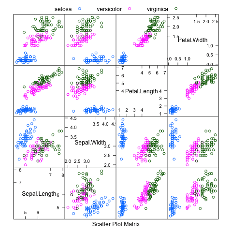
Scatterplot Matrix
A scatterplot matrix shows a grid of scatterplots where each attribute is plotted against all other attributes. It can be read by column or row, and each plot appears twice, allowing you to consider the spatial relationships from two perspectives.
An improvement of just plotting the scatterplots, is to further include class information. This is commonly done by coloring dots in each scatterplot by their class value.
The example below shows a scatterplot matrix for the iris dataset, with pair-wise scatter plots for all four attributes, and dots in the scatterplots colored by the class attribute.
Scatterplot matrix in caret r package
R
1
2
3
4
5
6
# load the library
library(caret)
# load the data
data(iris)
# pair-wise plots of all 4 attributes, dots colored by class
Scatterplot Matrix of the Iris dataset using the Caret R package
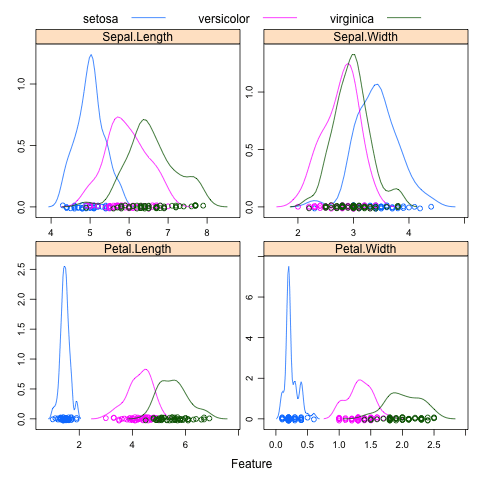
Density Plots
Density estimation plots (density plots for short) summarize the distribution of the data. Like a histogram, the relationship between the attribute values and number of observations is summarized, but rather than a frequency, the relationship is summarized as a continuous probability density function (PDF). This is the probability that a given observation has a given value.
The density plots can further be improved by separating each attribute by their class value for the observation. This can be useful to understand the single-attribute relationship with the class values and highlight useful structures like linear separability of attribute values into classes.
The example below shows density plots for the iris dataset, showing PDFs for how each attribute relates to each class value.
Density Plot of the iris dataset using the Caret R package
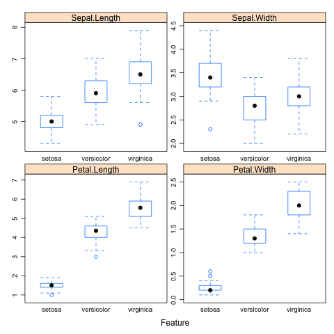
Box and Whisker Plots
Box and Whisker plots (or box plots for short) summarize the distribution of a given attribute by showing a box for the 25th and 75th percentile, a line in the box for the 50th percentile (median) and a dot for the mean. The whiskers show 1.5*the height of the box (called the Inter Quartile Range) which indicate the expected range of the data and any data beyond those whiskers is assumed to be an outlier and marked with a dot.
Again, each attribute can be summarized in terms of their observed class value, giving you an idea of how attribute values and class values relate, much like the density plots.
The example below shows box and whisker plots for the iris data set, showing a separate box for each class value for a given attribute.
Box plots in caret r
R
1
2
3
4
5
6
# load the library
library(caret)
# load the data
data(iris)
# box and whisker plots for each attribute by class value
Thank you the article, I found it very useful. For large datasets one may be interested to remove the rug in the density plot (pch = “”) to speed up plotting.
I have a question about the order/sequence of plotted variables. Can I make them appear in the sequence the attributes are stored in the dataset?
I figured it out: used properties of the lattice graphs to change the featurePlot() function.