Data visualization is an important aspect of all AI and machine learning applications. You can gain key insights into your data through different graphical representations. In this tutorial, we’ll talk about a few options for data visualization in Python. We’ll use the MNIST dataset and the Tensorflow library for number crunching and data manipulation. To illustrate various methods for creating different types of graphs, we’ll use Python’s graphing libraries, namely matplotlib, Seaborn, and Bokeh.
After completing this tutorial, you will know:
How to visualize images in matplotlib
How to make scatter plots in matplotlib, Seaborn, and Bokeh
How to make multiline plots in matplotlib, Seaborn, and Bokeh
Kick-start your project with my new book Python for Machine Learning, including step-by-step tutorials and the Python source code files for all examples.
Let’s get started.
Data Visualization in Python With matplotlib, Seaborn, and Bokeh Photo by Mehreen Saeed, some rights reserved.
Tutorial Overview
This tutorial is divided into seven parts; they are:
Preparation of scatter data
Figures in matplotlib
Scatter plots in matplotlib and Seaborn
Scatter plots in Bokeh
Preparation of line plot data
Line plots in matplotlib, Seaborn, and Bokeh
More on visualization
Preparation of Scatter Data
In this post, we will use matplotlib, Seaborn, and Bokeh. They are all external libraries that need to be installed. To install them using pip, run the following command:
1
pip install matplotlib seaborn bokeh
For demonstration purposes, we will also use the MNIST handwritten digits dataset. We will load it from TensorFlow and run the PCA algorithm on it. Hence we will also need to install TensorFlow and pandas:
1
pip install tensorflow pandas
The code afterward will assume the following imports are executed:
1
2
3
4
5
6
7
8
9
10
11
12
13
14
15
16
17
18
# Importing from tensorflow and keras
from tensorflow.keras.datasets import mnist
from tensorflow.keras.models import Sequential
from tensorflow.keras.layers import Dense,Reshape
from tensorflow.keras import utils
from tensorflow import dtypes,tensordot
from tensorflow import convert_to_tensor,linalg,transpose
# For math operations
import numpy asnp
# For plotting with matplotlib
import matplotlib.pyplot asplt
# For plotting with seaborn
import seaborn assns
# For plotting with bokeh
from bokeh.plotting import figure,show
from bokeh.models import Legend,LegendItem
# For pandas dataframe
import pandas aspd
We load the MNIST dataset from the keras.datasets library. To keep things simple, we’ll retain only the subset of data containing the first three digits. We’ll also ignore the test set for now.
print('Training data has ',total_examples,'images')
print('Each image is of size ',img_length,'x',img_width)
Output
1
2
Training data has 18623 images
Each image is of size 28 x 28
Want to Get Started With Python for Machine Learning?
Take my free 7-day email crash course now (with sample code).
Click to sign-up and also get a free PDF Ebook version of the course.
Figures in matplotlib
Seaborn is indeed an add-on to matplotlib. Therefore, you need to understand how matplotlib handles plots even if using Seaborn.
Matplotlib calls its canvas the figure. You can divide the figure into several sections called subplots, so you can put two visualizations side-by-side.
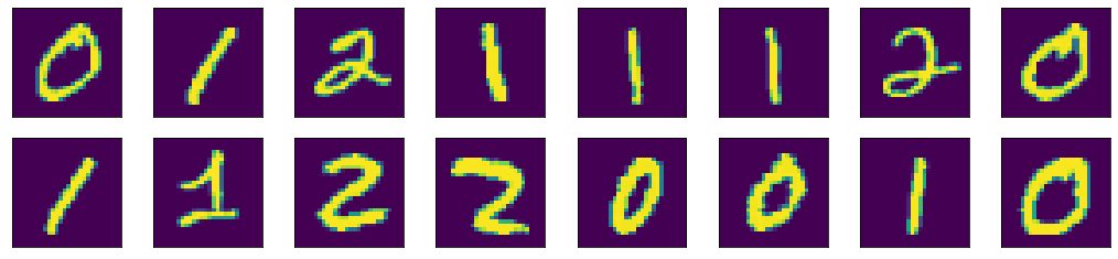
For example, let’s visualize the first 16 images of our MNIST dataset using matplotlib. We’ll create 2 rows and 8 columns using the subplots() function. The subplots() function will create the axes objects for each unit. Then we will display each image on each axes object using the imshow() method. Finally, the figure will be shown using the show() function:
First 16 images of the training dataset displayed in 2 rows and 8 columns
Here we can see a few properties of matplotlib. There is a default figure and default axes in matplotlib. There are a number of functions defined in matplotlib under the pyplot submodule for plotting on the default axes. If we want to plot on a particular axis, we can use the plotting function under the axes objects. The operations to manipulate a figure are procedural. Meaning, there is a data structure remembered internally by matplotlib, and our operations will mutate it. The show() function simply displays the result of a series of operations. Because of that, we can gradually fine-tune a lot of details in the figure. In the example above, we hid the “ticks” (i.e., the markers on the axes) by setting xticks and yticks to empty lists.
Scatter Plots in matplotlib and Seaborn
One common visualization we use in machine learning projects is the scatter plot.
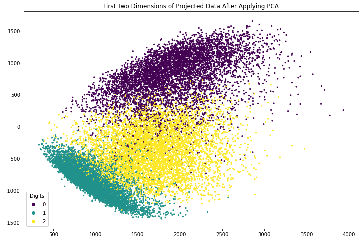
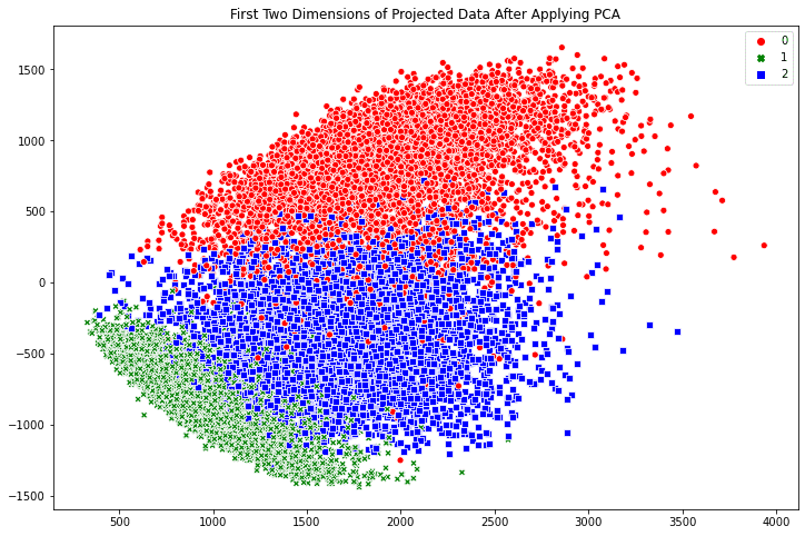
For example, we apply PCA to the MNIST dataset and extract the first three components of each image. In the code below, we compute the eigenvectors and eigenvalues from the dataset, then project the data of each image along the direction of the eigenvectors and store the result in x_pca. For simplicity, we didn’t normalize the data to zero mean and unit variance before computing the eigenvectors. This omission does not affect our purpose of visualization.
1
2
3
4
5
6
7
8
9
10
...
# Convert the dataset into a 2D array of shape 18623 x 784
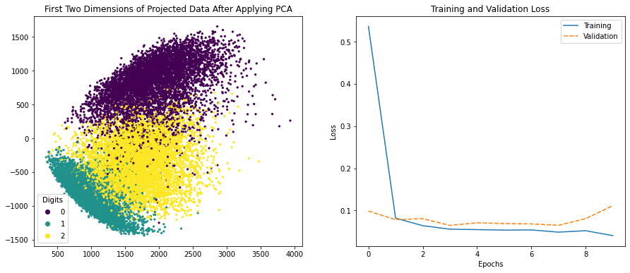
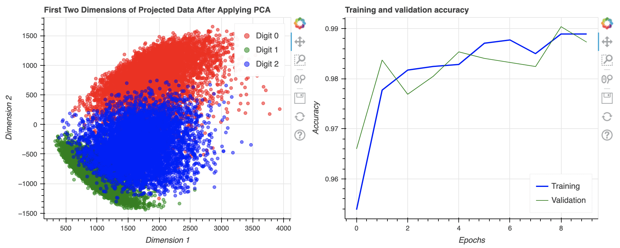
The array x_pca is in the shape 18623 x 784. Let’s consider the last two columns as the x- and y-coordinates and make the point of each row in the plot. We can further color the point according to which digit it corresponds to.
The following code generates a scatter plot using matplotlib. The plot is created using the axes object’s scatter() function, which takes the x- and y-coordinates as the first two arguments. The c argument to the scatter() method specifies a value that will become its color. The s argument specifies its size. The code also creates a legend and adds a title to the plot.
plt.title('First Two Dimensions of Projected Data After Applying PCA')
plt.show()
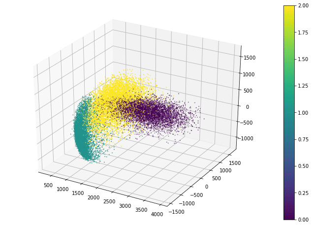
Matplotlib also allows a 3D scatter plot to be produced. To do so, you need to create an axes object with 3D projection first. Then the 3D scatter plot is created with the scatter3D() function, with the x-, y-, and z-coordinates as the first three arguments. The code below uses the data projected along the eigenvectors corresponding to the three largest eigenvalues. Instead of creating a legend, this code creates a color bar:
The scatter3D() function just puts the points onto the 3D space. Afterward, we can still modify how the figure displays, such as the label of each axis and the background color. But in 3D plots, one common tweak is the viewport, namely, the angle we look at the 3D space. The viewport is controlled by the view_init() function in the axes object:
1
ax.view_init(elev=30,azim=-60)
The viewport is controlled by the elevation angle (i.e., angle to the horizon plane) and the azimuthal angle (i.e., rotation on the horizon plane). By default, matplotlib uses 30-degree elevation and -60-degree azimuthal, as shown above.
Putting everything together, the following is the complete code to create the 3D scatter plot in matplotlib:
1
2
3
4
5
6
7
8
9
10
11
12
13
14
15
16
17
18
19
20
21
22
23
24
25
26
27
28
29
30
31
32
33
34
from tensorflow.keras.datasets import mnist
from tensorflow import dtypes,tensordot
from tensorflow import convert_to_tensor,linalg,transpose
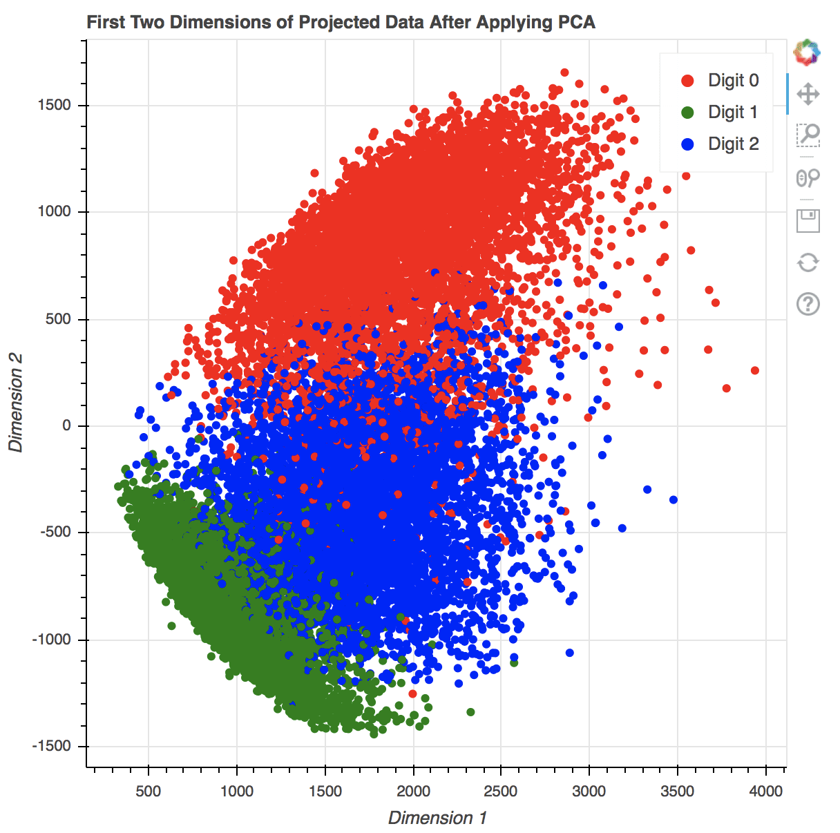
Creating scatter plots in Seaborn is similarly easy. The scatterplot() method automatically creates a legend and uses different symbols for different classes when plotting the points. By default, the plot is created on the “current axes” from matplotlib, unless the axes object is specified by the ax argument.
1
2
3
4
5
6
fig,ax=plt.subplots(figsize=(12,8))
sns.scatterplot(x_pca[:,-1],x_pca[:,-2],
style=train_labels,hue=train_labels,
palette=["red","green","blue"])
plt.title('First Two Dimensions of Projected Data After Applying PCA')
plt.show()
2D scatter plot generated using Seaborn
The benefit of Seaborn over matplotlib is twofold: First, we have a polished default style. For example, if we compare the point style in the two scatter plots above, the Seaborn one has a border around the dot to prevent the many points from being smudged together. Indeed, if we run the following line before calling any matplotlib functions:
1
sns.set(style="darkgrid")
We can still use the matplotlib functions but get a better looking figure by using Seaborn’s style. Secondly, it is more convenient to use Seaborn if we are using a pandas DataFrame to hold our data. As an example, let’s convert our MNIST data from a tensor into a pandas DataFrame:
plt.title('First Two Dimensions of Projected Data After Applying PCA')
plt.show()
Seaborn, as a wrapper to some matplotlib functions, is not replacing matplotlib entirely. Plotting in 3D, for example, is not supported by Seaborn, and we still need to resort to matplotlib functions for such purposes.
Scatter Plots in Bokeh
The plots created by matplotlib and Seaborn are static images. If you need to zoom in, pan, or toggle the display of some part of the plot, you should use Bokeh instead.
Creating scatter plots in Bokeh is also easy. The following code generates a scatter plot and adds a legend. The show() method from the Bokeh library opens a new browser window to display the image. You can interact with the plot by scaling, zooming, scrolling, and more using options that are shown in the toolbar next to the rendered plot. You can also hide part of the scatter by clicking on the legend.
1
2
3
4
5
6
7
8
9
10
11
colormap={0:"red",1:"green",2:"blue"}
my_scatter=figure(title="First Two Dimensions of Projected Data After Applying PCA",
Bokeh will produce the plot in HTML with Javascript. All your actions to control the plot are handled by some Javascript functions. Its output will look like the following:
2D scatter plot generated using Bokeh in a new browser window. Note the various options on the right for interacting with the plot.
The following is the complete code to generate the above scatter plot using Bokeh:
1
2
3
4
5
6
7
8
9
10
11
12
13
14
15
16
17
18
19
20
21
22
23
24
25
26
27
28
29
30
31
32
33
34
35
36
37
38
39
from tensorflow.keras.datasets import mnist
from tensorflow import dtypes,tensordot
from tensorflow import convert_to_tensor,linalg,transpose
If you are rendering the Bokeh plot in a Jupyter notebook, you may see the plot is produced in a new browser window. To put the plot in the Jupyter notebook, you need to tell Bokeh that you are under the notebook environment by running the following before the Bokeh functions:
1
2
from bokeh.io import output_notebook
output_notebook()
Also, note that we create the scatter plot of the three digits in a loop, one digit at a time. This is required to make the legend interactive since each time scatter() is called, a new object is created. If we create all scatter points at once, like the following, clicking on the legend will hide and show everything instead of only the points of one of the digits.
1
2
3
4
5
6
7
8
9
10
11
12
13
colormap={0:"red",1:"green",2:"blue"}
colors=[colormap[i]foriintrain_labels]
my_scatter=figure(title="First Two Dimensions of Projected Data After Applying PCA",
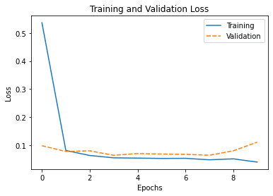
Before we move on to show how we can visualize line plot data, let’s generate some data for illustration. Below is a simple classifier using the Keras library, which we train to learn the handwritten digit classification. The history object returned by the fit() method is a dictionary that contains all the learning history of the training stage. For simplicity, we’ll train the model using only 10 epochs.
1
2
3
4
5
6
7
8
9
10
11
12
13
14
15
epochs=10
y_train=utils.to_categorical(train_labels)
input_dim=img_length*img_width
# Create a Sequential model
model=Sequential()
# First layer for reshaping input images from 2D to 1D
Let’s look at various options for visualizing the learning history obtained from training our classifier.
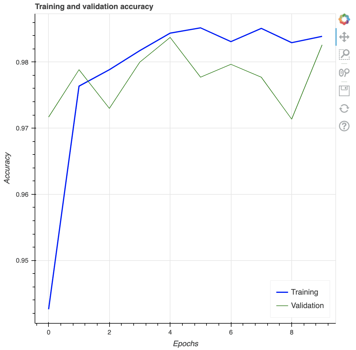
Creating a multi-line plot in matplotlib is as trivial as the following. We obtain the list of values of the training and validation accuracies from the history, and by default, matplotlib will consider that as sequential data (i.e., x-coordinates are integers counting from 0 onward).
Similarly, we can do the same in Seaborn. As we have seen in the case of scatter plots, we can pass in the data to Seaborn as a series of values explicitly or through a pandas DataFrame. Let’s plot the training loss and validation loss in the following using a pandas DataFrame:
It will print the following table, which is the DataFrame we created from the history:
Output
1
2
3
4
5
6
7
8
9
10
11
loss accuracy val_loss val_accuracy
0 0.536215 0.942614 0.098741 0.971689
1 0.081841 0.976357 0.078354 0.978848
2 0.064002 0.978841 0.080637 0.972991
3 0.055695 0.981726 0.064659 0.979987
4 0.054693 0.984371 0.070817 0.983729
5 0.053512 0.985173 0.069099 0.977709
6 0.053916 0.983089 0.068139 0.979662
7 0.048681 0.985093 0.064914 0.977709
8 0.052084 0.982929 0.080508 0.971363
9 0.040484 0.983890 0.111380 0.982590
And the plot it generated is as follows:
Multi-line plot using Seaborn
By default, Seaborn will understand the column labels from the DataFrame and use them as a legend. In the above, we provide a new label for each plot. Moreover, the x-axis of the line plot is taken from the index of the DataFrame by default, which is an integer running from 0 to 9 in our case, as we can see above.
The complete code of producing the plot in Seaborn is as follows:
As you can expect, we can also provide arguments x and y together with data to our call to lineplot() as in our example of the Seaborn scatter plot above if we want to control the x- and y-coordinates precisely.
Bokeh can also generate multi-line plots, as illustrated in the code below. As we saw in the scatter plot example, we need to provide the x- and y-coordinates explicitly and do one line at a time. Again, the show() method opens a new browser window to display the plot, and you can interact with it.
1
2
3
4
5
6
7
8
9
10
p=figure(title="Training and validation accuracy",
Each of the tools we introduced above has a lot more functions for us to control the bits and pieces of the details in the visualization. It is important to search their respective documentation to find how you can polish your plots. It is equally important to check out the example code in their documentation to learn how you can possibly make your visualization better.
Without providing too much detail, here are some ideas that you may want to add to your visualization:
Add auxiliary lines, such as to mark the training and validation dataset on a time series data. The axvline() function from matplotlib can make a vertical line on plots for this purpose.
Add annotations, such as arrows and text labels, to identify key points on the plot. See the annotate() function in matplotlib axes objects.
Control the transparency level in case of overlapping graphic elements. All plotting functions we introduced above allow an alpha argument to provide a value between 0 and 1 for how much we can see through the graph.
If the data is better illustrated this way, we may show some of the axes in log scale. It is usually called the log plot or semilog plot.
Before we conclude this post, the following is an example to create a side-by-side visualization in matplotlib, where one of them is created using Seaborn:
1
2
3
4
5
6
7
8
9
10
11
12
13
14
15
16
17
18
19
20
21
22
23
24
25
26
27
28
29
30
31
32
33
34
35
36
37
38
39
40
41
42
43
44
45
46
47
48
49
50
51
52
53
54
55
56
57
58
59
60
61
62
63
64
65
66
67
68
69
70
71
from tensorflow.keras.datasets import mnist
from tensorflow.keras import utils
from tensorflow.keras.models import Sequential
from tensorflow.keras.layers import Dense,Reshape
from tensorflow import dtypes,tensordot
from tensorflow import convert_to_tensor,linalg,transpose
In this tutorial, you discovered various options for data visualization in Python.
Specifically, you learned:
How to create subplots in different rows and columns
How to render images using matplotlib
How to generate 2D and 3D scatter plots using matplotlib
How to create 2D plots using Seaborn and Bokeh
How to create multi-line plots using matplotlib, Seaborn, and Bokeh
Do you have any questions about the data visualization options discussed in this post? Ask your questions in the comments below, and I will do my best to answer.
It provides self-study tutorials with hundreds of working code to equip you with skills including: debugging, profiling, duck typing, decorators, deployment,
and much more...
Showing You the Python Toolbox at a High Level for Your Projects
I read all your GAN related blog on YouTube channel, it’s very interesting and completely explained .Just want to tell , can you make any extension on evolution of generative model , in simple word, “how can you find convergence of your generative model?” .Currently I’m doing a project on CGAN. I’m also trying on this extension. So if you have any suggestions about that please let me know.
I feel like “Visualizations” as a title is somewhat misleading. You are simply plotting the accuracy curve and showing the original data. ML visualizations to me are typically visual manifestations of the actual machine learning. Clustering diagrams, heatmaps, pdfs…
There is some good knowledge here, but I don’t really see this as visualizations at all


")
To Jason Brownlee and team,
I read all your GAN related blog on YouTube channel, it’s very interesting and completely explained .Just want to tell , can you make any extension on evolution of generative model , in simple word, “how can you find convergence of your generative model?” .Currently I’m doing a project on CGAN. I’m also trying on this extension. So if you have any suggestions about that please let me know.
Thank you.
I think there’s a typo in the first code line, ‘boken’ instead of ‘bokeh’.
Thank you for the feedback Richard!
May God Bless You,
How to cite your blog in our papers
I feel like “Visualizations” as a title is somewhat misleading. You are simply plotting the accuracy curve and showing the original data. ML visualizations to me are typically visual manifestations of the actual machine learning. Clustering diagrams, heatmaps, pdfs…
There is some good knowledge here, but I don’t really see this as visualizations at all
Thank you for your feedback Perri!