Forecast errors on time series regression problems are called residuals or residual errors.
Careful exploration of residual errors on your time series prediction problem can tell you a lot about your forecast model and even suggest improvements.
In this tutorial, you will discover how to visualize residual errors from time series forecasts.
After completing this tutorial, you will know:
How to create and review line plots of residual errors over time.
How to review summary statistics and plots of the distribution of residual plots.
How to explore the correlation structure of residual errors.
Kick-start your project with my new book Time Series Forecasting With Python, including step-by-step tutorials and the Python source code files for all examples.
Let’s get started.
Updated Apr/2019: Updated the link to dataset.
Updated Aug/2019: Updated data loading to use new API.
Updated Sept/2019: Updated examples to use latest API.
Residual Forecast Errors
Forecast errors on a time series forecasting problem are called residual errors or residuals.
A residual error is calculated as the expected outcome minus the forecast, for example:
1
residual error = expected - forecast
Or, more succinctly and using standard terms as:
1
e = y - yhat
We often stop there and summarize the skill of a model as a summary of this error.
Instead, we can collect these individual residual errors across all forecasts and use them to better understand the forecast model.
Generally, when exploring residual errors we are looking for patterns or structure. A sign of a pattern suggests that the errors are not random.
We expect the residual errors to be random, because it means that the model has captured all of the structure and the only error left is the random fluctuations in the time series that cannot be modeled.
A sign of a pattern or structure suggests that there is more information that a model could capture and use to make better predictions.
Before we start exploring the different ways to look for patterns in residual errors, we need context. In the next section, we will look at a dataset and a simple forecast method that we will use to generate residual errors to explore in this tutorial.
Stop learning Time Series Forecasting the slow way!
Take my free 7-day email course and discover how to get started (with sample code).
Click to sign-up and also get a free PDF Ebook version of the course.
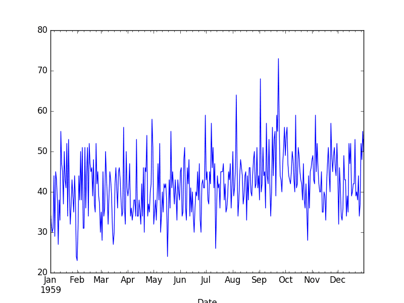
Daily Female Births Dataset
This dataset describes the number of daily female births in California in 1959.
The units are a count and there are 365 observations. The source of the dataset is credited to Newton, 1988.
Running the example prints the first 5 rows of the loaded file.
1
2
3
4
5
6
7
Date
1959-01-01 35
1959-01-02 32
1959-01-03 30
1959-01-04 31
1959-01-05 44
Name: Births, dtype: int64
The dataset is also shown in a line plot of observations over time.
Daily Female Births Dataset
Persistence Forecast Model
The simplest forecast that we can make is to forecast that what happened in the previous time step will be the same as what will happen in the next time step.
This is called the “naive forecast” or the persistence forecast model.
We can implement the persistence model in Python.
After the dataset is loaded, it is phrased as a supervised learning problem. A lagged version of the dataset is created where the prior time step (t-1) is used as the input variable and the next time step (t+1) is taken as the output variable.
1
2
3
4
# create lagged dataset
values=DataFrame(series.values)
dataframe=concat([values.shift(1),values],axis=1)
dataframe.columns=['t-1','t+1']
Next, the dataset is split into training and test sets. A total of 66% of the data is kept for training and the remaining 34% is held for the test set. No training is required for the persistence model; this is just a standard test harness approach.
Once split, the train and test sets are separated into their input and output components.
1
2
3
4
5
6
# split into train and test sets
X=dataframe.values
train_size=int(len(X)*0.66)
train,test=X[1:train_size],X[train_size:]
train_X,train_y=train[:,0],train[:,1]
test_X,test_y=test[:,0],test[:,1]
The persistence model is applied by predicting the output value (y) as a copy of the input value (x).
1
2
# persistence model
predictions=[xforxintest_X]
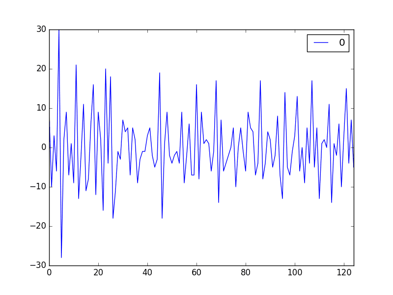
The residual errors are then calculated as the difference between the expected outcome (test_y) and the prediction (predictions).
Running the example shows a seemingly random plot of the residual time series.
If we did see trend, seasonal or cyclic structure, we could go back to our model and attempt to capture those elements directly.
Line Plot of Residual Errors for the Daily Female Births Dataset
Next, we look at summary statistics that we can use to see how the errors are spread around zero.
Residual Summary Statistics
We can calculate summary statistics on the residual errors.
Primarily, we are interested in the mean value of the residual errors. A value close to zero suggests no bias in the forecasts, whereas positive and negative values suggest a positive or negative bias in the forecasts made.
It is useful to know about a bias in the forecasts as it can be directly corrected in forecasts prior to their use or evaluation.
Below is an example of calculating summary statistics of the distribution of residual errors. This includes the mean and standard deviation of the distribution, as well as percentiles and the minimum and maximum errors observed.
Running the example shows a mean error value close to zero, but perhaps not close enough.
It suggests that there may be some bias and that we may be able to further improve the model by performing a bias correction. This could be done by adding the mean residual error (0.064000) to forecasts.
This may work in this case, but it is a naive form of bias correction and there are more sophisticated methods available.
1
2
3
4
5
6
7
8
count 125.000000
mean 0.064000
std 9.187776
min -28.000000
25% -6.000000
50% -1.000000
75% 5.000000
max 30.000000
Next, we go beyond summary statistics and look at methods to visualize the distribution of the residual errors.
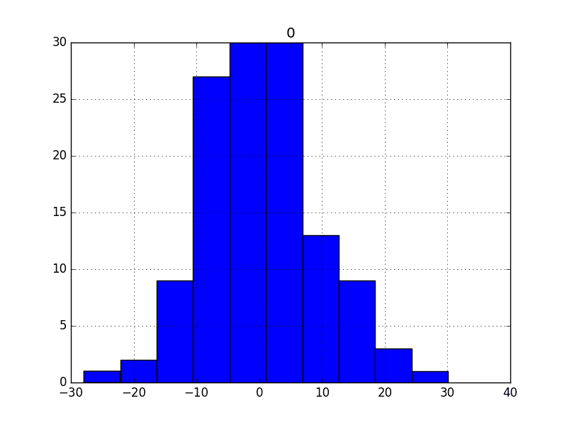
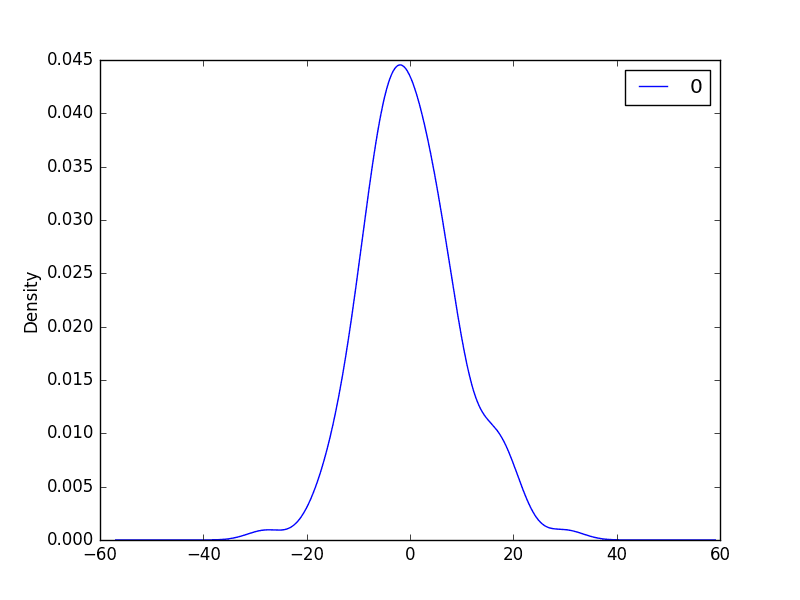
Residual Histogram and Density Plots
Plots can be used to better understand the distribution of errors beyond summary statistics.
We would expect the forecast errors to be normally distributed around a zero mean.
Plots can help discover skews in this distribution.
We can use both histograms and density plots to better understand the distribution of residual errors. Below is an example of creating one of each plot.
We can see that the distribution does have a Gaussian look, but is perhaps more pointy, showing an exponential distribution with some asymmetry.
If the plot showed a distribution that was distinctly non-Gaussian, it would suggest that assumptions made by the modeling process were perhaps incorrect and that a different modeling method may be required.
A large skew may suggest the opportunity for performing a transform to the data prior to modeling, such as taking the log or square root.
Histogram Plot of Residual Errors for the Daily Female Births Dataset
Density Plot of Residual Errors for the Daily Female Births Dataset
Next, we will look at another quick, and perhaps more reliable, way to check if the distribution of residuals is Gaussian.
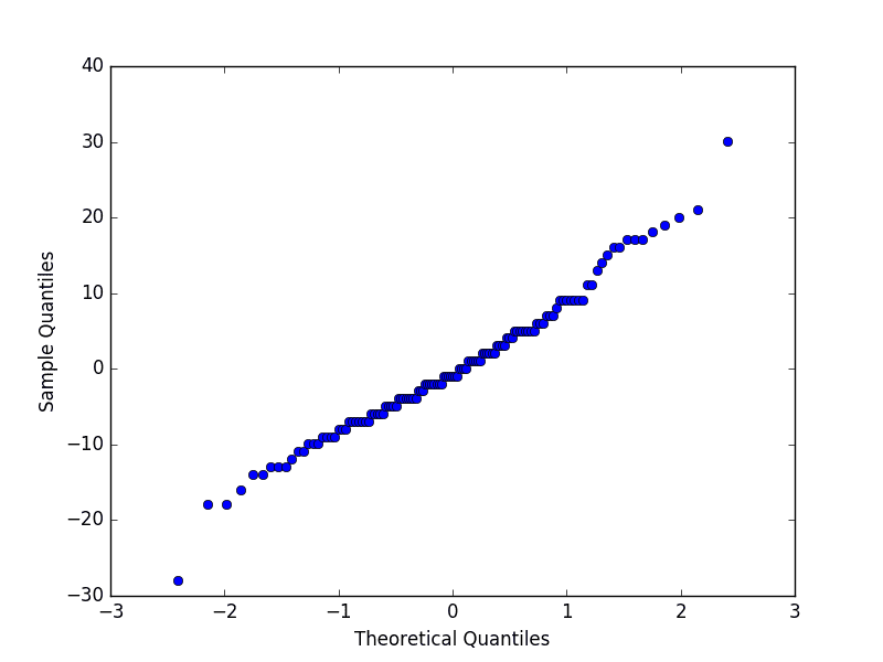
Residual Q-Q Plot
A Q-Q plot, or quantile plot, compares two distributions and can be used to see how similar or different they happen to be.
We can create a Q-Q plot using the qqplot() function in the statsmodels library.
The Q-Q plot can be used to quickly check the normality of the distribution of residual errors.
The values are ordered and compared to an idealized Gaussian distribution. The comparison is shown as a scatter plot (theoretical on the x-axis and observed on the y-axis) where a match between the two distributions is shown as a diagonal line from the bottom left to the top-right of the plot.
The plot is helpful to spot obvious departures from this expectation.
Below is an example of a Q-Q plot of the residual errors. The x-axis shows the theoretical quantiles and the y-axis shows the sample quantiles.
Running the example shows a Q-Q plot that the distribution is seemingly normal with a few bumps and outliers.
Q-Q Plot of Residual Errors for the Daily Female Births Dataset
Next, we can check for correlations between the errors over time.
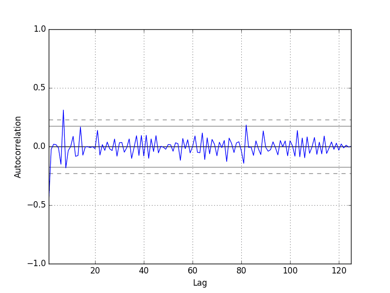
Residual Autocorrelation Plot
Autocorrelation calculates the strength of the relationship between an observation and observations at prior time steps.
We can calculate the autocorrelation of the residual error time series and plot the results. This is called an autocorrelation plot.
We would not expect there to be any correlation between the residuals. This would be shown by autocorrelation scores being below the threshold of significance (dashed and dotted horizontal lines on the plot).
A significant autocorrelation in the residual plot suggests that the model could be doing a better job of incorporating the relationship between observations and lagged observations, called autoregression.
Pandas provides a built-in function for calculating an autocorrelation plot, called autocorrelation_plot().
Below is an example of visualizing the autocorrelation for the residual errors. The x-axis shows the lag and the y-axis shows the correlation between an observation and the lag variable, where correlation values are between -1 and 1 for negative and positive correlations respectively.
Running the example creates an autoregression plot of other residual errors.
We do not see an obvious autocorrelation trend across the plot. There may be some positive autocorrelation worthy of further investigation at lag 7 that seems significant.
Autocorrelation Plot of Residual Errors for the Daily Female Births Dataset
Summary
In this tutorial, you discovered how to explore the time series of residual forecast errors with Python.
Specifically, you learned:
How to plot the time series of forecast residual errors as a line plot.
How to explore the distribution of residual errors using statistics, density plots, and Q-Q plots.
How to check the residual time series for autocorrelation.
Do you have any questions about exploring residual error time series, or about this tutorial?
Ask your questions in the comments below.
Want to Develop Time Series Forecasts with Python?
A code change: pandas.tools.plotting was moved to pandas.plotting, so below command doesn’t work in your code.
from pandas.tools.plotting import autocorrelation_plot
amazing, can we find the residual and the correlation from two series, one output of the system and the other is estimated model, without need to find model? is it possible?


Great tutorial, but please change:
from pandas.tools.plotting import autocorrelation_plot
on
from pandas.plotting import autocorrelation_plot
Because in newer version pandas, the path has been changed.
Thanks for the note Anton.
It’s a great post.
A code change: pandas.tools.plotting was moved to pandas.plotting, so below command doesn’t work in your code.
from pandas.tools.plotting import autocorrelation_plot
Thanks.
Thanks a bunch, Jason.
Actually helping me out in my research. Great stuff!
You’re welcome, I’m glad it helps.
Hello Jason!
I am getting a residual histogram with a Laplace distribution. What could be happening? Or how could I interpret this?
Perhaps with more data it would be come gaussian, or perhaps it is close enough to gaussian.
Otherwise, perhaps explore power transforms of the input data prior to modeling.
amazing, can we find the residual and the correlation from two series, one output of the system and the other is estimated model, without need to find model? is it possible?
Are you saying you already have the two series? If so, yes, you can simply run the correlation function with the two series as input.