Numerical input variables may have a highly skewed or non-standard distribution.
This could be caused by outliers in the data, multi-modal distributions, highly exponential distributions, and more.
Many machine learning algorithms prefer or perform better when numerical input variables and even output variables in the case of regression have a standard probability distribution, such as a Gaussian (normal) or a uniform distribution.
The quantile transform provides an automatic way to transform a numeric input variable to have a different data distribution, which in turn, can be used as input to a predictive model.
In this tutorial, you will discover how to use quantile transforms to change the distribution of numeric variables for machine learning.
After completing this tutorial, you will know:
Many machine learning algorithms prefer or perform better when numerical variables have a Gaussian or standard probability distribution.
Quantile transforms are a technique for transforming numerical input or output variables to have a Gaussian or uniform probability distribution.
How to use the QuantileTransformer to change the probability distribution of numeric variables to improve the performance of predictive models.
Kick-start your project with my new book Data Preparation for Machine Learning, including step-by-step tutorials and the Python source code files for all examples.
Let’s get started.
How to Use Quantile Transforms for Machine Learning Photo by Bernard Spragg. NZ, some rights reserved.
Tutorial Overview
This tutorial is divided into five parts; they are:
Change Data Distribution
Quantile Transforms
Sonar Dataset
Normal Quantile Transform
Uniform Quantile Transform
Change Data Distribution
Many machine learning algorithms perform better when the distribution of variables is Gaussian.
Recall that the observations for each variable may be thought to be drawn from a probability distribution. The Gaussian is a common distribution with the familiar bell shape. It is so common that it is often referred to as the “normal” distribution.
For more on the Gaussian probability distribution, see the tutorial:
Some algorithms, like linear regression and logistic regression, explicitly assume the real-valued variables have a Gaussian distribution. Other nonlinear algorithms may not have this assumption, yet often perform better when variables have a Gaussian distribution.
This applies both to real-valued input variables in the case of classification and regression tasks, and real-valued target variables in the case of regression tasks.
Some input variables may have a highly skewed distribution, such as an exponential distribution where the most common observations are bunched together. Some input variables may have outliers that cause the distribution to be highly spread.
These concerns and others, like non-standard distributions and multi-modal distributions, can make a dataset challenging to model with a range of machine learning models.
As such, it is often desirable to transform each input variable to have a standard probability distribution, such as a Gaussian (normal) distribution or a uniform distribution.
Want to Get Started With Data Preparation?
Take my free 7-day email crash course now (with sample code).
Click to sign-up and also get a free PDF Ebook version of the course.
Quantile Transforms
A quantile transform will map a variable’s probability distribution to another probability distribution.
Recall that a quantile function, also called a percent-point function (PPF), is the inverse of the cumulative probability distribution (CDF). A CDF is a function that returns the probability of a value at or below a given value. The PPF is the inverse of this function and returns the value at or below a given probability.
The quantile function ranks or smooths out the relationship between observations and can be mapped onto other distributions, such as the uniform or normal distribution.
The transformation can be applied to each numeric input variable in the training dataset and then provided as input to a machine learning model to learn a predictive modeling task.
This quantile transform is available in the scikit-learn Python machine learning library via the QuantileTransformer class.
The class has an “output_distribution” argument that can be set to “uniform” or “normal” and defaults to “uniform“.
It also provides a “n_quantiles” that determines the resolution of the mapping or ranking of the observations in the dataset. This must be set to a value less than the number of observations in the dataset and defaults to 1,000.
We can demonstrate the QuantileTransformer with a small worked example. We can generate a sample of random Gaussian numbers and impose a skew on the distribution by calculating the exponent. The QuantileTransformer can then be used to transform the dataset to be another distribution, in this cases back to a Gaussian distribution.
The complete example is listed below.
1
2
3
4
5
6
7
8
9
10
11
12
13
14
15
16
17
18
19
20
# demonstration of the quantile transform
from numpy import exp
from numpy.random import randn
from sklearn.preprocessing import QuantileTransformer
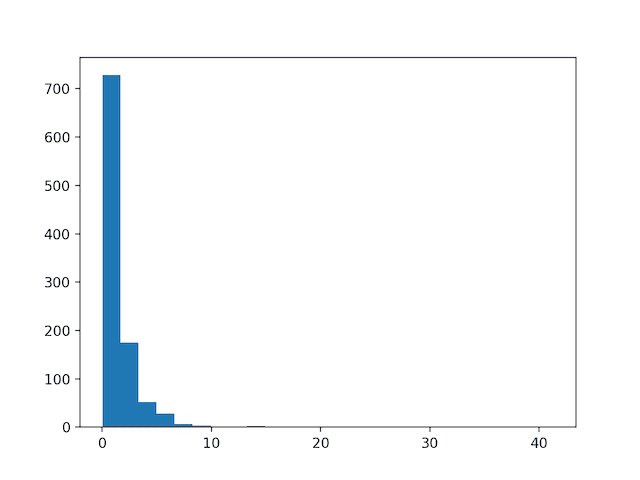
Running the example first creates a sample of 1,000 random Gaussian values and adds a skew to the dataset.
A histogram is created from the skewed dataset and clearly shows the distribution pushed to the far left.
Histogram of Skewed Gaussian Distribution
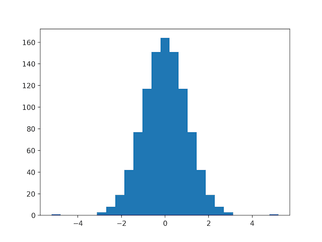
Then a QuantileTransformer is used to map the data distribution Gaussian and standardize the result, centering the values on the mean value of 0 and a standard deviation of 1.0.
A histogram of the transform data is created showing a Gaussian shaped data distribution.
Histogram of Skewed Gaussian Data After Quantile Transform
In the following sections will take a closer look at how to use the quantile transform on a real dataset.
Next, let’s introduce the dataset.
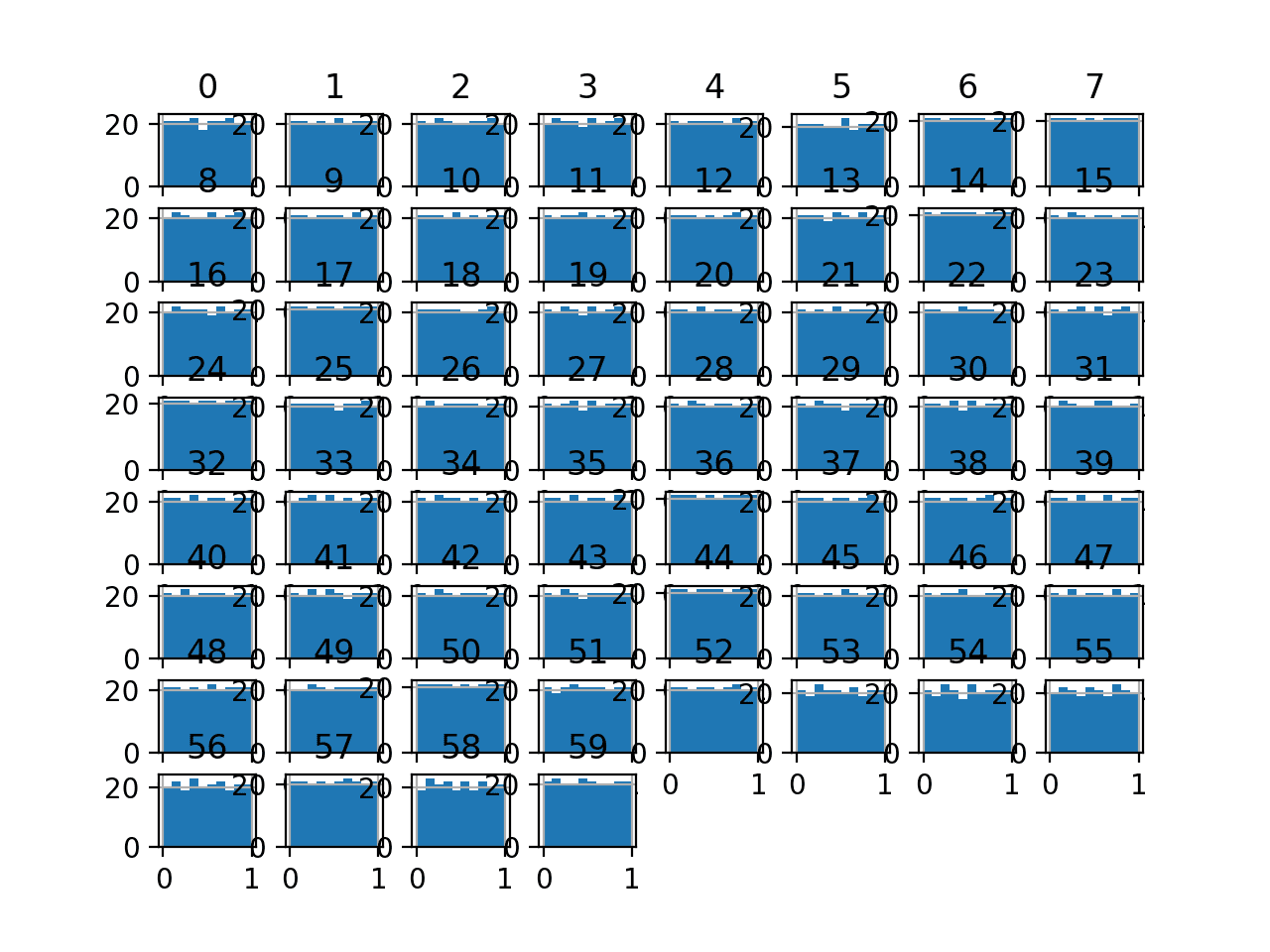
Sonar Dataset
The sonar dataset is a standard machine learning dataset for binary classification.
It involves 60 real-valued inputs and a two-class target variable. There are 208 examples in the dataset and the classes are reasonably balanced.
A baseline classification algorithm can achieve a classification accuracy of about 53.4 percent using repeated stratified 10-fold cross-validation. Top performance on this dataset is about 88 percent using repeated stratified 10-fold cross-validation.
The dataset describes sonar returns of rocks or simulated mines.
max 0.137100 0.233900 0.305900 ... 0.044000 0.036400 0.043900
[8 rows x 60 columns]
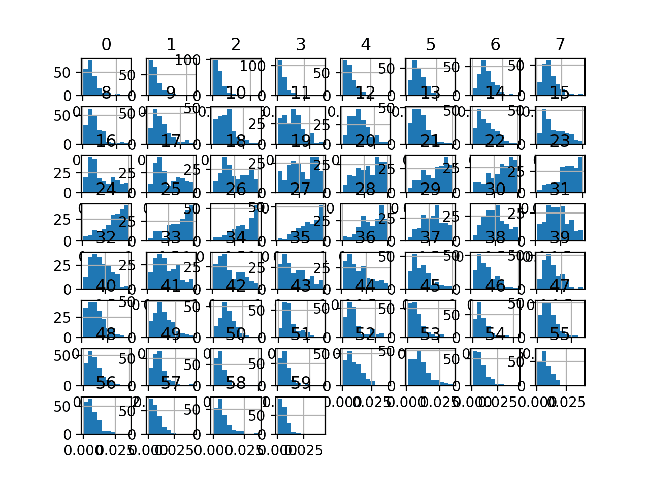
Finally a histogram is created for each input variable.
If we ignore the clutter of the plots and focus on the histograms themselves, we can see that many variables have a skewed distribution.
The dataset provides a good candidate for using a quantile transform to make the variables more-Gaussian.
Histogram Plots of Input Variables for the Sonar Binary Classification Dataset
Next, let’s fit and evaluate a machine learning model on the raw dataset.
We will use a k-nearest neighbor algorithm with default hyperparameters and evaluate it using repeated stratified k-fold cross-validation. The complete example is listed below.
1
2
3
4
5
6
7
8
9
10
11
12
13
14
15
16
17
18
19
20
21
22
23
24
25
# evaluate knn on the raw sonar dataset
from numpy import mean
from numpy import std
from pandas import read_csv
from sklearn.model_selection import cross_val_score
from sklearn.model_selection import RepeatedStratifiedKFold
from sklearn.neighbors import KNeighborsClassifier
Running the example evaluates a KNN model on the raw sonar dataset.
Note: Your results may vary given the stochastic nature of the algorithm or evaluation procedure, or differences in numerical precision. Consider running the example a few times and compare the average outcome.
We can see that the model achieved a mean classification accuracy of about 79.7 percent, showing that it has skill (better than 53.4 percent) and is in the ball-park of good performance (88 percent).
1
Accuracy: 0.797 (0.073)
Next, let’s explore a normal quantile transform of the dataset.
Normal Quantile Transform
It is often desirable to transform an input variable to have a normal probability distribution to improve the modeling performance.
We can apply the Quantile transform using the QuantileTransformer class and set the “output_distribution” argument to “normal“. We must also set the “n_quantiles” argument to a value less than the number of observations in the training dataset, in this case, 100.
Once defined, we can call the fit_transform() function and pass it to our dataset to create a quantile transformed version of our dataset.
1
2
3
4
...
# perform a normal quantile transform of the dataset
Note: Your results may vary given the stochastic nature of the algorithm or evaluation procedure, or differences in numerical precision. Consider running the example a few times and compare the average outcome.
Running the example, we can see that the normal quantile transform results in a lift in performance from 79.7% accuracy without the transform to about 81.7% with the transform.
1
Accuracy: 0.817 (0.087)
Next, let’s take a closer look at the uniform quantile transform.
Uniform Quantile Transform
Sometimes it can be beneficial to transform a highly exponential or multi-modal distribution to have a uniform distribution.
This is especially useful for data with a large and sparse range of values, e.g. outliers that are common rather than rare.
We can apply the transform by defining a QuantileTransformer class and setting the “output_distribution” argument to “uniform” (the default).
1
2
3
4
...
# perform a uniform quantile transform of the dataset
Note: Your results may vary given the stochastic nature of the algorithm or evaluation procedure, or differences in numerical precision. Consider running the example a few times and compare the average outcome.
Running the example, we can see that the uniform transform results in a lift in performance from 79.7 percent accuracy without the transform to about 84.5 percent with the transform, better than the normal transform that achieved a score of 81.7 percent.
1
Accuracy: 0.845 (0.074)
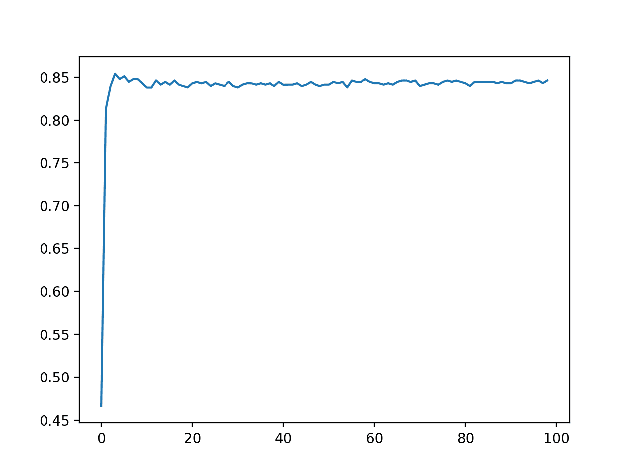
We chose the number of quantiles as an arbitrary number, in this case, 100.
This hyperparameter can be tuned to explore the effect of the resolution of the transform on the resulting skill of the model.
The example below performs this experiment and plots the mean accuracy for different “n_quantiles” values from 1 to 99.
1
2
3
4
5
6
7
8
9
10
11
12
13
14
15
16
17
18
19
20
21
22
23
24
25
26
27
28
29
30
31
32
33
34
35
36
37
38
39
40
41
42
43
44
45
46
47
48
49
50
51
52
53
54
# explore number of quantiles on classification accuracy
from numpy import mean
from numpy import std
from pandas import read_csv
from sklearn.model_selection import cross_val_score
from sklearn.model_selection import RepeatedStratifiedKFold
from sklearn.neighbors import KNeighborsClassifier
from sklearn.preprocessing import QuantileTransformer
Running the example reports the mean classification accuracy for each value of the “n_quantiles” argument.
Note: Your results may vary given the stochastic nature of the algorithm or evaluation procedure, or differences in numerical precision. Consider running the example a few times and compare the average outcome.
We can see that surprisingly smaller values resulted in better accuracy, with values such as 4 achieving an accuracy of about 85.4 percent.
1
2
3
4
5
6
7
8
9
10
11
>1 0.466 (0.016)
>2 0.813 (0.085)
>3 0.840 (0.080)
>4 0.854 (0.075)
>5 0.848 (0.072)
>6 0.851 (0.071)
>7 0.845 (0.071)
>8 0.848 (0.066)
>9 0.848 (0.071)
>10 0.843 (0.074)
...
A line plot is created showing the number of quantiles used in the transform versus the classification accuracy of the resulting model.
We can see a bump with values less than 10 and drop and flat performance after that.
The results highlight that there is likely some benefit in exploring different distributions and number of quantiles to see if better performance can be achieved.
Line Plot of Number of Quantiles vs. Classification Accuracy of KNN on the Sonar Dataset
Further Reading
This section provides more resources on the topic if you are looking to go deeper.
It provides self-study tutorials with full working code on: Feature Selection, RFE, Data Cleaning, Data Transforms, Scaling, Dimensionality Reduction,
and much more...
Bring Modern Data Preparation Techniques to Your Machine Learning Projects
Hi Jason, great tutorial! Thank you so much. Perhaps it is worthwhile to point out a small typo in the problem description. You wrote “The dataset describes radar returns of rocks or simulated mines.” But ii should be “The dataset describes sonar returns of rocks or simulated mines.”
Very useful, thanks a lot. I noticed something in here ‘The class has an “output_distribution” argument that can be set to “uniform” or “random” and defaults to “uniform“.’, instead of “random” it should be “normal”. Correct me if I’m wrong.
Good evening, I am student in Russia, at this moment I am preparing a research report on the theme : Machine Learning in the R language on the example of stock market data adjustment . I need your help please
I am working on an imbalanced classification problem, some columns have a right-skewed distribution (thay have to do with money, so most of them are close to zero).
If I transform those columns by usng logarithmic or QuantileTransformer, accuracy gets worse.
Even if I remove outliers (percentile 98/99) to remove highest values, accuracy gets worse also.
BTW I’m using a logistic regression with class_weight=”balanced”
Why could it happen?
I expected to improve accuracy.
My only question is if you performed a simple regression – assuming normally distributed covariates – after transformation with the gaussian transformation how do you explain the result?
Certainly – suppose I have very right skewed data for covariates. (~98% of thee covariates fall into one quantile. If I perform quantile transformation with the output distribution showing more gaussian and then perform regression using a simile GLM, how would I explain the coefficients, standard error and p values?
For preparing data for “neural networks” is there a way to determine when and when not to do the transformations? Example like the one above. Poisson to Gaussian using QuantileTransform.
If I say skewed distributions be one of the reasons for those zig-zags in the loss plots that we get during training as because a lot of observations move around the decision boundary? Is that the reason we transform?
Hi Jason. Great tutorial as usual.
My question is for regression problems. Assume your target (dependent variable) has an empirical distribution that is neither uniform nor gaussian. Would a quantile scale of the independent variables that maps with as output_distribution that of a target a good option.
Would still simply scale the independent with normal or uniform and not scale the target?
Hi Jason,
Very thanks for this article. I’ve a comment that may help someone else and a question.
– Comment: I used quantile transforming (QuantileTransformer) for a dataframe with discontinuous values index, when training with transformed dataframe I got an error: “Input contains NaN, infinity or a value too large for dtype(‘float64’)”. even when there were no nan, +infinite nor -infinite values. One persone soved the problem by reseting the index before transformation and this also works for me .
– Question: I saw there are two quantile transformation in sklearn (1) sklearn.preprocessing.QuantileTransformer and (2) sklearn.preprocessing.quantile_transform. It say both are equivalent function and differ on the estimator API. What called my attention is that in the seconde one there is a warning of data leak risk and say “A common mistake is to apply it to the entire data before splitting into training and test sets”. Do you know why this is a mistake.
Thanks
bryson_je
The grand rule is test set is supposed to be unseen by the entire pipeline before you really use it. Hence test set is not supposed to be exposed even in the preprocessing stage. You can fit your preprocessors with training data and reuse it for test set. But you should not fit it with both training and test data because if I am reading the processed training data, I might somehow guess what the test data looks like.


Do decision trees / boosted trees prefer or perform better when numerical variables have a Gaussian or standard probability distribution ?
No.
Do decision trees / boosted trees perform worst when numerical variables have a Gaussian or standard probability distribution ?
Hi Paul…The following resource may add clarity:
https://towardsdatascience.com/decision-trees-d07e0f420175
Hi, Jason, great tutorial here. Thanks.
My question, does a high std value mean high accuracy or lower?
Secondly, you have any tutorial on how to write pipeline classes for reusability?
It means more variance in the estimate of the model performance.
What do you mean by your second question?
Hi Jason, great tutorial! Thank you so much. Perhaps it is worthwhile to point out a small typo in the problem description. You wrote “The dataset describes radar returns of rocks or simulated mines.” But ii should be “The dataset describes sonar returns of rocks or simulated mines.”
You’re welcome!
Thanks!
Very useful, thanks a lot. I noticed something in here ‘The class has an “output_distribution” argument that can be set to “uniform” or “random” and defaults to “uniform“.’, instead of “random” it should be “normal”. Correct me if I’m wrong.
You’re welcome!
Thanks, fixed!
Good evening, I am student in Russia, at this moment I am preparing a research report on the theme : Machine Learning in the R language on the example of stock market data adjustment . I need your help please
I don’t know about the stock market, sorry:
https://machinelearningmastery.com/faq/single-faq/can-you-help-me-with-machine-learning-for-finance-or-the-stock-market
Hi Jason,
Thanks for sharing this with us 🙂
I am working on an imbalanced classification problem, some columns have a right-skewed distribution (thay have to do with money, so most of them are close to zero).
If I transform those columns by usng logarithmic or QuantileTransformer, accuracy gets worse.
Even if I remove outliers (percentile 98/99) to remove highest values, accuracy gets worse also.
BTW I’m using a logistic regression with class_weight=”balanced”
Why could it happen?
I expected to improve accuracy.
Thanks
Answering “why” questions is hard if not intractable. This is why we use experiments.
My only question is if you performed a simple regression – assuming normally distributed covariates – after transformation with the gaussian transformation how do you explain the result?
What do you mean exactly? Perhaps you could elaborate the issue?
Certainly – suppose I have very right skewed data for covariates. (~98% of thee covariates fall into one quantile. If I perform quantile transformation with the output distribution showing more gaussian and then perform regression using a simile GLM, how would I explain the coefficients, standard error and p values?
Surely, it is not the same interpretation? I ask this as I read through this paper: http://people.stat.sfu.ca/~lockhart/Research/Papers/ChenLockhartStephens.pdf
Good question, I don’t have a straightforward answer for you.
Hi Jason, thanks for all your posts, they really got me interested in this field.
I have one question, is this kind of transformation useful in time series forecasting? More specifically, for fitting SARIMAs and the like?
You’re welcome.
It could be helpful for time series. Perhaps try it and compare results to raw data and other transforms like a power transform.
Hello Jason,
For preparing data for “neural networks” is there a way to determine when and when not to do the transformations? Example like the one above. Poisson to Gaussian using QuantileTransform.
If I say skewed distributions be one of the reasons for those zig-zags in the loss plots that we get during training as because a lot of observations move around the decision boundary? Is that the reason we transform?
Thanks,
Experience tells me we cannot accurately predict what will work well a priori.
Use them when they result in better performance for your model and dataset.
e.g. try and see.
Hi there Jason!! Can you see any difference between quantile transforms (output_distribution=”nomal”) and StandardScaler?
Thank you!
Different cause, similar effect.
Hi Jason. Great tutorial as usual.
My question is for regression problems. Assume your target (dependent variable) has an empirical distribution that is neither uniform nor gaussian. Would a quantile scale of the independent variables that maps with as output_distribution that of a target a good option.
Would still simply scale the independent with normal or uniform and not scale the target?
Perhaps try it and compare results to other data preparation methods.
Hi Jason,
Very thanks for this article. I’ve a comment that may help someone else and a question.
– Comment: I used quantile transforming (QuantileTransformer) for a dataframe with discontinuous values index, when training with transformed dataframe I got an error: “Input contains NaN, infinity or a value too large for dtype(‘float64’)”. even when there were no nan, +infinite nor -infinite values. One persone soved the problem by reseting the index before transformation and this also works for me .
– Question: I saw there are two quantile transformation in sklearn (1) sklearn.preprocessing.QuantileTransformer and (2) sklearn.preprocessing.quantile_transform. It say both are equivalent function and differ on the estimator API. What called my attention is that in the seconde one there is a warning of data leak risk and say “A common mistake is to apply it to the entire data before splitting into training and test sets”. Do you know why this is a mistake.
Thanks
bryson_je
The grand rule is test set is supposed to be unseen by the entire pipeline before you really use it. Hence test set is not supposed to be exposed even in the preprocessing stage. You can fit your preprocessors with training data and reuse it for test set. But you should not fit it with both training and test data because if I am reading the processed training data, I might somehow guess what the test data looks like.
Thanks Adrian
bryson_je