Given the rise of smart electricity meters and the wide adoption of electricity generation technology like solar panels, there is a wealth of electricity usage data available.
This data represents a multivariate time series of power-related variables, that in turn could be used to model and even forecast future electricity consumption.
In this tutorial, you will discover a household power consumption dataset for multi-step time series forecasting and how to better understand the raw data using exploratory analysis.
After completing this tutorial, you will know:
- The household power consumption dataset that describes electricity usage for a single house over four years.
- How to explore and understand the dataset using a suite of line plots for the series data and histogram for the data distributions.
- How to use the new understanding of the problem to consider different framings of the prediction problem, ways the data may be prepared, and modeling methods that may be used.
Kick-start your project with my new book Deep Learning for Time Series Forecasting, including step-by-step tutorials and the Python source code files for all examples.
Let’s get started.

How to Load and Explore Household Electricity Usage Data
Photo by Sheila Sund, some rights reserved.
Tutorial Overview
This tutorial is divided into five parts; they are:
- Power Consumption Dataset
- Load Dataset
- Patterns in Observations Over Time
- Time Series Data Distributions
- Ideas on Modeling
Household Power Consumption Dataset
The Household Power Consumption dataset is a multivariate time series dataset that describes the electricity consumption for a single household over four years.
The data was collected between December 2006 and November 2010 and observations of power consumption within the household were collected every minute.
It is a multivariate series comprised of seven variables (besides the date and time); they are:
- global_active_power: The total active power consumed by the household (kilowatts).
- global_reactive_power: The total reactive power consumed by the household (kilowatts).
- voltage: Average voltage (volts).
- global_intensity: Average current intensity (amps).
- sub_metering_1: Active energy for kitchen (watt-hours of active energy).
- sub_metering_2: Active energy for laundry (watt-hours of active energy).
- sub_metering_3: Active energy for climate control systems (watt-hours of active energy).
Active and reactive energy refer to the technical details of alternative current.
In general terms, the active energy is the real power consumed by the household, whereas the reactive energy is the unused power in the lines.
We can see that the dataset provides the active power as well as some division of the active power by main circuit in the house, specifically the kitchen, laundry, and climate control. These are not all the circuits in the household.
The remaining watt-hours can be calculated from the active energy by first converting the active energy to watt-hours then subtracting the other sub-metered active energy in watt-hours, as follows:
|
1 |
sub_metering_remainder = (global_active_power * 1000 / 60) - (sub_metering_1 + sub_metering_2 + sub_metering_3) |
The dataset seems to have been provided without a seminal reference paper.
Nevertheless, this dataset has become a standard for evaluating time series forecasting and machine learning methods for multi-step forecasting, specifically for forecasting active power. Further, it is not clear whether the other features in the dataset may benefit a model in forecasting active power.
Need help with Deep Learning for Time Series?
Take my free 7-day email crash course now (with sample code).
Click to sign-up and also get a free PDF Ebook version of the course.
Load Dataset
The dataset can be downloaded from the UCI Machine Learning repository as a single 20 megabyte .zip file:
Download the dataset and unzip it into your current working directory. You will now have the file “household_power_consumption.txt” that is about 127 megabytes in size and contains all of the observations
Inspect the data file.
Below are the first five rows of data (and the header) from the raw data file.
|
1 2 3 4 5 6 7 |
Date;Time;Global_active_power;Global_reactive_power;Voltage;Global_intensity;Sub_metering_1;Sub_metering_2;Sub_metering_3 16/12/2006;17:24:00;4.216;0.418;234.840;18.400;0.000;1.000;17.000 16/12/2006;17:25:00;5.360;0.436;233.630;23.000;0.000;1.000;16.000 16/12/2006;17:26:00;5.374;0.498;233.290;23.000;0.000;2.000;17.000 16/12/2006;17:27:00;5.388;0.502;233.740;23.000;0.000;1.000;17.000 16/12/2006;17:28:00;3.666;0.528;235.680;15.800;0.000;1.000;17.000 ... |
We can see that the data columns are separated by semicolons (‘;‘).
The data is reported to have one row for each day in the time period.
The data does have missing values; for example, we can see 2-3 days worth of missing data around 28/4/2007.
|
1 2 3 4 5 6 7 |
... 28/4/2007;00:20:00;0.492;0.208;236.240;2.200;0.000;0.000;0.000 28/4/2007;00:21:00;?;?;?;?;?;?; 28/4/2007;00:22:00;?;?;?;?;?;?; 28/4/2007;00:23:00;?;?;?;?;?;?; 28/4/2007;00:24:00;?;?;?;?;?;?; ... |
We can start-off by loading the data file as a Pandas DataFrame and summarize the loaded data.
We can use the read_csv() function to load the data.
It is easy to load the data with this function, but a little tricky to load it correctly.
Specifically, we need to do a few custom things:
- Specify the separate between columns as a semicolon (sep=’;’)
- Specify that line 0 has the names for the columns (header=0)
- Specify that we have lots of RAM to avoid a warning that we are loading the data as an array of objects instead of an array of numbers, because of the ‘?’ values for missing data (low_memory=False).
- Specify that it is okay for Pandas to try to infer the date-time format when parsing dates, which is way faster (infer_datetime_format=True)
- Specify that we would like to parse the date and time columns together as a new column called ‘datetime’ (parse_dates={‘datetime’:[0,1]})
- Specify that we would like our new ‘datetime’ column to be the index for the DataFrame (index_col=[‘datetime’]).
Putting all of this together, we can now load the data and summarize the loaded shape and first few rows.
|
1 2 3 4 5 |
# load all data dataset = read_csv('household_power_consumption.txt', sep=';', header=0, low_memory=False, infer_datetime_format=True, parse_dates={'datetime':[0,1]}, index_col=['datetime']) # summarize print(dataset.shape) print(dataset.head()) |
Next, we can mark all missing values indicated with a ‘?’ character with a NaN value, which is a float.
This will allow us to work with the data as one array of floating point values rather than mixed types, which is less efficient.
|
1 2 |
# mark all missing values dataset.replace('?', nan, inplace=True) |
Now we can create a new column that contains the remainder of the sub-metering, using the calculation from the previous section.
|
1 2 3 |
# add a column for for the remainder of sub metering values = dataset.values.astype('float32') dataset['sub_metering_4'] = (values[:,0] * 1000 / 60) - (values[:,4] + values[:,5] + values[:,6]) |
We can now save the cleaned-up version of the dataset to a new file; in this case we will just change the file extension to .csv and save the dataset as ‘household_power_consumption.csv‘.
|
1 2 |
# save updated dataset dataset.to_csv('household_power_consumption.csv') |
To confirm that we have not messed-up, we can re-load the dataset and summarize the first five rows.
|
1 2 3 |
# load the new file dataset = read_csv('household_power_consumption.csv', header=None) print(dataset.head()) |
Tying all of this together, the complete example of loading, cleaning-up, and saving the dataset is listed below.
|
1 2 3 4 5 6 7 8 9 10 11 12 13 14 15 16 17 18 |
# load and clean-up data from numpy import nan from pandas import read_csv # load all data dataset = read_csv('household_power_consumption.txt', sep=';', header=0, low_memory=False, infer_datetime_format=True, parse_dates={'datetime':[0,1]}, index_col=['datetime']) # summarize print(dataset.shape) print(dataset.head()) # mark all missing values dataset.replace('?', nan, inplace=True) # add a column for for the remainder of sub metering values = dataset.values.astype('float32') dataset['sub_metering_4'] = (values[:,0] * 1000 / 60) - (values[:,4] + values[:,5] + values[:,6]) # save updated dataset dataset.to_csv('household_power_consumption.csv') # load the new dataset and summarize dataset = read_csv('household_power_consumption.csv', header=0, infer_datetime_format=True, parse_dates=['datetime'], index_col=['datetime']) print(dataset.head()) |
Running the example first loads the raw data and summarizes the shape and first five rows of the loaded data.
|
1 2 3 4 5 6 7 8 9 |
(2075259, 7) Global_active_power ... Sub_metering_3 datetime ... 2006-12-16 17:24:00 4.216 ... 17.0 2006-12-16 17:25:00 5.360 ... 16.0 2006-12-16 17:26:00 5.374 ... 17.0 2006-12-16 17:27:00 5.388 ... 17.0 2006-12-16 17:28:00 3.666 ... 17.0 |
The dataset is then cleaned up and saved to a new file.
We load this new file and again print the first five rows, showing the removal of the date and time columns and addition of the new sub-metered column.
|
1 2 3 4 5 6 7 |
Global_active_power ... sub_metering_4 datetime ... 2006-12-16 17:24:00 4.216 ... 52.266670 2006-12-16 17:25:00 5.360 ... 72.333336 2006-12-16 17:26:00 5.374 ... 70.566666 2006-12-16 17:27:00 5.388 ... 71.800000 2006-12-16 17:28:00 3.666 ... 43.100000 |
We can peek inside the new ‘household_power_consumption.csv‘ file and check that the missing observations are marked with an empty column, that pandas will correctly read as NaN, for example around row 190,499:
|
1 2 3 4 5 6 7 8 |
... 2007-04-28 00:20:00,0.492,0.208,236.240,2.200,0.000,0.000,0.0,8.2 2007-04-28 00:21:00,,,,,,,, 2007-04-28 00:22:00,,,,,,,, 2007-04-28 00:23:00,,,,,,,, 2007-04-28 00:24:00,,,,,,,, 2007-04-28 00:25:00,,,,,,,, ... |
Now that we have a cleaned-up version of the dataset, we can investigate it further using visualizations.
Patterns in Observations Over Time
The data is a multivariate time series and the best way to understand a time series is to create line plots.
We can start off by creating a separate line plot for each of the eight variables.
The complete example is listed below.
|
1 2 3 4 5 6 7 8 9 10 11 12 13 |
# line plots from pandas import read_csv from matplotlib import pyplot # load the new file dataset = read_csv('household_power_consumption.csv', header=0, infer_datetime_format=True, parse_dates=['datetime'], index_col=['datetime']) # line plot for each variable pyplot.figure() for i in range(len(dataset.columns)): pyplot.subplot(len(dataset.columns), 1, i+1) name = dataset.columns[i] pyplot.plot(dataset[name]) pyplot.title(name, y=0) pyplot.show() |
Running the example creates a single image with eight subplots, one for each variable.
This gives us a really high level of the four years of one minute observations. We can see that something interesting was going on in ‘Sub_metering_3‘ (environmental control) that may not directly map to hot or cold years. Perhaps new systems were installed.
Interestingly, the contribution of ‘sub_metering_4‘ seems to decrease with time, or show a downward trend, perhaps matching up with the solid increase in seen towards the end of the series for ‘Sub_metering_3‘.
These observations do reinforce the need to honor the temporal ordering of subsequences of this data when fitting and evaluating any model.
We might be able to see the wave of a seasonal effect in the ‘Global_active_power‘ and some other variates.
There is some spiky usage that may match up with a specific period, such as weekends.
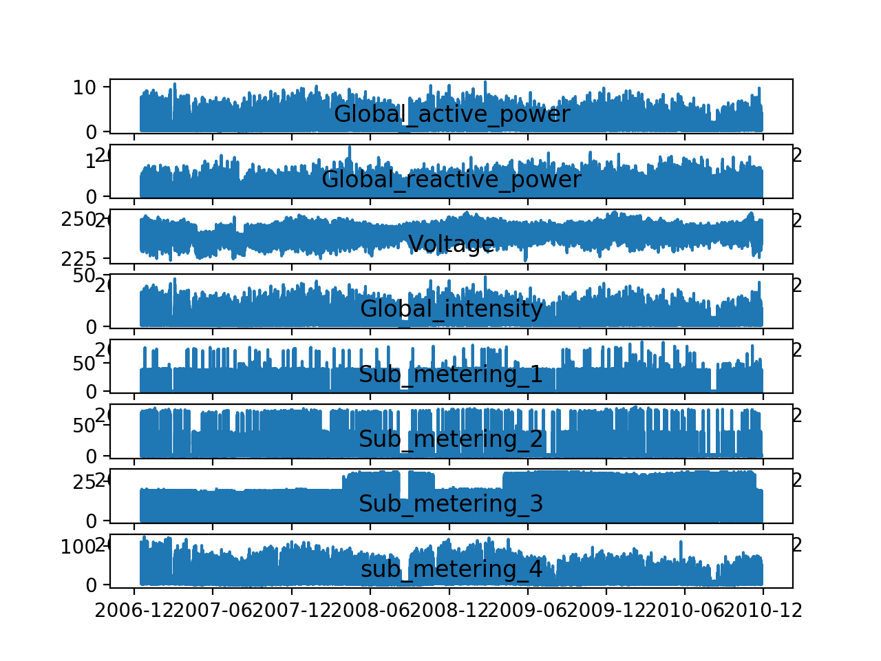
Line Plots of Each Variable in the Power Consumption Dataset
Let’s zoom in and focus on the ‘Global_active_power‘, or ‘active power‘ for short.
We can create a new plot of the active power for each year to see if there are any common patterns across the years. The first year, 2006, has less than one month of data, so will remove it from the plot.
The complete example is listed below.
|
1 2 3 4 5 6 7 8 9 10 11 12 13 14 15 16 17 18 19 20 |
# yearly line plots from pandas import read_csv from matplotlib import pyplot # load the new file dataset = read_csv('household_power_consumption.csv', header=0, infer_datetime_format=True, parse_dates=['datetime'], index_col=['datetime']) # plot active power for each year years = ['2007', '2008', '2009', '2010'] pyplot.figure() for i in range(len(years)): # prepare subplot ax = pyplot.subplot(len(years), 1, i+1) # determine the year to plot year = years[i] # get all observations for the year result = dataset[str(year)] # plot the active power for the year pyplot.plot(result['Global_active_power']) # add a title to the subplot pyplot.title(str(year), y=0, loc='left') pyplot.show() |
Running the example creates one single image with four line plots, one for each full year (or mostly full years) of data in the dataset.
We can see some common gross patterns across the years, such as around Feb-Mar and around Aug-Sept where we see a marked decrease in consumption.
We also seem to see a downward trend over the summer months (middle of the year in the northern hemisphere) and perhaps more consumption in the winter months towards the edges of the plots. These may show an annual seasonal pattern in consumption.
We can also see a few patches of missing data in at least the first, third, and fourth plots.
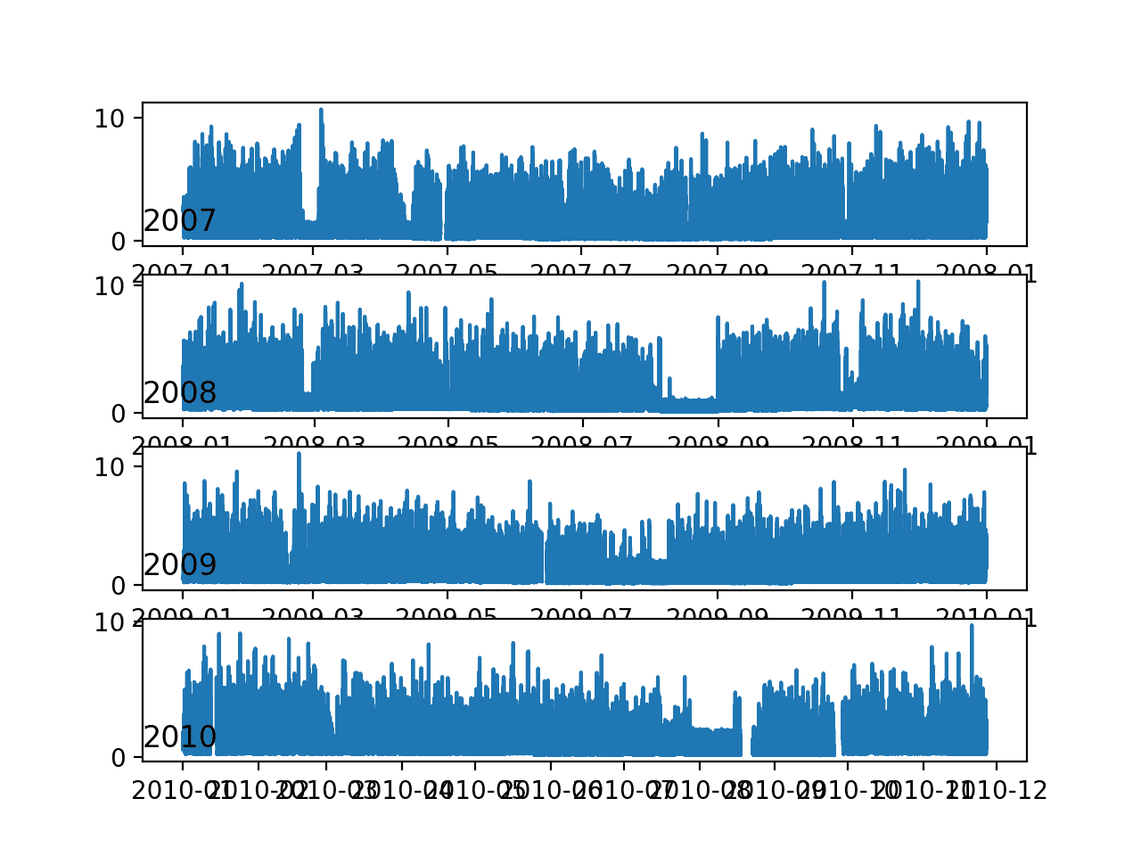
Line Plots of Active Power for Most Years
We can continue to zoom in on consumption and look at active power for each of the 12 months of 2007.
This might help tease out gross structures across the months, such as daily and weekly patterns.
The complete example is listed below.
|
1 2 3 4 5 6 7 8 9 10 11 12 13 14 15 16 17 18 19 20 |
# monthly line plots from pandas import read_csv from matplotlib import pyplot # load the new file dataset = read_csv('household_power_consumption.csv', header=0, infer_datetime_format=True, parse_dates=['datetime'], index_col=['datetime']) # plot active power for each year months = [x for x in range(1, 13)] pyplot.figure() for i in range(len(months)): # prepare subplot ax = pyplot.subplot(len(months), 1, i+1) # determine the month to plot month = '2007-' + str(months[i]) # get all observations for the month result = dataset[month] # plot the active power for the month pyplot.plot(result['Global_active_power']) # add a title to the subplot pyplot.title(month, y=0, loc='left') pyplot.show() |
Running the example creates a single image with 12 line plots, one for each month in 2007.
We can see the sign-wave of power consumption of the days within each month. This is good as we would expect some kind of daily pattern in power consumption.
We can see that there are stretches of days with very minimal consumption, such as in August and in April. These may represent vacation periods where the home was unoccupied and where power consumption was minimal.
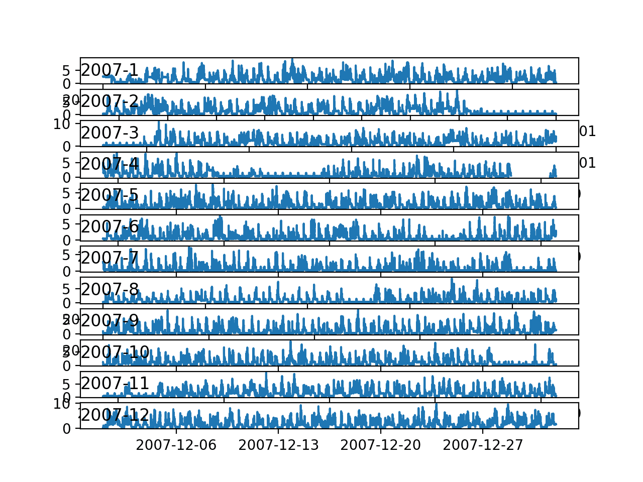
Line Plots for Active Power for All Months in One Year
Finally, we can zoom in one more level and take a closer look at power consumption at the daily level.
We would expect there to be some pattern to consumption each day, and perhaps differences in days over a week.
The complete example is listed below.
|
1 2 3 4 5 6 7 8 9 10 11 12 13 14 15 16 17 18 19 20 |
# daily line plots from pandas import read_csv from matplotlib import pyplot # load the new file dataset = read_csv('household_power_consumption.csv', header=0, infer_datetime_format=True, parse_dates=['datetime'], index_col=['datetime']) # plot active power for each year days = [x for x in range(1, 20)] pyplot.figure() for i in range(len(days)): # prepare subplot ax = pyplot.subplot(len(days), 1, i+1) # determine the day to plot day = '2007-01-' + str(days[i]) # get all observations for the day result = dataset[day] # plot the active power for the day pyplot.plot(result['Global_active_power']) # add a title to the subplot pyplot.title(day, y=0, loc='left') pyplot.show() |
Running the example creates a single image with 20 line plots, one for the first 20 days in January 2007.
There is commonality across the days; for example, many days consumption starts early morning, around 6-7AM.
Some days show a drop in consumption in the middle of the day, which might make sense if most occupants are out of the house.
We do see some strong overnight consumption on some days, that in a northern hemisphere January may match up with a heating system being used.
Time of year, specifically the season and the weather that it brings, will be an important factor in modeling this data, as would be expected.
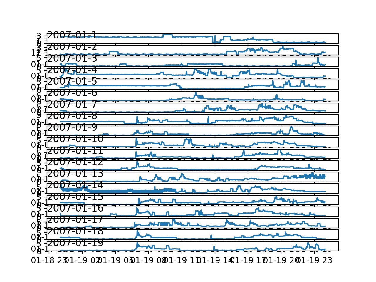
Line Plots for Active Power for 20 Days in One Month
Time Series Data Distributions
Another important area to consider is the distribution of the variables.
For example, it may be interesting to know if the distributions of observations are Gaussian or some other distribution.
We can investigate the distributions of the data by reviewing histograms.
We can start-off by creating a histogram for each variable in the time series.
The complete example is listed below.
|
1 2 3 4 5 6 7 8 9 10 11 12 13 |
# histogram plots from pandas import read_csv from matplotlib import pyplot # load the new file dataset = read_csv('household_power_consumption.csv', header=0, infer_datetime_format=True, parse_dates=['datetime'], index_col=['datetime']) # histogram plot for each variable pyplot.figure() for i in range(len(dataset.columns)): pyplot.subplot(len(dataset.columns), 1, i+1) name = dataset.columns[i] dataset[name].hist(bins=100) pyplot.title(name, y=0) pyplot.show() |
Running the example creates a single figure with a separate histogram for each of the 8 variables.
We can see that active and reactive power, intensity, as well as the sub-metered power are all skewed distributions down towards small watt-hour or kilowatt values.
We can also see that distribution of voltage data is strongly Gaussian.
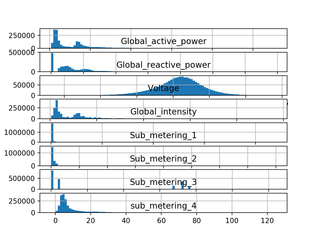
Histogram plots for Each Variable in the Power Consumption Dataset
The distribution of active power appears to be bi-modal, meaning it looks like it has two mean groups of observations.
We can investigate this further by looking at the distribution of active power consumption for the four full years of data.
The complete example is listed below.
|
1 2 3 4 5 6 7 8 9 10 11 12 13 14 15 16 17 18 19 20 21 22 |
# yearly histogram plots from pandas import read_csv from matplotlib import pyplot # load the new file dataset = read_csv('household_power_consumption.csv', header=0, infer_datetime_format=True, parse_dates=['datetime'], index_col=['datetime']) # plot active power for each year years = ['2007', '2008', '2009', '2010'] pyplot.figure() for i in range(len(years)): # prepare subplot ax = pyplot.subplot(len(years), 1, i+1) # determine the year to plot year = years[i] # get all observations for the year result = dataset[str(year)] # plot the active power for the year result['Global_active_power'].hist(bins=100) # zoom in on the distribution ax.set_xlim(0, 5) # add a title to the subplot pyplot.title(str(year), y=0, loc='right') pyplot.show() |
Running the example creates a single plot with four figures, one for each of the years between 2007 to 2010.
We can see that the distribution of active power consumption across those years looks very similar. The distribution is indeed bimodal with one peak around 0.3 KW and perhaps another around 1.3 KW.
There is a long tail on the distribution to higher kilowatt values. It might open the door to notions of discretizing the data and separating it into peak 1, peak 2 or long tail. These groups or clusters for usage on a day or hour may be helpful in developing a predictive model.
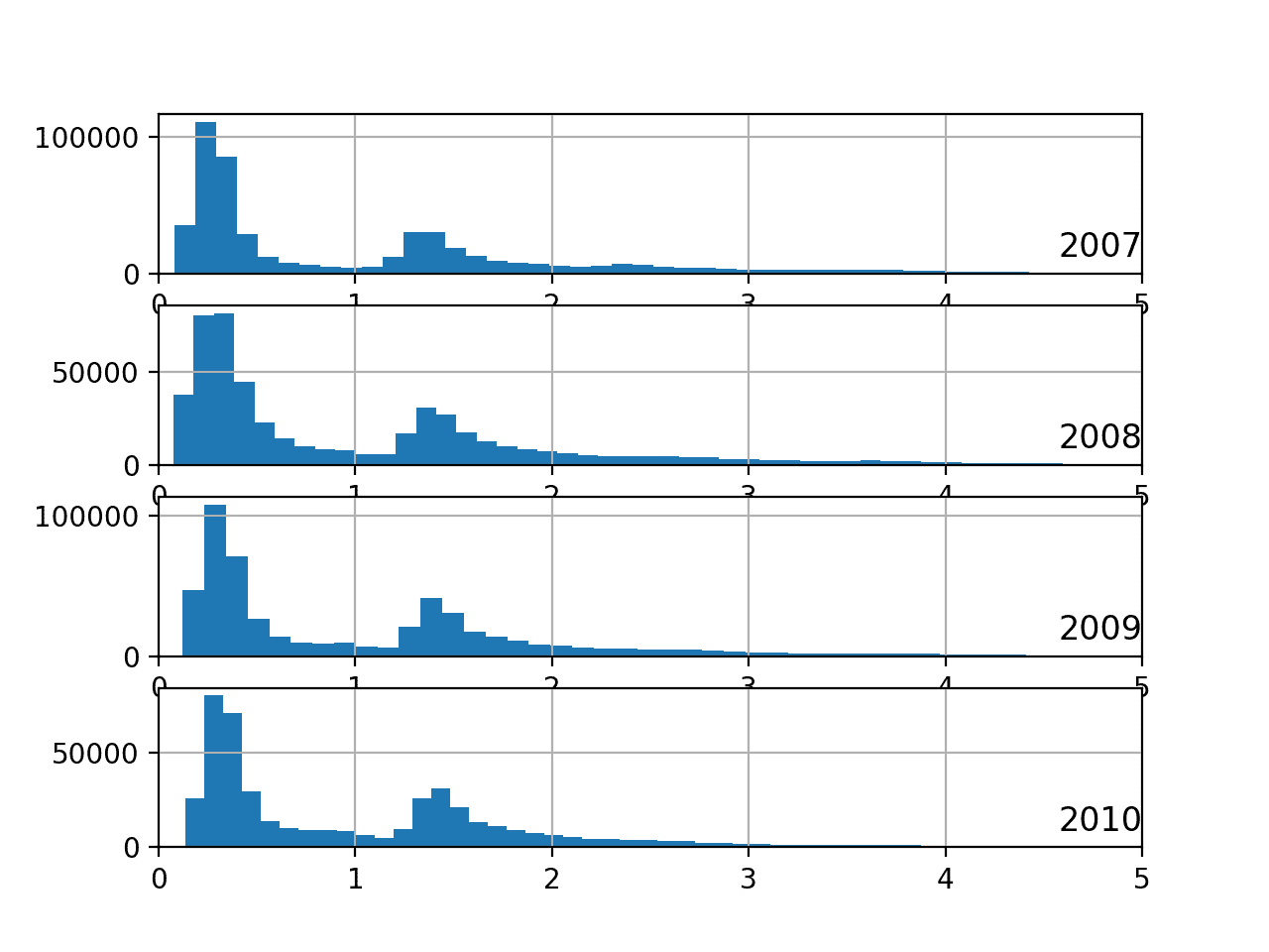
Histogram Plots of Active Power for Most Years
It is possible that the identified groups may vary over the seasons of the year.
We can investigate this by looking at the distribution for active power for each month in a year.
The complete example is listed below.
|
1 2 3 4 5 6 7 8 9 10 11 12 13 14 15 16 17 18 19 20 21 22 |
# monthly histogram plots from pandas import read_csv from matplotlib import pyplot # load the new file dataset = read_csv('household_power_consumption.csv', header=0, infer_datetime_format=True, parse_dates=['datetime'], index_col=['datetime']) # plot active power for each year months = [x for x in range(1, 13)] pyplot.figure() for i in range(len(months)): # prepare subplot ax = pyplot.subplot(len(months), 1, i+1) # determine the month to plot month = '2007-' + str(months[i]) # get all observations for the month result = dataset[month] # plot the active power for the month result['Global_active_power'].hist(bins=100) # zoom in on the distribution ax.set_xlim(0, 5) # add a title to the subplot pyplot.title(month, y=0, loc='right') pyplot.show() |
Running the example creates an image with 12 plots, one for each month in 2007.
We can see generally the same data distribution each month. The axes for the plots appear to align (given the similar scales), and we can see that the peaks are shifted down in the warmer northern hemisphere months and shifted up for the colder months.
We can also see a thicker or more prominent tail toward larger kilowatt values for the cooler months of December through to March.
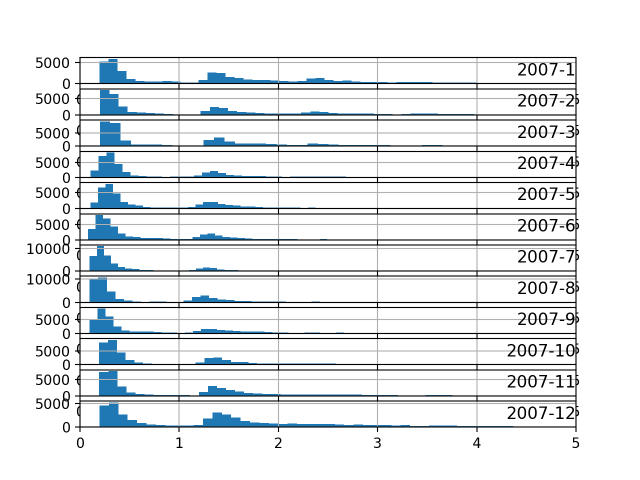
Histogram Plots for Active Power for All Months in One Year
Ideas on Modeling
Now that we know how to load and explore the dataset, we can pose some ideas on how to model the dataset.
In this section, we will take a closer look at three main areas when working with the data; they are:
- Problem Framing
- Data Preparation
- Modeling Methods
Problem Framing
There does not appear to be a seminal publication for the dataset to demonstrate the intended way to frame the data in a predictive modeling problem.
We are therefore left to guess at possibly useful ways that this data may be used.
The data is only for a single household, but perhaps effective modeling approaches could be generalized across to similar households.
Perhaps the most useful framing of the dataset is to forecast an interval of future active power consumption.
Four examples include:
- Forecast hourly consumption for the next day.
- Forecast daily consumption for the next week.
- Forecast daily consumption for the next month.
- Forecast monthly consumption for the next year.
Generally, these types of forecasting problems are referred to as multi-step forecasting. Models that make use of all of the variables might be referred to as a multivariate multi-step forecasting models.
Each of these models is not limited to forecasting the minutely data, but instead could model the problem at or below the chosen forecast resolution.
Forecasting consumption in turn, at scale, could aid in a utility company forecasting demand, which is a widely studied and important problem.
Data Preparation
There is a lot of flexibility in preparing this data for modeling.
The specific data preparation methods and their benefit really depend on the chosen framing of the problem and the modeling methods. Nevertheless, below is a list of general data preparation methods that may be useful:
- Daily differencing may be useful to adjust for the daily cycle in the data.
- Annual differencing may be useful to adjust for any yearly cycle in the data.
- Normalization may aid in reducing the variables with differing units to the same scale.
There are many simple human factors that may be helpful in engineering features from the data, that in turn may make specific days easier to forecast.
Some examples include:
- Indicating the time of day, to account for the likelihood of people being home or not.
- Indicating whether a day is a weekday or weekend.
- Indicating whether a day is a North American public holiday or not.
These factors may be significantly less important for forecasting monthly data, and perhaps to a degree for weekly data.
More general features may include:
- Indicating the season, which may lead to the type or amount environmental control systems being used.
Modeling Methods
There are perhaps four classes of methods that might be interesting to explore on this problem; they are:
- Naive Methods.
- Classical Linear Methods.
- Machine Learning Methods.
- Deep Learning Methods.
Naive Methods
Naive methods would include methods that make very simple, but often very effective assumptions.
Some examples include:
- Tomorrow will be the same as today.
- Tomorrow will be the same as this day last year.
- Tomorrow will be an average of the last few days.
Classical Linear Methods
Classical linear methods include techniques are very effective for univariate time series forecasting.
Two important examples include:
- SARIMA
- ETS (triple exponential smoothing)
They would require that the additional variables be discarded and the parameters of the model be configured or tuned to the specific framing of the dataset. Concerns related to adjusting the data for daily and seasonal structures can also be supported directly.
Machine Learning Methods
Machine learning methods require that the problem be framed as a supervised learning problem.
This would require that lag observations for a series be framed as input features, discarding the temporal relationship in the data.
A suite of nonlinear and ensemble methods could be explored, including:
- k-nearest neighbors.
- Support vector machines
- Decision trees
- Random forest
- Gradient boosting machines
Careful attention is required to ensure that the fitting and evaluation of these models preserved the temporal structure in the data. This is important so that the method is not able to ‘cheat’ by harnessing observations from the future.
These methods are often agnostic to large numbers of variables and may aid in teasing out whether the additional variables can be harnessed and add value to predictive models.
Deep Learning Methods
Generally, neural networks have not proven very effective at autoregression type problems.
Nevertheless, techniques such as convolutional neural networks are able to automatically learn complex features from raw data, including one-dimensional signal data. And recurrent neural networks, such as the long short-term memory network, are capable of directly learning across multiple parallel sequences of input data.
Further, combinations of these methods, such as CNN LSTM and ConvLSTM, have proven effective on time series classification tasks.
It is possible that these methods may be able to harness the large volume of minute-based data and multiple input variables.
Further Reading
This section provides more resources on the topic if you are looking to go deeper.
- Individual household electric power consumption Data Set, UCI Machine Learning Repository.
- AC power, Wikipedia.
- pandas.read_csv API
Summary
In this tutorial, you discovered a household power consumption dataset for multi-step time series forecasting and how to better understand the raw data using exploratory analysis.
Specifically, you learned:
- The household power consumption dataset that describes electricity usage for a single house over four years.
- How to explore and understand the dataset using a suite of line plots for the series data and histogram for the data distributions.
- How to use the new understanding of the problem to consider different framings of the prediction problem, ways the data may be prepared, and modeling methods that may be used.
Do you have any questions?
Ask your questions in the comments below and I will do my best to answer.
Develop Deep Learning models for Time Series Today!

Develop Your Own Forecasting models in Minutes
...with just a few lines of python code
Discover how in my new Ebook:
Deep Learning for Time Series Forecasting
It provides self-study tutorials on topics like:
CNNs, LSTMs,
Multivariate Forecasting, Multi-Step Forecasting and much more...
Finally Bring Deep Learning to your Time Series Forecasting Projects
Skip the Academics. Just Results.


Great work Jason!
Thanks.
Thank you for the post. It is really helpful.
I was wondering how to frame the input data for Forecasting hourly consumption for the next day using SVM, ANN and Randomforest.
Is there any reference for multi-step multi-variate time series prediction?
Also, would Forecast hourly consumption for the next day be more accurate than Forecast hourly consumption for the next week?
Yes, I have many examples.
Here’s a starting point:
https://machinelearningmastery.com/multivariate-time-series-forecasting-lstms-keras/
I also have many more examples in my book:
https://machinelearningmastery.com/deep-learning-for-time-series-forecasting/
pls send me the random forest example code!!!! Thanks in Advance.
See this tutorial:
https://machinelearningmastery.com/multi-step-time-series-forecasting-with-machine-learning-models-for-household-electricity-consumption/
If there was “IoT” in the title, people (including me) would faster recognize the immense value in your post/book.
Thanks for the suggestion.
Machine Learning Methods
Machine learning methods require that the problem be framed as a supervised learning problem.
This would require that lag observations for a series be framed as input features, discarding the temporal relationship in the data.
A suite of nonlinear and ensemble methods could be explored, including:
k-nearest neighbors.
Support vector machines
Decision trees
Random forest
Gradient boosting machines
Careful attention is required to ensure that the fitting and evaluation of these models preserved the temporal structure in the data. This is important so that the method is not able to ‘cheat’ by harnessing observations from the future.
These methods are often agnostic to large numbers of variables and may aid in teasing out whether the additional variables can be harnessed and add value to predictive models.
Can you guess references as an example of how to do this predictive analysis? You have an example?
Sure, see this post:
https://machinelearningmastery.com/multi-step-time-series-forecasting-with-machine-learning-models-for-household-electricity-consumption/
Thanks for writing this very informative post. On a related note, is there a dataset that can be used for classification of appliance’s consumption i.e. Consumption disaggregation at appliances level?
I suspect there is, perhaps search on some of these sites:
https://machinelearningmastery.com/faq/single-faq/where-can-i-get-a-dataset-on-___
I used this data set but it seems to be strange … at some points the date is change its arrangement
i.e instead of continue being in y-m-d, it goes y-d-m
how can i maintain the same arrangements?
Really, are you sure?
If so, the data may require careful manual handling (custom code).
The data is too big to manual handling
Maybe try progressive loading and some if-statements to make the data consistent?
Also it give me a message a list is out of index. I had to split the data
What do you mean exactly?
The error is fixed… Sorry for interrupt you.
I do not know where is the error .. i just repeat the code next day and there is no error
No problem.
how classical linear method can be applied can i get the code please.
I give an example here:
https://machinelearningmastery.com/how-to-develop-an-autoregression-forecast-model-for-household-electricity-consumption/
the data is more than the excel line capacity .how can i handle it?
You can load and manage your data programmatically in Python.
If arrays are new to you, perhaps start here:
https://machinelearningmastery.com/gentle-introduction-n-dimensional-arrays-python-numpy/
Great work. how can i test the model
Thanks.
What do you mean test the model?
I show how to evaluate the model in the above tutorial.
Hai Jason ….can u post the csv file of household electricity usage…as fast as possible..plz
I provide a copy here:
https://github.com/jbrownlee/Datasets
Great work!
If I have a large dataset of customers (500-1000) in different “excel” (each 5 days), how to work this data in python in order to manipulate and identify the consumers patterns? (group them)
Any code, for example? … Thanks!
Save to csv files and load using read_csv from pandas.
i am going to use random forest to train this model and may i know what all features can be included as input and what can be the output?
is this method efficient?
can u please provide the code if u have ?
Try it and see.
Perhaps use this as a starting point:
https://machinelearningmastery.com/xgboost-for-time-series-forecasting/
Hey Jason! Great work. I am working on a similar project and need power consumption data like this for any city for the last 10 years. Can you help me with the dataset?
This will help you locate a dataset:
https://machinelearningmastery.com/faq/single-faq/where-can-i-get-a-dataset-on-___
i am working on this dataset .
i tried to make models 2-LSTM(using 2 LSTM in the model), and CNN-LSTM(first CNN then LSTM) following your tutorial where you explain all models on RAW data .
But my model is not giving good RMSE values. I want the code if you have on this dataset(CNN_LSTM code)
please help me
These tutorials will help diagnose issues and improve the performance of your models:
https://machinelearningmastery.com/start-here/#better
thanks for sharing this helpful material
please suggest me the best parameters (timesteps ,units ,kernel size ,epochs ,and more best parameters ) for this dataset using cnn-lstm model.
please , i need your help
waiting for your response
You’re welcome.
We cannot know the best hyperparameters, instead they must be discovered by careful experimentation for a given dataset and model.
Thanks Jason:
Very useful tutorial about time series data preparation and plotting via pandas Dataframe.
Quick plotting steps to access time line features plotting, histograms, and features correlation to analyse trend/seasonality, features distribution (vs Gaussian) and features correlation are welcome!.
Anyway, I permed some changes, I convert per minute time series dataset to per day time series, to reduce data plotting. And also I apply the “pd.DataFrame.corr()” method to get the correlation scalar coefficients between all the features (most of them highly and positively correlated)
Thanks. Nice work!
Hello jasson, Thanks for the information you give, but I have a slightly different project. I have to calculate the value in one of the months and group it by hour, i.e. 17.00 – 22.00 is the first group and 22.01 – 16.59 is group 2. I have tried to change the code you give, but until now I still haven’t found a way out. Therefore, can you help me to find the solution? Thank you for your attention Jason
Perhaps make small changes to the above example to use your dataset?
Perhaps start with a simpler project and adapt it for your dataset?
Perhaps explore a different dataset?
Perhaps hire someone to adapt the code for you?