You must understand your data in order to get the best results from machine learning algorithms.
The fastest way to learn more about your data is to use data visualization.
In this post you will discover exactly how you can visualize your machine learning data in Python using Pandas.
Kick-start your project with my new book Machine Learning Mastery With Python, including step-by-step tutorials and the Python source code files for all examples.
Let’s get started.
Update Mar/2018: Added alternate link to download the dataset as the original appears to have been taken down.
Visualize Machine Learning Data in Python With Pandas Photo by Alex Cheek, some rights reserved.
About The Recipes
Each recipe in this post is complete and standalone so that you can copy-and-paste it into your own project and use it immediately.
The Pima Indians dataset is used to demonstrate each plot. This dataset describes the medical records for Pima Indians and whether or not each patient will have an onset of diabetes within five years. As such it is a classification problem.
It is a good dataset for demonstration because all of the input attributes are numeric and the output variable to be predicted is binary (0 or 1).
Need help with Machine Learning in Python?
Take my free 2-week email course and discover data prep, algorithms and more (with code).
Click to sign-up now and also get a free PDF Ebook version of the course.
Univariate Plots
In this section we will look at techniques that you can use to understand each attribute independently.
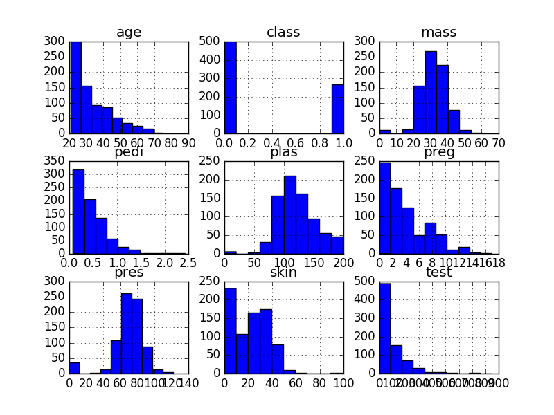
Histograms
A fast way to get an idea of the distribution of each attribute is to look at histograms.
Histograms group data into bins and provide you a count of the number of observations in each bin. From the shape of the bins you can quickly get a feeling for whether an attribute is Gaussian’, skewed or even has an exponential distribution. It can also help you see possible outliers.
We can see that perhaps the attributes age, pedi and test may have an exponential distribution. We can also see that perhaps the mass and pres and plas attributes may have a Gaussian or nearly Gaussian distribution. This is interesting because many machine learning techniques assume a Gaussian univariate distribution on the input variables.
Univariate Histograms
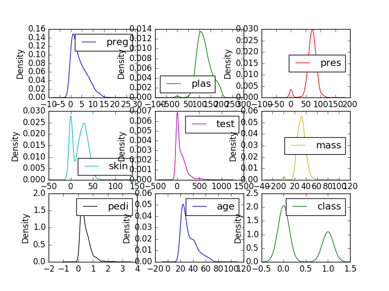
Density Plots
Density plots are another way of getting a quick idea of the distribution of each attribute. The plots look like an abstracted histogram with a smooth curve drawn through the top of each bin, much like your eye tried to do with the histograms.
We can see the distribution for each attribute is clearer than the histograms.
Univariate Density Plots
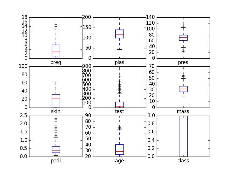
Box and Whisker Plots
Another useful way to review the distribution of each attribute is to use Box and Whisker Plots or boxplots for short.
Boxplots summarize the distribution of each attribute, drawing a line for the median (middle value) and a box around the 25th and 75th percentiles (the middle 50% of the data). The whiskers give an idea of the spread of the data and dots outside of the whiskers show candidate outlier values (values that are 1.5 times greater than the size of spread of the middle 50% of the data).
We can see that the spread of attributes is quite different. Some like age, test and skin appear quite skewed towards smaller values.
Univariate Box and Whisker Plots
Multivariate Plots
This section shows examples of plots with interactions between multiple variables.
Correlation Matrix Plot
Correlation gives an indication of how related the changes are between two variables. If two variables change in the same direction they are positively correlated. If the change in opposite directions together (one goes up, one goes down), then they are negatively correlated.
You can calculate the correlation between each pair of attributes. This is called a correlation matrix. You can then plot the correlation matrix and get an idea of which variables have a high correlation with each other.
This is useful to know, because some machine learning algorithms like linear and logistic regression can have poor performance if there are highly correlated input variables in your data.
We can see that the matrix is symmetrical, i.e. the bottom left of the matrix is the same as the top right. This is useful as we can see two different views on the same data in one plot. We can also see that each variable is perfectly positively correlated with each other (as you would expected) in the diagonal line from top left to bottom right.
Correlation Matrix Plot
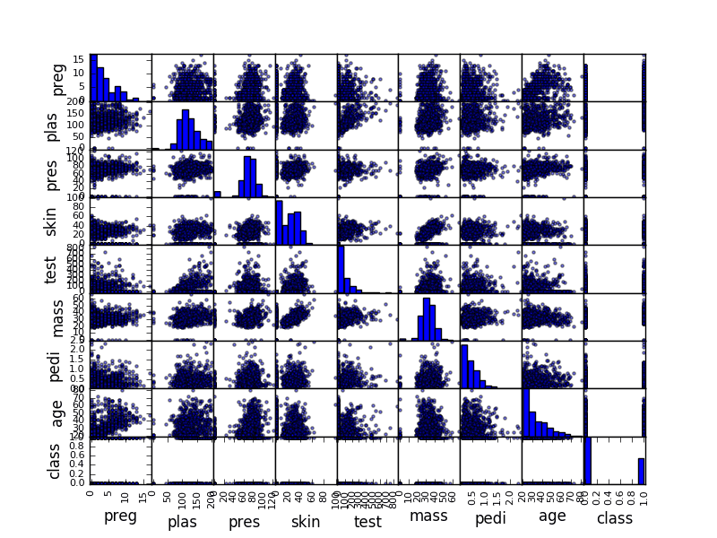
Scatterplot Matrix
A scatterplot shows the relationship between two variables as dots in two dimensions, one axis for each attribute. You can create a scatterplot for each pair of attributes in your data. Drawing all these scatterplots together is called a scatterplot matrix.
Scatter plots are useful for spotting structured relationships between variables, like whether you could summarize the relationship between two variables with a line. Attributes with structured relationships may also be correlated and good candidates for removal from your dataset.
Like the Correlation Matrix Plot, the scatterplot matrix is symmetrical. This is useful to look at the pair-wise relationships from different perspectives. Because there is little point oi drawing a scatterplot of each variable with itself, the diagonal shows histograms of each attribute.
Scatterplot Matrix
Summary
In this post you discovered a number of ways that you can better understand your machine learning data in Python using Pandas.
Specifically, you learned how to plot your data using:
Histograms
Density Plots
Box and Whisker Plots
Correlation Matrix Plot
Scatterplot Matrix
Open your Python interactive environment and try out each recipe.
Do you have any questions about Pandas or the recipes in this post? Ask in the comments and I will do my best to answer.
Thanks for this post. Till now I using different python visuvalization libraries like matplotlib , plotly or seaborn for getting more out of the data which I have loaded into pandas dataframe. Till now I am not aware of using the pandas itself for visulzation.
From now onwards I am gonna use your recipe for visualization.
Box plots are great for getting a snapshot of the spread of the data and where the meat of the data is on the scale. It also quickly helps you spot outliers (outside the whiskers or really > or < 1.5 x IQR).
Hello jason ,
While I try to create correlation matrix for my own dataset having 12 variables, however in matrix only 7 variables have colored matrix and left 5 have white color.I just change this
“ticks=np.arange(0,12,1)” form 9 to 12 ,
similar case is with scatter plot ,could you please let me know where I have the issue
and also one more thing how we decide which scatter plot is highly valuable
I have categorical and continuous variables feature set. After predictions(binary classification) I want to visualize how each and combination of features resulted in prediction. For e.g. I have categorical feature like income range, gender, occupation and age as continuous feature. How these features influenced the prediction.
Usually I don’t make effort to comment on publications, but your articles are always on point. Extremely useful, well written, and with codes that actually works. Congrats!
Hope you are doing well !
Actually I wanted to know how to give the interval size on the X and the Y axis in Matplotlib. For e.g. I want x axis to have tick values as 0, 0.1, 0.2, 0.3 and so on untill 1.0, and on the Y axis I want to have the tick values as 0, 20, 40, 60 and so on till 100. I have a dataset as .csv file in which I have taken one column as X axis and the other column as Y axis.
In case of multivariate analysis having a large number of explanatory features involved, visual inference might not be the solution. What would you suggest to handle such cases.
Hi is it Possible to find the correlation between strings (eg: correlation between websites and the cities they are used from) or find correlation between a string and numbers(eg: correlation between websites and the age group of people watching the same).
In correlation matrix, how to decide which independent variables we need to chose for Logistic regression model?
We have value between +1 and −1 for Pearson correlation is there any threshold value based on we can decide which of the independent variables can’t be consider?
But my question is how to plot plt.scatter(x1,x2)
if x1=[1,2,3]
and x2=[4,5,6,9,8]
using matplotlib.pyplot as plt
it showing x and x2 shoold be of same size
if both of different size how to plot it
I am new to the machine learning course and I am using python idle for the basic visualization for my data-set. But it is getting not responding for many visualization methods such as Scatter-plot Matrix. Will you please clear me the reason behind this (Whether due to the size of data or scaling issues).
hey Jason, i have a doubt…
I am working on a diabetes dataset in jupyter notebook. here im unable to find the target dataset shape and with what percent my dataset is classified for training and testing.
like i want to know what line of code I should write to get the target shape and to view the percentage of division of training and testing of dataset.
I’m glad to see you teaching the OO approach to matplotlib. I think 95% of blogs and tutorials stick with the matlab interface. This is much more Pythony.
1) In the data files given, do each row represents the ‘preg’, ‘plas’, ‘pres’, ‘skin’, ‘test’, ‘mass’, ‘pedi’, ‘age’, ‘class’ ?
2) In the Histogram section, can you please tell what is the y axis variable? Is it number of times that x-axis variable appearing in the data file?
3) In density plot, how is the y-axis range calculated?
4) In case I want to scale the features (0 to 1 value) for some model prediction, will I still get the accurate results for pair-wise scatter? Also when I have new data and I want to predict the output variable, how will scaling affect my output accuracy?
Thank you so much. Also is there any way I can take features X1,X2,…variables in x-axis and output Y in y-axis in a single graph figure? Would there be multiple curves for different features? And what values of X2, X3,… will I take when I draw X1 vs Y curve?
In the Machine Learning Mastery book, section 5.2 deals with descriptive statistics.
It appears that set_option(‘precision’, 3) is no longer supported. Is there an alternative I can use?


Hi Jason Brownlee,
Thanks for this post. Till now I using different python visuvalization libraries like matplotlib , plotly or seaborn for getting more out of the data which I have loaded into pandas dataframe. Till now I am not aware of using the pandas itself for visulzation.
From now onwards I am gonna use your recipe for visualization.
I’m glad the post was useful saimadhu.
Hello Jason,
what we can deduce from class variable box plot, why and when we get this kind of plot.
Great question naresh.
Box plots are great for getting a snapshot of the spread of the data and where the meat of the data is on the scale. It also quickly helps you spot outliers (outside the whiskers or really > or < 1.5 x IQR).
Hello jason ,
While I try to create correlation matrix for my own dataset having 12 variables, however in matrix only 7 variables have colored matrix and left 5 have white color.I just change this
“ticks=np.arange(0,12,1)” form 9 to 12 ,
import numpy as np
names=[‘PassId’,’Sur’,’Pclas’,’Name’,’Sex’,’Age’,’SibSp’,’Parch’,’Ticket’,’Fare’,’Cabin’,’Emb’]
correlation=train.corr()
#create a correlation matrix
fig = plt.figure()
ax = fig.add_subplot(111)
cax = ax.matshow(correlation, vmin=-1, vmax =1)
fig.colorbar(cax)
ticks=np.arange(0,12,1)
ax.set_xticks(ticks)
ax.set_yticks(ticks)
ax.set_xticklabels(names)
ax.set_yticklabels(names)
plt.show()
similar case is with scatter plot ,could you please let me know where I have the issue
and also one more thing how we decide which scatter plot is highly valuable
Great question naresh, I don’t know off the top of my head.
I would suggest looking into how to specify your own color lists to the function. Perhaps the limit is 6-7 defaults.
Hi Jason,
I am curious about how to make a plot for the probability from a multivariate logistic regression. Do you have any ideas or examples of doing that?
Thank you.
Not off hand sorry.
Consider trying a few different approaches and see what conveys the best understanding.
Also consider copying an approach used in an existing analysis.
Forgive my ignorance, but isn’t this using matplotlib to visualise data? Not Pandas?
Yes, matplotlib via pandas wrappers.
Hi Jason,
Do you have blog which explains binary classification( and visualization) using categorical data. It would help me a lot.
I have a few in Python. Try the search.
Are you looking for something specific?
I have categorical and continuous variables feature set. After predictions(binary classification) I want to visualize how each and combination of features resulted in prediction. For e.g. I have categorical feature like income range, gender, occupation and age as continuous feature. How these features influenced the prediction.
Often we give up the understandability of the predictions for better predictive skill in applied machine learning.
Generally, for deeper understanding of why predictions are being made, you can use linear models and give up some predictive skill.
Usually I don’t make effort to comment on publications, but your articles are always on point. Extremely useful, well written, and with codes that actually works. Congrats!
Thanks FF, I really appreciate the kind words and support!
Hii Jason,
Hope you are doing well !
Actually I wanted to know how to give the interval size on the X and the Y axis in Matplotlib. For e.g. I want x axis to have tick values as 0, 0.1, 0.2, 0.3 and so on untill 1.0, and on the Y axis I want to have the tick values as 0, 20, 40, 60 and so on till 100. I have a dataset as .csv file in which I have taken one column as X axis and the other column as Y axis.
Thank you so much in advance.
I would recommend reading up on the matplotlib API.
Hello Jason,
In case of multivariate analysis having a large number of explanatory features involved, visual inference might not be the solution. What would you suggest to handle such cases.
Thanks
Perhaps projection methods?
Thanks Jason.Your post saved me a lot of time.
I’m really glad to hear that, thanks!
Awesome Blogs! And your 14 day tutorials are great!
Learnt a Lot!!
Thank u so much Jason
Do u have blogs on Deep Learning Models??
Thanks!
I do, start here:
https://machinelearningmastery.com/start-here/#deeplearning
Hi is it Possible to find the correlation between strings (eg: correlation between websites and the cities they are used from) or find correlation between a string and numbers(eg: correlation between websites and the age group of people watching the same).
Yes, convert the labels to ranks data first, then use a nonparametric correlation measure.
Awesome Blogs!
how do we correlate Histograms and Density Plots?
Density Plots is same as Kurtosis ?
Both plots can show the distribution and features of the distribution like shape, skew, etc.
I want to see how my each variable is related to my target variable ! How can I visualize that !
Thanks !
Correlation is a good approach:
https://machinelearningmastery.com/how-to-use-correlation-to-understand-the-relationship-between-variables/
In correlation matrix, how to decide which independent variables we need to chose for Logistic regression model?
We have value between +1 and −1 for Pearson correlation is there any threshold value based on we can decide which of the independent variables can’t be consider?
Perhaps experiment with different thresholds to see what works best for your dataset?
thank you Jason Brownlee i found this site maybe can add some things
http://www.codibits.com/category/python/matplotlib/
Thanks for sharing.
Awesome !
But sir my question is if x1=[1,2,3] and x2=[4,5,6,7] then how to plot plt.scatter(x1,x2) using matplotlib,pyplot as plt
The scatter() function takes two arguments for the list of x and y coordinates respectively.
For example:
Awesome sir
But my question is how to plot plt.scatter(x1,x2)
if x1=[1,2,3]
and x2=[4,5,6,9,8]
using matplotlib.pyplot as plt
it showing x and x2 shoold be of same size
if both of different size how to plot it
You must have the same number of x and y coordinates.
Hello sir…Thank you for such nice recipes.
I am new to the machine learning course and I am using python idle for the basic visualization for my data-set. But it is getting not responding for many visualization methods such as Scatter-plot Matrix. Will you please clear me the reason behind this (Whether due to the size of data or scaling issues).
The size of data=2560*45
What do you mean by not responding?
When i plot the histograms, the plots are too small. How can i adjust the size?
I recommend reviewing the matplotlib API related to figure size.
sir i want to use the csv file which is saved into my laptop.plz tell me command which is used to load data and print this graph
I explain how to load data here:
https://machinelearningmastery.com/load-machine-learning-data-python/
Jason: Thank you so much for this post!
Particularly for the Correlation Matrix Plot…
I’m glad i helped.
Great article, thank you. I noticed that of the code examples says “correction matrix”. Am I right to assume this is a typo?
No, there is a correlation matrix example.
Nice tips and tricks Jason.
What are some ways to validate categorical data?
What do you mean exactly?
Can you give an example?
import pandas as pd
import numpy as np
import matplotlib.pyplot as plt
%matplotlib inline
import os
os.getcwd()
os.chdir(“C:/Users/user/desktop”)
diabetes = pd.read_csv(‘diabetes.csv’)
print(diabetes.columns)
print(“dimension of diabetes data: {}”.format(diabetes.shape))
print(diabetes.groupby(‘Diabetes’).size())
from sklearn.model_selection import train_test_split
X_train, X_test, y_train, y_test = train_test_split(diabetes.loc[:, diabetes.columns != ‘Diabetes’], diabetes[‘Diabetes’], stratify=diabetes[‘Diabetes’], random_state=66)
hey Jason, i have a doubt…
I am working on a diabetes dataset in jupyter notebook. here im unable to find the target dataset shape and with what percent my dataset is classified for training and testing.
You can access the shape of an array via: array.shape
You can choose the split as a variable to train_test_split():
https://scikit-learn.org/stable/modules/generated/sklearn.model_selection.train_test_split.html
like i want to know what line of code I should write to get the target shape and to view the percentage of division of training and testing of dataset.
how to get relationship between features in a data set.
This is called correlation:
https://machinelearningmastery.com/how-to-use-correlation-to-understand-the-relationship-between-variables/
I’m glad to see you teaching the OO approach to matplotlib. I think 95% of blogs and tutorials stick with the matlab interface. This is much more Pythony.
Thanks Mike.
how to implement the bond energy algorithm with giving input as a dataset
What is “bond energy algorithm”?
Hi Jasan,
I have query, for outlier detection(UCL-Upper control limit) which of the below are suggested.
a) Percentile method :
capping the variable to 90% percentile. Any value >90% would be treated as outlier
b) Std deviation method
creating limit of (Mean+3std deviation) or (Median+3std deviation)
Perhaps test a suite of methods on your dataset and discover what is most appropriate for your you.
Hi Jason,
I have some doubts.
1) In the data files given, do each row represents the ‘preg’, ‘plas’, ‘pres’, ‘skin’, ‘test’, ‘mass’, ‘pedi’, ‘age’, ‘class’ ?
2) In the Histogram section, can you please tell what is the y axis variable? Is it number of times that x-axis variable appearing in the data file?
3) In density plot, how is the y-axis range calculated?
4) In case I want to scale the features (0 to 1 value) for some model prediction, will I still get the accurate results for pair-wise scatter? Also when I have new data and I want to predict the output variable, how will scaling affect my output accuracy?
Yes, each column is a different measure, you can learn more about them here:
https://raw.githubusercontent.com/jbrownlee/Datasets/master/pima-indians-diabetes.names
y axis in a histogram is a count of the number of examples that fall into the bin.
y in a density plot is the probability of observing the value, independent of all other values, more on probability density estimation here:
https://machinelearningmastery.com/probability-density-estimation/
Scaling can improve modeling for some models and some datasets, more here:
https://machinelearningmastery.com/standardscaler-and-minmaxscaler-transforms-in-python/
Thank you so much. Also is there any way I can take features X1,X2,…variables in x-axis and output Y in y-axis in a single graph figure? Would there be multiple curves for different features? And what values of X2, X3,… will I take when I draw X1 vs Y curve?
You’re welcome.
Yes, you can plot all variables on one graph, but I expect it will be messy.
Hi Jason,
I have a doubt,
how can we plot categorical columns or data, which plots we can use for categorical data vs numeric data or categorical vs categorical
Thank you
Often a table is used colored by frequency.
Just a quick comment… We are talking PANDAS or MATPLOTLIB?
Hi Andrea…both libraries are being used.
# Scatterplot Matrix
import matplotlib.pyplot as plt
import pandas from pandas.plotting import scatter_matrix
In the Machine Learning Mastery book, section 5.2 deals with descriptive statistics.
It appears that set_option(‘precision’, 3) is no longer supported. Is there an alternative I can use?
In response to my query above it looks like the following code will work correctly instead…
set_option(‘display.float_format’, ‘{:.3f}’.format)
Thank you for the feedback Gary!
Very helpful post. I will use pandas now for plotting.
Thank you for your feedback and support Mohammad! More options can be found in the following resource:
https://machinelearningmastery.com/data-visualization-in-python-with-matplotlib-seaborn-and-bokeh/