A part of having a good understanding of the machine learning problem that you’re working on, you need to know the data intimately.
I personally find this step onerous sometimes and just want to get on with defining my test harness, but I know it always flushes out interested ideas and assumptions to test. As such, I use a step-by-step process to capture a minimum number of observations about the actual dataset before moving on from this step in the process of applied machine learning.

Quick and Dirty Data Analysis
Photo by timparkinson, some rights reserved
In this post you will discover my quick and easy process to analyse a dataset and get a minimum set of observations (and a minimum understanding) from a given dataset.
Kick-start your project with my new book Machine Learning Mastery With Weka, including step-by-step tutorials and clear screenshots for all examples.
Data Analysis
The objective of the data analysis step is to increase the understanding of the problem by better understanding the problems data.
This involves providing multiple different ways to describe the data as an opportunity to review and capture observations and assumptions that can be tested in later experiments.
There are two different approaches I used to describe a given dataset:
- Summarize Data: Describe the data and the data distributions.
- Visualize Data: Create various graphical summaries of the data.
The key here is to create different perspectives or views on the dataset in order to elicit insights in you about the data.
1. Summarize Data
Summarizing the data is about describing the actual structure of the data. I typically use a lot of automated tools to describe things like attribute distributions. The minimum aspects of the data I like to summarize are the structure and the distributions.
Data Structure
Summarizing the data structure is about describing the number and data types of attributes. For example, going through this process highlights ideas for transforms in the Data Preparation step for converting attributes from one type to another (such as real to ordinal or ordinal to binary).
Some motivating questions for this step include:
- How many attributes and instances are there?
- What are the data types of each attribute (e.g. nominal, ordinal, integer, real, etc.)?
Data Distributions
Summarizing the distributions of each attributes can also flush out ideas for possible data transforms in the Data Preparation step, such a the need and effects of Discretization, Normalization and Standardization.
I like to capture a summary of the distribution of each real valued attribute. This typically includes the minimum, maximum, median, mode, mean, standard deviation and number of missing values.
Some motivating questions for this step include:
- Create a five-number summary of each real-valued attribute.
- What is the distribution of the values for the class attribute?
Knowing the distribution of the class attribute (or mean of a regression output variable) is useful because you can use it to define the minimum accuracy of a predictive model.
For example, if there is a binary classification problem (2 classes) with the distribution of 80% apples and 20% bananas, then a predictor can predict “apples” for every test instance and be assured to achieve an accuracy of 80%. This is the worst case algorithm that all algorithms in the test harness must beat when Evaluating Algorithms.
Additionally, if I have the time or interest, I like to generate a summary of the pair-wise attribute correlations using a parametric (Pearson’s) and non-parametric (Spearman’s) correlation coefficient. This can highlight attributes that might be candidates for removal (highly correlated with each other) and others that may be highly predictive (highly correlated with the outcome attribute).
Need more help with Weka for Machine Learning?
Take my free 14-day email course and discover how to use the platform step-by-step.
Click to sign-up and also get a free PDF Ebook version of the course.
2. Visualize Data
Visualizing the data is about creating graphs that summarize the data, capturing them and studying them for interesting structure that can be described.
There are seemingly an infinite number of graphs you can create (especially in software like R), so I like to keep it simple and focus on histograms and scatter plots.
Attribute Histograms
I like to create histograms of all attributes and mark class values. I like this because I used Weka a lot when I was learning machine learning and it does this for you. Nevertheless, it’s easy to do in other software like R.
Having a discrete distribution graphically can quickly highlight things like the possible family of distribution (such as Normal or Exponential) and how the class values map onto those distributions.

Attribute Histograms Showing Class Values
Some motivating questions for this step include:
- What families of distributions are shown (if any):
- Are there any obvious structures in the attributes that map to class values?
Pairwise Scatter-plots
Scatter plots plot one attribute on each axis. In addition, a third axis can be added in the form of the color of the plotted points mapping to class values. Pairwise scatter plots can be created for all pairs of attributes.
These graphs can quickly highlight 2-dimensional structure between attributes (such as correlation) as well as cross-attribute trends in the mapping of attribute to class values.
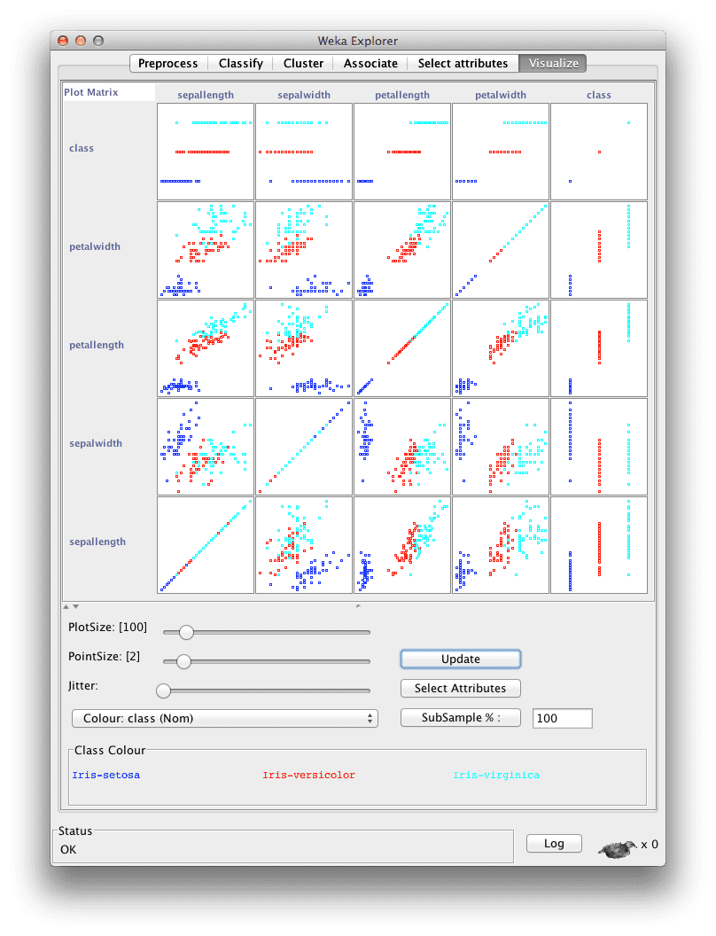
Pairwise Scatter-plots Showing Class Values
Some motivating questions for this step include:
- What interesting two-dimensional structures are shown?
- What interesting relationship between the attributes to class values are shown?
Summary
In this post you discovered a process for data analysis that seeks creating different views on the data in order to elicit observations and assumptions about the data.
The two approaches used are:
- Summarize Data: Describe the data and the data distributions.
- Visualize Data: Create various graphical summaries of the data.
Discover Machine Learning Without The Code!
Develop Your Own Models in Minutes
...with just a few a few clicks
Discover how in my new Ebook:
Machine Learning Mastery With Weka
Covers self-study tutorials and end-to-end projects like:
Loading data, visualization, build models, tuning, and much more...
Finally Bring The Machine Learning To Your Own Projects
Skip the Academics. Just Results.


Thank’s for sharing
You’re welcome!
Very interesting, thanks for sharing
woooow I find this topic amazing. I think need to work a lot on data visualization and explore more about it. thanks Jason
Thank you, very nice!
Thank you for sharing this.
I have a question though: if your data contains a lot of missing values, do you have to do imputations before visualizing the data and then splitting into train and test data set before doing further analyses?
Excellent question Yvette.
I would advise visualization before and after. Use the before to get an idea of what the raw data looks like. Apply transforms and impute missing data / remove obs with missing /etc. and then visualize again and get an understanding of the effects. Also calculate stats before and after (even class-wise stats) to get an idea of how you have changed the distribution of data.
I hope that helps.
Nice article, Jason. I think that getting to know the data is 80% of the work. Many times we are eager to jump right into the model selection and tuning phase without really spending enough time with the data. There are occasions where simple models like Linear Regression would suffice after transforming the data in a particular way, but instead, we spend days tuning an unnecessary ensemble! This is fairly common in Kaggle competitions.
Thanks again for the info!
I agree. A deep understanding of the data and careful framing of the problem counts for a lot.
👋