The digital age has ushered in an era where data-driven decision-making is pivotal in various domains, real estate being a prime example. Comprehensive datasets, like the one concerning properties in Ames, offer a treasure trove for data enthusiasts. Through meticulous exploration and analysis of such datasets, one can uncover patterns, gain insights, and make informed decisions.
Starting from this post, you will embark on a captivating journey through the intricate lanes of Ames properties, focusing primarily on Data Science techniques.
Let’s get started.
Revealing the Invisible: Visualizing Missing Values in Ames Housing Photo by Joakim Honkasalo. Some rights reserved
Overview
This post is divided into three parts; they are:
The Ames Properties Dataset
Loading & Sizing Up the Dataset
Uncovering & Visualizing Missing Values
TheAmesPropertiesDataset
Every dataset has a story to tell, and understanding its background can offer invaluable context. While the Ames Housing Dataset is widely known in academic circles, the dataset we’re analyzing today, Ames.csv, is a more comprehensive collection of property details from Ames.
Dr. Dean De Cock, a dedicated academician, recognized the need for a new, robust dataset in the domain of real estate. He meticulously compiled the Ames Housing Dataset, which has since become a cornerstone for budding data scientists and researchers. This dataset stands out due to its comprehensive details, capturing myriad facets of real estate properties. It has been a foundation for numerous predictive modeling exercises and offers a rich landscape for exploratory data analysis.
The Ames Housing Dataset was envisioned as a modern alternative to the older Boston Housing Dataset. Covering residential sales in Ames, Iowa between 2006 and 2010, it presents a diverse array of variables, setting the stage for advanced regression techniques.
This time frame is particularly significant in U.S. history. The period leading up to 2007-2008 saw the dramatic inflation of housing prices, fueled by speculative frenzy and subprime mortgages. This culminated in the devastating collapse of the housing bubble in late 2007, an event vividly captured in narratives like “The Big Short.” The aftermath of this collapse rippled across the nation, leading to the Great Recession. Housing prices plummeted, foreclosures skyrocketed, and many Americans found themselves underwater on their mortgages. The Ames dataset provides a glimpse into this turbulent period, capturing property sales in the midst of national economic upheaval.
For those who are venturing into the realm of data science, having the right tools in your arsenal is paramount. If you require some help to set up your Python environment, this comprehensive guide is an excellent resource.
DatasetDimensions: Before diving into intricate analyses, it’s essential to familiarize yourself with the dataset’s basic structure and data types. This step provides a roadmap for subsequent exploration and ensures you tailor your analyses based on the data’s nature. With the environment in place, let’s load and gauge the dataset’s extent in terms of rows (representing individual properties) and columns (representing attributes of these properties).
1
2
3
4
5
6
7
8
9
# Load the Ames dataset
import pandas aspd
Ames=pd.read_csv('Ames.csv')
# Dataset shape
print(Ames.shape)
rows,columns=Ames.shape
print(f"The dataset comprises {rows} properties described across {columns} attributes.")
Python
1
2
(2579,85)
The dataset comprises2579properties described across85attributes.
DataTypes: Recognizing the datatype of each attribute helps shape our analysis approach. Numerical attributes might be summarized using measures like mean or median, while mode (most frequent value) is apt for categorical attributes.
1
2
3
4
5
6
7
# Determine the data type for each feature
data_types=Ames.dtypes
# Tally the total by data type
type_counts=data_types.value_counts()
print(type_counts)
1
2
3
4
object44
int6427
float6414
dtype:int64
TheDataDictionary: A data dictionary, often accompanying comprehensive datasets, is a handy resource. It offers detailed descriptions of each feature, specifying its meaning, possible values, and sometimes even the logic behind its collection. For datasets like the Ames properties, which encompass a wide range of features, a data dictionary can be a beacon of clarity. By referring to the attached data dictionary, analysts, data scientists, and even domain experts can gain a deeper understanding of the nuances of each feature. Whether you’re deciphering the meaning behind an unfamiliar feature or discerning the significance of particular values, the data dictionary serves as a comprehensive guide. It bridges the gap between raw data and actionable insights, ensuring that the analyses and decisions are well-informed.
1
2
3
4
5
# Determine the data type for each feature
data_types=Ames.dtypes
# View a few datatypes from the dataset (first and last 5 features)
print(data_types)
1
2
3
4
5
6
7
8
9
10
11
12
PID int64
GrLivArea int64
SalePrice int64
MSSubClass int64
MSZoning object
...
SaleCondition object
GeoRefNo float64
Prop_Addr object
Latitude float64
Longitude float64
Length:85,dtype:object
Ground Living Area and Sale Price are numerical (int64) data types, while Sale Condition (object, which is string type in this example) is a categorical data type.
Uncovering&VisualizingMissingValues
Real-world datasets seldom arrive perfectly curated, often presenting analysts with the challenge of missing values. These gaps in data can arise due to various reasons, such as errors in data collection, system limitations, or the absence of information. Addressing missing values is not merely a technical necessity but a critical step that significantly impacts the integrity and reliability of subsequent analyses.
Understanding the patterns of missing values is essential for informed data analysis. This insight guides the selection of appropriate imputation methods, which fill in missing data based on available information, thereby influencing the accuracy and interpretability of results. Additionally, assessing missing value patterns informs decisions on feature selection; features with extensive missing data may be excluded to enhance model performance and focus on more reliable information. In essence, grasping the patterns of missing values ensures robust and trustworthy data analyses, guiding imputation strategies and optimizing feature inclusion for more accurate insights.
NaN or None?: In pandas, the isnull() function is used to detect missing values in a DataFrame or Series. Specifically, it identifies the following types or missing data:
np.nan (Not a Number), often used to denote missing numerical data
None, which is Python’s built-in object to denote the absence of a value or a null value
Both nan and NaN are just different ways to refer to NumPy’s np.nan, and isnull() will identify them as missing values. Here is a quick example.
1
2
3
4
5
6
7
8
9
10
11
12
13
14
15
16
17
# Import NumPy
import numpy asnp
# Create a DataFrame with various types of missing values
df=pd.DataFrame({
'A':[1,2,np.nan,4,5],
'B':['a','b',None,'d','e'],
'C':[np.nan,np.nan,np.nan,np.nan,np.nan],
'D':[1,2,3,4,5]
})
# Use isnull() to identify missing values
missing_data=df.isnull().sum()
print(df)
print()
print(missing_data)
1
2
3
4
5
6
ABCD
01.0aNaN1
12.0bNaN2
2NaN None NaN3
34.0dNaN4
45.0eNaN5
1
2
3
4
5
A1
B1
C5
D0
dtype:int64
VisualizingMissingValues: When it comes to visualizing missing data, tools like DataFrames,missingno, matplotlib, and seaborncome in handy. By sorting the features based on the percentage of missing values and placing them into a DataFrame, you can easily rank the features most affected by missing data.
1
2
3
4
5
6
7
8
9
10
11
12
# Calculating the percentage of missing values for each column
missing_data=Ames.isnull().sum()
missing_percentage=(missing_data/len(Ames))*100
# Combining the counts and percentages into a DataFrame for better visualization
The missingno package facilitates a swift, graphical representation of missing data. The visualization’s white lines or gaps denote missing values. However, it will only accommodate up to 50 labeled variables. Past that range, labels begin to overlap or become unreadable, and by default, large displays omit them.
1
2
3
4
import missingno asmsno
import matplotlib.pyplot asplt
msno.matrix(Ames,sparkline=False,fontsize=20)
plt.show()
Visual representation of missing values using missingno.matrix().
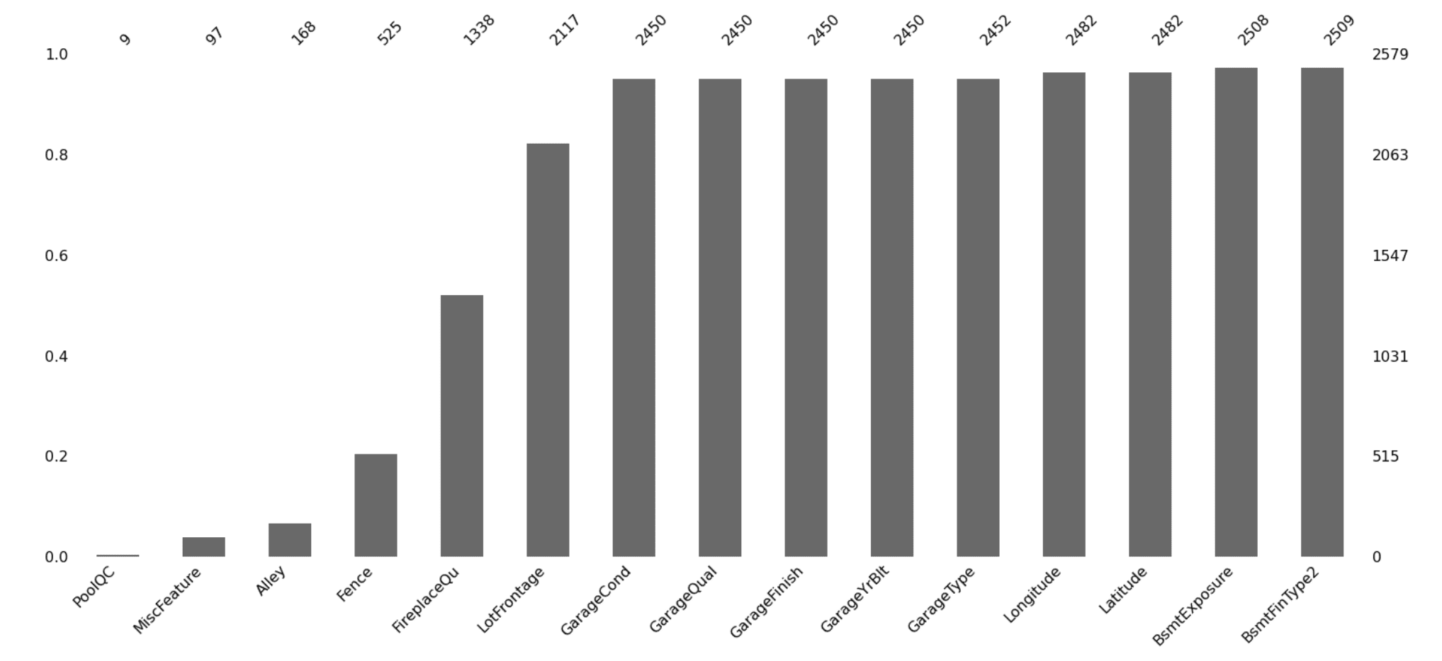
Using the msno.bar() visual after extracting the top 15 features with the most missing values provides a crisp illustration by column.
1
2
3
4
5
6
7
8
9
10
11
12
13
14
15
16
# Calculating the percentage of missing values for each column
missing_data=Ames.isnull().sum()
missing_percentage=(missing_data/len(Ames))*100
# Combining the counts and percentages into a DataFrame for better visualization
# Select the top 15 columns with the most missing values
top_15_missing=sorted_df.iloc[:,:15]
#Visual with missingno
msno.bar(top_15_missing)
plt.show()
Using missingno.bar() to visualize features with missing data.
The illustration above denotes that Pool Quality, Miscellaneous Feature, and the type of Alley access to the property are the three features with the highest number of missing values.
1
2
3
4
5
6
7
8
9
10
11
12
13
14
import seaborn assns
import matplotlib.pyplot asplt
# Filter to show only the top 15 columns with the most missing values
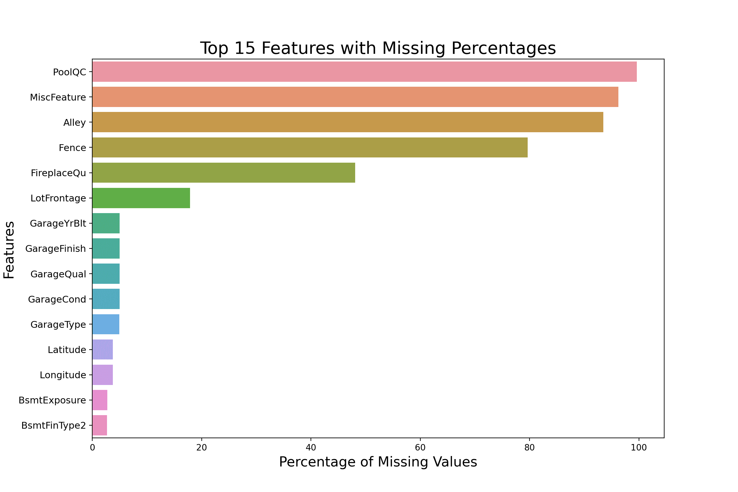
plt.title('Top 15 Features with Missing Percentages',fontsize=20)
plt.xlabel('Percentage of Missing Values',fontsize=16)
plt.ylabel('Features',fontsize=16)
plt.yticks(fontsize=11)
plt.show()
Using seaborn horizontal bar plots to visualize missing data.
A horizontal bar plot using seaborn allows you to list features with the highest missing values in a vertical format, adding both readability and aesthetic value.
Handling missing values is more than just a technical requirement; it’s a significant step that can influence the quality of your machine learning models. Understanding and visualizing these missing values are the first steps in this intricate dance.
Want to Get Started With Beginner's Guide to Data Science?
Take my free email crash course now (with sample code).
Click to sign-up and also get a free PDF Ebook version of the course.
FurtherReading
This section provides more resources on the topic if you want to go deeper.
In this tutorial, you embarked on an exploration of the Ames Properties dataset, a comprehensive collection of housing data tailored for data science applications.
Specifically, you learned:
About the context of the Ames dataset, including the pioneers and academic importance behind it.
How to extract dataset dimensions, data types, and missing values.
How to use packages like missingno, Matplotlib, and Seaborn to quickly visualize your missing data.
Do you have any questions? Please ask your questions in the comments below, and I will do my best to answer.
Get Started on The Beginner's Guide to Data Science!
Learn the mindset to become successful in data science projects
...using only minimal math and statistics, acquire your skill through short examples in Python
It provides self-study tutorials with all working code in Python to turn you from a novice to an expert. It shows you how to find outliers, confirm the normality of data, find correlated features, handle skewness, check hypotheses, and much more...all to support you in creating a narrative from a dataset.
Kick-start your data science journey with hands-on exercises
This is a very good eye openers into visualizing missing values. Though, I do use missingno to run visualisation of my missing values, but plotting using seaborn I have not done that before. Will have to try that! Thank you very much!
Many thanks Vinod for this article. I was glad to run it and see the importance of missing values. I am now going on to studying your next link on Ames housing.


This is a very good eye openers into visualizing missing values. Though, I do use missingno to run visualisation of my missing values, but plotting using seaborn I have not done that before. Will have to try that! Thank you very much!
You are very welcome Abdulsalam!
Many thanks Vinod for this article. I was glad to run it and see the importance of missing values. I am now going on to studying your next link on Ames housing.
You are very welcome! I am glad to hear that you found the article helpful.