You start your data science journey on the Ames dataset with descriptive statistics. The richness of the Ames housing dataset allows descriptive statistics to distill data into meaningful summaries. It is the initial step in analysis, offering a concise summary of the main aspects of a dataset. Their significance lies in simplifying complexity, aiding data exploration, facilitating comparative analysis, and enabling data-driven narratives.
As you delve into the Ames properties dataset, you’ll explore the transformative power of descriptive statistics, distilling vast volumes of data into meaningful summaries. Along the way, you’ll discover the nuances of key metrics and their interpretations, such as the implications of the average being greater than the median in terms of skewness.
Let’s get started.

Decoding Data: An Introduction to Descriptive Statistics with the Ames Housing Dataset
Photo by lilartsy. Some rights reserved.
Overview
This post is divided into three parts; they are:
- Fundamentals of Descriptive Statistics
- Data Dive with the Ames Dataset
- Visual Narratives
Fundamentals of Descriptive Statistics
This post will show you how to make use of descriptive statistics to make sense of data. Let’s have a refresher on what statistics can help describing data.
Central Tendency: The Heart of the Data
Central tendency captures the dataset’s core or typical value. The most common measures include:
- Mean (average): The sum of all values divided by the number of values.
- Median: The middle value when the data is ordered.
- Mode: The value(s) that appear most frequently.
Dispersion: The Spread and Variability
Dispersion uncovers the spread and variability within the dataset. Key measures comprise:
- Range: Difference between the maximum and minimum values.
- Variance: Average of the squared differences from the mean.
- Standard Deviation: Square root of the variance.
- Interquartile Range (IQR): Range between the 25th and 75th percentiles.
Shape and Position: The Contour and Landmarks of Data
Shape and Position reveal the dataset’s distributional form and critical markers, characterized by the following measures:
- Skewness: Asymmetry of the distribution. If the median is greater than the mean, we say the data is left-skewed (large values are more common). Conversely, it is right-skewed.
- Kurtosis: “Tailedness” of the distribution. In other words, how often you can see outliers. If you can see extremely large or extremely small values more often than normal distribution, you say the data is leptokurtic.
- Percentiles: Values below which a percentage of observations fall. The 25th, 50th, and 75th percentiles are also called the quartiles.
Descriptive Statistics gives voice to data, allowing it to tell its story succinctly and understandably.
Kick-start your project with my book The Beginner’s Guide to Data Science. It provides self-study tutorials with working code.
Data Dive with the Ames Dataset
To delve into the Ames dataset, our spotlight is on the “SalePrice” attribute.
|
1 2 3 4 5 6 7 |
# Importing libraries and loading the dataset import pandas as pd Ames = pd.read_csv('Ames.csv') # Descriptive Statistics of Sales Price sales_price_description = Ames['SalePrice'].describe() print(sales_price_description) |
|
1 2 3 4 5 6 7 8 9 |
count 2579.000000 mean 178053.442420 std 75044.983207 min 12789.000000 25% 129950.000000 50% 159900.000000 75% 209750.000000 max 755000.000000 Name: SalePrice, dtype: float64 |
This summarizes “SalePrice,” showcasing count, mean, standard deviation, and percentiles.
|
1 2 3 4 5 |
median_saleprice = Ames['SalePrice'].median() print("Median Sale Price:", median_saleprice) mode_saleprice = Ames['SalePrice'].mode().values[0] print("Mode Sale Price:", mode_saleprice) |
|
1 2 |
Median Sale Price: 159900.0 Mode Sale Price: 135000 |
The average “SalePrice” (or mean) of homes in Ames is approximately \$178,053.44, while the median price of \$159,900 suggests half the homes are sold below this value. The difference between these measures hints at high-value homes influencing the average, with the mode offering insights into the most frequent sale prices.
|
1 2 3 4 5 6 7 8 9 10 11 |
range_saleprice = Ames['SalePrice'].max() - Ames['SalePrice'].min() print("Range of Sale Price:", range_saleprice) variance_saleprice = Ames['SalePrice'].var() print("Variance of Sale Price:", variance_saleprice) std_dev_saleprice = Ames['SalePrice'].std() print("Standard Deviation of Sale Price:", std_dev_saleprice) iqr_saleprice = Ames['SalePrice'].quantile(0.75) - Ames['SalePrice'].quantile(0.25) print("IQR of Sale Price:", iqr_saleprice) |
|
1 2 3 4 |
Range of Sale Price: 742211 Variance of Sale Price: 5631749504.563301 Standard Deviation of Sale Price: 75044.9832071625 IQR of Sale Price: 79800.0 |
The range of “SalePrice”, spanning from \$12,789 to \$755,000, showcases the vast diversity in Ames’ property values. With a variance of approximately \$5.63 billion, it underscores the substantial variability in prices, further emphasized by a standard deviation of around \$75,044.98. The Interquartile Range (IQR), representing the middle 50% of the data, stands at $79,800, reflecting the spread of the central bulk of housing prices.
|
1 2 3 4 5 6 7 8 9 10 11 12 13 14 15 16 17 |
skewness_saleprice = Ames['SalePrice'].skew() print("Skewness of Sale Price:", skewness_saleprice) kurtosis_saleprice = Ames['SalePrice'].kurt() print("Kurtosis of Sale Price:", kurtosis_saleprice) tenth_percentile = Ames['SalePrice'].quantile(0.10) ninetieth_percentile = Ames['SalePrice'].quantile(0.90) print("10th Percentile:", tenth_percentile) print("90th Percentile:", ninetieth_percentile) q1_saleprice = Ames['SalePrice'].quantile(0.25) q2_saleprice = Ames['SalePrice'].quantile(0.50) q3_saleprice = Ames['SalePrice'].quantile(0.75) print("Q1 (25th Percentile):", q1_saleprice) print("Q2 (Median/50th Percentile):", q2_saleprice) print("Q3 (75th Percentile):", q3_saleprice) |
|
1 2 3 4 5 6 7 |
Skewness of Sale Price: 1.7607507033716905 Kurtosis of Sale Price: 5.430410648673599 10th Percentile: 107500.0 90th Percentile: 272100.0000000001 Q1 (25th Percentile): 129950.0 Q2 (Median/50th Percentile): 159900.0 Q3 (75th Percentile): 209750.0 |
The “SalePrice” in Ames displays a positive skewness of approximately 1.76, indicative of a longer or fatter tail on the right side of the distribution. This skewness underscores that the average sale price is influenced by a subset of higher-priced properties, while the majority of homes are transacted at prices below this average. Such skewness quantifies the asymmetry or deviation from symmetry within the distribution, highlighting the disproportionate influence of higher-priced properties in elevating the average. When the average (mean) sale price eclipses the median, it subtly signifies the presence of higher-priced properties, contributing to a right-skewed distribution where the tail extends prominently to the right. The kurtosis value at approximately 5.43 further accentuates these insights, suggesting potential outliers or extreme values that augment the distribution’s heavier tails.
Delving deeper, the quartile values offer insights into the central tendencies of the data. With Q1 at \$129,950 and Q3 at \$209,750, these quartiles encapsulate the interquartile range, representing the middle 50% of the data. This delineation underscores the central spread of prices, furnishing a nuanced portrayal of the pricing spectrum. Additionally, the 10th and 90th percentiles, positioned at \$107,500 and \$272,100, respectively, function as pivotal demarcations. These percentiles demarcate the boundaries within which 80% of the home prices reside, highlighting the expansive range in property valuations and accentuating the multifaceted nature of the Ames housing market.
Visual Narratives
Visualizations breathe life into data, narrating its story. Let’s dive into the visual narrative of the “SalePrice” feature from the Ames dataset.
|
1 2 3 4 5 6 7 8 9 10 11 12 13 14 15 16 17 18 19 20 21 22 23 24 25 26 27 28 29 30 31 32 |
# Importing visualization libraries import matplotlib.pyplot as plt import seaborn as sns # Setting up the style sns.set_style("whitegrid") # Calculate Mean, Median, Mode for SalePrice mean_saleprice = Ames['SalePrice'].mean() median_saleprice = Ames['SalePrice'].median() mode_saleprice = Ames['SalePrice'].mode().values[0] # Plotting the histogram plt.figure(figsize=(14, 7)) sns.histplot(x=Ames['SalePrice'], bins=30, kde=True, color="skyblue") plt.axvline(mean_saleprice, color='r', linestyle='--', label=f"Mean: ${mean_saleprice:.2f}") plt.axvline(median_saleprice, color='g', linestyle='-', label=f"Median: ${median_saleprice:.2f}") plt.axvline(mode_saleprice, color='b', linestyle='-.', label=f"Mode: ${mode_saleprice:.2f}") # Calculating skewness and kurtosis for SalePrice skewness_saleprice = Ames['SalePrice'].skew() kurtosis_saleprice = Ames['SalePrice'].kurt() # Annotations for skewness and kurtosis plt.annotate('Skewness: {:.2f}\nKurtosis: {:.2f}'.format(Ames['SalePrice'].skew(), Ames['SalePrice'].kurt()), xy=(500000, 100), fontsize=14, bbox=dict(boxstyle="round,pad=0.3", edgecolor="black", facecolor="aliceblue")) plt.title('Histogram of Ames\' Housing Prices with KDE and Reference Lines') plt.xlabel('Housing Prices') plt.ylabel('Frequency') plt.legend() plt.show() |

The histogram above offers a compelling visual representation of Ames’ housing prices. The pronounced peak near \$150,000 underscores a significant concentration of homes within this particular price bracket. Complementing the histogram is the Kernel Density Estimation (KDE) curve, which provides a smoothed representation of the data distribution. The KDE is essentially an estimate of the histogram but with the advantage of infinitely narrow bins, offering a more continuous view of the data. It serves as a “limit” or refined version of the histogram, capturing nuances that might be missed in a discrete binning approach.
Notably, the KDE curve’s rightward tail aligns with the positive skewness we previously computed, emphasizing a denser concentration of homes priced below the mean. The colored lines – red for mean, green for median, and blue for mode – act as pivotal markers, allowing for a quick comparison and understanding of the distribution’s central tendencies against the broader data landscape. Together, these visual elements provide a comprehensive insight into the distribution and characteristics of Ames’ housing prices.
|
1 2 3 4 5 6 7 8 9 10 11 12 13 14 15 16 17 18 19 20 21 22 23 24 25 26 |
from matplotlib.lines import Line2D # Horizontal box plot with annotations plt.figure(figsize=(12, 8)) # Plotting the box plot with specified color and style sns.boxplot(x=Ames['SalePrice'], color='skyblue', showmeans=True, meanprops={"marker": "D", "markerfacecolor": "red", "markeredgecolor": "red", "markersize":10}) # Plotting arrows for Q1, Median and Q3 plt.annotate('Q1', xy=(q1_saleprice, 0.30), xytext=(q1_saleprice - 70000, 0.45), arrowprops=dict(edgecolor='black', arrowstyle='->'), fontsize=14) plt.annotate('Q3', xy=(q3_saleprice, 0.30), xytext=(q3_saleprice + 20000, 0.45), arrowprops=dict(edgecolor='black', arrowstyle='->'), fontsize=14) plt.annotate('Median', xy=(q2_saleprice, 0.20), xytext=(q2_saleprice - 90000, 0.05), arrowprops=dict(edgecolor='black', arrowstyle='->'), fontsize=14) # Titles, labels, and legends plt.title('Box Plot Ames\' Housing Prices', fontsize=16) plt.xlabel('Housing Prices', fontsize=14) plt.yticks([]) # Hide y-axis tick labels plt.legend(handles=[Line2D([0], [0], marker='D', color='w', markerfacecolor='red', markersize=10, label='Mean')], loc='upper left', fontsize=14) plt.tight_layout() plt.show() |
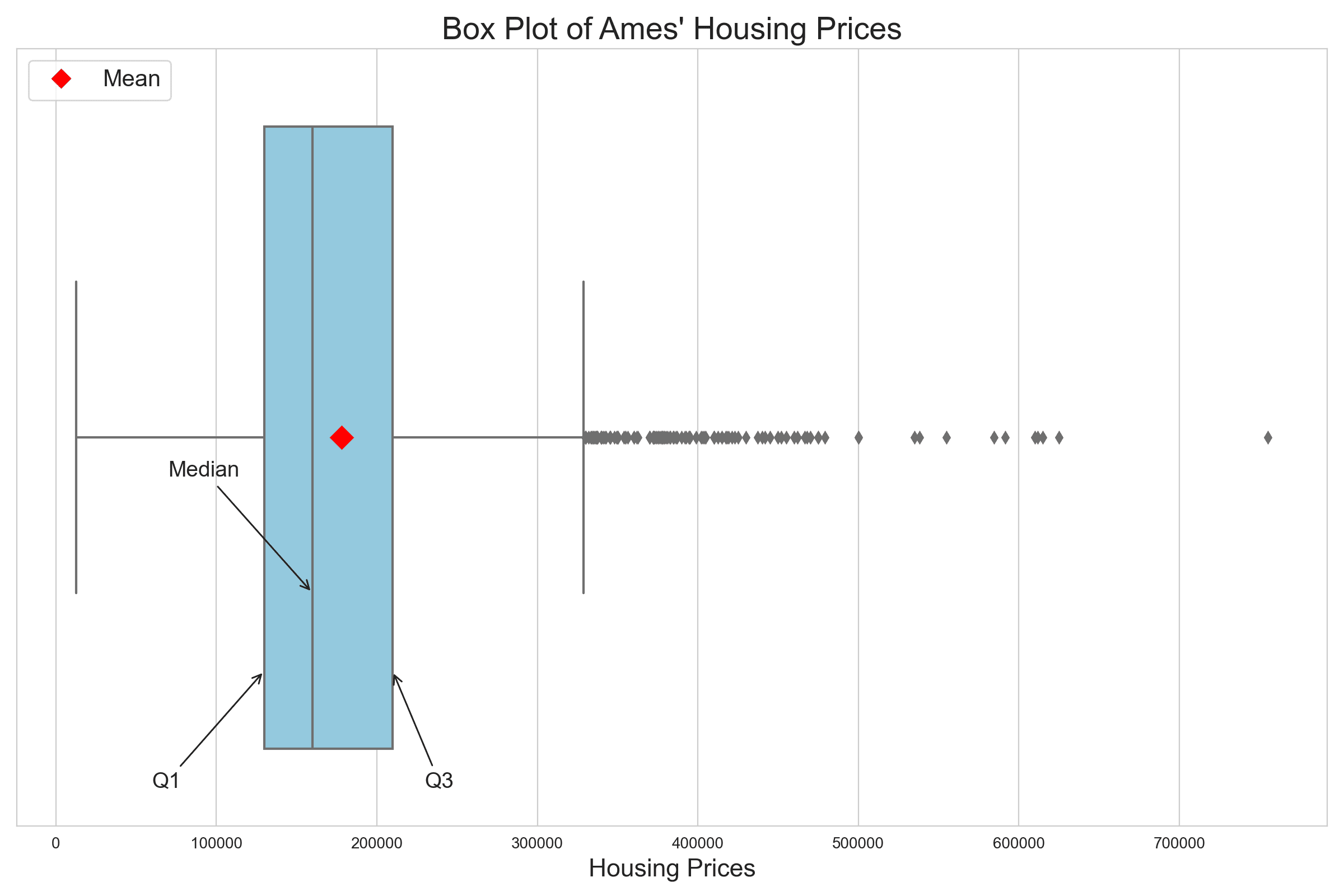
The box plot provides a concise representation of central tendencies, ranges, and outliers, offering insights not readily depicted by the KDE curve or histogram. The Interquartile Range (IQR), which spans from Q1 to Q3, captures the middle 50% of the data, providing a clear view of the central range of prices. Additionally, the positioning of the red diamond, representing the mean, to the right of the median emphasizes the influence of high-value properties on the average.
Central to interpreting the box plot are its “whiskers.” The left whisker extends from the box’s left edge to the smallest data point within the lower fence, indicating prices that fall within 1.5 times the IQR below Q1. In contrast, the right whisker stretches from the box’s right edge to the largest data point within the upper fence, encompassing prices that lie within 1.5 times the IQR above Q3. These whiskers serve as boundaries that delineate the data’s spread beyond the central 50%, with points lying outside them often flagged as potential outliers.
Outliers, depicted as individual points, spotlight exceptionally priced homes, potentially luxury properties, or those with distinct features. Outliers in a box plot are those below 1.5 times the IQR below Q1 or above 1.5 times the IQR above Q3. In the plot above, there is no outlier at the lower end but a lot at the higher end. Recognizing and understanding these outliers is crucial, as they can highlight unique market dynamics or anomalies within the Ames housing market.
Visualizations like these breathe life into raw data, weaving compelling narratives and revealing insights that might remain hidden in mere numbers. As we move forward, it’s crucial to recognize and embrace the profound impact of visualization in data analysis—it has the unique ability to convey nuances and complexities that words or figures alone cannot capture.
Want to Get Started With Beginner's Guide to Data Science?
Take my free email crash course now (with sample code).
Click to sign-up and also get a free PDF Ebook version of the course.
Further Reading
This section provides more resources on the topic if you want to go deeper.
Resources
Summary
In this tutorial, we delved into the Ames Housing dataset using Descriptive Statistics to uncover key insights about property sales. We computed and visualized essential statistical measures, emphasizing the value of central tendency, dispersion, and shape. By harnessing visual narratives and data analytics, we transformed raw data into compelling stories, revealing the intricacies and patterns of Ames’ housing prices.
Specifically, you learned:
- How to utilize Descriptive Statistics to extract meaningful insights from the Ames Housing dataset, focusing on the ‘SalePrice’ attribute.
- The significance of measures like mean, median, mode, range, and IQR, and how they narrate the story of housing prices in Ames.
- The power of visual narratives, particularly histograms and box plots, in visually representing and interpreting the distribution and variability of data.
Do you have any questions? Please ask your questions in the comments below, and I will do my best to answer.
Get Started on The Beginner's Guide to Data Science!
Learn the mindset to become successful in data science projects
...using only minimal math and statistics, acquire your skill through short examples in Python
Discover how in my new Ebook:
The Beginner's Guide to Data Science
It provides self-study tutorials with all working code in Python to turn you from a novice to an expert. It shows you how to find outliers, confirm the normality of data, find correlated features, handle skewness, check hypotheses, and much more...all to support you in creating a narrative from a dataset.


No comments yet.