Understanding real estate data involves exploring different property features and their impact on housing market trends. One useful tool for exploring these relationships is the pair plot. This data visualization technique allows you to discover the direction and magnitude of correlations among different features within the dataset.
Let’s get started.

Mastering Pair Plots for Visualization and Hypothesis Creation in the Ames Housing Market
Photo by Juliana e Mariana Amorim. Some rights reserved.
Overview
This post is divided into three parts; they are:
- Exploring Feature Relationships with Pair Plots
- Unveiling Deeper Insights: Pair Plots with Categorical Enhancement
- Inspiring Data-Driven Inquiries: Hypothesis Generation Through Pair Plots
Exploring Feature Relationships with Pair Plots
A pair plot, also known as a scatterplot matrix, provides a comprehensive view of the interplay between multiple variables in a dataset. Unlike correlation heatmaps, which represent correlation coefficients in a color-coded grid, pair plots depict the actual data points, revealing the nature of relationships beyond just their strength and direction.
To illustrate this, let’s delve into the Ames Housing dataset. We’ll focus on the top five features most strongly correlated with ‘SalePrice’.
|
1 2 3 4 5 6 7 8 9 10 11 12 13 14 15 16 17 18 19 20 |
# Import the necessary libraries import pandas as pd import seaborn as sns import matplotlib.pyplot as plt # Load the dataset Ames = pd.read_csv('Ames.csv') # Calculate the correlation of all features with 'SalePrice' correlations = Ames.corr()['SalePrice'].sort_values(ascending=False) # Top 5 features most correlated with 'SalePrice' (excluding 'SalePrice' itself) top_5_features = correlations.index[1:6] # Creating the pair plot for these features and 'SalePrice' # Adjust the size by setting height and aspect sns.pairplot(Ames, vars=['SalePrice'] + list(top_5_features), height=1.35, aspect=1.85) # Displaying the plot plt.show() |
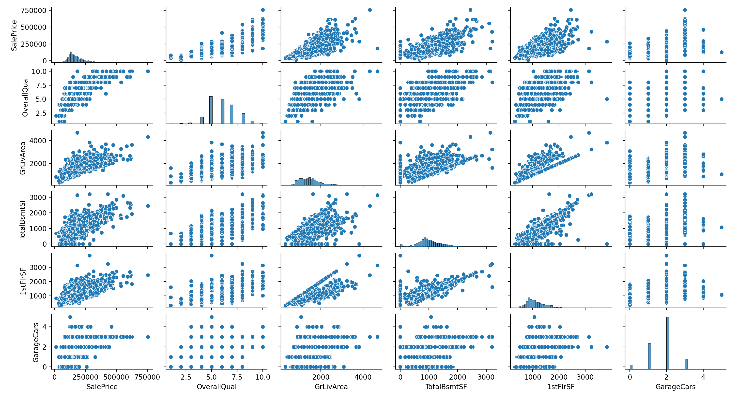
As seen in the pair plot above, each subplot provides a scatter plot for a pair of features. This visualization method not only allows us to observe the distribution of individual variables but also reveals the intricate relationships between them. The pair plot is particularly adept at uncovering the nature of these relationships. For example, we can see whether the relationships are linear, suggesting a steady increase or decrease, or non-linear, indicating more complex dynamics. It also highlights clusters where data points are grouped and outliers that stand apart from the general trend.
Take, for instance, the relationship between “SalePrice” and “GrLivArea.” The scatter plot in the pair plot shows a broadly linear relationship, indicating that as “GrLivArea” increases, so does “SalePrice.” However, it’s not a perfect linear correlation — some data points deviate from this trend, suggesting other factors may also influence the sale price. Moreover, the plot reveals a few outliers, properties with exceptionally high “GrLivArea” or “SalePrice,” that could be unique cases or potential data entry errors.
By presenting data in this format, pair plots go beyond mere numerical coefficients, offering a nuanced and detailed view of the data. They enable us to identify patterns, trends, and exceptions within the dataset, which are vital for making informed decisions in the real estate market. Such insights are especially beneficial for stakeholders looking to understand the multifaceted nature of property value determinants.
Kick-start your project with my book The Beginner’s Guide to Data Science. It provides self-study tutorials with working code.
Unveiling Deeper Insights: Pair Plots with Categorical Enhancement
In our continued exploration of real estate data visualization, we now focus on enriching our pair plots with categorical variables. By incorporating a categorical dimension, we can uncover deeper insights and more nuanced relationships within the data. In this section, we transform “LotShape” from the Ames Housing dataset into a binary category (Regular vs. Irregular) and integrate it into our pair plot. This enhancement allows us to observe how these lot shapes interact with key variables like “SalePrice”, “OverallQual”, and “GrLivArea.”
|
1 2 3 4 5 6 7 8 9 |
# Convert 'LotShape' to a binary feature: 'Regular' and 'Irregular' Ames['LotShape_Binary'] = Ames['LotShape'].apply(lambda x: 'Regular' if x == 'Reg' else 'Irregular') # Creating the pair plot, color-coded by 'LotShape_Binary' sns.pairplot(Ames, vars=['SalePrice', 'OverallQual', 'GrLivArea'], hue='LotShape_Binary', palette='Set1', height=2.5, aspect=1.75) # Display the plot plt.show() |
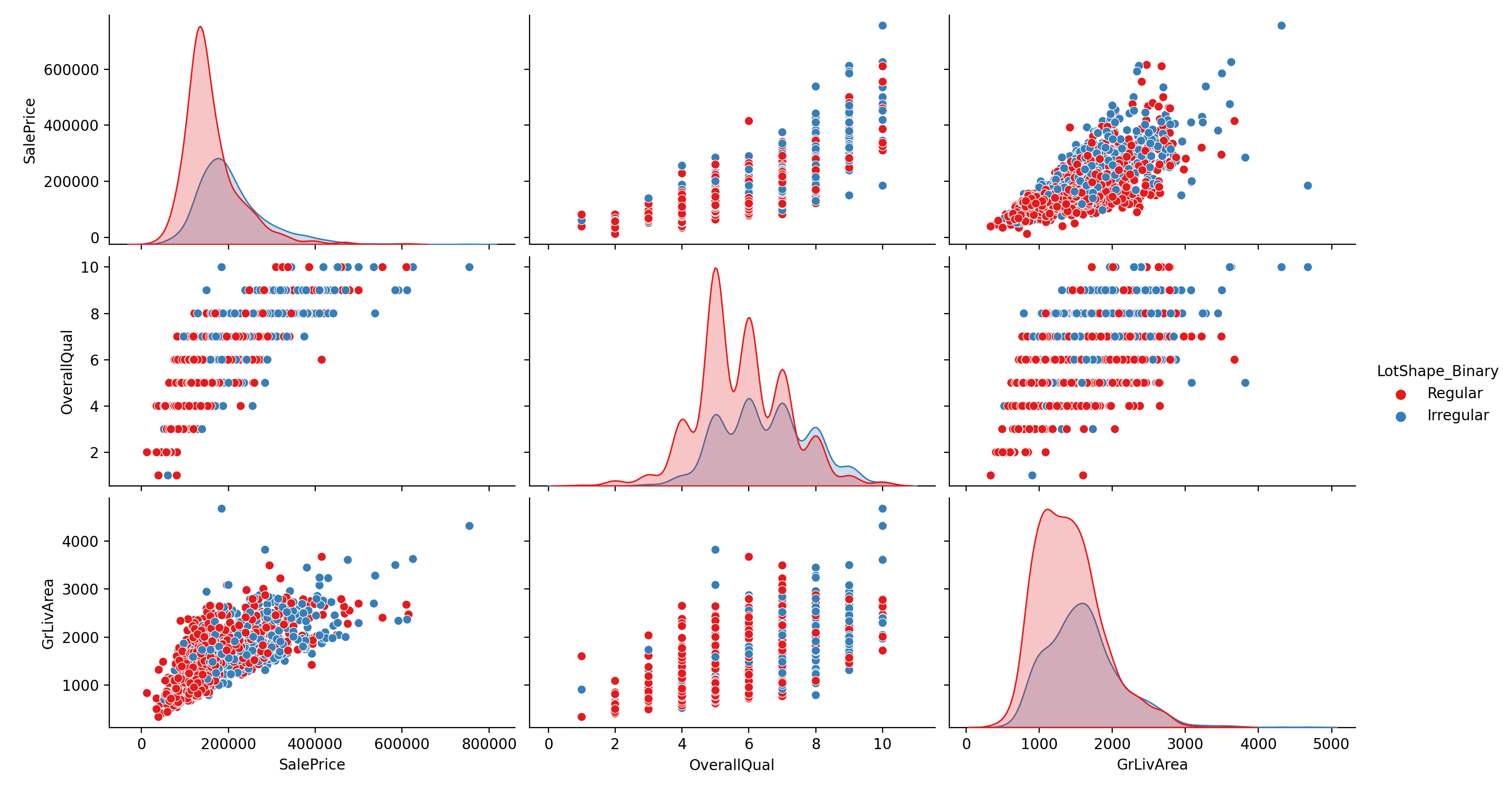
The resulting pair plot, color-coded for “Regular” and “Irregular” lot shapes, reveals intriguing patterns. For instance, we notice that homes with irregular lot shapes tend to have a varied range of sale prices and living areas, potentially indicating a diversity in property types or buyer preferences. Additionally, the overall quality (“OverallQual”) appears to be less variable for regular lots, suggesting a possible trend in construction standards or design choices in these areas.
This enhanced visual tool not only deepens our understanding of the housing market dynamics but also invites further exploration. Stakeholders can experiment with different feature combinations and categorical variables to tailor their analysis to specific interests or market segments, making this approach a versatile asset in real estate analytics.
Inspiring Data-Driven Inquiries: Hypothesis Generation Through Pair Plots
Pair plots serve as a powerful tool not just for visualization but also for hypothesis generation in data analysis. By revealing patterns, trends, and anomalies in a dataset, these plots can inspire insightful questions and hypotheses. For instance, observing a linear relationship between two variables might lead to a hypothesis about a causal connection, or an unexpected cluster of data points could prompt inquiries into underlying factors. Essentially, pair plots can act as a springboard for deeper, more targeted statistical testing and exploration.
Hypotheses From the First Visual (Relationships between “SalePrice” and other features):
- Hypothesis 1: There is a linear relationship between “GrLivArea” and “SalePrice,” suggesting that larger living areas directly contribute to higher property values.
- Hypothesis 2: Outliers observed in the ‘SalePrice’ versus “GrLivArea” plot may indicate unique luxury properties or data entry errors, warranting further investigation.
Hypotheses From the Second Visual (Incorporating “LotShape” as a binary category):
- Hypothesis 3: Properties with irregular lot shapes have a wider variance in sale prices than regular lot shapes, possibly due to a higher diversity in property types or unique features.
- Hypothesis 4: The overall quality of properties on regular-shaped lots tends to be more consistent, suggesting standardized construction practices or buyer preferences in these areas.
These hypotheses, derived from the observed patterns in the pair plots, can then be tested through more rigorous statistical methods to validate or refute the initial observations. This approach underscores the utility of pair plots as a foundational step in hypothesis-driven data analysis.
Want to Get Started With Beginner's Guide to Data Science?
Take my free email crash course now (with sample code).
Click to sign-up and also get a free PDF Ebook version of the course.
Further Reading
This section provides more resources on the topic if you want to go deeper.
Resources
Summary
In our exploration of the Ames Housing dataset, we have journeyed through the world of pair plots, uncovering the intricate stories told by the data. This journey has not only highlighted the importance of visual analysis in real estate analytics but also demonstrated the power of pair plots in revealing complex relationships and guiding data-driven hypothesis generation. Specifically, you learned:
- The effectiveness of pair plots in illustrating the relationships between various housing market features, especially with regard to “SalePrice.”
- How the integration of categorical variables like “LotShape” into pair plots can provide deeper insights and reveal subtler trends in the data.
- The potential of pair plots as a foundation for generating hypotheses, setting the stage for more advanced statistical analyses and informed decision-making.
Do you have any questions? Please ask your questions in the comments below, and I will do my best to answer.
Get Started on The Beginner's Guide to Data Science!

Learn the mindset to become successful in data science projects
...using only minimal math and statistics, acquire your skill through short examples in Python
Discover how in my new Ebook:
The Beginner's Guide to Data Science
It provides self-study tutorials with all working code in Python to turn you from a novice to an expert. It shows you how to find outliers, confirm the normality of data, find correlated features, handle skewness, check hypotheses, and much more...all to support you in creating a narrative from a dataset.


Great article. Very useful. Thanks.
Since the resource link supplied for Ames.csv has both numeric and non-numeric columns, to get it to work I had to do the following in the first code listing:
# Load the dataset
Ames_orig = pd.read_csv(‘Ames.csv’) #modification
Ames = Ames_orig._get_numeric_data() #modification
And the following in the 2nd code listing:
# Convert ‘LotShape’ to a binary feature: ‘Regular’ and ‘Irregular’
Ames = Ames_orig #modification
Ames[‘LotShape_Binary’] = Ames[‘LotShape’].apply(lambda x: ‘Regular’ if x == ‘Reg’ else ‘Irregular’)
Thank you for your feedback nj! We appreciate that you shared your findings with us!