Classification algorithms learn how to assign class labels to examples, although their decisions can appear opaque.
A popular diagnostic for understanding the decisions made by a classification algorithm is the decision surface. This is a plot that shows how a fit machine learning algorithm predicts a coarse grid across the input feature space.
A decision surface plot is a powerful tool for understanding how a given model “sees” the prediction task and how it has decided to divide the input feature space by class label.
In this tutorial, you will discover how to plot a decision surface for a classification machine learning algorithm.
After completing this tutorial, you will know:
- Decision surface is a diagnostic tool for understanding how a classification algorithm divides up the feature space.
- How to plot a decision surface for using crisp class labels for a machine learning algorithm.
- How to plot and interpret a decision surface using predicted probabilities.
Kick-start your project with my new book Machine Learning Mastery With Python, including step-by-step tutorials and the Python source code files for all examples.
Let’s get started.

Plot a Decision Surface for Machine Learning Algorithms in Python
Photo by Tony Webster, some rights reserved.
Tutorial Overview
This tutorial is divided into three parts; they are:
- Decision Surface
- Dataset and Model
- Plot a Decision Surface
Decision Surface
Classification machine learning algorithms learn to assign labels to input examples.
Consider numeric input features for the classification task defining a continuous input feature space.
We can think of each input feature defining an axis or dimension on a feature space. Two input features would define a feature space that is a plane, with dots representing input coordinates in the input space. If there were three input variables, the feature space would be a three-dimensional volume.
Each point in the space can be assigned a class label. In terms of a two-dimensional feature space, we can think of each point on the planing having a different color, according to their assigned class.
The goal of a classification algorithm is to learn how to divide up the feature space such that labels are assigned correctly to points in the feature space, or at least, as correctly as is possible.
This is a useful geometric understanding of classification predictive modeling. We can take it one step further.
Once a classification machine learning algorithm divides a feature space, we can then classify each point in the feature space, on some arbitrary grid, to get an idea of how exactly the algorithm chose to divide up the feature space.
This is called a decision surface or decision boundary, and it provides a diagnostic tool for understanding a model on a classification predictive modeling task.
Although the notion of a “surface” suggests a two-dimensional feature space, the method can be used with feature spaces with more than two dimensions, where a surface is created for each pair of input features.
Now that we are familiar with what a decision surface is, next, let’s define a dataset and model for which we later explore the decision surface.
Dataset and Model
In this section, we will define a classification task and predictive model to learn the task.
Synthetic Classification Dataset
We can use the make_blobs() scikit-learn function to define a classification task with a two-dimensional class numerical feature space and each point assigned one of two class labels, e.g. a binary classification task.
|
1 2 3 |
... # generate dataset X, y = make_blobs(n_samples=1000, centers=2, n_features=2, random_state=1, cluster_std=3) |
Once defined, we can then create a scatter plot of the feature space with the first feature defining the x-axis, the second feature defining the y axis, and each sample represented as a point in the feature space.
We can then color points in the scatter plot according to their class label as either 0 or 1.
|
1 2 3 4 5 6 7 8 9 |
... # create scatter plot for samples from each class for class_value in range(2): # get row indexes for samples with this class row_ix = where(y == class_value) # create scatter of these samples pyplot.scatter(X[row_ix, 0], X[row_ix, 1]) # show the plot pyplot.show() |
Tying this together, the complete example of defining and plotting a synthetic classification dataset is listed below.
|
1 2 3 4 5 6 7 8 9 10 11 12 13 14 |
# generate binary classification dataset and plot from numpy import where from matplotlib import pyplot from sklearn.datasets import make_blobs # generate dataset X, y = make_blobs(n_samples=1000, centers=2, n_features=2, random_state=1, cluster_std=3) # create scatter plot for samples from each class for class_value in range(2): # get row indexes for samples with this class row_ix = where(y == class_value) # create scatter of these samples pyplot.scatter(X[row_ix, 0], X[row_ix, 1]) # show the plot pyplot.show() |
Running the example creates the dataset, then plots the dataset as a scatter plot with points colored by class label.
We can see a clear separation between examples from the two classes and we can imagine how a machine learning model might draw a line to separate the two classes, e.g. perhaps a diagonal line right through the middle of the two groups.
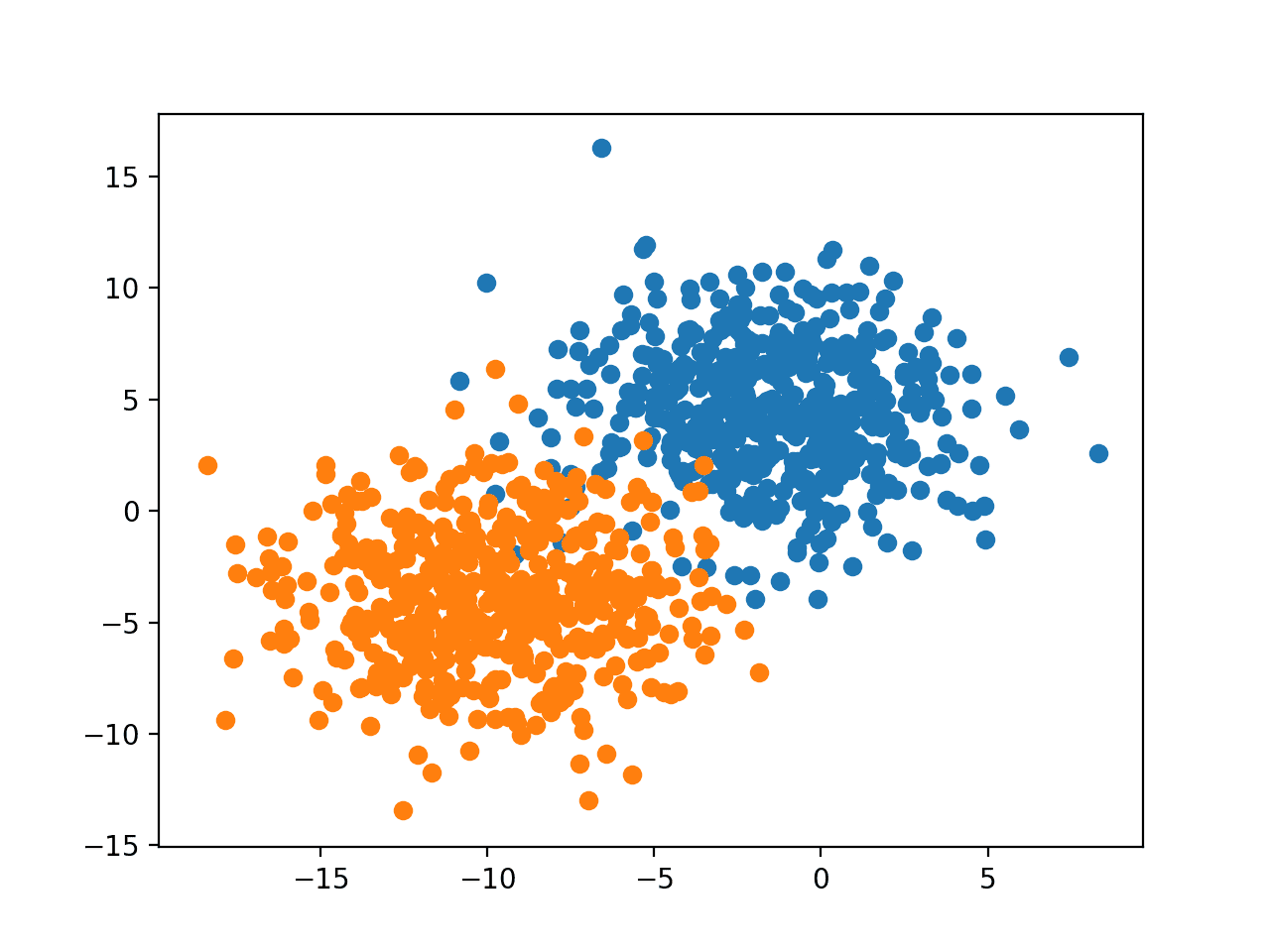
Scatter Plot of Binary Classification Dataset With 2D Feature Space
Fit Classification Predictive Model
We can now fit a model on our dataset.
In this case, we will fit a logistic regression algorithm because we can predict both crisp class labels and probabilities, both of which we can use in our decision surface.
We can define the model, then fit it on the training dataset.
|
1 2 3 4 5 |
... # define the model model = LogisticRegression() # fit the model model.fit(X, y) |
Once defined, we can use the model to make a prediction for the training dataset to get an idea of how well it learned to divide the feature space of the training dataset and assign labels.
|
1 2 3 |
... # make predictions yhat = model.predict(X) |
The predictions can be evaluated using classification accuracy.
|
1 2 3 4 |
... # evaluate the predictions acc = accuracy_score(y, yhat) print('Accuracy: %.3f' % acc) |
Tying this together, the complete example of fitting and evaluating a model on the synthetic binary classification dataset is listed below.
|
1 2 3 4 5 6 7 8 9 10 11 12 13 14 15 |
# example of fitting and evaluating a model on the classification dataset from sklearn.datasets import make_blobs from sklearn.linear_model import LogisticRegression from sklearn.metrics import accuracy_score # generate dataset X, y = make_blobs(n_samples=1000, centers=2, n_features=2, random_state=1, cluster_std=3) # define the model model = LogisticRegression() # fit the model model.fit(X, y) # make predictions yhat = model.predict(X) # evaluate the predictions acc = accuracy_score(y, yhat) print('Accuracy: %.3f' % acc) |
Running the example fits the model and makes a prediction for each example.
Note: Your results may vary given the stochastic nature of the algorithm or evaluation procedure, or differences in numerical precision. Consider running the example a few times and compare the average outcome.
In this case, we can see that the model achieved a performance of about 97.2 percent.
|
1 |
Accuracy: 0.972 |
Now that we have a dataset and model, let’s explore how we can develop a decision surface.
Plot a Decision Surface
We can create a decision surface by fitting a model on the training dataset, then using the model to make predictions for a grid of values across the input domain.
Once we have the grid of predictions, we can plot the values and their class label.
A scatter plot could be used if a fine enough grid was taken. A better approach is to use a contour plot that can interpolate the colors between the points.
The contourf() Matplotlib function can be used.
This requires a few steps.
First, we need to define a grid of points across the feature space.
To do this, we can find the minimum and maximum values for each feature and expand the grid one step beyond that to ensure the whole feature space is covered.
|
1 2 3 4 |
... # define bounds of the domain min1, max1 = X[:, 0].min()-1, X[:, 0].max()+1 min2, max2 = X[:, 1].min()-1, X[:, 1].max()+1 |
We can then create a uniform sample across each dimension using the arange() function at a chosen resolution. We will use a resolution of 0.1 in this case.
|
1 2 3 4 |
... # define the x and y scale x1grid = arange(min1, max1, 0.1) x2grid = arange(min2, max2, 0.1) |
Now we need to turn this into a grid.
We can use the meshgrid() NumPy function to create a grid from these two vectors.
If the first feature x1 is our x-axis of the feature space, then we need one row of x1 values of the grid for each point on the y-axis.
Similarly, if we take x2 as our y-axis of the feature space, then we need one column of x2 values of the grid for each point on the x-axis.
The meshgrid() function will do this for us, duplicating the rows and columns for us as needed. It returns two grids for the two input vectors. The first grid of x-values and the second of y-values, organized in an appropriately sized grid of rows and columns across the feature space.
|
1 2 3 |
... # create all of the lines and rows of the grid xx, yy = meshgrid(x1grid, x2grid) |
We then need to flatten out the grid to create samples that we can feed into the model and make a prediction.
To do this, first, we flatten each grid into a vector.
|
1 2 3 4 |
... # flatten each grid to a vector r1, r2 = xx.flatten(), yy.flatten() r1, r2 = r1.reshape((len(r1), 1)), r2.reshape((len(r2), 1)) |
Then we stack the vectors side by side as columns in an input dataset, e.g. like our original training dataset, but at a much higher resolution.
|
1 2 3 |
... # horizontal stack vectors to create x1,x2 input for the model grid = hstack((r1,r2)) |
We can then feed this into our model and get a prediction for each point in the grid.
|
1 2 3 4 |
... # make predictions for the grid yhat = model.predict(grid) # reshape the predictions back into a grid |
So far, so good.
We have a grid of values across the feature space and the class labels as predicted by our model.
Next, we need to plot the grid of values as a contour plot.
The contourf() function takes separate grids for each axis, just like what was returned from our prior call to meshgrid(). Great!
So we can use xx and yy that we prepared earlier and simply reshape the predictions (yhat) from the model to have the same shape.
|
1 2 3 |
... # reshape the predictions back into a grid zz = yhat.reshape(xx.shape) |
We then plot the decision surface with a two-color colormap.
|
1 2 3 |
... # plot the grid of x, y and z values as a surface pyplot.contourf(xx, yy, zz, cmap='Paired') |
We can then plot the actual points of the dataset over the top to see how well they were separated by the logistic regression decision surface.
The complete example of plotting a decision surface for a logistic regression model on our synthetic binary classification dataset is listed below.
|
1 2 3 4 5 6 7 8 9 10 11 12 13 14 15 16 17 18 19 20 21 22 23 24 25 26 27 28 29 30 31 32 33 34 35 36 37 38 39 40 41 |
# decision surface for logistic regression on a binary classification dataset from numpy import where from numpy import meshgrid from numpy import arange from numpy import hstack from sklearn.datasets import make_blobs from sklearn.linear_model import LogisticRegression from matplotlib import pyplot # generate dataset X, y = make_blobs(n_samples=1000, centers=2, n_features=2, random_state=1, cluster_std=3) # define bounds of the domain min1, max1 = X[:, 0].min()-1, X[:, 0].max()+1 min2, max2 = X[:, 1].min()-1, X[:, 1].max()+1 # define the x and y scale x1grid = arange(min1, max1, 0.1) x2grid = arange(min2, max2, 0.1) # create all of the lines and rows of the grid xx, yy = meshgrid(x1grid, x2grid) # flatten each grid to a vector r1, r2 = xx.flatten(), yy.flatten() r1, r2 = r1.reshape((len(r1), 1)), r2.reshape((len(r2), 1)) # horizontal stack vectors to create x1,x2 input for the model grid = hstack((r1,r2)) # define the model model = LogisticRegression() # fit the model model.fit(X, y) # make predictions for the grid yhat = model.predict(grid) # reshape the predictions back into a grid zz = yhat.reshape(xx.shape) # plot the grid of x, y and z values as a surface pyplot.contourf(xx, yy, zz, cmap='Paired') # create scatter plot for samples from each class for class_value in range(2): # get row indexes for samples with this class row_ix = where(y == class_value) # create scatter of these samples pyplot.scatter(X[row_ix, 0], X[row_ix, 1], cmap='Paired') # show the plot pyplot.show() |
Running the example fits the model and uses it to predict outcomes for the grid of values across the feature space and plots the result as a contour plot.
We can see, as we might have suspected, logistic regression divides the feature space using a straight line. It is a linear model, after all; this is all it can do.
Creating a decision surface is almost like magic. It gives immediate and meaningful insight into how the model has learned the task.
Try it with different algorithms, like an SVM or decision tree.
Post your resulting maps as links in the comments below!
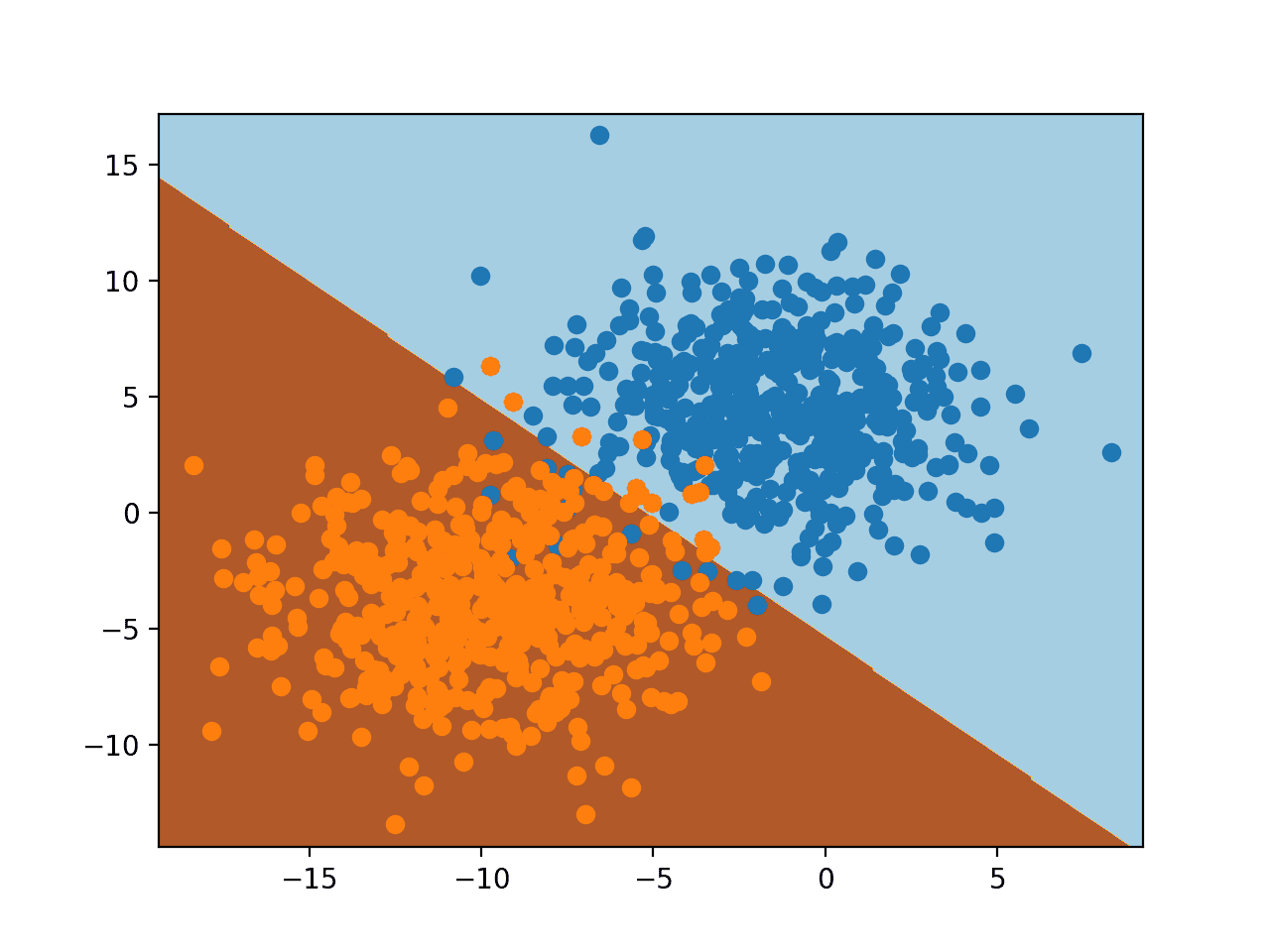
Decision Surface for Logistic Regression on a Binary Classification Task
We can add more depth to the decision surface by using the model to predict probabilities instead of class labels.
|
1 2 3 4 5 |
... # make predictions for the grid yhat = model.predict_proba(grid) # keep just the probabilities for class 0 yhat = yhat[:, 0] |
When plotted, we can see how confident or likely it is that each point in the feature space belongs to each of the class labels, as seen by the model.
We can use a different color map that has gradations, and show a legend so we can interpret the colors.
|
1 2 3 4 5 |
... # plot the grid of x, y and z values as a surface c = pyplot.contourf(xx, yy, zz, cmap='RdBu') # add a legend, called a color bar pyplot.colorbar(c) |
The complete example of creating a decision surface using probabilities is listed below.
|
1 2 3 4 5 6 7 8 9 10 11 12 13 14 15 16 17 18 19 20 21 22 23 24 25 26 27 28 29 30 31 32 33 34 35 36 37 38 39 40 41 42 43 44 45 |
# probability decision surface for logistic regression on a binary classification dataset from numpy import where from numpy import meshgrid from numpy import arange from numpy import hstack from sklearn.datasets import make_blobs from sklearn.linear_model import LogisticRegression from matplotlib import pyplot # generate dataset X, y = make_blobs(n_samples=1000, centers=2, n_features=2, random_state=1, cluster_std=3) # define bounds of the domain min1, max1 = X[:, 0].min()-1, X[:, 0].max()+1 min2, max2 = X[:, 1].min()-1, X[:, 1].max()+1 # define the x and y scale x1grid = arange(min1, max1, 0.1) x2grid = arange(min2, max2, 0.1) # create all of the lines and rows of the grid xx, yy = meshgrid(x1grid, x2grid) # flatten each grid to a vector r1, r2 = xx.flatten(), yy.flatten() r1, r2 = r1.reshape((len(r1), 1)), r2.reshape((len(r2), 1)) # horizontal stack vectors to create x1,x2 input for the model grid = hstack((r1,r2)) # define the model model = LogisticRegression() # fit the model model.fit(X, y) # make predictions for the grid yhat = model.predict_proba(grid) # keep just the probabilities for class 0 yhat = yhat[:, 0] # reshape the predictions back into a grid zz = yhat.reshape(xx.shape) # plot the grid of x, y and z values as a surface c = pyplot.contourf(xx, yy, zz, cmap='RdBu') # add a legend, called a color bar pyplot.colorbar(c) # create scatter plot for samples from each class for class_value in range(2): # get row indexes for samples with this class row_ix = where(y == class_value) # create scatter of these samples pyplot.scatter(X[row_ix, 0], X[row_ix, 1], cmap='Paired') # show the plot pyplot.show() |
Running the example predicts the probability of class membership for each point on the grid across the feature space and plots the result.
Here, we can see that the model is unsure (lighter colors) around the middle of the domain, given the sampling noise in that area of the feature space. We can also see that the model is very confident (full colors) in the bottom-left and top-right halves of the domain.
Together, the crisp class and probability decision surfaces are powerful diagnostic tools for understanding your model and how it divides the feature space for your predictive modeling task.
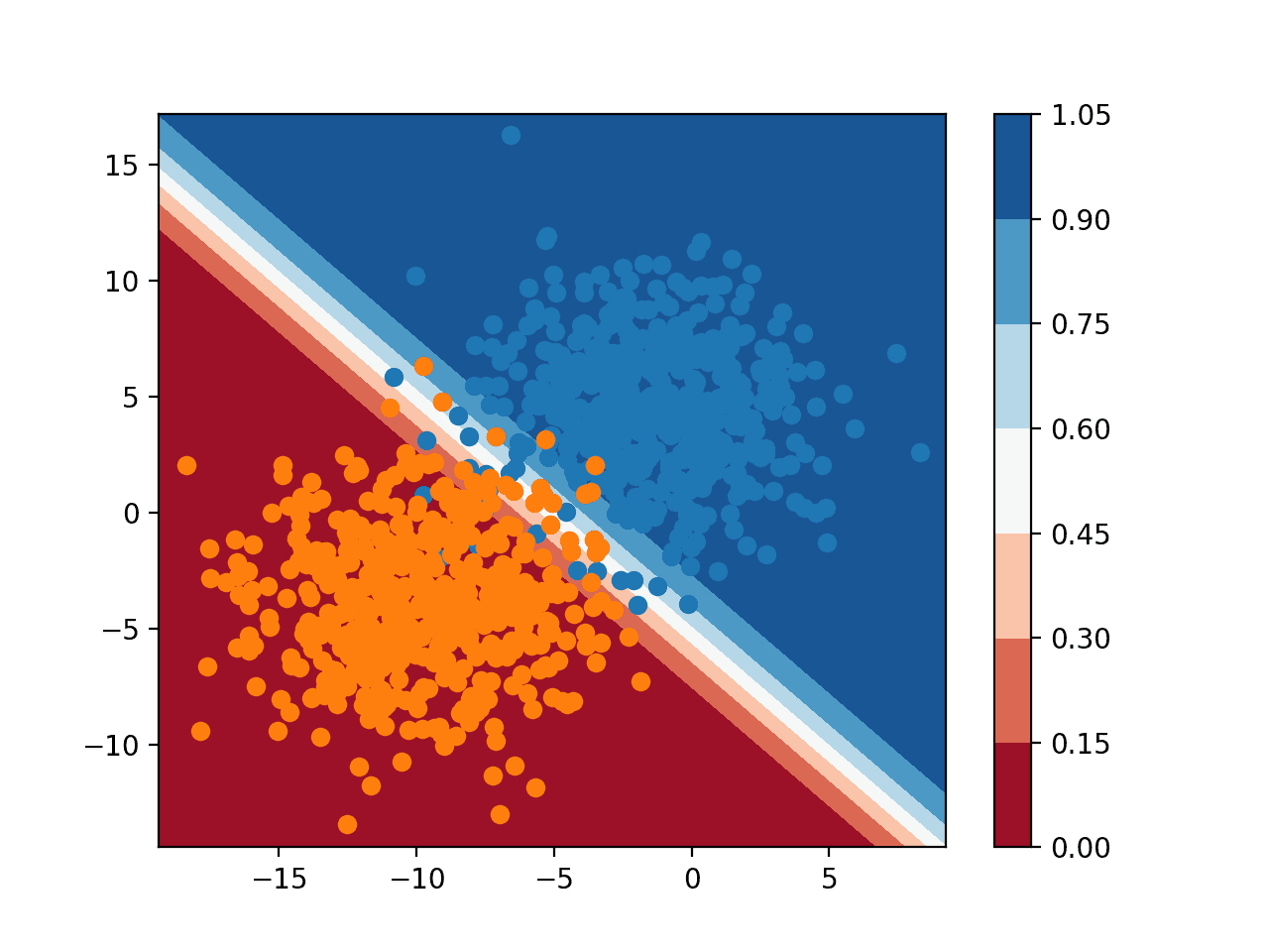
Probability Decision Surface for Logistic Regression on a Binary Classification Task
Further Reading
This section provides more resources on the topic if you are looking to go deeper.
- matplotlib.pyplot.contourf API.
- Matplotlib Colormaps
- numpy.meshgrid API.
- Plot the decision surface of a decision tree on the iris dataset, sklearn example.
Summary
In this tutorial, you discovered how to plot a decision surface for a classification machine learning algorithm.
Specifically, you learned:
- Decision surface is a diagnostic tool for understanding how a classification algorithm divides up the feature space.
- How to plot a decision surface for using crisp class labels for a machine learning algorithm.
- How to plot and interpret a decision surface using predicted probabilities.
Do you have any questions?
Ask your questions in the comments below and I will do my best to answer.
Discover Fast Machine Learning in Python!

Develop Your Own Models in Minutes
...with just a few lines of scikit-learn code
Learn how in my new Ebook:
Machine Learning Mastery With Python
Covers self-study tutorials and end-to-end projects like:
Loading data, visualization, modeling, tuning, and much more...
Finally Bring Machine Learning To
Your Own Projects
Skip the Academics. Just Results.
")


Great tutorial!
Ive been performing similiar tasks over the last year with a quuite computationally expensive series of for-loop functions, the code here seems to speed up my old code quite a lot!
Thanks Jason
Thanks! I’m happy to hear that it’s useful.
Hi how can we do the same for decision trees and spiral dataset.
Thanks for the nice tutorial, very helpful!
Are there any plans to do a tutorial with three or more features? That would be very interesting. Or do you have some reading recommendations?
You’re welcome.
With more than 2 features, you would create one surface plot for each pair of input variables.
Great stuff as usual Jason.
Can u also provide as simple and clear reading on data discovery and cataloging.
One more thing pls,
Data source APIs
Regards
Thanks.
What is “data discovery and cataloging”?
Thanks for the great lesson!
You’re welcome.
Thanks for the great tutorial!
I googled for a library module that creates a decision surface, and found this:
https://towardsdatascience.com/easily-visualize-scikit-learn-models-decision-boundaries-dd0fb3747508
I renamed the module to plot_decision_boundaries.py, because python did not accept the original name. With that, and having put the file in my current directory, I could then execute the following python code:
from numpy import where
from matplotlib import pyplot
from sklearn.datasets import make_blobs
from sklearn.linear_model import LogisticRegression
from plot_decision_boundaries import plot_decision_boundaries
# generate dataset
X, y = make_blobs(n_samples=1000, centers=2, n_features=2, random_state=1, cluster_std=3)
fig = pyplot.figure()
plot_decision_boundaries(X, y, LogisticRegression)
pyplot.savefig(‘plot_decision_boundaries_1.png’)
pyplot.close(fig=’all’)
Nice work.
Dear Dr Jason,
The major steps in making a grid and predicting using the grid values to me are the most ‘complex’ operations. While you can find help files on arange and meshgrid as in the following:
I will explain with fake data in order to understand the the above operations. Pseudocode may be involved.
In summary knowing how arrays of features (X) can be turned into a meshgrid and then into a grid help us understand how the grid is fed into a model to predict the coordinates of the decision surface. The colours of the decision surface are determined by xx and fed into the contourf function.
I’ll be experimenting with the iris data. This project will have to be split into two plots based on petal length vs petal width, and sepal length vs sepal width.
Thank you,
Anthony of Sydney
Nice work.
Hello,
I have tried the above python lines of code, It worked well.
Question
How can I link these lines of code CSV file?
Good question, this will help:
https://machinelearningmastery.com/how-to-connect-model-input-data-with-predictions-for-machine-learning/
Very interesting!
How could i change the code so each class is plotted with a different marker? Say the oranges with marker ‘+’ and the blue with marker ‘o’?
Hi Murilo,
Please refer to the following:
https://matplotlib.org/stable/api/markers_api.html
Regards,
What changes should I make for softmax regression with three classes?
Hi San…You may find the following resources of interest:
https://machinelearningmastery.com/multinomial-logistic-regression-with-python/
https://towardsdatascience.com/multiclass-classification-with-softmax-regression-explained-ea320518ea5d