Visualizing data can sometimes help people understand it better. As a data analytics platform, R provided some advanced plotting functions. In this post, you will learn how to use the built-in plot functions to create some common visualization. Specifically, you will learn how to create:
- Line plot
- Scatter plot
- Pie charts
Let’s get started.

Plotting Graphs in R
Photo by Jason Coudriet. Some rights reserved.
Overview
This post is divided into two parts, they are:
- Plotting a Function
- Plotting a Data Frame
Plotting a Function
Let’s consider the most basic plot function in R. To create a plot with one dot, you can simply use:
|
1 |
plot(2,3) |

Plotting a dot
You can see this plot automatically in RStudio. If you run this in R shell or as a script, you will need to save the plot into a picture, as follows:
|
1 2 3 |
png("myplot.png") plot(2,3) dev.off() |
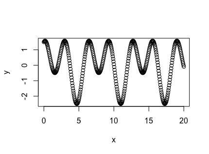
The plot() function parameters are the x- and y-coordinates of the dot. As you know, a single number in R is simply a vector of one element. Hence, it is intuitive to plot a function in the form of two longer vectors of x-y coordinates:
|
1 2 3 |
x <- seq(from=0, to=20, by=0.05) y <- sin(x) + 1.5*cos(2*x) plot(x,y) |
Plotting a function
In above, x is a vector from 0 to 20 and y is a function of x. Note that the sin() and cos() function consider their argument as radians. The plot is in the form of dots as specified by the vector.
Indeed, you may want to customize this plot. First, you may notice that the plots above use a fairly large circle to mark the points. You can control the size of those dots with the cex parameter (default value is 1). For example, this is how to make the dots smaller:
|
1 |
plot(x, y, cex=0.1) |
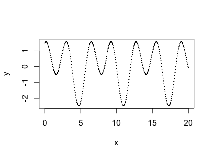
Plotting with cex=0.1
You can add a caption to the plot or label the axes. There are parameters for all these. For example:
|
1 2 3 |
plot(x, y, main="Plotting a function", sub="A demonstration of the plot function", xlab="radian", ylab="value") |
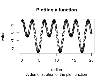
Plot with labels and captions
Note that the main caption and subcaption are above and below the plot respectively.
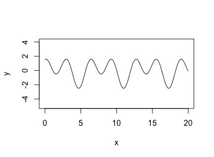
You can also choose to plot the function in lines instead of dots. And you may also consider the plot in a different scale. Here is how you can do these:
|
1 |
plot(x, y, type="l", asp=1) |
Line plot in R
The type controls the plot type. You may also found “b” (both) useful sometimes as it gives both the dots and the line in the same plot. You should refer to the documentation of the plot function to find all possible plot types.
The parameter “asp” is for aspect ratio. This is not to control the aspect ratio of the plot as a whole, but to control the scale between the x- and y- axis. Setting asp=2 would make two units on the x-axis have the same width as one unit on the y-axis.
Plotting a Data Frame
For illustration purposes, let’s consider the iris data frame that comes with R.
The iris dataset is a classification dataset. It has the “Species” column as the label for the iris species. It is a problem for classification modeling if the data are imbalanced. One easy way to check if the iris dataset is balanced is to show the labels in a pie chart:
|
1 |
pie(table(iris$Species)) |

Pie chart in R
The pie chart above shows that the three labels are evenly distributed (since each has a slice of same size).
The table() function takes a vector of labels and returns the count of each unique label in a table format. The pie() function then shows the count as a pie chart. There are some parameters in the pie() function for you to customize the output. You should refer to the documentation for more details.
Since we can pull a column from a data frame into a vector using the syntax iris$Sepal.Length, it is easy to plot two columns in a scatter plot using the plot() function:
|
1 |
plot(iris$Sepal.Length, iris$Sepal.Width) |
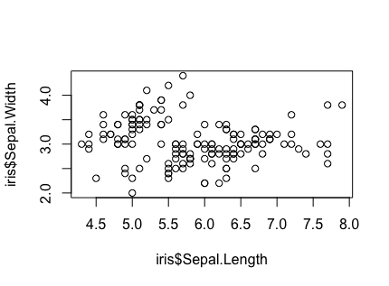
Scatter plot of two columns from the iris dataset
Similarly, if your data frame has one column of sorted values, you can use the plot() function to create a line plot. Note that passing randomly ordered values to the plot() function for a line plot would not produce a good visualization.
You should also learn that the above plot may sometimes written as follows:
|
1 |
plot(iris$Sepal.Width ~ iris$Sepal.Length) |
The use of the tilde (~) symbol emphasizes the relationship as $y = x$. In other words, you may use plot(x,y) and plot(y ~ x) interchangeably.
However, since the iris dataset is a classification dataset, the above plots are not very helpful. A better way to illustrate the relationship between the two columns is as follows:
|
1 2 3 |
plot(iris$Sepal.Length, iris$Sepal.Width, pch=23, cex=0.5, bg=c("red","green","blue")[unclass(iris$Species)]) |

Scatter plot showing the classification in the iris dataset
The parameter pch is to use a filled diamond as the marker in the scatter plot. The filling color of the markers is specified using bg. If you omitted the pch”parameter, the default marker is a hollow circle in which you should color it with the parameter col instead.
The way to assign different color to the marker according to the classification result is to set a vector. This vector is created using:
|
1 |
c("red","green","blue")[unclass(iris$Species)] |
which the part c("red","green","blue") is to create a vector of strings, and iris$Species is the class label (in R’s “factor” type). The unclass() function converts the class label into integers (1, 2, or 3), which is then used to index the vector before. The resulting vector should be the same length as iris$Species, so it can match the number of markers in the scatter plot.
If you run the following:
|
1 |
plot(iris$Species, iris$Sepal.Length, cex=0.5) |
you will get a box and whisker plot, as follows:
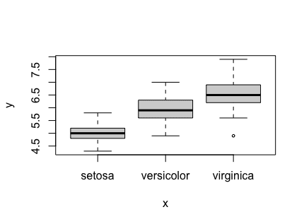
Box and whisker plot
This is a magic from R that when you plot continuous values against discrete labels, a box and whisker plot will be produced to show you the value range.
Finally, a handy “first plot” you should try when you get a new dataset is the scatter plot matrix:
|
1 |
pairs(iris, cex=0.5, col=c("red","green","blue")[unclass(iris$Species)]) |

Scatter plot matrix
This is an automatic way to give you all possible scatter plots. From there you can tell whether some columns in the data frame are correlated. You can design your data modeling strategy from there.
Further Readings
You can learn more about the above topics from the following:
Website
- The R Manuals: https://cran.r-project.org/manuals.html
- Base Graphics in R: A Detailed Idiot’s Guide by Susan E Johnston: https://sejohnston.com/2013/08/30/base-graphics-in-r-a-detailed-idiots-guide/
Summary
In this post, you learned how to create visualization in R. Specifically, you learned
- How to create a function sample and plot the function
- How to plot the existing data from a data frame, as a pie chart or scatter plot

No comments yet.