In a data science project, the data you collect is often not in the shape that you want it to be. Often you will need to create derived features, aggregate subsets of data into a summarized form, or select a portion of the data according to some complex logic. This is not a hypothetical situation. In a project big or small, the data you obtained at the first step is very likely far from ideal.
As a data scientist, you must be handy to format the data into the right shape to make your subsequent steps easier. In the following, you will learn how to slice and dice the dataset in pandas as well as reassemble them into a very different form to make the useful data more pronounced, so that analysis can be easier.
Let’s get started.

Harmonizing Data: A Symphony of Segmenting, Concatenating, Pivoting, and Merging
Photo by Samuel Sianipar. Some rights reserved.
Overview
This post is divided into two parts; they are:
- Segmenting and Concatenating: Choreographing with Pandas
- Pivoting and Merging: Dancing with Pandas
Segmenting and Concatenating: Choreographing with Pandas
One intriguing question you might pose is: How does the year a property was built influence its price? To investigate this, you can segment the dataset by ‘SalePrice’ into four quartiles—Low, Medium, High, and Premium—and analyze the construction years within these segments. This methodical division of the dataset not only paves the way for a focused analysis but also reveals trends that might be concealed within a collective review.
Segmentation Strategy: Quartiles of ‘SalePrice’
Let’s begin by creating a new column that neatly classifies the ‘SalePrice’ of properties into your defined price categories:
|
1 2 3 4 5 6 7 8 9 10 11 12 13 14 15 16 17 18 19 20 21 22 23 |
# Import the Pandas Library import pandas as pd # Load the dataset Ames = pd.read_csv('Ames.csv') # Define the quartiles quantiles = Ames['SalePrice'].quantile([0.25, 0.5, 0.75]) # Function to categorize each row def categorize_by_price(row): if row['SalePrice'] <= quantiles.iloc[0]: return 'Low' elif row['SalePrice'] <= quantiles.iloc[1]: return 'Medium' elif row['SalePrice'] <= quantiles.iloc[2]: return 'High' else: return 'Premium' # Apply the function to create a new column Ames['Price_Category'] = Ames.apply(categorize_by_price, axis=1) print(Ames[['SalePrice','Price_Category']]) |
By executing the above code, you have enriched your dataset with a new column entitled ‘Price_Category’. Here’s a glimpse of the output you’ve obtained:
|
1 2 3 4 5 6 7 8 9 10 11 12 13 14 |
SalePrice Price_Category 0 126000 Low 1 139500 Medium 2 124900 Low 3 114000 Low 4 227000 Premium ... ... ... 2574 121000 Low 2575 139600 Medium 2576 145000 Medium 2577 217500 Premium 2578 215000 Premium [2579 rows x 2 columns] |
Visualizing Trends with the Empirical Cumulative Distribution Function (ECDF)
You can now split the original dataset into four DataFrames and proceed to visualize the cumulative distribution of construction years within each price category. This visual will help your understand at a glance the historical trends in property construction as they relate to pricing.
|
1 2 3 4 5 6 7 8 9 10 11 12 13 14 15 16 17 18 19 20 21 22 23 24 25 26 27 28 29 30 |
# Import Matplotlib & Seaborn import matplotlib.pyplot as plt import seaborn as sns # Split original dataset into 4 DataFrames by Price Category low_priced_homes = Ames.query('Price_Category == "Low"') medium_priced_homes = Ames.query('Price_Category == "Medium"') high_priced_homes = Ames.query('Price_Category == "High"') premium_priced_homes = Ames.query('Price_Category == "Premium"') # Setting the style for aesthetic looks sns.set_style("whitegrid") # Create a figure plt.figure(figsize=(10, 6)) # Plot each ECDF on the same figure sns.ecdfplot(data=low_priced_homes, x='YearBuilt', color='skyblue', label='Low') sns.ecdfplot(data=medium_priced_homes, x='YearBuilt', color='orange', label='Medium') sns.ecdfplot(data=high_priced_homes, x='YearBuilt', color='green', label='High') sns.ecdfplot(data=premium_priced_homes, x='YearBuilt', color='red', label='Premium') # Adding labels and title for clarity plt.title('ECDF of Year Built by Price Category', fontsize=16) plt.xlabel('Year Built', fontsize=14) plt.ylabel('ECDF', fontsize=14) plt.legend(title='Price Category', title_fontsize=14, fontsize=14) # Show the plot plt.show() |
Below is the ECDF plot, which provides a visual summation of the data you’ve categorized. An ECDF, or Empirical Cumulative Distribution Function, is a statistical tool used to describe the distribution of data points in a dataset. It represents the proportion or percentage of data points that fall below or at a certain value. Essentially, it gives you a way to visualize the distribution of data points across different values, providing insights into the shape, spread, and central tendency of the data. ECDF plots are particularly useful because they allow for easy comparison between different datasets. Notice how the curves for each price category give you a narrative of housing trends over the years.
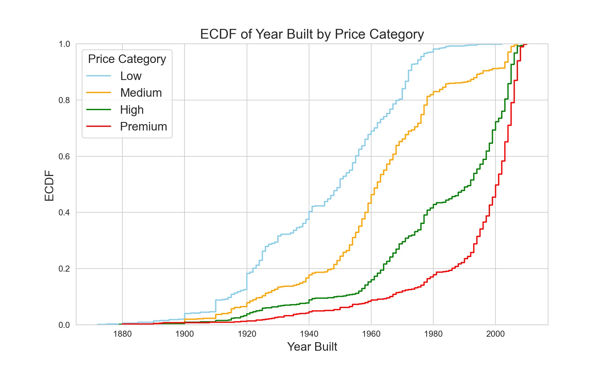 From the plot, it is evident that lower and medium-priced homes have a higher frequency of being built in earlier years, while high and premium-priced homes tend to be of more recent construction. Armed with the understanding that property age varies significantly across price segments, you find a compelling reason to use
 Pandas.concat().
Stacking Datasets with Pandas.concat()
As data scientists, you often need to stack datasets or their segments to glean deeper insights. The Pandas.concat() function is your Swiss Army knife for such tasks, enabling you to combine DataFrames with precision and flexibility. This powerful function is reminiscent of SQL’s UNION operation when it comes to combining rows from different datasets. Yet, Pandas.concat() stands out by offering greater flexibility—it allows both vertical and horizontal concatenation of DataFrames. This feature becomes indispensable when you work with datasets that have non-matching columns or when you need to align them by common columns, significantly broadening your analytical scope. Here’s how you can combine the segmented DataFrames to compare the broader market categories of ‘affordable’ and ‘luxury’ homes:
|
1 2 3 4 5 |
# Stacking Low and Medium categories into an "affordable_homes" DataFrame affordable_homes = pd.concat([low_priced_homes, medium_priced_homes]) # Stacking High and Premium categories into a "luxury_homes" DataFrame luxury_homes = pd.concat([high_priced_homes, premium_priced_homes]) |
Through this, you can juxtapose and analyze the characteristics that differentiate more accessible homes from their expensive counterparts.
Kick-start your project with my book The Beginner’s Guide to Data Science. It provides self-study tutorials with working code.
Pivoting and Merging: Dancing with Pandas
Having segmented the dataset into ‘affordable’ and ‘luxury’ homes and explored the distribution of their construction years, you now turn your attention to another dimension that influences property value: amenities, with a focus on the number of fireplaces. Before you delve into merging datasets—a task for which Pandas.merge() stands as a robust tool comparable to SQL’s JOIN—you must first examine your data through a finer lens.
Pivot tables are an excellent tool for summarizing and analyzing specific data points within the segments. They provide you with the ability to aggregate data and reveal patterns that can inform your subsequent merge operations. By creating pivot tables, you can compile a clear and organized overview of the average living area and the count of homes, categorized by the number of fireplaces. This preliminary analysis will not only enrich your understanding of the two market segments but also set a solid foundation for the intricate merging techniques you want to show.
Creating Insightful Summaries with Pivot Tables
Let’s commence by constructing pivot tables for the ‘affordable’ and ‘luxury’ home categories. These tables will summarize the average gross living area (GrLivArea) and provide a count of homes for each category of fireplaces present. Such analysis is crucial as it illustrates a key aspect of home desirability and value—the presence and number of fireplaces—and how these features vary across different segments of the housing market.
|
1 2 3 4 5 6 7 8 9 10 11 12 13 14 15 16 |
# Creating pivot tables with both mean living area and home count pivot_affordable = affordable_homes.pivot_table(index='Fireplaces', aggfunc={'GrLivArea': 'mean', 'Fireplaces': 'count'}) pivot_luxury = luxury_homes.pivot_table(index='Fireplaces', aggfunc={'GrLivArea': 'mean', 'Fireplaces': 'count'}) # Renaming columns and index labels separately pivot_affordable.rename(columns={'GrLivArea': 'AvLivArea', 'Fireplaces': 'HmCount'}, inplace=True) pivot_affordable.index.name = 'Fire' pivot_luxury.rename(columns={'GrLivArea': 'AvLivArea', 'Fireplaces': 'HmCount'}, inplace=True) pivot_luxury.index.name = 'Fire' # View the pivot tables print(pivot_affordable) print(pivot_luxury) |
With these pivot tables, you can now easily visualize and compare how features like fireplaces correlate with the living area and how frequently they occur within each segment. The first pivot table was crafted from the ‘affordable’ homes DataFrame and demonstrates that most properties within this grouping do not have any fireplaces.
|
1 2 3 4 5 |
HmCount AvLivArea Fire 0 931 1159.050483 1 323 1296.808050 2 38 1379.947368 |
The second pivot table which was derived from the ‘luxury’ homes DataFrame illustrates that properties within this subset have a range of zero to four fireplaces, with one fireplace being the most common.
|
1 2 3 4 5 6 7 |
HmCount AvLivArea Fire 0 310 1560.987097 1 808 1805.243812 2 157 1998.248408 3 11 2088.090909 4 1 2646.000000 |
With the creation of the pivot tables, you’ve distilled the data into a form that’s ripe for the next analytical step—melding these insights using Pandas.merge() to see how these features interplay across the broader market.
The pivot table above is the simplest one. The more advanced version allows you to specify not only the index but also the columns in the argument. The idea is similar: you pick two columns, one specified as index and the other as columns argument, which the values of these two columns are aggregated and become a matrix. The value in the matrix is then the result as specified by the aggfunc argument.
You can consider the following example, which produces a similar result as above:
|
1 2 3 4 |
pivot = Ames.pivot_table(index="Fireplaces", columns="Price_Category", aggfunc={'GrLivArea':'mean', 'Fireplaces':'count'}) print(pivot) |
This prints:
|
1 2 3 4 5 6 7 8 |
Fireplaces GrLivArea Price_Category High Low Medium Premium High Low Medium Premium Fireplaces 0 228.0 520.0 411.0 82.0 1511.912281 1081.496154 1257.172749 1697.439024 1 357.0 116.0 207.0 451.0 1580.644258 1184.112069 1359.961353 1983.031042 2 52.0 9.0 29.0 105.0 1627.384615 1184.888889 1440.482759 2181.914286 3 5.0 NaN NaN 6.0 1834.600000 NaN NaN 2299.333333 4 NaN NaN NaN 1.0 NaN NaN NaN 2646.000000 |
You can see the result is the same by comparing, for example, the count of low and medium homes of zero fireplaces to be 520 and 411, respectively, which 931 = 520+411 as you obtained previously. You see the second-level columns are labeled with Low, Medium, High, and Premium because you specified “Price_Category” as columns argument in pivot_table(). The dictionary to the aggfunc argument gives the top-level columns.
Towards Deeper Insights: Leveraging Pandas.merge() for Comparative Analysis
Having illuminated the relationship between fireplaces, home count, and living area within the segmented datasets, you are well-positioned to take your analysis one step further. With Pandas.merge(), you can overlay these insights, akin to how SQL’s JOIN operation combines records from two or more tables based on a related column. This technique will allow you to merge the segmented data on a common attribute, enabling a comparative analysis that transcends categorization.
Our first operation uses an outer join to combine the affordable and luxury home datasets, ensuring no data is lost from either category. This method is particularly illuminating as it reveals the full spectrum of homes, regardless of whether they share a common number of fireplaces.
|
1 2 |
pivot_outer_join = pd.merge(pivot_affordable, pivot_luxury, on='Fire', how='outer', suffixes=('_aff', '_lux')).fillna(0) print(pivot_outer_join) |
|
1 2 3 4 5 6 7 |
HmCount_aff AvLivArea_aff HmCount_lux AvLivArea_lux Fire 0 931.0 1159.050483 310 1560.987097 1 323.0 1296.808050 808 1805.243812 2 38.0 1379.947368 157 1998.248408 3 0.0 0.000000 11 2088.090909 4 0.0 0.000000 1 2646.000000 |
In this case, the outer join functions similarly to a right join, capturing every distinct category of fireplaces present across both market segments. It is interesting to note that there are no properties within the affordable price range that have 3 or 4 fireplaces. You need to specify two strings for the suffixes argument because the “HmCount” and “AvLivArea” columns exist in both DataFrames pivot_affordable and pivot_luxury. You see “HmCount_aff” is zero for 3 and 4 fireplaces because you need them as a placeholder for the outer join to match the rows in pivot_luxury.
Next, you can use the inner join, focusing on the intersection where affordable and luxury homes share the same number of fireplaces. This approach highlights the core similarities between the two segments.
|
1 2 |
pivot_inner_join = pd.merge(pivot_affordable, pivot_luxury, on='Fire', how='inner', suffixes=('_aff', '_lux')) print(pivot_inner_join) |
|
1 2 3 4 5 |
HmCount_aff AvLivArea_aff HmCount_lux AvLivArea_lux Fire 0 931 1159.050483 310 1560.987097 1 323 1296.808050 808 1805.243812 2 38 1379.947368 157 1998.248408 |
Interestingly, in this context, the inner join mirrors the functionality of a left join, showcasing categories present in both datasets. You do not see the rows corresponding to 3 and 4 fireplaces because it is the result of inner join, and there are no such rows in the DataFrame pivot_affordable.
Lastly, a cross join allows you to examine every possible combination of affordable and luxury home attributes, offering a comprehensive view of how different features interact across the entire dataset. The result is sometimes called the Cartesian product of rows from the two DataFrames.
|
1 2 3 4 5 6 |
# Resetting index to display cross join pivot_affordable.reset_index(inplace=True) pivot_luxury.reset_index(inplace=True) pivot_cross_join = pd.merge(pivot_affordable, pivot_luxury, how='cross', suffixes=('_aff', '_lux')).round(2) print(pivot_cross_join) |
The result is as follows, which demonstrates the result of cross-join but does not provide any special insight in the context of this dataset.
|
1 2 3 4 5 6 7 8 9 10 11 12 13 14 15 16 |
Fire_aff HmCount_aff AvLivArea_aff Fire_lux HmCount_lux AvLivArea_lux 0 0 931 1159.05 0 310 1560.99 1 0 931 1159.05 1 808 1805.24 2 0 931 1159.05 2 157 1998.25 3 0 931 1159.05 3 11 2088.09 4 0 931 1159.05 4 1 2646.00 5 1 323 1296.81 0 310 1560.99 6 1 323 1296.81 1 808 1805.24 7 1 323 1296.81 2 157 1998.25 8 1 323 1296.81 3 11 2088.09 9 1 323 1296.81 4 1 2646.00 10 2 38 1379.95 0 310 1560.99 11 2 38 1379.95 1 808 1805.24 12 2 38 1379.95 2 157 1998.25 13 2 38 1379.95 3 11 2088.09 14 2 38 1379.95 4 1 2646.00 |
Deriving Insights from Merged Data
With these merge operations complete, you can delve into the insights they unearth. Each join type sheds light on different aspects of the housing market:
- The outer join reveals the broadest range of properties, emphasizing the diversity in amenities like fireplaces across all price points.
- The inner join refines your view, focusing on the direct comparisons where affordable and luxury homes overlap in their fireplace counts, providing a clearer picture of standard market offerings.
- The cross join offers an exhaustive combination of features, ideal for hypothetical analyses or understanding potential market expansions.
After conducting these merges, you observe amongst affordable homes that:
- Homes with no fireplaces have an average gross living area of approximately 1159 square feet and constitute the largest segment.
- As the number of fireplaces increases to one, the average living area expands to around 1296 square feet, underscoring a noticeable uptick in living space.
- Homes with two fireplaces, though fewer in number, boast an even larger average living area of approximately 1379 square feet, highlighting a trend where additional amenities correlate with more generous living spaces.
In contrast, you observe amongst luxury homes that:
- The luxury segment presents a starting point with homes without fireplaces averaging 1560 square feet, significantly larger than their affordable counterparts.
- The leap in the average living area is more pronounced as the number of fireplaces increases, with one-fireplace homes averaging about 1805 square feet.
- Homes with two fireplaces further amplify this trend, offering an average living area of nearly 1998 square feet. The rare presence of three and even four fireplaces in homes marks a significant increase in living space, peaking at an expansive 2646 square feet for a home with four fireplaces.
These observations offer a fascinating glimpse into how amenities such as fireplaces not only add to the desirability of homes but also appear to be a marker of larger living spaces, particularly as you move from affordable to luxury market segments.
Want to Get Started With Beginner's Guide to Data Science?
Take my free email crash course now (with sample code).
Click to sign-up and also get a free PDF Ebook version of the course.
Further Reading
Tutorials
Resources
Summary
In this comprehensive exploration of data harmonization techniques using Python and Pandas, you’ve delved into the intricacies of segmenting, concatenating, pivoting, and merging datasets. From dividing datasets into meaningful segments based on price categories to visualizing trends in construction years, and from stacking datasets to analyzing broader market categories using Pandas.concat(), to summarizing and analyzing data points within segments using pivot tables, you’ve covered a wide array of essential data manipulation and analysis techniques. Additionally, by leveraging Pandas.merge() to compare segmented datasets and derive insights from different types of merge operations (outer, inner, cross), you’ve unlocked the power of data integration and exploration. Armed with these techniques, data scientists and analysts can navigate the complex landscape of data with confidence, uncovering hidden patterns, and extracting valuable insights that drive informed decision-making.
Specifically, you learned:
- How to divide datasets into meaningful segments based on price categories and visualize trends in construction years.
- The use of
Pandas.concat()to stack datasets and analyze broader market categories. - The role of pivot tables in summarizing and analyzing data points within segments.
- How to leverage
Pandas.merge()to compare segmented datasets and derive insights from different types of merge operations (outer, inner, cross).
Do you have any questions? Please ask your questions in the comments below, and I will do my best to answer.
Get Started on The Beginner's Guide to Data Science!
Learn the mindset to become successful in data science projects
...using only minimal math and statistics, acquire your skill through short examples in Python
Discover how in my new Ebook:
The Beginner's Guide to Data Science
It provides self-study tutorials with all working code in Python to turn you from a novice to an expert. It shows you how to find outliers, confirm the normality of data, find correlated features, handle skewness, check hypotheses, and much more...all to support you in creating a narrative from a dataset.


No comments yet.