Our discussion so far has been anchored around the family of linear models. Each approach, from simple linear regression to penalized techniques like Lasso and Ridge, has offered invaluable insights into predicting continuous outcomes based on linear relationships. As we begin our exploration of tree-based models, it’s important to reiterate that our focus remains on regression. While tree-based models are versatile, how they handle, evaluate, and optimize outcomes differs significantly between classification and regression tasks.
Tree-based regression models are powerful tools in machine learning that can handle non-linear relationships and complex data structures. In this post, we’ll introduce a spectrum of tree-based models, highlighting their strengths and weaknesses. Then, we’ll dive into a practical example of implementing and visualizing a Decision Tree using sklearn and matplotlib. Finally, we’ll enhance our visualization using dtreeviz, a tool that provides more detailed insights.
Kick-start your project with my book Next-Level Data Science. It provides self-study tutorials with working code.
Let’s get started.
Branching Out: Exploring Tree-Based Models for Regression Photo by Michael Held. Some rights reserved.
Overview
This post is divided into three parts; they are:
A Spectrum of Tree-Based Regression Models
Visualization of a Decision Tree with sklearn and matplotlib
An Enhanced Visualization with dtreeviz
A Spectrum of Tree-Based Regression Models
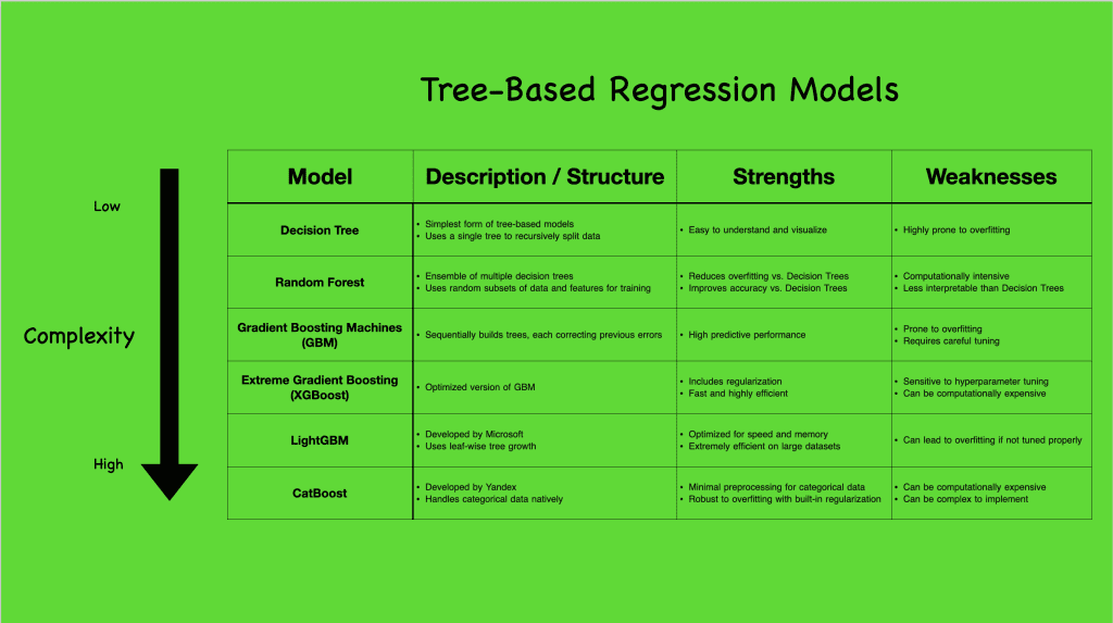
Tree-based models come in various complexities, each with unique capabilities and suited for different scenarios. To better understand the range of tree-based regression models, let’s take a look at the following visual that summarizes a few popular ones:
Tree-based regression models. Click to enlarge.
Starting with the Decision Tree (CART), the simplest form, we see a model that constructs a single tree to capture data splits. Though straightforward, it’s prone to overfitting but sets the stage for more complex models. Progressing to ensemble methods like Random Forest and Gradient Boosting Machines (GBM), and even further to advanced algorithms like XGBoost, LightGBM, and CatBoost, we observe increasingly sophisticated ways to handle data, reduce overfitting, and boost predictive accuracy.
While linear models assume a direct, linear relationship between features and outcomes, tree-based models break the mold by effortlessly capturing non-linear interactions. This non-linearity allows tree-based models to uncover intricate patterns in the data, making them particularly powerful in real-world applications where relationships between variables are seldom purely linear. They are robust to outliers and flexible with different data types, making no stringent demands on feature scaling. However, this flexibility comes with challenges, notably overfitting and computational demands, especially as the models grow in complexity.
Want to Get Started With Next-Level Data Science?
Take my free email crash course now (with sample code).
Click to sign-up and also get a free PDF Ebook version of the course.
Visualization of a Decision Tree with sklearn and matplotlib
In the previous section, we explored a spectrum of tree-based regression models and their varying complexities. Now, let’s dive deeper into one of the simplest yet fundamental models: the Decision Tree. We’ll use the Ames housing dataset to understand how a Decision Tree works in practice. The following code block demonstrates how to import the necessary libraries, extract numerical data without missing values (for simplicity), train a Decision Tree model, and visualize the resulting tree structure using Matplotlib and the in-built sklearn.tree.plot_tree function:
1
2
3
4
5
6
7
8
9
10
11
12
13
14
15
16
17
18
19
20
21
22
23
24
25
26
# Import the necessary libraries
import pandas aspd
from sklearn import tree
import matplotlib.pyplot asplt
from sklearn.tree import DecisionTreeRegressor
from sklearn.model_selection import train_test_split
# Load all the numeric features without any missing values
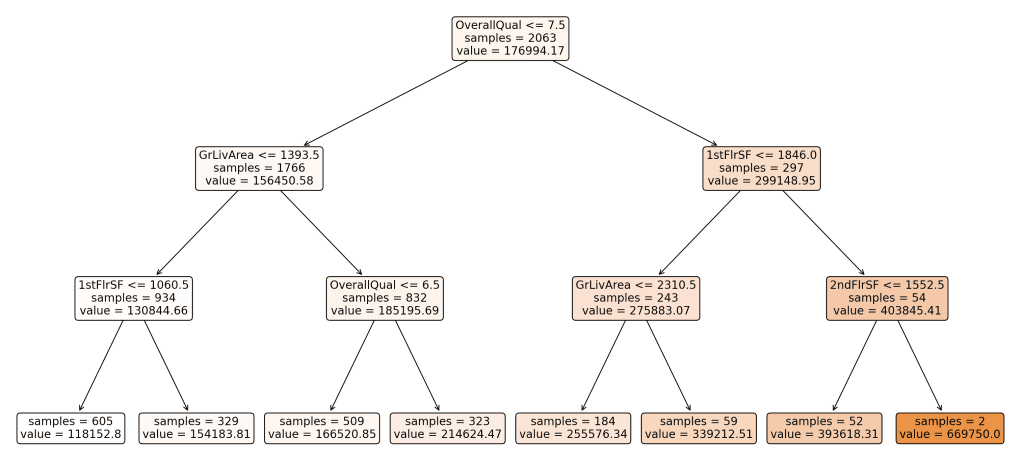
We deliberately set max_depth=3 to constrain the complexity of the tree. This parameter limits the maximum depth of the tree, ensuring that it does not grow too deep. By doing this, we make the tree simpler and easier to visualize, which helps in understanding the basic structure and decision-making process of the model without getting lost in too many details.
Here’s the resulting visualization of our Decision Tree:
Derived decision tree. Click to enlarge.
This tree represents how the model splits the data based on various features to predict the sale price of houses. Each node in the tree represents a decision point based on the value of a feature, and the leaves represent the final predicted values.
Understanding the Splits:
Why did the tree split the way it did?
The Decision Tree algorithm splits the data at each node to minimize the Mean Squared Error (MSE) of the target variable, which in this case is the sale price. MSE measures the average of the squares of the errors—that is, the difference between the predicted and actual values. By choosing splits that reduce MSE, the tree aims to create groups of data that are as homogeneous as possible in terms of the target variable.
What features were chosen for the split?
The features chosen for the splits in this tree include “OverallQual”, “GrLivArea”, “1stFlrSF”, and “2ndFlrSF’. These features were selected based on their ability to reduce the MSE when used to split the data. The levels or thresholds for these splits (e.g., OverallQual <= 7.5) were determined during the training process to optimize the separation of data points into more homogeneous groups.
Interpreting the Splits and Arrows:
Each node in the tree includes a feature and a threshold value. For example, the root node splits the data based on whether “OverallQual” is less than or equal to 7.5.
Arrows pointing left represent data points that meet the condition (e.g., OverallQual <= 7.5), while arrows pointing right represent data points that do not meet the condition (e.g., OverallQual > 7.5).
Subsequent splits further divide the data to refine the predictions, with each split aiming to reduce the MSE within the resulting groups.
Color Coding of Branches:
The branches in the visualization are color-coded from white to darker shades to indicate the predicted value at each node. Lighter colors represent lower predicted values, while darker shades indicate higher predicted values. This color gradient helps to visually differentiate the predictions across the tree and understand the distribution of sale prices.
Leaves and Final Predictions:
The leaves of the tree represent the final predicted values for the target variable. Each leaf node shows the predicted sale price (e.g., value = 118152.80) and the number of samples that fall into that leaf (e.g., samples = 605). These values are calculated as the average sale price of all data points within that group.
The Decision Tree model is straightforward and interpretable, making it an excellent starting point for understanding more complex tree-based models. However, as mentioned earlier, one major drawback is its tendency to overfit, especially with deeper trees. Overfitting occurs when the model captures noise in the training data, leading to poor generalization on unseen data.
An Enhanced Visualization with dtreeviz
In the previous part, we visualized a Decision Tree using matplotlib and the built-in sklearn.tree.plot_tree function to understand the decision-making process of the model. While this provides a good overview, more sophisticated tools are available that offer enhanced visualizations.
In this section, we will use dtreeviz, a library that provides detailed visualizations for Decision Trees. For a list of dependencies and libraries that may need to be installed depending on your operating system, please refer to this GitHub repository. The following code block demonstrates how to import the necessary libraries, prepare the data, train a Decision Tree model, and visualize the tree using dtreeviz.
1
2
3
4
5
6
7
8
9
10
11
12
13
14
15
16
17
18
19
20
21
22
23
24
25
26
27
28
29
# Import the necessary libraries
import pandas aspd
from sklearn.tree import DecisionTreeRegressor
from sklearn.model_selection import train_test_split
import dtreeviz
# Load all the numeric features without any missing values
# In Jupyter Notebook, you can directly view the visual using the below:
# viz.view() # Renders and displays the SVG visualization
# In PyCharm, you can render and display the SVG image:
v=viz.view()# render as SVG into internal object
v.show()# pop up window
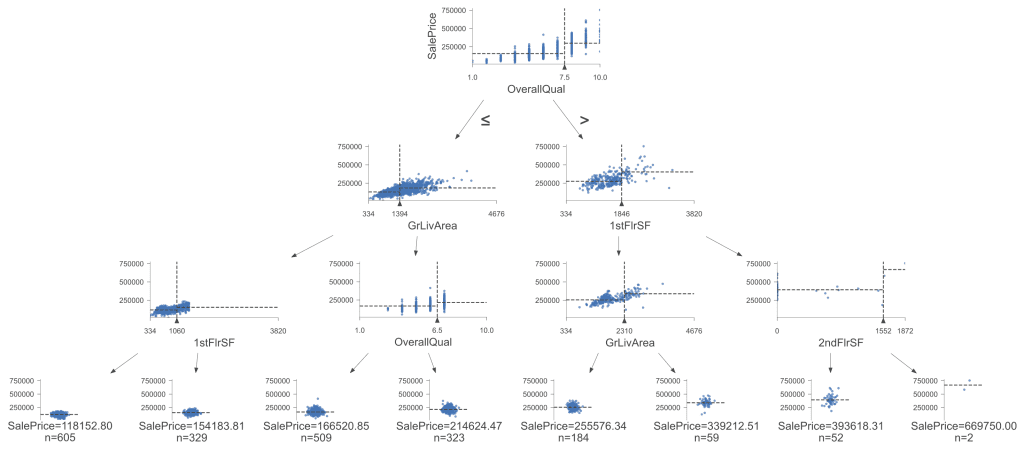
Here’s the enhanced visualization (once again with max_depth=3) using dtreeviz:
Visualization of the decision tree. Click to enlarge.
This visualization provides more information and a detailed view of the Decision Tree. The scatter plots at each node help us understand each split’s feature distributions and impact, making it particularly useful for understanding complex splits and the importance of different features. The tree splits on the same rules and decision boundaries as our first visual, leading to the same conclusions. However, dtreeviz makes it easier to visualize homogeneous or clustered data as the trees get deeper, providing a clearer picture of how data points group together based on the splits.
In this post, we introduced tree-based regression models, focusing on Decision Trees. We started with an overview of various tree-based models, highlighting their strengths and weaknesses. We then visualized a Decision Tree using sklearn and matplotlib to understand its basic structure and decision-making process. Finally, we enhanced the visualization using dtreeviz, providing deeper insights and a more interactive model view.
Specifically, you learned:
The strengths and weaknesses of various tree-based regression models.
How to train and visualize a Decision Tree using sklearn and matplotlib.
How to use dtreeviz for more detailed Decision Tree visualizations.
Do you have any questions? Please ask your questions in the comments below, and I will do my best to answer.
Get Started on Next-Level Data Science!
Master the mindset for success in data science projects
..build expertise through clear, practical examples, with minimal complex math and a focus on hands-on learning.
It provides self-study tutorials designed to guide you from intermediate to advanced. Learn to optimize workflows, manage multicollinearity, refine tree-based models, and handle missing data—and more, to help you achieve deeper insights and effective storytelling with data.
Advance your data science skills with real-world exercises


No comments yet.