Real-world time series forecasting is challenging for a whole host of reasons not limited to problem features such as having multiple input variables, the requirement to predict multiple time steps, and the need to perform the same type of prediction for multiple physical sites.
The EMC Data Science Global Hackathon dataset, or the ‘Air Quality Prediction‘ dataset for short, describes weather conditions at multiple sites and requires a prediction of air quality measurements over the subsequent three days.
In this tutorial, you will discover and explore the Air Quality Prediction dataset that represents a challenging multivariate, multi-site, and multi-step time series forecasting problem.
After completing this tutorial, you will know:
How to load and explore the chunk-structure of the dataset.
How to explore and visualize the input and target variables for the dataset.
How to use the new understanding to outline a suite of methods for framing the problem, preparing the data, and modeling the dataset.
Kick-start your project with my new book Deep Learning for Time Series Forecasting, including step-by-step tutorials and the Python source code files for all examples.
Let’s get started.
Update Apr/2019: Fixed bug in the calculation of the total missing values (thanks zhangzhe).
How to Load, Visualize, and Explore a Complex Multivariate Multistep Time Series Forecasting Dataset Photo by H Matthew Howarth, some rights reserved.
Tutorial Overview
This tutorial is divided into seven parts; they are:
Problem Description
Load Dataset
Chunk Data Structure
Input Variables
Target Variables
A Wrinkle With Target Variables
Thoughts on Modeling
Problem Description
The EMC Data Science Global Hackathon dataset, or the ‘Air Quality Prediction‘ dataset for short, describes weather conditions at multiple sites and requires a prediction of air quality measurements over the subsequent three days.
Specifically, weather observations such as temperature, pressure, wind speed, and wind direction are provided hourly for eight days for multiple sites. The objective is to predict air quality measurements for the next three days at multiple sites. The forecast lead times are not contiguous; instead, specific lead times must be forecast over the 72 hour forecast period; they are:
1
+1, +2, +3, +4, +5, +10, +17, +24, +48, +72
Further, the dataset is divided into disjoint but contiguous chunks of data, with eight days of data followed by three days that require a forecast.
Not all observations are available at all sites or chunks and not all output variables are available at all sites and chunks. There are large portions of missing data that must be addressed.
Submissions for the competition were evaluated against the true observations that were withheld from participants and scored using Mean Absolute Error (MAE). Submissions required the value of -1,000,000 to be specified in those cases where a forecast was not possible due to missing data. In fact, a template of where to insert missing values was provided and required to be adopted for all submissions (what a pain).
A winning entrant achieved a MAE of 0.21058 on the withheld test set (private leaderboard) using random forest on lagged observations. A writeup of this solution is available in the post:
In this tutorial, we will explore this dataset in order to better understand the nature of the forecast problem and suggest approaches for how it may be modeled.
Load Dataset
The first step is to download the dataset and load it into memory.
The dataset can be downloaded for free from the Kaggle website. You may have to create an account and log in, in order to be able to download the dataset.
Download the entire dataset, e.g. “Download All” to your workstation and unzip the archive in your current working directory with the folder named ‘AirQualityPrediction‘
You should have five files in the AirQualityPrediction/ folder; they are:
SiteLocations.csv
SiteLocations_with_more_sites.csv
SubmissionZerosExceptNAs.csv
TrainingData.csv
sample_code.r
Our focus will be the ‘TrainingData.csv‘ that contains the training dataset, specifically data in chunks where each chunk is eight contiguous days of observations and target variables.
The test dataset (remaining three days of each chunk) is not available for this dataset at the time of writing.
Open the ‘TrainingData.csv‘ file and review the contents. The unzipped data file is relatively small (21 megabytes) and will easily fit into RAM.
Reviewing the contents of the file, we can see that the data file contains a header row.
We can also see that missing data is marked with the ‘NA‘ value, which Pandas will automatically convert to NumPy.NaN.
We can see that the ‘weekday‘ column contains the day as a string, whereas all other data is numeric.
Below are the first few lines of the data file for reference.
We can also get a quick idea of how much missing data there is in the dataset. We can do that by first trimming the first few columns to remove the string weekday data and convert the remaining columns to floating point values.
1
2
3
# trim and transform to floats
values=dataset.values
data=values[:,6:].astype('float32')
We can then calculate the total number of missing observations and the percentage of values that are missing.
Running the example first prints the shape of the loaded dataset.
We can see that we have about 37,000 rows and 95 columns. We know these numbers are misleading given that the data is in fact divided into chunks and the columns are divided into the same observations at different sites.
We can also see that a little over 40% of the data is missing. This is a lot. The data is very patchy and we are going to have to understand this well before modeling the problem.
1
2
(37821, 95)
Total Missing: 1922092/3366069 (57.1%)
Need help with Deep Learning for Time Series?
Take my free 7-day email crash course now (with sample code).
Click to sign-up and also get a free PDF Ebook version of the course.
Chunk Data Structure
A good starting point is to look at the data in terms of the chunks.
Chunk Durations
We can group data by the ‘chunkID’ variable (column index 1).
If each chunk is eight days and the observations are hourly, then we would expect (8 * 24) or 192 rows of data per chunk.
If there are 37,821 rows of data, then there must be chunks with more or less than 192 hours as 37,821/192 is about 196.9 chunks.
Let’s first split the data into chunks. We can first get a list of the unique chunk identifiers.
1
chunk_ids=unique(values[:,1])
We can then collect all rows for each chunk identifier and store them in a dictionary for easy access.
1
2
3
4
5
chunks=dict()
# sort rows by chunk id
forchunk_id inchunk_ids:
selection=values[:,chunk_ix]==chunk_id
chunks[chunk_id]=values[selection,:]
Below defines a function named to_chunks() that takes a NumPy array of the loaded data and returns a dictionary of chunk_id to rows for the chunk.
1
2
3
4
5
6
7
8
9
10
# split the dataset by 'chunkID', return a dict of id to rows
def to_chunks(values,chunk_ix=1):
chunks=dict()
# get the unique chunk ids
chunk_ids=unique(values[:,chunk_ix])
# group rows by chunk id
forchunk_id inchunk_ids:
selection=values[:,chunk_ix]==chunk_id
chunks[chunk_id]=values[selection,:]
returnchunks
The ‘position_within_chunk‘ in the data file indicates the order of a row within a chunk. At this stage, we assume that rows are already ordered and do not need to be sorted. A skim of the raw data file seems to confirm this assumption.
Once the data is sorted into chunks, we can calculate the number of rows in each chunk and have a look at the distribution, such as with a box and whisker plot.
1
2
3
4
5
6
7
8
9
10
11
12
# plot distribution of chunk durations
def plot_chunk_durations(chunks):
# chunk durations in hours
chunk_durations=[len(v)fork,vinchunks.items()]
# boxplot
pyplot.subplot(2,1,1)
pyplot.boxplot(chunk_durations)
# histogram
pyplot.subplot(2,1,2)
pyplot.hist(chunk_durations)
# histogram
pyplot.show()
The complete example that ties all of this together is listed below
1
2
3
4
5
6
7
8
9
10
11
12
13
14
15
16
17
18
19
20
21
22
23
24
25
26
27
28
29
30
31
32
33
34
35
36
37
# split data into chunks
from numpy import unique
from pandas import read_csv
from matplotlib import pyplot
# split the dataset by 'chunkID', return a dict of id to rows
Running the example first prints the number of chunks in the dataset.
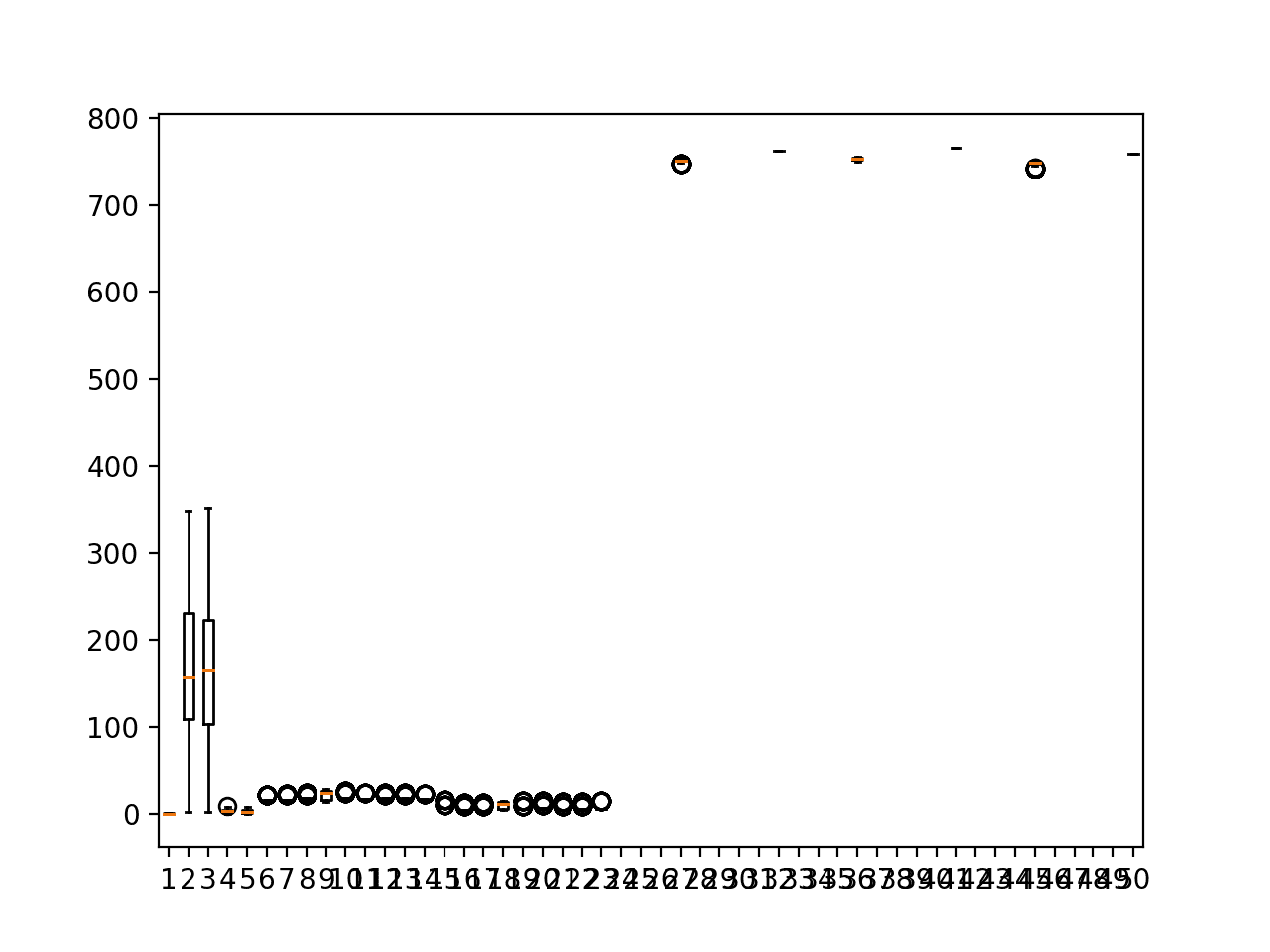
We can see that there are 208, which suggests that indeed the number of hourly observations must vary across the chunks.
1
Total Chunks: 208
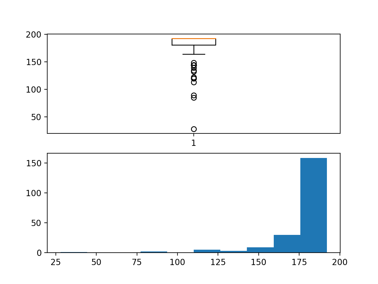
A box and whisker plot and a histogram plot of chunk durations is created. We can see that indeed the median is 192, meaning that most chunks have eight days of observations or close to it.
We can also see a long tail of durations down to about 25 rows. Although there are not many of these cases, we would expect that will be challenging to forecast given the lack of data.
The distribution also raises questions about how contiguous the observations within each chunk may be.
Box and whisker plot and Histogram plot of chunk duration in hours
Chunk Contiguousness
It may be helpful to get an idea of how contiguous (or not) the observations are within those chunks that do not have the full eight days of data.
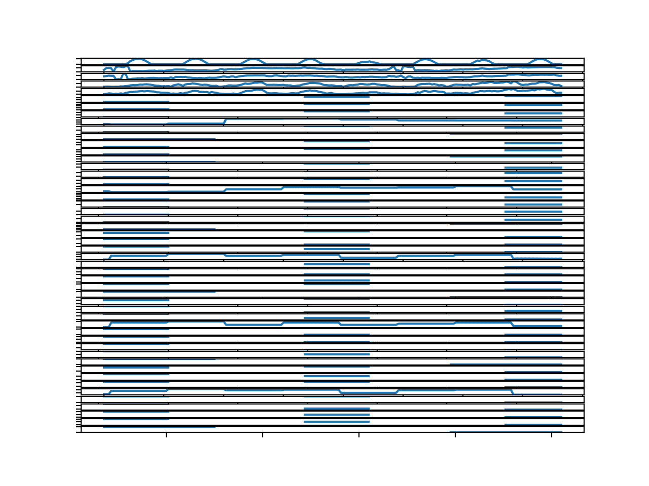
One approach to considering this is to create a line plot for each discontiguous chunk and show the gaps in the observations.
We can do this on a single plot. Each chunk has a unique identifier, from 1 to 208, and we can use this as the value for the series and mark missing observations within the eight day interval via NaN values that will not appear on the plot.
Inverting this, we can assume that we have NaN values for all time steps within a chunk, then use the ‘position_within_chunk‘ column (index 2) to determine the time steps that do have values and mark them with the chunk id.
The plot_discontinuous_chunks() below implements this behavior, creating one series or line for each chunk with missing rows all on the same plot. The expectation is that breaks in the line will help us see how contiguous or discontiguous these incomplete chunks happen to be.
Running the example creates a single figure with one line for each of the chunks with missing data.
The number and lengths of the breaks in the line for each chunk give an idea of how discontiguous the observations within each chunk happen to be.
Many of the chunks do have long stretches of contiguous data, which is a good sign for modeling.
There are cases where chunks have very few observations and those observations that are present are in small contiguous patches. These may be challenging to model.
Further, not all of these chunks have observations at the end of chunk: the period right before a forecast is required. These specifically will be a challenge for those models that seek to persist recent observations.
The discontinuous nature of the series data within the chunks will also make it challenging to evaluate models. For example, one cannot simply split chunk data in half, train on the first half and test on the second when the observations are patchy. At least, when the incomplete chunk data is considered.
Line plots of chunks with discontinuous observations
Daily Coverage Within Chunks
The discontiguous nature of the chunks also suggests that it may be important to look at the hours covered by each chunk.
The time of day is important in environmental data, and models that assume that each chunk covers the same daily or weekly cycle may stumble if the start and end time of day vary across chunks.
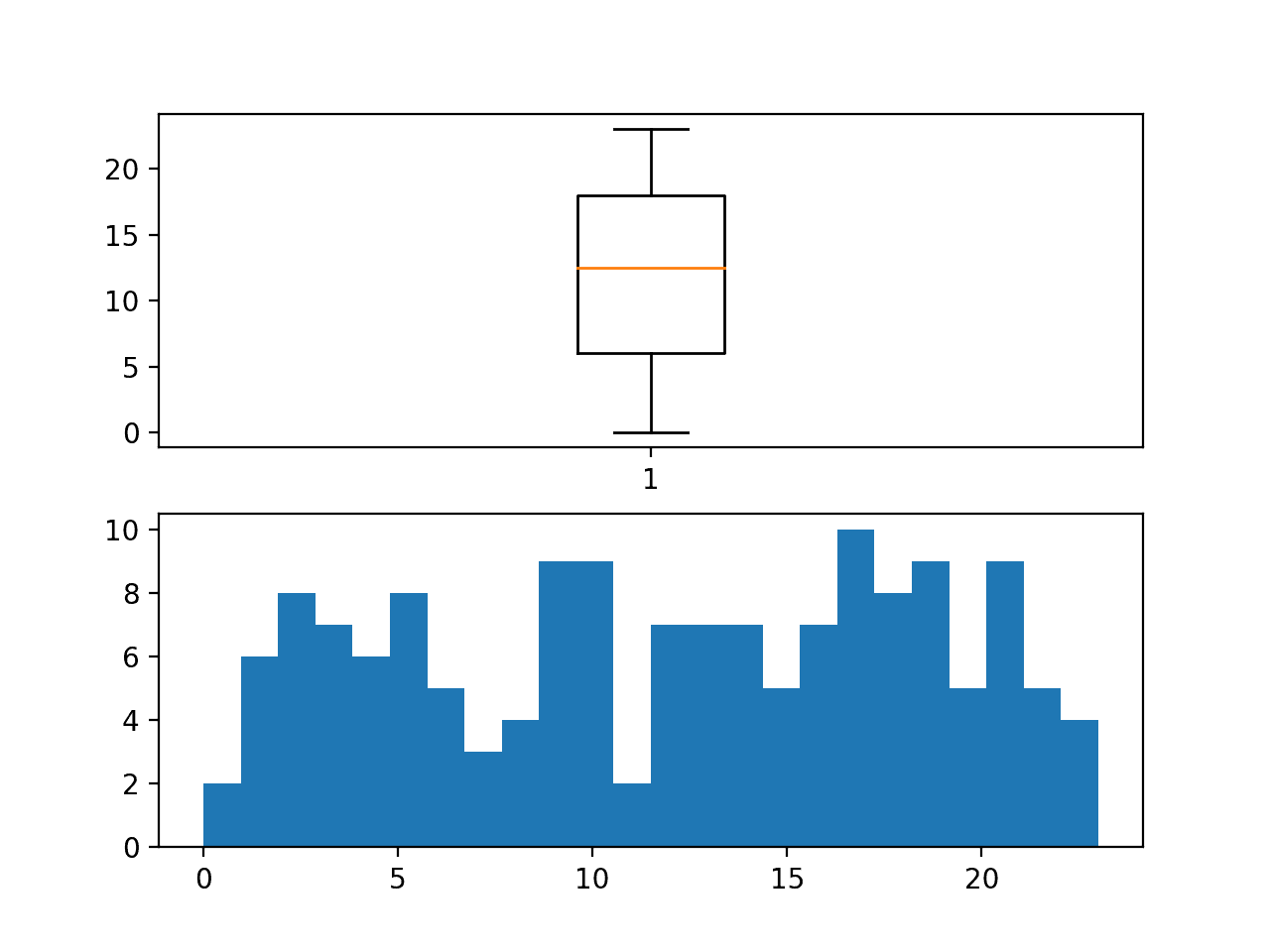
We can quickly check this by plotting the distribution of the first hour (in a 24 hour day) of each chunk.
The number of bins in the histogram is set to 24 so we can clearly see the distribution for each hour of the day in 24-hour time.
Further, when collecting the first hour of the chunk, we are careful to only collect it from those chunks that have all eight days of data, in case a chunk with missing data does not have observations at the beginning of the chunk, which we know happens.
Running the example creates a box and whisker plot and a histogram of the first hour within each chunk.
We can see a reasonably uniform distribution of the start time across the 24 hours in the day.
Further, this means that the interval to be forecast for each chunk will also vary across the 24 hour period. This adds a wrinkle for models that might expect a standard three day forecast period (midnight to midnight).
Distribution of first hour in observations within each chunk
Now that we have some idea of the chunk-structure of the data, let’s take a closer look at the input variables that describe the meteorological observations.
Input Variables
There are 56 input variables.
The first six (indexes 0 to 5) are metadata information for the chunk and time of the observations. They are:
1
2
3
4
5
6
rowID
chunkID
position_within_chunk
month_most_common
weekday
hour
The remaining 50 describe meteorological information for specific sites; they are:
1
2
3
4
5
6
7
8
9
10
11
12
13
14
15
16
17
18
19
20
21
22
23
24
25
26
27
28
29
30
31
32
33
34
35
36
37
38
39
40
41
42
43
44
45
46
47
48
49
50
Solar.radiation_64
WindDirection..Resultant_1
WindDirection..Resultant_1018
WindSpeed..Resultant_1
WindSpeed..Resultant_1018
Ambient.Max.Temperature_14
Ambient.Max.Temperature_22
Ambient.Max.Temperature_50
Ambient.Max.Temperature_52
Ambient.Max.Temperature_57
Ambient.Max.Temperature_76
Ambient.Max.Temperature_2001
Ambient.Max.Temperature_3301
Ambient.Max.Temperature_6005
Ambient.Min.Temperature_14
Ambient.Min.Temperature_22
Ambient.Min.Temperature_50
Ambient.Min.Temperature_52
Ambient.Min.Temperature_57
Ambient.Min.Temperature_76
Ambient.Min.Temperature_2001
Ambient.Min.Temperature_3301
Ambient.Min.Temperature_6005
Sample.Baro.Pressure_14
Sample.Baro.Pressure_22
Sample.Baro.Pressure_50
Sample.Baro.Pressure_52
Sample.Baro.Pressure_57
Sample.Baro.Pressure_76
Sample.Baro.Pressure_2001
Sample.Baro.Pressure_3301
Sample.Baro.Pressure_6005
Sample.Max.Baro.Pressure_14
Sample.Max.Baro.Pressure_22
Sample.Max.Baro.Pressure_50
Sample.Max.Baro.Pressure_52
Sample.Max.Baro.Pressure_57
Sample.Max.Baro.Pressure_76
Sample.Max.Baro.Pressure_2001
Sample.Max.Baro.Pressure_3301
Sample.Max.Baro.Pressure_6005
Sample.Min.Baro.Pressure_14
Sample.Min.Baro.Pressure_22
Sample.Min.Baro.Pressure_50
Sample.Min.Baro.Pressure_52
Sample.Min.Baro.Pressure_57
Sample.Min.Baro.Pressure_76
Sample.Min.Baro.Pressure_2001
Sample.Min.Baro.Pressure_3301
Sample.Min.Baro.Pressure_6005
Really, there are only eight meteorological input variables:
1
2
3
4
5
6
7
8
Solar.radiation
WindDirection..Resultant
WindSpeed..Resultant
Ambient.Max.Temperature
Ambient.Min.Temperature
Sample.Baro.Pressure
Sample.Max.Baro.Pressure
Sample.Min.Baro.Pressure
These variables are recorded across 23 unique sites; they are:
There is some overlap in the site identifiers used in the target variables, such as 1, 50, 64, etc.
There are site identifiers used in the target variables that are not used in the input variables, such as 4002. There are also site identifiers that are used in the input that are not used in the target identifiers, such as 15.
This suggests, at the very least, that not all variables are recorded at all locations. That recording stations are heterogeneous across sites. Further, there might be something special about sites that only collect measures of a given type or collect all measurements.
Let’s take a closer look at the data for the input variables.
Temporal Structure of Inputs for a Chunk
We can start off by looking at the structure and distribution of inputs per chunk.
The first few chunks that have all eight days of observations have the chunkId of 1, 3, and 5.
We can enumerate all of the input columns and create one line plot for each. This will create a time series line plot for each input variable to give a rough idea of how each varies across time.
We can repeat this for a few chunks to get an idea how the temporal structure may differ across chunks.
The function below named plot_chunk_inputs() takes the data in chunk format and a list of chunk ids to plot. It will create a figure with 50 line plots, one for each input variable, and n lines per plot, one for each chunk.
1
2
3
4
5
6
7
8
9
10
11
12
13
# plot all inputs for one or more chunk ids
def plot_chunk_inputs(chunks,c_ids):
pyplot.figure()
inputs=range(6,56)
foriinrange(len(inputs)):
ax=pyplot.subplot(len(inputs),1,i+1)
ax.set_xticklabels([])
ax.set_yticklabels([])
column=inputs[i]
forchunk_id inc_ids:
rows=chunks[chunk_id]
pyplot.plot(rows[:,column])
pyplot.show()
The complete example is listed below.
1
2
3
4
5
6
7
8
9
10
11
12
13
14
15
16
17
18
19
20
21
22
23
24
25
26
27
28
29
30
31
32
33
34
35
36
37
# plot inputs for a chunk
from numpy import unique
from pandas import read_csv
from matplotlib import pyplot
# split the dataset by 'chunkID', return a dict of id to rows
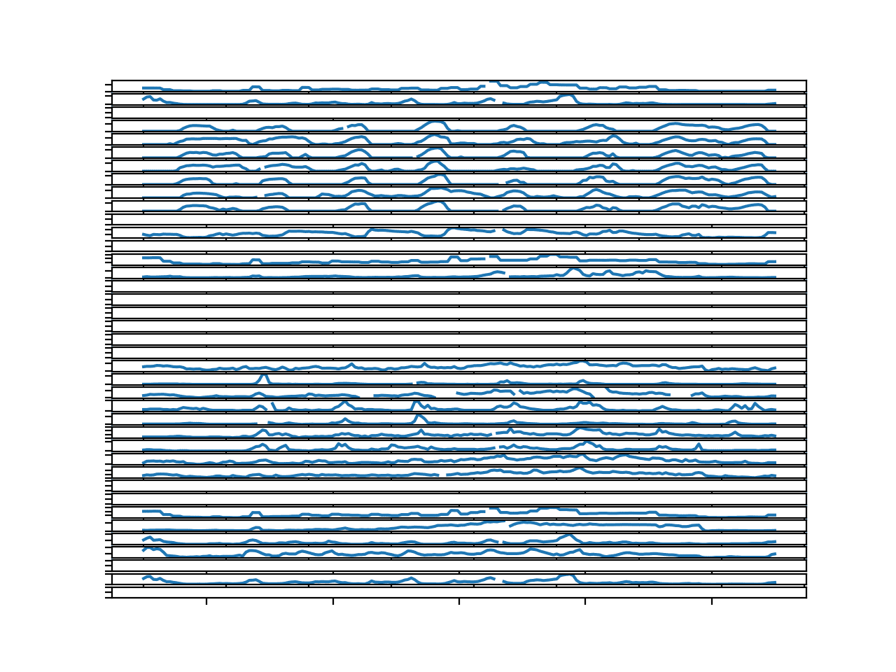
Running the example creates a single figure with 50 line plots, one for each of the meteorological input variables.
The plots are hard to see, so you may want to increase the size of the created figure.
We can see that the observations for the first five variables look pretty complete; these are solar radiation, wind speed, and wind direction. The rest of the variables appear pretty patchy, at least for this chunk.
Parallel Time Series Line Plots For All Input Variables for 1 Chunks
We can update the example and plot the input variables for the first three chunks with the full eight days of observations.
1
plot_chunk_inputs(chunks,[1,3,5])
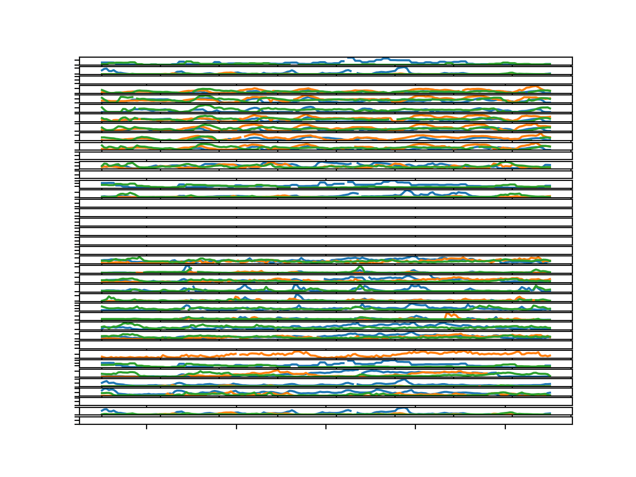
Running the example creates the same 50 line plots, each with three series or lines per plot, one for each chunk.
Again, the figure makes the individual plots hard to see, so you may need to increase the size of the figure to better review the patterns.
We can see that these three figures do show similar structures within each line plot. This is helpful finding as it suggests that it may be useful to model the same variables across multiple chunks.
Parallel Time Series Line Plots For All Input Variables for 3 Chunks
It does raise the question as to whether the distribution of the variables differs greatly across sites.
Input Data Distribution
We can look at the distribution of input variables crudely using box and whisker plots.
The plot_chunk_input_boxplots() below will create one box and whisker per input feature for the data for one chunk.
1
2
3
4
5
# boxplot for input variables for a chuck
def plot_chunk_input_boxplots(chunks,c_id):
rows=chunks[c_id]
pyplot.boxplot(rows[:,6:56])
pyplot.show()
The complete example is listed below.
1
2
3
4
5
6
7
8
9
10
11
12
13
14
15
16
17
18
19
20
21
22
23
24
25
26
27
28
29
30
31
# boxplots of inputs for a chunk
from numpy import unique
from numpy import isnan
from numpy import count_nonzero
from pandas import read_csv
from matplotlib import pyplot
# split the dataset by 'chunkID', return a dict of id to rows
def to_chunks(values,chunk_ix=1):
chunks=dict()
# get the unique chunk ids
chunk_ids=unique(values[:,chunk_ix])
# group rows by chunk id
forchunk_id inchunk_ids:
selection=values[:,chunk_ix]==chunk_id
chunks[chunk_id]=values[selection,:]
returnchunks
# boxplot for input variables for a chuck
def plot_chunk_input_boxplots(chunks,c_id):
rows=chunks[c_id]
pyplot.boxplot(rows[:,6:56])
pyplot.show()
# load data
dataset=read_csv('TrainingData.csv',header=0)
# group data by chunks
values=dataset.values
chunks=to_chunks(values)
# boxplot for input variables
plot_chunk_input_boxplots(chunks,1)
Running the example creates 50 boxplots, one for each input variable for the observations in the first chunk in the training dataset.
We can see that variables of the same type may have the same spread of observations, and each group of variables appears to have differing units. Perhaps degrees for wind direction, hectopascales for pressure, degrees Celsius for temperature, and so on.
Box and whisker plots of input variables for one chunk
It may be interesting to further investigate the distribution and spread of observations for each of the eight variable types. This is left as a further exercise.
We have some rough ideas about the input variables, and perhaps they may be useful in predicting the target variables. We cannot be sure.
We can now turn our attention to the target variables.
Target Variables
The goal of the forecast problem is to predict multiple variables across multiple sites for three days.
Running the example prints the number of unique variables and sites.
We can see that 39 target variables is far less than (12*14) 168 if we were predicting all variables for all sites.
1
2
Unique Variables: 12
Unique Sites: 14
Let’s take a closer look at the data for the target variables.
Temporal Structure of Targets for a Chunk
We can start off by looking at the structure and distribution of targets per chunk.
The first few chunks that have all eight days of observations have the chunkId of 1, 3, and 5.
We can enumerate all of the target columns and create one line plot for each. This will create a time series line plot for each target variable to give a rough idea of how it varies across time.
We can repeat this for a few chunks to get a rough idea of how the temporal structure may vary across chunks.
The function below, named plot_chunk_targets(), takes the data in chunk format and a list of chunk ids to plot. It will create a figure with 39 line plots, one for each target variable, and n lines per plot, one for each chunk.
1
2
3
4
5
6
7
8
9
10
11
12
13
# plot all targets for one or more chunk ids
def plot_chunk_targets(chunks,c_ids):
pyplot.figure()
targets=range(56,95)
foriinrange(len(targets)):
ax=pyplot.subplot(len(targets),1,i+1)
ax.set_xticklabels([])
ax.set_yticklabels([])
column=targets[i]
forchunk_id inc_ids:
rows=chunks[chunk_id]
pyplot.plot(rows[:,column])
pyplot.show()
The complete example is listed below.
1
2
3
4
5
6
7
8
9
10
11
12
13
14
15
16
17
18
19
20
21
22
23
24
25
26
27
28
29
30
31
32
33
34
35
36
37
# plot targets for a chunk
from numpy import unique
from pandas import read_csv
from matplotlib import pyplot
# split the dataset by 'chunkID', return a dict of id to rows
Running the example creates a single figure with 39 line plots for chunk identifier “1”.
The plots are small, but give a rough idea of the temporal structure for the variables.
We can see that there are more than a few variables that have no data for this chunk. These cannot be forecasted directly, and probably not indirectly.
This suggests that in addition to not having all variables for all sites, that even those specified in the column header may not be present for some chunks.
We can also see breaks in some of the series for missing values. This suggests that even though we may have observations for each time step within the chunk, that we may not have a contiguous series for all variables in the chunk.
There is a cyclic structure to many of the plots. Most have eight peaks, very likely corresponding to the eight days of observations within the chunk. This seasonal structure could be modeled directly, and perhaps removed from the data when modeling and added back to the forecasted interval.
There does not appear to be any trend to the series.
Parallel Time Series Line Plots For All Target Variables for 1 Chunk
We can re-run the example and plot the target variables for the first three chunks with complete data.
1
2
# plot targets for some chunks
plot_chunk_targets(chunks,[1,3,5])
Running the example creates a figure with 39 plots and three time series per plot, one for the targets for each chunk.
The plot is busy, and you may want to increase the size of the plot window to better see the comparison across the chunks for the target variables.
For many of the variables that have a cyclic daily structure, we can see the structure repeated across the chunks.
This is encouraging as it suggests that modeling a variable for a site may be helpful across chunks.
Further, plots 3-to-10 correspond to variable 11 across seven different sites. The string similarity in temporal structure across these plots suggest that modeling the data per variable which is used across sites may be beneficial.
Parallel Time Series Line Plots For All Target Variables for 3 Chunks
Boxplot Distribution of Target Variables
It is also useful to take a look at the distribution of the target variables.
We can start by taking a look at the distribution of each target variable for one chuck by creating box and whisker plots for each target variable.
A separate boxplot can be created for each target side-by-side, allowing the shape and range of values to be directly compared on the same scale.
1
2
3
4
5
# boxplot for target variables for a chuck
def plot_chunk_targets_boxplots(chunks,c_id):
rows=chunks[c_id]
pyplot.boxplot(rows[:,56:])
pyplot.show()
The complete example is listed below.
1
2
3
4
5
6
7
8
9
10
11
12
13
14
15
16
17
18
19
20
21
22
23
24
25
26
27
28
29
30
31
# boxplots of targets for a chunk
from numpy import unique
from numpy import isnan
from numpy import count_nonzero
from pandas import read_csv
from matplotlib import pyplot
# split the dataset by 'chunkID', return a dict of id to rows
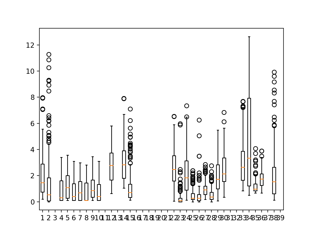
Running the example creates a figure containing 39 boxplots, one for each of the 39 target variables for the first chunk.
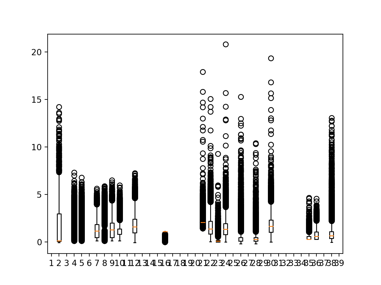
We can see that many of the variables have a median close to zero or one; we can also see a large asymmetrical spread for most variables, suggesting the variables likely have a skew with outliers.
It is encouraging that the boxplots from 4-10 for variable 11 across seven sites show a similar distribution. This is further supporting evidence that data may be grouped by variable and used to fit a model that could be used across sites.
Box and whisker plots of target variables for one chunk
We can re-create this plot using data across all chunks to see dataset-wide patterns.
Running the example creates a new figure showing 39 box and whisker plots for the entire training dataset regardless of chunk.
It is a little bit of a mess, where the circle outliers obscure the main data distributions.
We can see that outlier values do extend into the range 5-to-10 units. This suggests there might be some use in standardizing and/or rescaling the targets when modeling.
Perhaps the most useful finding is that there are some targets that do not have any (or very much) data regardless of chunk. These columns probably should be excluded from the dataset.
Box and whisker plots of target variables for all training data
Apparently Empty Target Columns
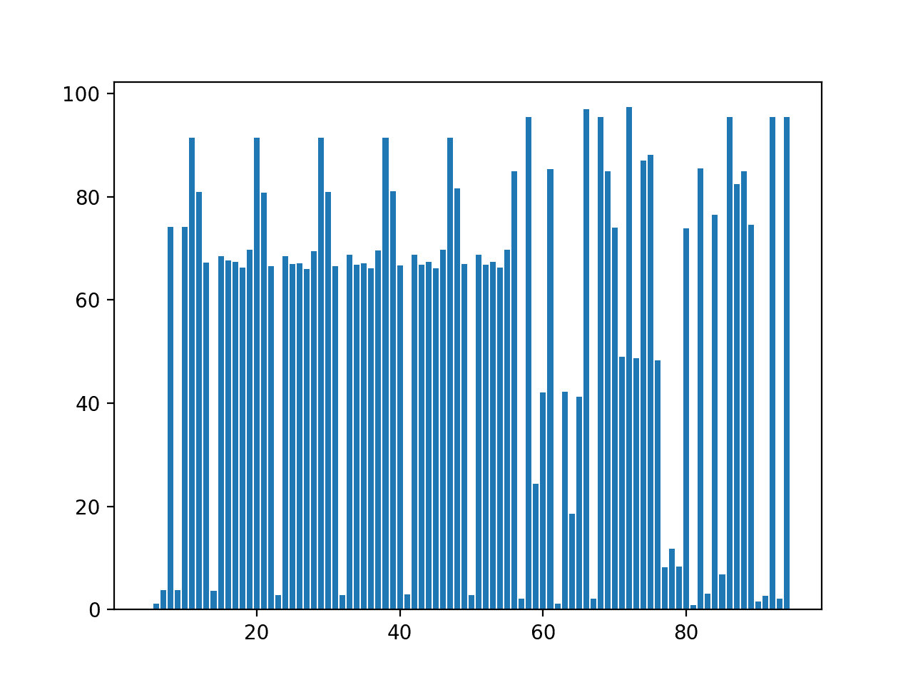
We can investigate the apparent missing data further by creating a bar chart of the ratio of missing data per column, excluding the metadata columns at the beginning (e.g. the first five columns).
The plot_col_percentage_missing() function below implements this.
1
2
3
4
5
6
7
8
9
10
11
12
13
# bar chart of the ratio of missing data per column
Running the example first prints the column id (zero offset) and the ratio of missing data, if the ratio is above 90%.
We can see that there are in fact no columns with zero non-NaN data, but perhaps two dozen (12) that have above 90% missing data.
Interestingly, seven of these are target variables (index 56 or higher).
1
2
3
4
5
6
7
8
9
10
11
12
11 91.48885539779488
20 91.48885539779488
29 91.48885539779488
38 91.48885539779488
47 91.48885539779488
58 95.38880516115385
66 96.9805134713519
68 95.38880516115385
72 97.31630575606145
86 95.38880516115385
92 95.38880516115385
94 95.38880516115385
A bar chart of column index number to ratio of missing data is created.
We can see that there might be some stratification to the ratio of missing data, with a cluster below 10%, a cluster around 70%, and a cluster above 90%.
We can also see a separation between input variable and target variables where the former are quite regular as they show the same variable type measured across different sites.
Such small amounts of data for some target variables suggest the need to leverage other factors besides past observations in order to make predictions.
Bar Chart of Percentage of Missing Data Per Column
Histogram Distribution of Target Variables
The distribution of the target variables are not neat and may be non-Gaussian at the least, or highly multimodal at worst.
We can check this by looking at histograms of the target variables, for the data for a single chunk.
A problem with the hist() function in matplotlib is that it is not robust to NaN values. We can overcome this by checking that each column has non-NaN values prior to plotting and excluding the rows with NaN values.
The function below does this and creates one histogram for each target variable for one or more chunks.
1
2
3
4
5
6
7
8
9
10
11
12
13
14
15
16
17
18
# plot distribution of targets for one or more chunk ids
def plot_chunk_targets_hist(chunks,c_ids):
pyplot.figure()
targets=range(56,95)
foriinrange(len(targets)):
ax=pyplot.subplot(len(targets),1,i+1)
ax.set_xticklabels([])
ax.set_yticklabels([])
column=targets[i]
forchunk_id inc_ids:
rows=chunks[chunk_id]
# extract column of interest
col=rows[:,column].astype('float32')
# check for some data to plot
ifcount_nonzero(isnan(col))<len(rows):
# only plot non-nan values
pyplot.hist(col[~isnan(col)],bins=100)
pyplot.show()
The complete example is listed below.
1
2
3
4
5
6
7
8
9
10
11
12
13
14
15
16
17
18
19
20
21
22
23
24
25
26
27
28
29
30
31
32
33
34
35
36
37
38
39
40
41
42
43
44
# plot distribution of targets for a chunk
from numpy import unique
from numpy import isnan
from numpy import count_nonzero
from pandas import read_csv
from matplotlib import pyplot
# split the dataset by 'chunkID', return a dict of id to rows
def to_chunks(values,chunk_ix=1):
chunks=dict()
# get the unique chunk ids
chunk_ids=unique(values[:,chunk_ix])
# group rows by chunk id
forchunk_id inchunk_ids:
selection=values[:,chunk_ix]==chunk_id
chunks[chunk_id]=values[selection,:]
returnchunks
# plot distribution of targets for one or more chunk ids
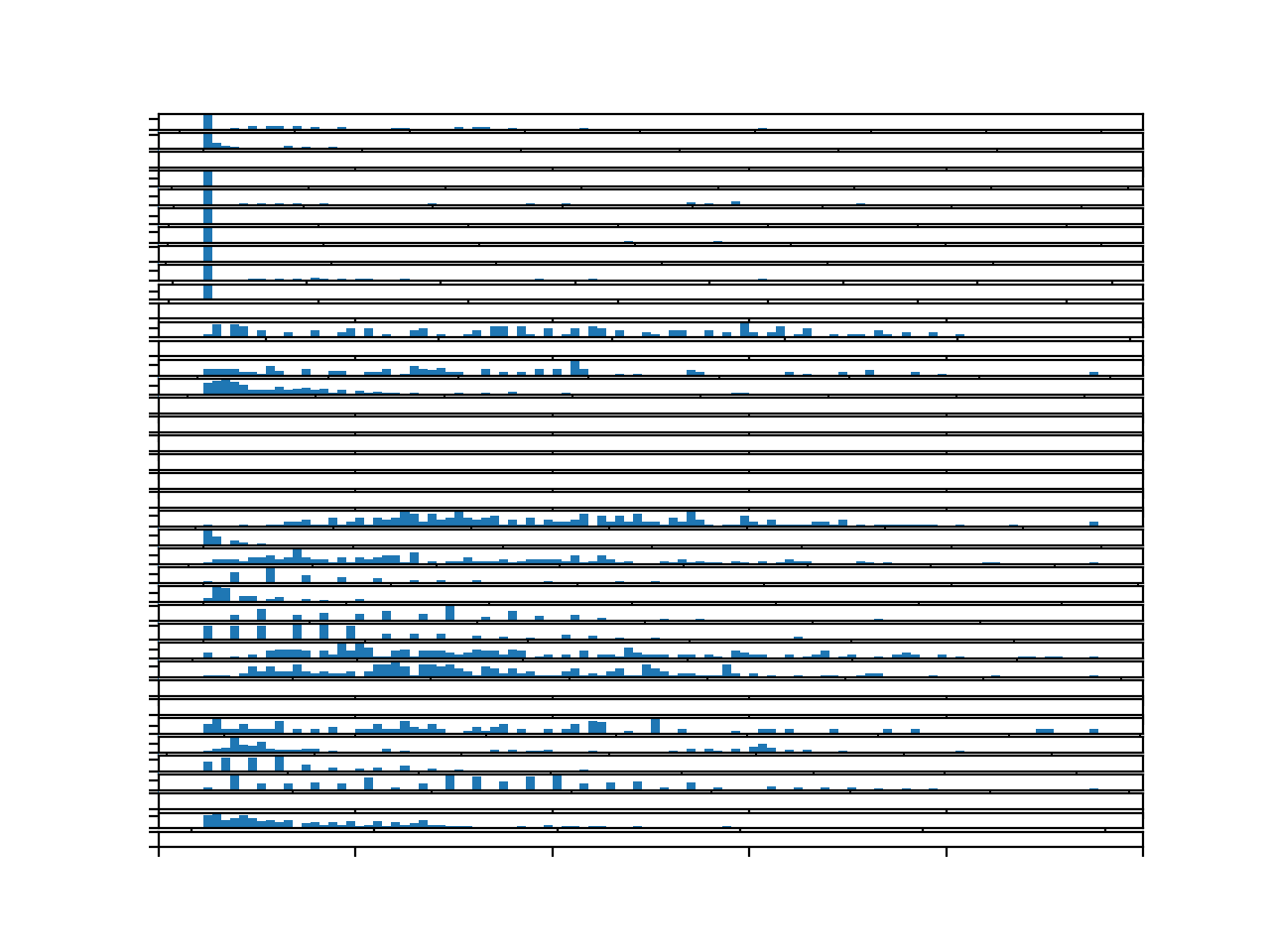
Running the example creates a figure with 39 histograms, one for each target variable for the first chunk.
The plot is hard to read, but the large number of bins goes to show the distribution of the variables.
It might be fair to say that perhaps none of the target variables have an obvious Gaussian distribution. Many may have a skewed distribution with a long right tail.
Other variables have what appears to be quite a discrete distribution that might be an artifact of the chosen measurement device or measurement scale.
Histograms for each target variable for one chunk
We can re-create the same plot with target variables for all chunks.
Running the example creates a figure with 39 histograms, one for each of the target variables in the training dataset.
We can see fuller distributions, which are more insightful.
The first handful of plots perhaps show a highly skewed distribution, the core of which may or may not be Gaussian.
We can see many Gaussian-like distributions with gaps, suggesting discrete measurements imposed on a Gaussian-distributed continuous variable.
We can also see some variables that show an exponential distribution.
Together, this suggests either the use of power transforms to explore reshaping the data to be more Gaussian, and/or the use of nonparametric modeling methods that are not dependent upon a Gaussian distribution of the variables. For example, classical linear methods may be expected to have a hard time.
Histograms for each target variable for the entire training dataset
A Wrinkle With Target Variables
After the end of the competition, the person who provided the data, David Chudzicki, summarized the true meaning of the 12 output variables.
This is interesting as we can see that the target variables are meteorological in nature and related to air quality as the name of the competition suggests.
A problem is that there are 15 variables and only 12 different types of target variables in the dataset.
The cause of this problem is that the same target variable in the dataset may be used to represent different target variables. Specifically:
Target 8 could be data for ‘Carbon monoxide‘ or ‘Sulfate PM2.5 LC‘.
Target 4 could be data for ‘Sulfur dioxide‘ or ‘PM2.5 Raw Data‘.
Target 3 could be data for ‘SO2 max 5-min avg‘ or ‘PM2.5 AQI & Speciation Mass‘.
From the names of the variables, the doubling-up of data into the same target variable was done so with variables with differing chemical characters and perhaps even measures, e.g. it appears to be accidental rather than strategic.
It is not clear, but it is likely that a target represents one variable within a chunk but may represent different variables across chunks. Alternately, it may be possible that the variables differ across sites within each chunk. In the former case, it means that models that expect consistency in these target variables across chunks, which is a very reasonable assumption, may have difficulty. In the latter, models can treat the variable-site combinations as distinct variables.
It may be possible to tease out the differences by comparing the distribution and scales of these variables across chunks.
This is disappointing, and depending on how consequential it is to model skill, it may require the removal of these variables from the dataset, which are a lot of the target variables (20 of 39).
Thoughts on Modeling
In this section, we will harness what we have discovered about the problem and suggest some approaches to modeling this problem.
I like this dataset; it is messy, realistic, and resists naive approaches.
This section is divided into four sections; they are:
Framing.
Data Preparation.
Modeling.
Evaluation.
Framing
The problem is generally framed as a multivariate multi-step time series forecasting problem.
Further, the multiple variables are required to be forecasted across multiple sites, which is a common structural breakdown for time series forecasting problems, e.g. predict the variable thing at different physical locations such as stores or stations.
Let’s walk through some possible framings of the data.
Univariate by Variable and Site
A first-cut approach might be to treat each variable at each site as a univariate time series forecasting problem.
A model is given eight days of hourly observations for a variable and is asked to forecast three days, from which a specific subset of forecast lead times are taken and used or evaluated.
It may be possible in a few select cases, and this could be confirmed with some further data analysis.
Nevertheless, the data generally resists this framing because not all chunks have eight days of observations for each target variable. Further, the time series for the target variable can be dramatically discontiguous, if not mostly (90%-to-95%) incomplete.
We could relax the expectation of the structure and amount of prior data required by the model, designing the model to make use of whatever is available.
This approach would require 39 models per chunk and a total of (208 * 39) or 8,112 separate models. It sounds possible, but perhaps less scalable than we may prefer from an engineering perspective.
The variable-site combinations could be modeled across chunks, requiring only 39 models.
Univariate by Variable
The target variables can be aggregated across sites.
We can also relax what lag lead times are used to make a forecast and present what is available either with zero-padding or imputing for missing values, or even lag observations that disregard lead time.
We can then frame the problem as given some prior observations for a given variable, forecast the following three days.
The models may have more to work with, but will disregard any variable differences based on site. This may or may not be reasonless and could be checked by comparing variable distributions across sites.
There are 12 unique variables.
We could model each variable per chunk, giving (208 * 12) or 2,496 models. It might make more sense to model the 12 variables across chunks, requiring only 12 models.
Multivariate Models
Perhaps one or more target variables are dependent on one or more of the meteorological variables, or even on the other target variables.
This could be explored by investigating the correlation between each target variable and each input variable, as well as with the other target variables.
If such dependencies exist, or could be assumed, it may be possible to not only forecast the variables with more complete data, but also those target variables with above 90% missing data.
Such models could use some subset of prior meteorological observations and/or target variable observations as input. The discontiguous nature of the data may require the relaxing of the traditional lag temporal structure for the input variables, allowing the model to use whatever was available for a specific forecast.
Data Preparation
Depending on the choice of model, the input and target variables may benefit from some data preparation, such as:
Standardization.
Normalization.
Power Transform, where Gaussian.
Seasonal Differencing, where seasonal structures are present.
To address the missing data, in some cases imputing may be required with simple persistence or averaging.
In other cases, and depending on the choice of model, it may be possible to learn directly from the NaN values as observations (e.g. XGBoost can do this) or to fill with 0 values and mask the inputs (e.g. LSTMs can do this).
It may be interesting to investigate downscaling input to 2, 4, or 12, hourly data or similar in an attempt to fill the gaps in discontiguous data, e.g. forecast hourly from 12 hourly data.
Modeling
Modeling may require some prototyping to discover what works well in terms of methods and chosen input observations.
Classical Methods
There may be rare examples of chunks with complete data where classical methods like ETS or SARIMA could be used for univariate forecasting.
Generally, the problem resists the classical methods.
Machine Learning
A good choice would be the use of nonlinear machine learning methods that are agnostic about the temporal structure of the input data, making use of whatever is available.
Such models could be used in a recursive or direct strategy to forecast the lead times. A direct strategy may make more sense, with one model per required lead time.
There are 10 lead times, and 39 target variables, in which case a direct strategy would require (39 * 10) or 390 models.
A downside of the direct approach to modeling the problem is the inability of the model to leverage any dependencies between target variables in the forecast interval, specifically across sites, across variables, or across lead times. If these dependencies exist (and some surely do), it may be possible to add a flavor of them in using a second-tier of of ensemble models.
Feature selection could be used to discover the variables and/or the lag lead times that may provide the most value in forecasting each target variable and lead time.
This approach would provide a lot of flexibility, and as was shown in the competition, ensembles of decision trees perform well with little tuning.
Deep Learning
Like machine learning methods, deep learning methods may be able to use whatever multivariate data is available in order to make a prediction.
Two classes of neural networks may be worth exploring for this problem:
Convolutional Neural Networks or CNNs.
Recurrent Neural Networks, specifically Long Short-Term Memory networks or LSTMs.
CNNs are capable of distilling long sequences of multivariate input time series data into small feature maps, and in essence learn the features from the sequences that are most relevant for forecasting. Their ability to handle noise and feature invariance across the input sequences may be useful. Like other neural networks, CNNs can output a vector in order to predict the forecast lead times.
LSTMs are designed to work with sequence data and can directly support missing data via masking. They too are capable of automatic feature learning from long input sequences and alone or combined with CNNs may perform well on this problem. Together with an encoder-decoder architecture, the LSTM network can be used to natively forecast multiple lead times.
Evaluation
A naive approach that mirrors that used in the competition might be best for evaluating models.
That is, splitting each chunk into train and test sets, in this case using the first five days of data for training and the remaining three for test.
It may be possible and interesting to finalize a model by training it on the entire dataset and submitting a forecast to the Kaggle website for evaluation on the held out test dataset.
Further Reading
This section provides more resources on the topic if you are looking to go deeper.
In this tutorial, you discovered and explored the Air Quality Prediction dataset that represents a challenging multivariate, multi-site, and multi-step time series forecasting problem.
Specifically, you learned:
How to load and explore the chunk-structure of the dataset.
How to explore and visualize the input and target variables for the dataset.
How to use the new understand to outline a suite of methods for framing the problem, preparing the data, and modeling the dataset.
Do you have any questions?
Ask your questions in the comments below and I will do my best to answer.
Develop Deep Learning models for Time Series Today!


Is there a mistake here? total_missing is the count_nonzero(isnan(data)) ,not the {data.size – count_nonzero(isnan(data)) }.
# summarize amount of missing data
total_missing = data.size – count_nonzero(isnan(data))
percent_missing = total_missing / data.size * 100
print(‘Total Missing: %d/%d (%.1f%%)’ % (total_missing, data.size, percent_missing))
How so?
We mark nan’s as a 1, count the 1s, then subtract them from the total dataset size.
nan represents missing data. we mark nan’s as a 1, then count the 1s, so count_nonzero(isnan(data)) is total_missing.
I think you’re right, thanks!
I’ll schedule time to update the example.
Thank you very much!
I’ve learned a lot from your blog.
I’m happy to hear that!
i am new to python. i do not know what chunk_ix is. can you help me please?
Perhaps start with some simpler tutorials here:
https://machinelearningmastery.com/start-here/#python
okay. thank you.
You’re welcome.