Autocorrelation and partial autocorrelation plots are heavily used in time series analysis and forecasting.
These are plots that graphically summarize the strength of a relationship with an observation in a time series with observations at prior time steps. The difference between autocorrelation and partial autocorrelation can be difficult and confusing for beginners to time series forecasting.
In this tutorial, you will discover how to calculate and plot autocorrelation and partial correlation plots with Python.
After completing this tutorial, you will know:
How to plot and review the autocorrelation function for a time series.
How to plot and review the partial autocorrelation function for a time series.
The difference between autocorrelation and partial autocorrelation functions for time series analysis.
Kick-start your project with my new book Time Series Forecasting With Python, including step-by-step tutorials and the Python source code files for all examples.
Let’s get started.
Updated Apr/2019: Updated the link to dataset.
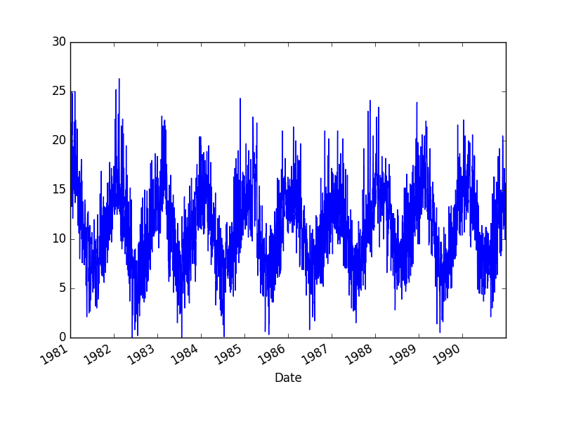
Minimum Daily Temperatures Dataset
This dataset describes the minimum daily temperatures over 10 years (1981-1990) in the city Melbourne, Australia.
The units are in degrees Celsius and there are 3,650 observations. The source of the data is credited as the Australian Bureau of Meteorology.
We can assume the distribution of each variable fits a Gaussian (bell curve) distribution. If this is the case, we can use the Pearson’s correlation coefficient to summarize the correlation between the variables.
The Pearson’s correlation coefficient is a number between -1 and 1 that describes a negative or positive correlation respectively. A value of zero indicates no correlation.
We can calculate the correlation for time series observations with observations with previous time steps, called lags. Because the correlation of the time series observations is calculated with values of the same series at previous times, this is called a serial correlation, or an autocorrelation.
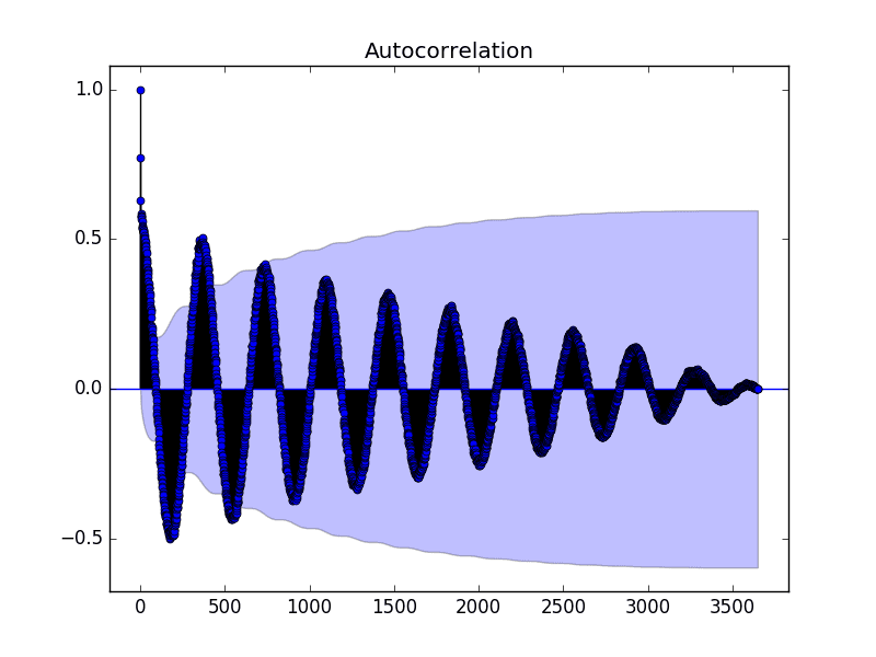
A plot of the autocorrelation of a time series by lag is called the AutoCorrelation Function, or the acronym ACF. This plot is sometimes called a correlogram or an autocorrelation plot.
Below is an example of calculating and plotting the autocorrelation plot for the Minimum Daily Temperatures using the plot_acf() function from the statsmodels library.
1
2
3
4
5
6
from pandas import read_csv
from matplotlib import pyplot
from statsmodels.graphics.tsaplots import plot_acf
Running the example creates a 2D plot showing the lag value along the x-axis and the correlation on the y-axis between -1 and 1.
Confidence intervals are drawn as a cone. By default, this is set to a 95% confidence interval, suggesting that correlation values outside of this code are very likely a correlation and not a statistical fluke.
Autocorrelation Plot of the Minimum Daily Temperatures Dataset
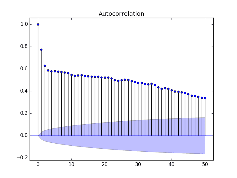
By default, all lag values are printed, which makes the plot noisy.
We can limit the number of lags on the x-axis to 50 to make the plot easier to read.
Autocorrelation Plot With Fewer Lags of the Minimum Daily Temperatures Dataset
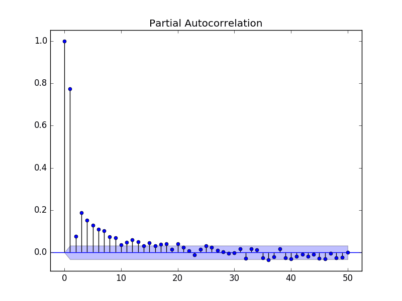
Partial Autocorrelation Function
A partial autocorrelation is a summary of the relationship between an observation in a time series with observations at prior time steps with the relationships of intervening observations removed.
The partial autocorrelation at lag k is the correlation that results after removing the effect of any correlations due to the terms at shorter lags.
The autocorrelation for an observation and an observation at a prior time step is comprised of both the direct correlation and indirect correlations. These indirect correlations are a linear function of the correlation of the observation, with observations at intervening time steps.
It is these indirect correlations that the partial autocorrelation function seeks to remove. Without going into the math, this is the intuition for the partial autocorrelation.
The example below calculates and plots a partial autocorrelation function for the first 50 lags in the Minimum Daily Temperatures dataset using the plot_pacf() from the statsmodels library.
1
2
3
4
5
6
from pandas import read_csv
from matplotlib import pyplot
from statsmodels.graphics.tsaplots import plot_pacf
Running the example creates a 2D plot of the partial autocorrelation for the first 50 lags.
Partial Autocorrelation Plot of the Minimum Daily Temperatures Dataset
Intuition for ACF and PACF Plots
Plots of the autocorrelation function and the partial autocorrelation function for a time series tell a very different story.
We can use the intuition for ACF and PACF above to explore some thought experiments.
Autoregression Intuition
Consider a time series that was generated by an autoregression (AR) process with a lag of k.
We know that the ACF describes the autocorrelation between an observation and another observation at a prior time step that includes direct and indirect dependence information.
This means we would expect the ACF for the AR(k) time series to be strong to a lag of k and the inertia of that relationship would carry on to subsequent lag values, trailing off at some point as the effect was weakened.
We know that the PACF only describes the direct relationship between an observation and its lag. This would suggest that there would be no correlation for lag values beyond k.
This is exactly the expectation of the ACF and PACF plots for an AR(k) process.
Moving Average Intuition
Consider a time series that was generated by a moving average (MA) process with a lag of k.
Remember that the moving average process is an autoregression model of the time series of residual errors from prior predictions. Another way to think about the moving average model is that it corrects future forecasts based on errors made on recent forecasts.
We would expect the ACF for the MA(k) process to show a strong correlation with recent values up to the lag of k, then a sharp decline to low or no correlation. By definition, this is how the process was generated.
For the PACF, we would expect the plot to show a strong relationship to the lag and a trailing off of correlation from the lag onwards.
Again, this is exactly the expectation of the ACF and PACF plots for an MA(k) process.
Further Reading
This section provides some resources for further reading about autocorrelation and partial autocorrelation for time series.
You have been unable or unwilling to create a real example and specify what those “indirect relationships” are, how they are related to the correlated observations. Everything was completely abstract without any tangible down to Earth real life case.
The autocorrelation for an observation and an observation at a prior time step is comprised of both the direct correlation and indirect correlations. These indirect correlations are a linear function of the correlation of the observation, with observations at intervening time steps.
That tells me nothing if you cannot translate that into something tangible.
Appreciate your calm response, and especially the first link you provided, which I’m going to follow now.
BTW your book is also great, so thanks for that (I will admit I… found it… online, but I promise once I get a job and/or get a profitable trading system working, I will buy a few copies :)).
Well I have I think a kind of stupid question. I am running the commands on Anaconda Prompt. When I hit the line series.plot() I get the error no integer in the data frame. Well I have checked the data set and it does contain integer values. Anything specific I am missing ?
I am currently using a MLP model with sliding window in order to forecast future values of a time series. One hyper parameter that seems to be crucial is the size of the window (the number of input neurons for the net). I was wondering if this value must be derived by studying the ACF/PACF plots of the series (as it is usually done with ARIMA models) ? I struggle to find documentation which explicitly discusses about this hyper parameter.
Hi Sir, I am reposting this question, because I have already read this blog as well but I still have confusion.
I am applying ARIMA model on my CDR dataset. I have checked that my data is non stationary (Augmented Dickey-Fuller test)
ADF Statistic: -1.569036
p-value: 0.499127
Critical Values:
1%: -3.478
10%: -2.578
5%: -2.882
Than I have plotted ACF, it showed that my first 15 lag values have autocorrelation value greater then 0.5. so I set ‘p’ parameter 15 (is p =15 is correct ?), and ‘d’ is 1 for stationarity. Could you please guide me how I will find the value of moving average MA(q) q parameter ?
Can I determine the value of ‘q’ parameter by visualizing ACF plot ?
Thanks
Hi Sir
As I told you in my previous question, I am applying ARIMA model on my CDR dataset. I have determined that my series is stationary by dicky fuller test,
Than I plotted ACF and PACF. In ACF plot my first 12 lags have AC value greater than 0.5, and in PACF plot first two lags have PAC value greater than 0.5 , first 4 lags have PAC values greater and equal to 0.2. Hence I have ‘p’ is equal to 12, ‘p’ is equal to 4 and d is 1 for stationarity (Should these parameters values are correct ?).
Secondly, when I set these values ARIMA(12,1,4), I have following error,
“ValueError: The computed initial AR coefficients are not stationary
You should induce stationarity, choose a different model order, or you can
pass your own start_params.”
and when I set ARIMA(12,1,2), I have same error. why ?
Third, when I use grid-search-arima, it shows best ARIMA(1,0,1) why ?
I have read your many blogs but still confused.
Could you please guide me ?
Thanks
Thanks Jason for the article. I am new to machine learning and have very basic statistical knowledge. So I am not able interpret the graphs.
The first graphs makes sense. But what does the other two graphs tell me “Autocorrelation Plot of the Minimum Daily Temperatures Dataset” and “Autocorrelation Plot With Fewer Lags of the Minimum Daily Temperatures Dataset” .
Thanks in advance for your help
Thanks a lot Jason. what you present in zour blog is really precious, what does the confidence interval represent? I dont fully understand why those ACF values out of the confidence interval are relevant! could you please explain?
I was wondering we the confidence intervals above are cone-shaped instead of “normal” horizontal lines.
Do you perhaps know the theoretical justification behind this?
Hi Jason,
Could you explain in more basic terms what the moving average model does? How are the predictions made in the moving average model? I ask because you said the moving average model is a autoregression model on the errors in the predictions.
Hi Jason, thank you for the tutorial, i just want to ask about choosing the p coefficient i have displayed the first 50 lags of my series and i find that the max value of correlation is on the lag 47 but when i tested it it show me an error message(
ValueError: The computed initial AR coefficients are not stationary
You should induce stationarity, choose a different model order, or you can
pass your own start_params.)
so whats the best method to choose p and how we construct the input list of p values of the method of grid search
thank you
when I try to compute autocorrelation in Python “by hand”:
val = pd.DataFrame(series.values)
lag = 2200
shifted = val.shift(lag)
dataframe = pd.concat([shifted, val], axis = 1)
dataframe.columns = [‘t’, ‘t+lag’]
result = dataframe.corr()
print(result)
for lag = 2200 I get corr = 0.554, while autocorrelations plot by plot_acf 1. decreases with lag and 2. is a the level of 0.25 for lag = 2200. Generally, my plot of correlations computed by Python differs significantly from plot_acf or autocorrelation.plot.
What’s wrong with my computations? I just followed Your snippet from “Time Series Forecasting with Python” > p. 190, Listing 22.2
Thanks for this post but i am still not gettting the intution of ACF & PACF.
In the example you have considered for temperatures (especially last 50 days(lag)) for ACF there is strong correlation while PACF it trails of immediately which means the indirect measure is strong so ACF is trail of slowly while the direct measure is not that strong. If my understanding is right, what would i conclude ?
Hi, first thanks for your all work. The point that i could not understand is how do we decide the order of arima model by using acf and pacf graphs?
Thank you.
Why would April 12, 2019 temperatures have more in common with April 12, 2018 than 2017? And why would they have nothing in common with temperatures on April 12, 2009?
Even worse, why would they have more in common with 2009 if the beginning of the data set is 1999?
Thanks for the response – very much appreciate puzzling through this with you.
Typically in time series there is a strong linear dependence between “close” observations. For seasonal data, “close” means one or more cycles away.
If we look at it from a statistical perspective, most of the dependence can be explained by one or two close observations, with very little contribution fro observations beyond that.
This makes sense, as we would expect data from today to be like yesterday more than last week. That last year is more like this year than 2 years ago. At least on average.
I get how today is more like yesterday than last week. It’s springtime and it was colder last week.
I’m just confused about why the last April would be much more similar than the year before. Seems like roughly the same weather in April for thousands of years. But this shows zero similarity at the beginning of the time series.
I checked this by generating a sine curve, where the pattern repeats precisely with every cycle – and still the same results.
Yes, but a series can and often do have general trends up or down across cycles.
Again, we are not talking about absolute difference/similarity across obs. Instead, we are talking about how much of the signal can be explained (or is dependent in a simple linear model). We can explain a lot with the prior observation in the cycle, with diminishing returns after that.
Mike and Jason. Could this problem be about the so called (let’s say) direct 1 / n discrete autocorrelation and OTOH the unbiased 1 / (n-k) autocorrelation? I noticed, and Mike seems to also have noticed, that even with a purely sinusoidal fake data the following happens: the typical/direct autocorrelation, in the case of a long time series and large’ish values of the lag, will eventually tend towards zero. This is theoretically not supposed to happen (for the continuous case), so it has to deal with the biasedness/unbiasedness of the discrete estimator. The unbiased autocorrelation will not exhibit this problem – or if it will, it will happen with much bigger data and bigger values of the lag than I tested. For large n and relatively large lag k it is easy to see that 1 / (n-k) could be a factor of 3, 4, why not even 6 larger than 1 / n. Thus it will obviously mitigate the zeroing out of the tail of the autocorrelation. In the Py package statsmodels.tsa.stattools.acf the acf object has the ability to choose between the typical and the unbiased versions. Hopefully this answered your problem four months later!
Take the sine cycle (repeats regularly, similar to temps but without any noise), which displays the same cycle gradually declining to zero in autocorrelation.
Let’s say autocorrelation is only looking at information that can’t be explained by prior observations (makes perfect sense). I’m thinking it should fall to zero after one cycle (365 days).
Apologies if this is repetitive. I’m trying to understand because I believe a good understanding of this tool will be very helpful in a problem I’m trying to solve.
Sir can you tell me the significance when the lag spike(in PACF plot) is within the confidence interval or it is not in the range of 95 percent confidence interval,how this thing is related to finding p value ?
ACF and PACF are used to find p and q parameters of the ARIMA model. So, I started plotting both and I found 2 different cases. In PACF Lag 0 and 1 have values close to 1.0, while the other Lag have values close to 0.05, but never bellow the significant line. In this case I think it’s easy to choose, so I take 1 as p term. In ACF case is more difficult to choose, because the values of the Lag 0 is close to 1.0 and the other values decrease linearly up to Lag 350, which is the last Lag supersedes the significant line.
I can’t use iterative methods, because I have too much data.
Hi Jason,
Thanks for this article. I have one query, please see if you can address this.
I have downloaded the csv file as attached modified the values of Temp filed, whose are varying like a sinusoidal wave. The values are as such
Date
1981-01-01 0
1981-01-02 1
1981-01-03 2
1981-01-04 3
1981-01-05 2
1981-01-06 1
1981-01-07 0
1981-01-08 -1
1981-01-09 -2
1981-01-10 -3
1981-01-11 -2
1981-01-12 -1
1981-01-13 0
1981-01-14 1
1981-01-15 2
1981-01-16 3
1981-01-17 2
1981-01-18 1
1981-01-19 0
1981-01-20 -1
1981-01-21 -2
1981-01-22 -3
1981-01-23 -2
1981-01-24 -1
1981-01-25 0
Hi Jason,
Let me elaborate the problem once gain. I download the “daily_minimum_tempretures.csv. Then modified the values in Column “temp” as such, that the values would be vary from 0 to 3, then 3 to 0 then 0 to -3 then -3 to 0 with a gap 1 in every interval for a year from 1/1/1981 to 1/12/1981. Then the same pattern repeated for another three years.
Now we have formed 4 dataframes in the lag of 0,12,24,36 from current time.
series = Series.from_csv(‘daily-minimum-temperatures.csv’, header=0)
values = DataFrame(series.values)
values_shift_12= values.shift(12)
values_shift_24= values.shift(24)
values_shift_36= values.shift(36)
df=concat([values, values_shift_12, values_shift_24, values_shift_36], axis=1)
df.columns = [‘t’, ‘t-12’, ‘t-24’, ‘t-36’]
print df
t t-12 t-24 t-36
0 0 NaN NaN NaN
1 1 NaN NaN NaN
2 2 NaN NaN NaN
3 3 NaN NaN NaN
4 2 NaN NaN NaN
5 1 NaN NaN NaN
6 0 NaN NaN NaN
7 -1 NaN NaN NaN
8 -2 NaN NaN NaN
9 -3 NaN NaN NaN
10 -2 NaN NaN NaN
11 -1 NaN NaN NaN
12 0 0.0 NaN NaN
13 1 1.0 NaN NaN
14 2 2.0 NaN NaN
15 3 3.0 NaN NaN
16 2 2.0 NaN NaN
17 1 1.0 NaN NaN
18 0 0.0 NaN NaN
19 -1 -1.0 NaN NaN
20 -2 -2.0 NaN NaN
21 -3 -3.0 NaN NaN
22 -2 -2.0 NaN NaN
23 -1 -1.0 NaN NaN
24 0 0.0 0.0 NaN
25 1 1.0 1.0 NaN
26 2 2.0 2.0 NaN
27 3 3.0 3.0 NaN
28 2 2.0 2.0 NaN
29 1 1.0 1.0 NaN
30 0 0.0 0.0 NaN
31 -1 -1.0 -1.0 NaN
32 -2 -2.0 -2.0 NaN
33 -3 -3.0 -3.0 NaN
34 -2 -2.0 -2.0 NaN
35 -1 -1.0 -1.0 NaN
36 0 0.0 0.0 0.0
37 1 1.0 1.0 1.0
38 2 2.0 2.0 2.0
39 3 3.0 3.0 3.0
40 2 2.0 2.0 2.0
41 1 1.0 1.0 1.0
42 0 0.0 0.0 0.0
43 -1 -1.0 -1.0 -1.0
44 -2 -2.0 -2.0 -2.0
45 -3 -3.0 -3.0 -3.0
46 -2 -2.0 -2.0 -2.0
47 -1 -1.0 -1.0 -1.0
So here we can see, from 12th row onwards values of t and t-12 column are same for each interval. Same holds good for 24th and 36th row onwards from t-24 and t-36 column also. In other words correlation of all these columns is 1.
When we have ploted acf_plot
plot_acf(series)
pyplot.show()
We found ACF value at 12th,24th and 36 lag is .75,.5,.25 respectively.
I was under impression ACF is certain lag is correlation between current time and same lag. But later I understood, the lag value also playing an important role to calculate ACF.
In this case
ACF of nth lag is= correlation between current time and nth lag*(number of sample data- n)/number of sample data
ACF at 0th lag = 1*(48-0)/48=1
ACF at 12th lag = 1*(48-12)/48=.75
ACF at 24th lag = 1*(48-24)/48=.5
ACF at 36th lag = 1*(48-36)/48=.25
Actual formula of ACF at nth lag is = (covariance between data of current time and nth lag)/variance of current time
I have a question — when I run the acf function from statsmodels and set alpha so that it returns the confidence intervals, those numbers are close, but don’t match up with the cone that shows when running plot_acf, so literally none of the acf values end up being outside the cone. Any idea where the discrepancy may lie?
I actually figured it out probably 15 minutes after I commented, but I couldn’t find my comment so I forgot to respond until now. The values for the “cone” in the plot are actually the acf value minus the confidence intervals (upper or lower) as calculated by the acf function.
Thank you for posting such helpful blogs on these topics. I have learnt a lot from them. I have a doubt with regards to the data i am using.
I work in the automotive field and I have testing data for clutch temperature. The data can be loosely described as follows:
Sampling is done every 20 ms.
The values start at around 20 deg, go upto 200 deg and then fall to around 50 deg (thats the nature of the experiments performed)
There are multiple files with such data.
Now i need analyse all these data files to make an ARIMA analysis. I was thinking about combining these files together in one dataframe but the big issue would be that the end of one file is at 50 deg and the start of the next is at 20 deg and this would create a sudden drop which is not realistic.
Would you kindly recommend me a way to combine these files properly to use them? Or any other way you think is better to go about. Apologies for the long post but i really look forward to your help.
Thank you for your response Jason. My quick follow up on this:
‘Perhaps into one line time series so that observations are contiguous.’ : Would you suggest a way to make this possible. Would interpolation between the end of one file and start of the other be helpful here?
‘Perhaps run experiments to see if all data is actually required.’ : Could you kindly elaborate? The data files are just data from the same experiment being performed multiple times with small changes.
Though I am not an expert but still would like to comment out of my curosity!
Cluth temperature in your experiment is definitely proportional to time keeping other parameter constant. Temperate should keep on increasing till engine seized/engine oil burnt. Means first experiment over.
I am not sure how the temperate of the cluth plates reduced to 50 Deg during experiment utill you changes paremeters. In this scenario, the data from next experiment cannot be considered in time series with the previous experiment data. These two data sets are completely different.
Is there any way that we can incorporate spatial autocorrelation into the machine learning algorithms like the xgboost?
I ran xgboost on spatial data and tested autocorrelation (global Morans’s I) on residuals. The residuals are clustered. I’m wondering how this can be addressed?
Thank you for your tutorial. I am experiencing autocorrelation with my data and all lags outside the cone. You missed in your tutorial to explain what if you have autocorrelation in your data, is it a problem? If so, how can you solve it, given that I will use LSTM to train my data?
In my timeseries i have daily measurements of a variable X. I was using the past two observations (D and D-1) to make forecast of a single day ahead (D+1). After an autocorrelation study, i have seen through ACF that the observations D-7 and D-14 have higher correlation than D and D-1 (wich make sens to me, since i D-7 represent the same day a week earlier and D-14 represent the same day two weeks earlier). So, i used them as input in my model, but i actually got worse results in my forecast than i had when i was using D and D-1.
Hi Jason, Vinay this side. Thanks for this intuitive understanding but still my doubt is not clear. I am actually working on a sensor-based time-series data where I need to predict OilTemperature but in my case after doing pre-processing and filtering for non-zero OilTemperature data, my ACF and PACF plot has two variants one in which ACF is constant and above the threshold line, while in second it’s gradually decreasing.
How to interpret the results in both the case?
Is it like my data is stationary in first case, and non-stationary in second?


Unable to download the data set. Throws an error
Sorry, I have fixed the link.
I don’t like the post at all.
You have been unable or unwilling to create a real example and specify what those “indirect relationships” are, how they are related to the correlated observations. Everything was completely abstract without any tangible down to Earth real life case.
The autocorrelation for an observation and an observation at a prior time step is comprised of both the direct correlation and indirect correlations. These indirect correlations are a linear function of the correlation of the observation, with observations at intervening time steps.
That tells me nothing if you cannot translate that into something tangible.
Sorry that you are frustrated.
Here is an example that uses the ACF/PACF plots to devise p and q values directly:
https://machinelearningmastery.com/time-series-forecast-study-python-monthly-sales-french-champagne/
I believe there are many other similar examples, you can use the blog search.
I recommend using a grid search, it is a lot more effective:
https://machinelearningmastery.com/grid-search-arima-hyperparameters-with-python/
I demonstrate that in the prior example as well.
Further, all of this and more is covered in the book:
https://machinelearningmastery.com/introduction-to-time-series-forecasting-with-python/
Appreciate your calm response, and especially the first link you provided, which I’m going to follow now.
BTW your book is also great, so thanks for that (I will admit I… found it… online, but I promise once I get a job and/or get a profitable trading system working, I will buy a few copies :)).
Thanks.
Thanks 🙂
You’re welcome Yasha.
Well I have I think a kind of stupid question. I am running the commands on Anaconda Prompt. When I hit the line series.plot() I get the error no integer in the data frame. Well I have checked the data set and it does contain integer values. Anything specific I am missing ?
Hi Yasha,
Double check the data file, open in a text editor and make sure there is no footer data.
Also, find and delete the “?” characters in the file.
If you still get an error, let me know, paste it in the comments.
Hi Jason,
I am currently using a MLP model with sliding window in order to forecast future values of a time series. One hyper parameter that seems to be crucial is the size of the window (the number of input neurons for the net). I was wondering if this value must be derived by studying the ACF/PACF plots of the series (as it is usually done with ARIMA models) ? I struggle to find documentation which explicitly discusses about this hyper parameter.
Thanks in advance
I would recommend an ACF/PACF analysis.
I would also recommend grid searching window sizes.
i think there is an error pointing to wrong a dataset in this post / tutorial.
https://datamarket.com/data/set/2328/daily-rainfall-in-melbourne-australia-1981-1990#!ds=2328&display=line
You’re right, I’ve fixed it.
Get the data here:
https://datamarket.com/data/set/2324/daily-minimum-temperatures-in-melbourne-australia-1981-1990#!ds=2324&display=line
Hi Jason,
i search through your posts / tutorial i just could not locate an example that use rainfall history. Do you have such post to predict / forecast ?
I have many posts on how to make predictions, for example:
https://machinelearningmastery.com/make-sample-forecasts-arima-python/
Hi Sir, I am reposting this question, because I have already read this blog as well but I still have confusion.
I am applying ARIMA model on my CDR dataset. I have checked that my data is non stationary (Augmented Dickey-Fuller test)
ADF Statistic: -1.569036
p-value: 0.499127
Critical Values:
1%: -3.478
10%: -2.578
5%: -2.882
Than I have plotted ACF, it showed that my first 15 lag values have autocorrelation value greater then 0.5. so I set ‘p’ parameter 15 (is p =15 is correct ?), and ‘d’ is 1 for stationarity. Could you please guide me how I will find the value of moving average MA(q) q parameter ?
Can I determine the value of ‘q’ parameter by visualizing ACF plot ?
Thanks
Yes, review the PACF plot and the ACF plots together and read the section “Moving Average Intuition”.
If that still does not help, try a grid search:
https://machinelearningmastery.com/grid-search-arima-hyperparameters-with-python/
Hi Jason,
Is it possible to actually make the review of PACF and ACF plot automatically?
Perhaps. Alternately, you can grid search p/q values for your model instead of using an analysis (my preferred approach).
Hi Sir
As I told you in my previous question, I am applying ARIMA model on my CDR dataset. I have determined that my series is stationary by dicky fuller test,
Than I plotted ACF and PACF. In ACF plot my first 12 lags have AC value greater than 0.5, and in PACF plot first two lags have PAC value greater than 0.5 , first 4 lags have PAC values greater and equal to 0.2. Hence I have ‘p’ is equal to 12, ‘p’ is equal to 4 and d is 1 for stationarity (Should these parameters values are correct ?).
Secondly, when I set these values ARIMA(12,1,4), I have following error,
“ValueError: The computed initial AR coefficients are not stationary
You should induce stationarity, choose a different model order, or you can
pass your own start_params.”
and when I set ARIMA(12,1,2), I have same error. why ?
Third, when I use grid-search-arima, it shows best ARIMA(1,0,1) why ?
I have read your many blogs but still confused.
Could you please guide me ?
Thanks
No idea, perhaps try a large d?
Perhaps try preparing your data manually?
Great explanation. Thank you!
I’m glad it helped.
tank you! that was as nice introduction to enter the subject.
best, bue
Thanks Elmar.
Good Stuff! Nice succinct tutorial.
Thanks.
Hi Jason,
Since i can’t show the python chart using SSMS, i want to save the ACF & PACF as a png file Instead of showing it using pyplot.show().
Would you please show me the way to do that? Thanks before 🙂
You can use:
Thanks Jason for the article. I am new to machine learning and have very basic statistical knowledge. So I am not able interpret the graphs.
The first graphs makes sense. But what does the other two graphs tell me “Autocorrelation Plot of the Minimum Daily Temperatures Dataset” and “Autocorrelation Plot With Fewer Lags of the Minimum Daily Temperatures Dataset” .
Thanks in advance for your help
Perhaps check the section titled “Partial Autocorrelation Function”.
Does that help?
Thanks a million Jason.
You’re welcome.
Thanks a lot Jason. what you present in zour blog is really precious, what does the confidence interval represent? I dont fully understand why those ACF values out of the confidence interval are relevant! could you please explain?
You can learn more about the confidence interval here:
https://machinelearningmastery.com/confidence-intervals-for-machine-learning/
Hi Jason,
I was wondering we the confidence intervals above are cone-shaped instead of “normal” horizontal lines.
Do you perhaps know the theoretical justification behind this?
Best,
Nikos
Your guess is as good as mine.
Hi Jason,
Could you explain in more basic terms what the moving average model does? How are the predictions made in the moving average model? I ask because you said the moving average model is a autoregression model on the errors in the predictions.
MA is an autoregression of the error component from each prior observation.
You can learn more here:
https://machinelearningmastery.com/model-residual-errors-correct-time-series-forecasts-python/
Hi Jason,
Can you please explan how to find p,q and d in best way
Yes, use a grid search:
https://machinelearningmastery.com/grid-search-arima-hyperparameters-with-python/
Hi Jason, thank you for the tutorial, i just want to ask about choosing the p coefficient i have displayed the first 50 lags of my series and i find that the max value of correlation is on the lag 47 but when i tested it it show me an error message(
ValueError: The computed initial AR coefficients are not stationary
You should induce stationarity, choose a different model order, or you can
pass your own start_params.)
so whats the best method to choose p and how we construct the input list of p values of the method of grid search
thank you
I recommend a grid search, here’s an example:
https://machinelearningmastery.com/grid-search-arima-hyperparameters-with-python/
Hi,
when I try to compute autocorrelation in Python “by hand”:
val = pd.DataFrame(series.values)
lag = 2200
shifted = val.shift(lag)
dataframe = pd.concat([shifted, val], axis = 1)
dataframe.columns = [‘t’, ‘t+lag’]
result = dataframe.corr()
print(result)
for lag = 2200 I get corr = 0.554, while autocorrelations plot by plot_acf 1. decreases with lag and 2. is a the level of 0.25 for lag = 2200. Generally, my plot of correlations computed by Python differs significantly from plot_acf or autocorrelation.plot.
What’s wrong with my computations? I just followed Your snippet from “Time Series Forecasting with Python” > p. 190, Listing 22.2
Many thanks for the explanation in advance 🙂
Yours,
Andy
The difference is that the ACF is calculating the correlation of each example with each t-1 and t-2, etc.
You have only calculated the correlation for t-1.
Thanks for this post but i am still not gettting the intution of ACF & PACF.
In the example you have considered for temperatures (especially last 50 days(lag)) for ACF there is strong correlation while PACF it trails of immediately which means the indirect measure is strong so ACF is trail of slowly while the direct measure is not that strong. If my understanding is right, what would i conclude ?
My compliments on a very clear explanation.
Thanks.
Hi, first thanks for your all work. The point that i could not understand is how do we decide the order of arima model by using acf and pacf graphs?
Thank you.
I explain more on how to interpret them here:
https://machinelearningmastery.com/gentle-introduction-box-jenkins-method-time-series-forecasting/
Also, I show how to grid search values (perhaps more reliable) here:
https://machinelearningmastery.com/grid-search-arima-hyperparameters-with-python/
I get why the autocorrelation starts at 1, gradually goes negative when you move 182 days away and then maxes out at multiples of 365.
But why does it gradually head to zero? You would expect two years out to have the same autocorrelation as one year.
This same pattern is found with autocorrelation of sine waves too. No matter how many cycles, the autocorrelation alternates and heads to zero.
What’s going on? Is the code filling unknown data (example: t-500 for the first data point) with zeros?
Great question.
The autocorrelation at 3 years is less than 2 years for the same day because obs at year 2 have more in common with year 3 than now. This makes sense.
We want to remove this effect, and this is what the PCAF achieves.
Why would April 12, 2019 temperatures have more in common with April 12, 2018 than 2017? And why would they have nothing in common with temperatures on April 12, 2009?
Even worse, why would they have more in common with 2009 if the beginning of the data set is 1999?
Thanks for the response – very much appreciate puzzling through this with you.
Great questions!
Typically in time series there is a strong linear dependence between “close” observations. For seasonal data, “close” means one or more cycles away.
If we look at it from a statistical perspective, most of the dependence can be explained by one or two close observations, with very little contribution fro observations beyond that.
This makes sense, as we would expect data from today to be like yesterday more than last week. That last year is more like this year than 2 years ago. At least on average.
Does that help?
I’m still confused, but appreciate your patience.
I get how today is more like yesterday than last week. It’s springtime and it was colder last week.
I’m just confused about why the last April would be much more similar than the year before. Seems like roughly the same weather in April for thousands of years. But this shows zero similarity at the beginning of the time series.
I checked this by generating a sine curve, where the pattern repeats precisely with every cycle – and still the same results.
I’m missing something about what this is doing.
Yes, but a series can and often do have general trends up or down across cycles.
Again, we are not talking about absolute difference/similarity across obs. Instead, we are talking about how much of the signal can be explained (or is dependent in a simple linear model). We can explain a lot with the prior observation in the cycle, with diminishing returns after that.
Mike and Jason. Could this problem be about the so called (let’s say) direct 1 / n discrete autocorrelation and OTOH the unbiased 1 / (n-k) autocorrelation? I noticed, and Mike seems to also have noticed, that even with a purely sinusoidal fake data the following happens: the typical/direct autocorrelation, in the case of a long time series and large’ish values of the lag, will eventually tend towards zero. This is theoretically not supposed to happen (for the continuous case), so it has to deal with the biasedness/unbiasedness of the discrete estimator. The unbiased autocorrelation will not exhibit this problem – or if it will, it will happen with much bigger data and bigger values of the lag than I tested. For large n and relatively large lag k it is easy to see that 1 / (n-k) could be a factor of 3, 4, why not even 6 larger than 1 / n. Thus it will obviously mitigate the zeroing out of the tail of the autocorrelation. In the Py package statsmodels.tsa.stattools.acf the acf object has the ability to choose between the typical and the unbiased versions. Hopefully this answered your problem four months later!
Nice one, thanks for sharing!
Maybe I’m starting to understand?
Take the sine cycle (repeats regularly, similar to temps but without any noise), which displays the same cycle gradually declining to zero in autocorrelation.
Let’s say autocorrelation is only looking at information that can’t be explained by prior observations (makes perfect sense). I’m thinking it should fall to zero after one cycle (365 days).
Apologies if this is repetitive. I’m trying to understand because I believe a good understanding of this tool will be very helpful in a problem I’m trying to solve.
Sir can you tell me the significance when the lag spike(in PACF plot) is within the confidence interval or it is not in the range of 95 percent confidence interval,how this thing is related to finding p value ?
It will be less than 95%.
More about p-values here:
https://machinelearningmastery.com/faq/single-faq/how-do-i-interpret-a-p-value
Hello Jason,
Do we need to apply any power transformation (YJ or Box-Cox) prior to using PACF/ACF? Thank you.
Yes, before and after, to understand the effect the transform had on your data.
What do you mean by after?
If we use PACF for feature selection (lag selection), is it necessary to apply PT prior to selecting lags?
Generally, I like to review and model data before and after each transform to confirm it added skill to the forecast.
Hi Jason,
ACF and PACF are used to find p and q parameters of the ARIMA model. So, I started plotting both and I found 2 different cases. In PACF Lag 0 and 1 have values close to 1.0, while the other Lag have values close to 0.05, but never bellow the significant line. In this case I think it’s easy to choose, so I take 1 as p term. In ACF case is more difficult to choose, because the values of the Lag 0 is close to 1.0 and the other values decrease linearly up to Lag 350, which is the last Lag supersedes the significant line.
I can’t use iterative methods, because I have too much data.
Perhaps try working with a smaller sample of your data and spot check a suite of model configurations?
Hi Jason,
Thanks for this article. I have one query, please see if you can address this.
I have downloaded the csv file as attached modified the values of Temp filed, whose are varying like a sinusoidal wave. The values are as such
Date
1981-01-01 0
1981-01-02 1
1981-01-03 2
1981-01-04 3
1981-01-05 2
1981-01-06 1
1981-01-07 0
1981-01-08 -1
1981-01-09 -2
1981-01-10 -3
1981-01-11 -2
1981-01-12 -1
1981-01-13 0
1981-01-14 1
1981-01-15 2
1981-01-16 3
1981-01-17 2
1981-01-18 1
1981-01-19 0
1981-01-20 -1
1981-01-21 -2
1981-01-22 -3
1981-01-23 -2
1981-01-24 -1
1981-01-25 0
Now I tried to find out the correlation 12th lag
series = Series.from_csv(‘daily-minimum-temperatures.csv’, header=0)
values = DataFrame(series.values)
values_shift = values.shift(12)
df=concat([values, values_shift], axis=1)
df.columns = [‘t’, ‘t-12’]
print df.corr()
t t-12
t 1.0 1.0
t-12 1.0 1.0
plot_acf(series)
pyplot.show()
But when I do the plot_acf, it shows .5 at 12th lag. Can you please guide me how plot_acf calculating the autocorrelation in this lag
Hi Json,
I think I got it. plot_acf multiplying correlation along with %number of sampling.
correlation*(totalsample-lag)/(totalsamples)
so in above example the total number of samples are 25
correlation at lag 12 is 1
sp plot_acf is calculating this as = 1 *(25-12)/25=.5
Glad to hear it.
An 0.5 correlation is high.
What is the problem exactly?
Hi Jason,
Let me elaborate the problem once gain. I download the “daily_minimum_tempretures.csv. Then modified the values in Column “temp” as such, that the values would be vary from 0 to 3, then 3 to 0 then 0 to -3 then -3 to 0 with a gap 1 in every interval for a year from 1/1/1981 to 1/12/1981. Then the same pattern repeated for another three years.
Now we have formed 4 dataframes in the lag of 0,12,24,36 from current time.
series = Series.from_csv(‘daily-minimum-temperatures.csv’, header=0)
values = DataFrame(series.values)
values_shift_12= values.shift(12)
values_shift_24= values.shift(24)
values_shift_36= values.shift(36)
df=concat([values, values_shift_12, values_shift_24, values_shift_36], axis=1)
df.columns = [‘t’, ‘t-12’, ‘t-24’, ‘t-36’]
print df
t t-12 t-24 t-36
0 0 NaN NaN NaN
1 1 NaN NaN NaN
2 2 NaN NaN NaN
3 3 NaN NaN NaN
4 2 NaN NaN NaN
5 1 NaN NaN NaN
6 0 NaN NaN NaN
7 -1 NaN NaN NaN
8 -2 NaN NaN NaN
9 -3 NaN NaN NaN
10 -2 NaN NaN NaN
11 -1 NaN NaN NaN
12 0 0.0 NaN NaN
13 1 1.0 NaN NaN
14 2 2.0 NaN NaN
15 3 3.0 NaN NaN
16 2 2.0 NaN NaN
17 1 1.0 NaN NaN
18 0 0.0 NaN NaN
19 -1 -1.0 NaN NaN
20 -2 -2.0 NaN NaN
21 -3 -3.0 NaN NaN
22 -2 -2.0 NaN NaN
23 -1 -1.0 NaN NaN
24 0 0.0 0.0 NaN
25 1 1.0 1.0 NaN
26 2 2.0 2.0 NaN
27 3 3.0 3.0 NaN
28 2 2.0 2.0 NaN
29 1 1.0 1.0 NaN
30 0 0.0 0.0 NaN
31 -1 -1.0 -1.0 NaN
32 -2 -2.0 -2.0 NaN
33 -3 -3.0 -3.0 NaN
34 -2 -2.0 -2.0 NaN
35 -1 -1.0 -1.0 NaN
36 0 0.0 0.0 0.0
37 1 1.0 1.0 1.0
38 2 2.0 2.0 2.0
39 3 3.0 3.0 3.0
40 2 2.0 2.0 2.0
41 1 1.0 1.0 1.0
42 0 0.0 0.0 0.0
43 -1 -1.0 -1.0 -1.0
44 -2 -2.0 -2.0 -2.0
45 -3 -3.0 -3.0 -3.0
46 -2 -2.0 -2.0 -2.0
47 -1 -1.0 -1.0 -1.0
So here we can see, from 12th row onwards values of t and t-12 column are same for each interval. Same holds good for 24th and 36th row onwards from t-24 and t-36 column also. In other words correlation of all these columns is 1.
print df.corr()
t t-12 t-24 t-36
t 1.0 1.0 1.0 1.0
t-12 1.0 1.0 1.0 1.0
t-24 1.0 1.0 1.0 1.0
t-36 1.0 1.0 1.0 1.0
When we have ploted acf_plot
plot_acf(series)
pyplot.show()
We found ACF value at 12th,24th and 36 lag is .75,.5,.25 respectively.
I was under impression ACF is certain lag is correlation between current time and same lag. But later I understood, the lag value also playing an important role to calculate ACF.
In this case
ACF of nth lag is= correlation between current time and nth lag*(number of sample data- n)/number of sample data
ACF at 0th lag = 1*(48-0)/48=1
ACF at 12th lag = 1*(48-12)/48=.75
ACF at 24th lag = 1*(48-24)/48=.5
ACF at 36th lag = 1*(48-36)/48=.25
Actual formula of ACF at nth lag is = (covariance between data of current time and nth lag)/variance of current time
Thanks,
Sanjeev Patro
Thanks,
Sanjeev patro
Nice work.
I have a question — when I run the acf function from statsmodels and set alpha so that it returns the confidence intervals, those numbers are close, but don’t match up with the cone that shows when running plot_acf, so literally none of the acf values end up being outside the cone. Any idea where the discrepancy may lie?
Not off the cuff, sorry.
Perhaps confirm that the interval matches in both cases, e.g. both are 95% percentile or whathaveyou?
I actually figured it out probably 15 minutes after I commented, but I couldn’t find my comment so I forgot to respond until now. The values for the “cone” in the plot are actually the acf value minus the confidence intervals (upper or lower) as calculated by the acf function.
Happy to hear that.
Great tutorial. Thank you!!
Thanks, I’m glad it helped!
Hi, Jason, I have a question that, according to the ACF and PACF plots above, what values should I choose for a ARMA model and why ?
Perhaps re-read the above post, it explains how to choose appropriate d and q values.
Also see some of the other tutorials that demonstrate this analysis when constructing a model, for example:
https://machinelearningmastery.com/time-series-forecast-study-python-annual-water-usage-baltimore/
ok, that’s really help, thanks a lot
You’re welcome.
Hi
an example of how to calculate by hand an acf from data.
Thank you
Thanks for the suggestion.
Small fix: the data file is called daily-min-temperatures.csv, but the code calls it daily-minimum-temperatures.csv.
Thanks, note this line:
“Download the dataset and place it in your current working directory with the filename ‘daily-minimum-temperatures.csv’.”
I base chemical assays of a manufactured batch of product based on the assay value of a certified reference sample of the same product.
Should I expect a series of manufactured batches, compared to the same reference for assay purposes, to be autocorrelated?
If yes, is the standard deviation of the manufactured batch series biased?
I don’t know, sorry.
Hi Jason,
Thank you for posting such helpful blogs on these topics. I have learnt a lot from them. I have a doubt with regards to the data i am using.
I work in the automotive field and I have testing data for clutch temperature. The data can be loosely described as follows:
Sampling is done every 20 ms.
The values start at around 20 deg, go upto 200 deg and then fall to around 50 deg (thats the nature of the experiments performed)
There are multiple files with such data.
Now i need analyse all these data files to make an ARIMA analysis. I was thinking about combining these files together in one dataframe but the big issue would be that the end of one file is at 50 deg and the start of the next is at 20 deg and this would create a sudden drop which is not realistic.
Would you kindly recommend me a way to combine these files properly to use them? Or any other way you think is better to go about. Apologies for the long post but i really look forward to your help.
Regards,
Gopal
Perhaps into one line time series so that observations are contiguous.
Perhaps run experiments to see if all data is actually required.
Thank you for your response Jason. My quick follow up on this:
‘Perhaps into one line time series so that observations are contiguous.’ : Would you suggest a way to make this possible. Would interpolation between the end of one file and start of the other be helpful here?
‘Perhaps run experiments to see if all data is actually required.’ : Could you kindly elaborate? The data files are just data from the same experiment being performed multiple times with small changes.
I don’t follow what you’re trying to achieve, sorry. Not sure how I can help exactly.
Hi
Though I am not an expert but still would like to comment out of my curosity!
Cluth temperature in your experiment is definitely proportional to time keeping other parameter constant. Temperate should keep on increasing till engine seized/engine oil burnt. Means first experiment over.
I am not sure how the temperate of the cluth plates reduced to 50 Deg during experiment utill you changes paremeters. In this scenario, the data from next experiment cannot be considered in time series with the previous experiment data. These two data sets are completely different.
Plese ingore if it doesn’t make any since.
Regards
Vivek
Great work. Everything would be crystal clear if you would just tell what the values of ‘p’ and ‘q’ are !
They are hyperparameters for the ARIMA model:
https://machinelearningmastery.com/arima-for-time-series-forecasting-with-python/
Awesome, very useful, just what i needed, thanks man
Thanks, happy it helps!
Thanks so much for the articles. Should pandas.plotting.autocorrelation_plot show the same values as the statsmodels plot_acf used in this article?
Maybe, depends if the implementations are identical.
Thanks for the reply. What do you mean by implementations? They seem to give different results for the exercise in this article.
Thanks Jason. With some tinkering i have them agreeing.
Great!
They are functions in different libraries, therefore their implementation will differ. In turn giving different results.
Hi Jason. Thank you for this great post.
I tried plotting the ACF and PACF. The ACF is reasonable, but the PACF is showing values above 1, for example 4.
Any idea why I am getting such values?
Yes, the ACF/PACF are giving you a hint on how to configure the q/p values for your ARIMA model.
But I mean shouldn’t their values be between -1 and +1?
Ah, I see. Yes, I would expect the values to be in that range. Perhaps I’m mistaken – check the API documentation for the function.
Is there any way that we can incorporate spatial autocorrelation into the machine learning algorithms like the xgboost?
I ran xgboost on spatial data and tested autocorrelation (global Morans’s I) on residuals. The residuals are clustered. I’m wondering how this can be addressed?
Might be better suited to a model like a CNN-LSTM, e.g. spatiotemporal model.
Is there a way to calculate autocorrelation for multivariate time series?
Hello Panagiota…What you are seeking in this case is “cross-correlation” as opposed to “auto-correlation”.
https://www.statology.org/cross-correlation-in-python/
Hi Jason,
Thank you for your tutorial. I am experiencing autocorrelation with my data and all lags outside the cone. You missed in your tutorial to explain what if you have autocorrelation in your data, is it a problem? If so, how can you solve it, given that I will use LSTM to train my data?
Hi Keeva…Autocorrelation is simply a “measurement” of the relative relation between quantities. It is not “good” or “bad”.
The following may help clarify:
https://www.statisticssolutions.com/dissertation-resources/autocorrelation/
In my timeseries i have daily measurements of a variable X. I was using the past two observations (D and D-1) to make forecast of a single day ahead (D+1). After an autocorrelation study, i have seen through ACF that the observations D-7 and D-14 have higher correlation than D and D-1 (wich make sens to me, since i D-7 represent the same day a week earlier and D-14 represent the same day two weeks earlier). So, i used them as input in my model, but i actually got worse results in my forecast than i had when i was using D and D-1.
Any ideas in what could be causing this problem?
Hi Jason, Vinay this side. Thanks for this intuitive understanding but still my doubt is not clear. I am actually working on a sensor-based time-series data where I need to predict OilTemperature but in my case after doing pre-processing and filtering for non-zero OilTemperature data, my ACF and PACF plot has two variants one in which ACF is constant and above the threshold line, while in second it’s gradually decreasing.
How to interpret the results in both the case?
Is it like my data is stationary in first case, and non-stationary in second?
Please help me understand this.
Hi Vinay…You may wish to consider deep learning models for this purpose:
https://machinelearningmastery.com/start-here/#deep_learning_time_series