You must understand your data to get the best results from machine learning algorithms.
Data visualization is perhaps the fastest and most useful way to summarize and learn more about your data.
In this post you will discover exactly how you can use data visualization to better understand or data for machine learning using R.
This post is perfect if you are a developer and are just starting using R for machine learning, or looking to get started.
Follow along or use the R recipes in this post in your current or next project.
Kick-start your project with my new book Machine Learning Mastery With R, including step-by-step tutorials and the R source code files for all examples.
Let’s get started.
Better Understand Data in R Using Visualization Photo by Cory M. Grenier, some rights reserved.
Understand Your Data To Get The Best Results
A better understanding of your data will yield better results from machine learning algorithms.
You will be able to clean, transform and best present the data that you have. The better that the data exposes the structure of the problem to the machine learning algorithms, the more accurate your models will be.
Additionally, a deeper understanding of your data may even suggest at specific machine learning algorithms to try on your data.
Visualize Your Data For Faster Understanding
The fastest way to improve your understanding of your dataset is to visualize it.
Visualization means creating charts and plots from the raw data.
Plots of the distribution or spread of attributes can help you spot outliers, strange or invalid data and give you an idea of possible data transformations you could apply.
Plots of the relationships between attributes can give you an idea of attributes that might be redundant, resampling methods that may be needed and ultimately how difficult a prediction problem might be.
Now, let’s look at how you can create plots of your data using R.
Need more Help with R for Machine Learning?
Take my free 14-day email course and discover how to use R on your project (with sample code).
Click to sign-up and also get a free PDF Ebook version of the course.
Visualize Your Data in R
In this section you will discover how you can quickly visualize your data in R.
This section is divided into three parts:
Visualization Packages: A quick note about your options when it comes to R packages for visualization.
Univariate Visualization: Plots you can use to understand each attribute standalone.
Multivariate Visualization: Plots that can help you to better understand the interactions between attributes.
Let’s get started.
1. Visualization Packages
There are many ways to visualize data in R, but a few packages have surfaced as perhaps being the most generally useful.
graphics: Excellent for fast and basic plots of data.
lattice: More pretty plots and more often useful in practice.
ggplot2: Beautiful plots you want to generate when you want to present results.
I often stick with simple plots from the graphics package for quick and dirty visualization, and use wrappers around lattice (via the caret package) for more useful multivariate plots.
I think ggplot2 plots are excellent and look lovely, but overkill for quick and dirty data visualization.
2. Univariate Visualization
Univariate plots are plots of individual attributes without interactions. The goal is learn something about the distribution, central tendency and spread of each attributes.
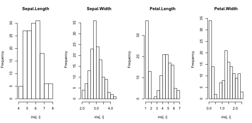
Histograms
Histograms provide a bar chart of a numeric attribute split into bins with the height showing the number of instances that fall into each bin.
They are useful to get an indication of the distribution of an attribute.
1
2
3
4
5
6
7
# load the data
data(iris)
# create histograms for each attribute
par(mfrow=c(1,4))
for(iin1:4){
hist(iris[,i],main=names(iris)[i])
}
You can see that most of the attributes show a Gaussian or double Gaussian distribution. You can see the measurements of very small flowers in the Petal width and length column.
Histogram Plot in R
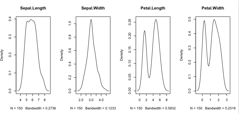
Density Plots
We can smooth out the histograms to lines using a density plot. These are useful for a more abstract depiction of the distribution of each variable.
1
2
3
4
5
6
7
8
9
# load libraries
library(lattice)
# load dataset
data(iris)
# create a panel of simpler density plots by attribute
par(mfrow=c(1,4))
for(iin1:4){
plot(density(iris[,i]),main=names(iris)[i])
}
Using the same dataset from the previous example with histograms, we can see the double Gaussian distribution with petal measurements. We can also see a possible exponential (Lapacian-like) distribution for the Sepal width.
Density Plot in R
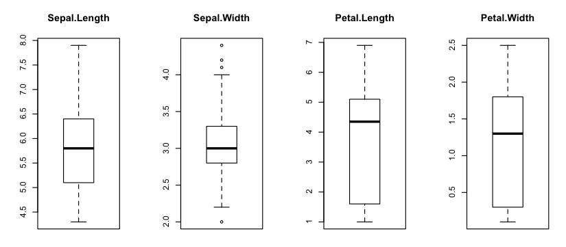
Box And Whisker Plots
We can look at the distribution of the data a different way using box and whisker plots. The box captures the middle 50% of the data, the line shows the median and the whiskers of the plots show the reasonable extent of data. Any dots outside the whiskers are good candidates for outliers.
1
2
3
4
5
6
7
# load dataset
data(iris)
# Create separate boxplots for each attribute
par(mfrow=c(1,4))
for(iin1:4){
boxplot(iris[,i],main=names(iris)[i])
}
We can see that the data all has a similar range (and the same units of centimeters). We can also see that Sepal width may have a few outlier values for this sample.
Box and Whisker Plot in R
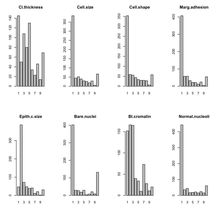
Barplots
In datasets that have categorical rather than numeric attributes, we can create barplots that given an idea of the proportion of instances that belong to each category.
1
2
3
4
5
6
7
8
9
10
11
# load the library
library(mlbench)
# load the dataset
data(BreastCancer)
# create a bar plot of each categorical attribute
par(mfrow=c(2,4))
for(iin2:9){
counts<-table(BreastCancer[,i])
name<-names(BreastCancer)[i]
barplot(counts,main=name)
}
We can see that some plots have a good mixed distribution and others show a few labels with the overwhelming number of instances.
Bar Plot in R
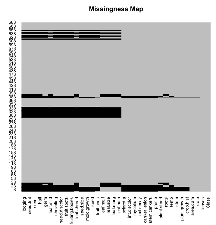
Missing Plot
Missing data have have a big impact on modeling. Some techniques ignore missing data, others break.
You can use a missing plot to get a quick idea of the amount of missing data in your dataset. The x axis shows attributes and the y axis shows instances. Horizontal lines indicate missing data for an instance, vertical blocks represent missing data for an attribute.
We can see that some instances have q lot of missing data across some or most of the attributes.
Missing Map in R
3. Multivariate Visualization
Multivariate plots are plots of the relationship or interactions between attributes. The goal is to learn something about the distribution, central tendency and spread over groups of data, typically pairs of attributes.
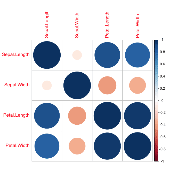
Correlation Plot
We can calculate the correlation between each pair of numeric attributes. These pair-wise correlations can be plotted in a correlation matrix plot to given an idea of which attributes change together.
1
2
3
4
5
6
7
8
# load library
library(corrplot)
# load the data
data(iris)
# calculate correlations
correlations<-cor(iris[,1:4])
# create correlation plot
corrplot(correlations,method="circle")
A dot-representation was used where blue represents positive correlation and red negative. The larger the dot the larger the correlation. We can see that the matrix is symmetrical and that the diagonal are perfectly positively correlated because it shows the correlation of each attribute with itself. We can see that some of the attributes are highly correlated.
Correlation Matrix Plot in R
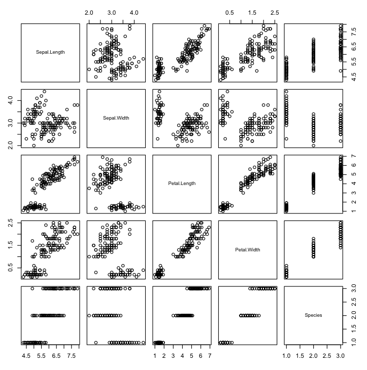
Scatterplot Matrix
A scatterplot plots two variables together, one on each of the x and y axes with points showing the interaction. The spread of the points indicates the relationship between the attributes. You can create scatter plots for all pairs of attributes in your dataset, called a scatterplot matrix.
1
2
3
4
# load the data
data(iris)
# pair-wise scatterplots of all 4 attributes
pairs(iris)
Note that the matrix is symmetrical, showing the same plots with axes reversed. This aids in looking at your data from multiple perspectives. Note the linear (diagonal line) relationship between petal length and width.
Scatterplot Matrix in R
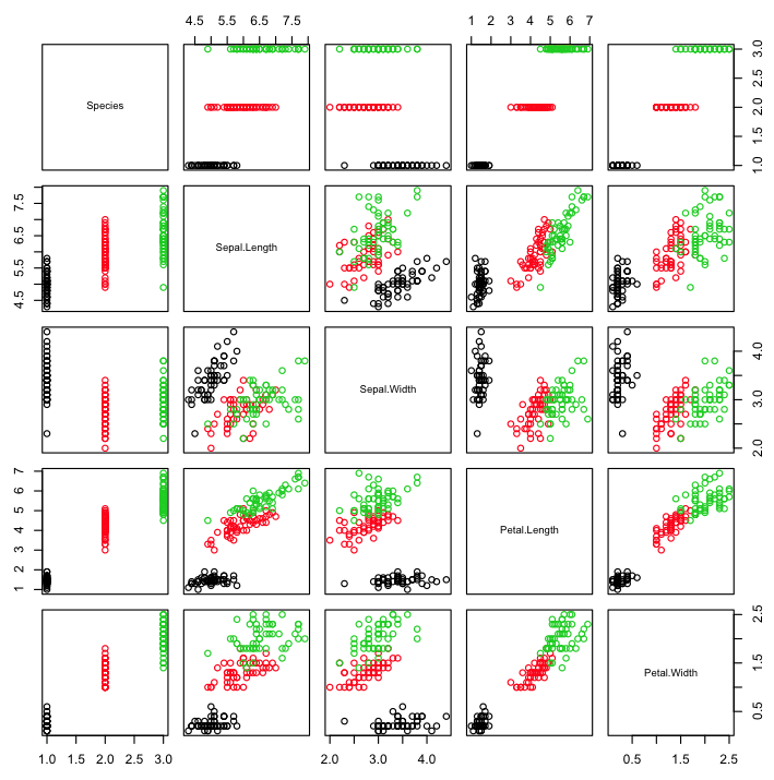
Scatterplot Matrix By Class
The points in a scatterplot matrix can be colored by the class label in classification problems. This can help to spot clear (or unclear) separation of classes and perhaps give an idea of how difficult the problem may be.
1
2
3
4
# load the data
data(iris)
# pair-wise scatterplots colored by class
pairs(Species~.,data=iris,col=iris$Species)
Note the clear separation of the points by class label on most pair-wise plots.
Scatterplot Matrix by Class in R
Density By Class
We can review the density distribution of each attribute broken down by class value. Like the scatterplot matrix, the density plot by class can help see the separation of classes. It can also help to understand the overlap in class values for an attribute.
We can see that some classes do not overlap at all (e.g. Petal Length) where as with other attributes there are hard to tease apart (Sepal Width).
Density Plot By Class in R
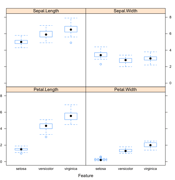
Box And Whisker Plots By Class
We can also review the boxplot distributions of each attribute by class value. This too can help in understanding how each attribute relates to the class value, but from a different perspective to that of the density plots.
1
2
3
4
5
6
7
8
# load the caret library
library(caret)
# load the iris dataset
data(iris)
# box and whisker plots for each attribute by class value
x<-iris[,1:4]
y<-iris[,5]
featurePlot(x=x,y=y,plot="box")
These plots help to understand the overlap and separation of the attribute-class groups. We can see some good separation of the Setosa class for the Petal Length attribute.
Box and Whisker Plots by Class in R
Additional Visualizations
Another type of visualization that you might find useful is that of projection of your dataset.
Sometimes projections using Principal Component Analysis or Self Organizing Map can provide insights into the data.
Do you have a favorite data visualization method that was not covered in this post? Leave a comment, I’d love to hear about it.
Tips For Data Visualization
Review Plots. Actually take the time to look at the plots you have generated and think about them. Try to relate what you are seeing to the general problem domain as well as specific records in the data. The goal is to learn something about your data, not to generate a plot.
Ugly Plots, Not Pretty. Your goal is to learn about your data not to create pretty visualizations. Do not worry if the graphs are ugly. You a not going to show them to anyone.
Write Down Ideas. You will get a lot of ideas when you are looking at visualizations of your data. Ideas like data splits to look at, transformations to apply and techniques to test. Write them all down. They will be invaluable later when you are struggling to think of more things to try to get better results.
You Can Visualize Data in R
You do not need to be an R programmer. The provided recipes are complete and provide everything you need to get a result. You can run them right now or use them as a template in your own project. Take your time and investigate the functions used to understand more about R programming.
You do not need to a data visualization expert. Data visualization is a large field and a lot of books have been written about. Focus on learning about your data, not creating lots of fancy graphs. The graphs are really going to be thrown away after you have learned from them.
You do not need to prepare your own dataset. There are many datasets available in R that you can work on. You do not need to wait until you collect your own. You can also download datasets from the UCI Machine learning repository, there are hundreds from a range of interesting field of study from which to choose.
You do not need a lot of time. Be quick with you visualizations. It should take minutes or hours, not days and weeks to learn about your data from visualization. If you are taking more than a few hours, you’re probably trying to make the plots to pretty. Ugly them up and focus on learning.
Summary
In this post you discovered the importance of data visualization in order to better understand your data.
You discovered a number of methods that you can use to both visualize and improve your understanding of attributes standalone using univariate plots and their interactions using multivariate plots:
Univariate Plots
Histograms
Density Plots
Box And Whisker Plots
Barplots
Missing Plot
Multivariate Plots
Correlation Plot
Scatterplot Matrix
Scatterplot Matrix By Class
Density By Class
Box And Whisker Plots By Class
Action Step
Did you work through the recipes?
Start your R interactive environment.
Type in or copy-paste each recipe into your environment.
Take a moment to understand how each recipe works and use R help to learn more about the functions used.
Use the visualization recipes from this post in your current or next machine learning project. If you do, I’d love to hear about it.
Do you have any questions from this post? Leave a comment and ask.
Hey Jason, this one looks really cool and I love these guidelines. But what I’m expecting next how these insights from my visualization are going to help? How do you use all the inferences you obtained from this in your modeling and also to create new features. I see a lot of Kagglers do excellent plots, find insights and use it for feature engineering. But I really lack those skills to turns insights into actions in modeling. All I know to do is plot a scatterplot see for outliers and then remove them. This is the action I have taken till now with my knowledge of plotting.
You have shown some interesting things like how there is a good separation from the sentosa class in the box plot Petal.length. Likewise Petal.Width in the density plot they don’t overlap. So I’m wondering how am I going to use them in the modeling & feature engineer them. If you could share those tips too it would be great
A good thing to look for is a Gaussian univariate distribution or near-Gaussian. A near Gaussian distribution can be fixed with a box-cox transform. A Gaussian may suggest that similar methods may perform well, e.g. linear/logistic regression, LDA, PCA, etc.
The questions of data viz and feature engineering are problem specific. The data can tell you a lot about how new features may be extracted, but it is very hard/impossible to talk about this in the abstract. I’d like to do a whole book on this topic one day.
Dear jason,
with dataset of 10 attributes and 50,000 observation,
am unable to run following command
pairs(Species~., data=iris, col=iris$Species)
i have changed margin command too using
graphics.off()
par(“mar”)
par(mar=c(1,1,1,1))
but its still not showing
any leads


")

This is awesome, thank you! I’m just getting into R and machine learning in general. Subscribed to your website and LOVE the lessons. Keep it comin’!
I’m glad you’re finding it useful Elia.
Hey Jason, this one looks really cool and I love these guidelines. But what I’m expecting next how these insights from my visualization are going to help? How do you use all the inferences you obtained from this in your modeling and also to create new features. I see a lot of Kagglers do excellent plots, find insights and use it for feature engineering. But I really lack those skills to turns insights into actions in modeling. All I know to do is plot a scatterplot see for outliers and then remove them. This is the action I have taken till now with my knowledge of plotting.
You have shown some interesting things like how there is a good separation from the sentosa class in the box plot Petal.length. Likewise Petal.Width in the density plot they don’t overlap. So I’m wondering how am I going to use them in the modeling & feature engineer them. If you could share those tips too it would be great
Great question Thanish.
A good thing to look for is a Gaussian univariate distribution or near-Gaussian. A near Gaussian distribution can be fixed with a box-cox transform. A Gaussian may suggest that similar methods may perform well, e.g. linear/logistic regression, LDA, PCA, etc.
The questions of data viz and feature engineering are problem specific. The data can tell you a lot about how new features may be extracted, but it is very hard/impossible to talk about this in the abstract. I’d like to do a whole book on this topic one day.
Dear jason,
with dataset of 10 attributes and 50,000 observation,
am unable to run following command
pairs(Species~., data=iris, col=iris$Species)
i have changed margin command too using
graphics.off()
par(“mar”)
par(mar=c(1,1,1,1))
but its still not showing
any leads
You may be trying to plot too many observations, try working with a smaller sample of your dataset.