How do you compare the estimated accuracy of different machine learning algorithms effectively?
In this post you will discover 8 techniques that you can use to compare machine learning algorithms in R.
You can use these techniques to choose the most accurate model, and be able to comment on the statistical significance and the absolute amount it beat out other algorithms.
Kick-start your project with my new book Machine Learning Mastery With R, including step-by-step tutorials and the R source code files for all examples.
Let’s get started.
Compare The Performance of Machine Learning Algorithms in R Photo by Matt Reinbold, some rights reserved.
Choose The Best Machine Learning Model
How do you choose the best model for your problem?
When you work on a machine learning project, you often end up with multiple good models to choose from. Each model will have different performance characteristics.
Using resampling methods like cross validation, you can get an estimate for how accurate each model may be on unseen data. You need to be able to uses the estimates to choose one or two best models from the suite of models that you have created.
Need more Help with R for Machine Learning?
Take my free 14-day email course and discover how to use R on your project (with sample code).
Click to sign-up and also get a free PDF Ebook version of the course.
Compare Machine Learning Models Carefully
When you have a new dataset it is a good idea to visualize the data using a number of different graphing techniques in order to look at the data from different perspectives.
The same idea applies to model selection. You should use a number of different ways of looking at the estimated accuracy of your machine learning algorithms in order to choose the one or two to finalize.
The way that you can do that is to use different visualization methods to show the average accuracy, variance and other properties of the distribution of model accuracies.
In the next section you will discover exactly how you can do that in R.
Compare and Select Machine Learning Models in R
In this section you will discover how you can objectively compare machine learning models in R.
Through the case study in this section you will create a number of machine learning models for the Pima Indians diabetes dataset. You will then use a suite of different visualization techniques to compare the estimated accuracy of the models.
This case study is split up into three sections:
Prepare Dataset. Load the libraries and dataset ready to train the models.
Train Models. Train standard machine learning models on the dataset ready for evaluation.
Compare Models. Compare the trained models using 8 different techniques.
1. Prepare Dataset
The dataset used in this case study is the Pima Indians diabetes dataset, available on the UCI Machine Learning Repository. It is also available in the mlbench package in R.
It is a binary classification problem as to whether a patient will have an onset of diabetes within the next 5 years. The input attributes are numeric and describe medical details for female patients.
Let’s load the libraries and dataset for this case study.
1
2
3
4
5
# load libraries
library(mlbench)
library(caret)
# load the dataset
data(PimaIndiansDiabetes)
2. Train Models
In this section we will train the 5 machine learning models that we will compare in the next section.
We will use repeated cross validation with 10 folds and 3 repeats, a common standard configuration for comparing models. The evaluation metric is accuracy and kappa because they are easy to interpret.
The algorithms were chosen semi-randomly for their diversity of representation and learning style. They include:
Classification and Regression Trees
Linear Discriminant Analysis
Support Vector Machine with Radial Basis Function
k-Nearest Neighbors
Random forest
After the models are trained, they are added to a list and resamples() is called on the list of models. This function checks that the models are comparable and that they used the same training scheme (trainControl configuration). This object contains the evaluation metrics for each fold and each repeat for each algorithm to be evaluated.
The functions that we use in the next section all expect an object with this data.
In this section we will look at 8 different techniques for comparing the estimated accuracy of the constructed models.
Table Summary
This is the easiest comparison that you can do, simply call the summary function() and pass it the resamples result. It will create a table with one algorithm for each row and evaluation metrics for each column. In this case we have sorted.
1
2
# summarize differences between modes
summary(results)
I find it useful to look at the mean and the max columns.
1
2
3
4
5
6
7
8
9
10
11
12
13
14
15
Accuracy
Min. 1st Qu. Median Mean 3rd Qu. Max. NA's
CART 0.6234 0.7115 0.7403 0.7382 0.7760 0.8442 0
LDA 0.6711 0.7532 0.7662 0.7759 0.8052 0.8701 0
SVM 0.6711 0.7403 0.7582 0.7651 0.7890 0.8961 0
KNN 0.6184 0.6984 0.7321 0.7299 0.7532 0.8182 0
RF 0.6711 0.7273 0.7516 0.7617 0.7890 0.8571 0
Kappa
Min. 1st Qu. Median Mean 3rd Qu. Max. NA's
CART 0.1585 0.3296 0.3765 0.3934 0.4685 0.6393 0
LDA 0.2484 0.4196 0.4516 0.4801 0.5512 0.7048 0
SVM 0.2187 0.3889 0.4167 0.4520 0.5003 0.7638 0
KNN 0.1113 0.3228 0.3867 0.3819 0.4382 0.5867 0
RF 0.2624 0.3787 0.4516 0.4588 0.5193 0.6781 0
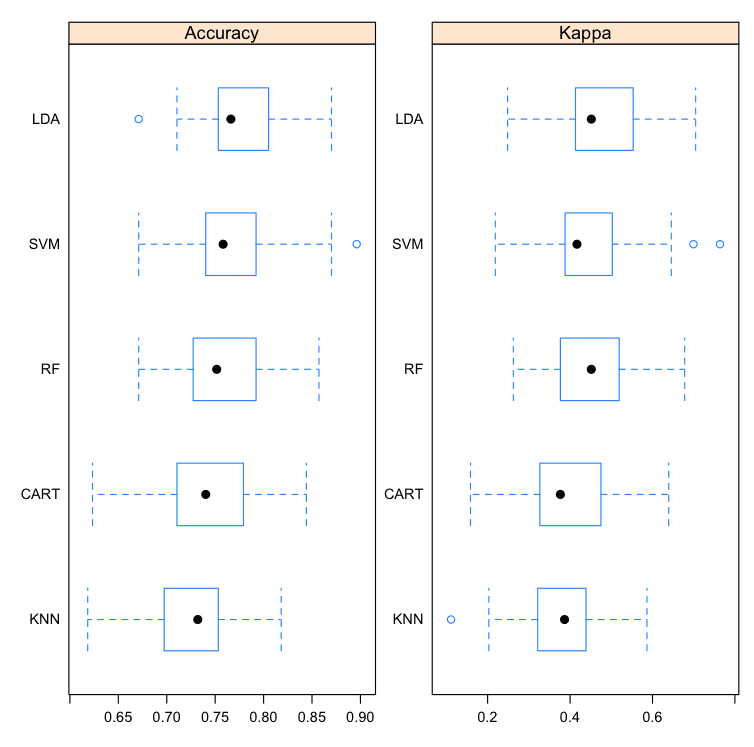
Box and Whisker Plots
This is a useful way to look at the spread of the estimated accuracies for different methods and how they relate.
Note that the boxes are ordered from highest to lowest mean accuracy. I find it useful to look at the mean values (dots) and the overlaps of the boxes (middle 50% of results).
Compare Machine Learning Algorithms in R Box and Whisker Plots
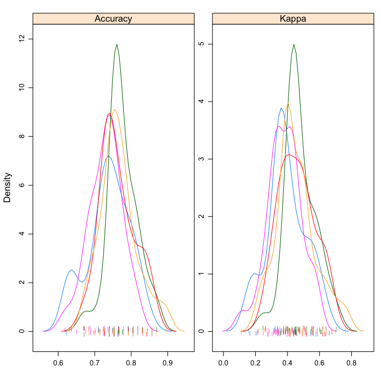
Density Plots
You can show the distribution of model accuracy as density plots. This is a useful way to evaluate the overlap in the estimated behavior of algorithms.
I like to look at the differences in the peaks as well as the spread or base of the distributions.
Compare Machine Learning Algorithms in R Density Plots
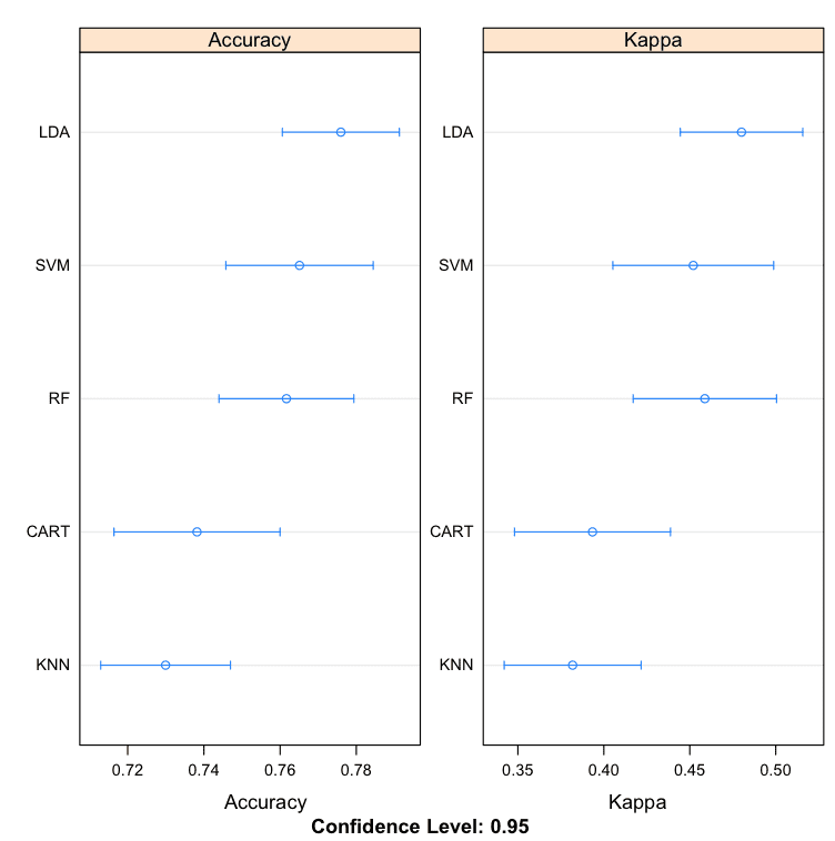
Dot Plots
These are useful plots as the show both the mean estimated accuracy as well as the 95% confidence interval (e.g. the range in which 95% of observed scores fell).
I find it useful to compare the means and eye-ball the overlap of the spreads between algorithms.
Compare Machine Learning Algorithms in R Dot Plots
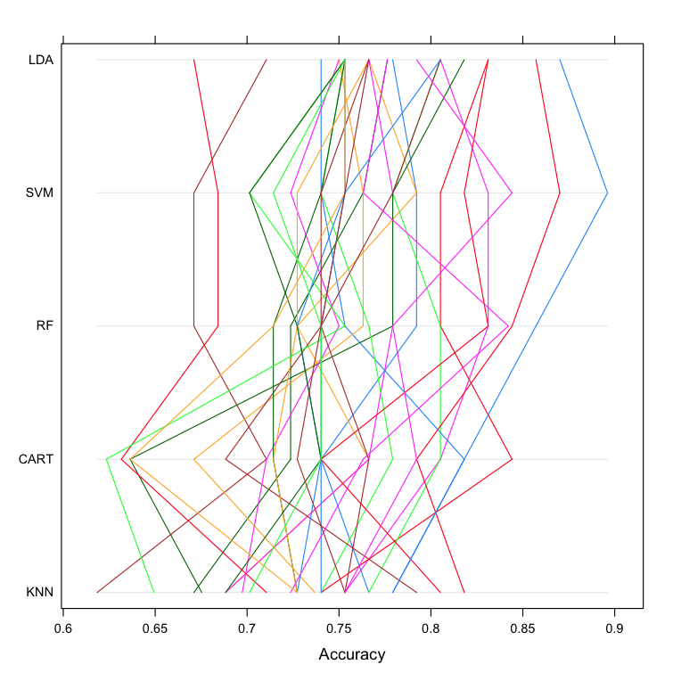
Parallel Plots
This is another way to look at the data. It shows how each trial of each cross validation fold behaved for each of the algorithms tested. It can help you see how those hold-out subsets that were difficult for one algorithms faired for other algorithms.
1
2
# parallel plots to compare models
parallelplot(results)
This can be a trick one to interpret. I like to think that this can be helpful in thinking about how different methods could be combined in an ensemble prediction (e.g. stacking) at a later time, especially if you see correlated movements in opposite directions.
Compare Machine Learning Algorithms in R Parallel Plots
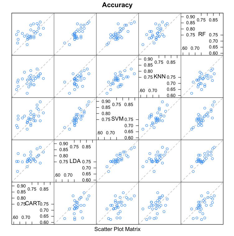
Scatterplot Matrix
This create a scatterplot matrix of all fold-trial results for an algorithm compared to the same fold-trial results for all other algorithms. All pairs are compared.
1
2
# pair-wise scatterplots of predictions to compare models
splom(results)
This is invaluable when considering whether the predictions from two different algorithms are correlated. If weakly correlated, they are good candidates for being combined in an ensemble prediction.
For example, eye-balling the graphs it looks like LDA and SVM look strongly correlated, as does SVM and RF. SVM and CART look weekly correlated.
Compare Machine Learning Algorithms in R Scatterplot Matrix
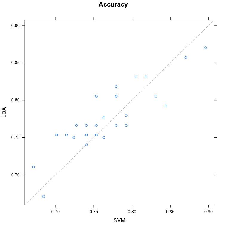
Pairwise xyPlots
You can zoom in on one pair-wise comparison of the accuracy of trial-folds for two machine learning algorithms with an xyplot.
1
2
# xyplot plots to compare models
xyplot(results,models=c("LDA","SVM"))
In this case we can see the seemingly correlated accuracy of the LDA and SVM models.
Compare Machine Learning Algorithms in R Pair-wise Scatterplot
Statistical Significance Tests
You can calculate the significance of the differences between the metric distributions of different machine learning algorithms. We can summarize the results directly by calling the summary() function.
1
2
3
4
# difference in model predictions
diffs<-diff(results)
# summarize p-values for pair-wise comparisons
summary(diffs)
We can see a table of pair-wise statistical significance scores. The lower diagonal of the table shows p-values for the null hypothesis (distributions are the same), smaller is better. We can see no difference between CART and kNN, we can also see little difference between the distributions for LDA and SVM.
The upper diagonal of the table shows the estimated difference between the distributions. If we think that LDA is the most accurate model from looking at the previous graphs, we can get an estimate of how much better than specific other models in terms of absolute accuracy.
These scores can help with any accuracy claims you might want to make between specific algorithms.
1
2
3
4
5
6
7
8
9
10
11
p-value adjustment: bonferroni
Upper diagonal: estimates of the difference
Lower diagonal: p-value for H0: difference = 0
Accuracy
CART LDA SVM KNN RF
CART -0.037759 -0.026908 0.008248 -0.023473
LDA 0.0050068 0.010851 0.046007 0.014286
SVM 0.0919580 0.3390336 0.035156 0.003435
KNN 1.0000000 1.218e-05 0.0007092 -0.031721
RF 0.1722106 0.1349151 1.0000000 0.0034441
A good tip is to increase the number of trials to increase the size of the populations and perhaps more precise p values. You can also plot the differences, but I find the plots a lot less useful than the above summary table.
Summary
In this post you discovered 8 different techniques that you can use compare the estimated accuracy of your machine learning models in R.
The 8 techniques you discovered were:
Table Summary
Box and Whisker Plots
Density Plots
Dot Plots
Parallel Plots
Scatterplot Matrix
Pairwise xyPlots
Statistical Significance Tests
Did I miss one of your favorite ways to compare the estimated accuracy of machine learning algorithms in R? Leave a comment, I’d love to hear about it!
Next Step
Did you try out these recipes?
Start your R interactive environment.
Type or copy-paste the recipes above and try them out.
Use the built-in help in R to learn more about the functions used.
Do you have a question. Ask it in the comments and I will do my best to answer it.
You can use tests to indicate whether the difference between two populations of results is significant or not. If so, you can then start making claims around A being better than B.
The prediction are not independent from each other if you use repeated cv as you did in this example. Increasing the number will artificially increase your sample size
when I am executing the above-mentioned code, I am not getting accuracy and kappa. I am getting RMSE and squared. I want to do classification but not regression. please help me to solve the issue.
Warning message:
In train.default(traindata, trainclass, method = “knn”, tunelength = 2, :
You are trying to do regression and your outcome only has two possible values Are you trying to do classification? If so, use a 2 level factor as your outcome column.
I can’t understand this phrase in scatterplot matrix part,
“This is invaluable when considering whether the predictions from two different algorithms are correlated. If weakly correlated, they are good candidates for being combined in an ensemble prediction.”
it means weakly correlated is good ???
As a result, I have to choose one or two algorithms to select proper algorithms.
Then.. In the scatterplot matrix, how to know??
Hi, Jason
Is it need to scale the data for SVMs and re-transform to original data for Random Forest?
Is the Compare between the models will be the same in Statistical Significance way?
Thank you! 🙂
cant we compare these algorithms based on the RMSE values for each of them.
The one with Lowest RMSE value will be considered as the best suited algorithm.
Hi Jason,
I like your parallel plots and Density plots. However, you didn’t provide legends for the models so it is hard to interpret the these charts.
Provide it, in my view will be very helpful
First of all thanks for this wonderful and detailed article.
I am trying to run a function that takes a matrix of predictors in their original form and outputs a vector of predicted-values. (For example the Boston dataset) . Until now, after I did the summary function for each of the models, I chose the best model based on summary(). I am trying to write a function that will do this.
Excellent tutorial and I follow all of your work! One question, if you have a different seed each time the model is executed, it seems to make the comparison between the models inappropriate. Basically, the results are similar to what you get with a seed of 7, but at least one or two of the plots seem very different. Could you comment on the impact of the seed?
Hi Jason,
thanks for the great information,
a little question here, can I repeat the topic of “Statistical Significance Tests” in Python?
I want to calculate the p-value between the each model after bonferroni adjustment,
is there has the suitable package or function to finish this problem in Python?
1. where does the diabetes variable come from and what is it?
2. what do the ~ and . operators/variables do in this instance?
3. where does the control variable come from, and what is it?
4. what is the meaning of trControl=control
it turns out that the ~. characters are a combined operator that yield a data frame excluding the column named before the operator…
That said, I’m not sure of the statistical methodology behind how you’re generating/using the results variable. it looks like you’re combining cross validation and resampling. I’m not sure I understand what you’re trying to do there, and making sense of all the remaining visualizations here depend on that understanding.
can you explain your decisions at the top with the fitting/sampling/cross validation a bit more?
how do you get accuracy and kappa out of that resamples function?
I read the documentation on the train function, but I still don’t understand what you’re doing there.
In this tutorial we are using 10-fold cross validation, and repeating the process 3 times to give a mean of means. It is a good practice when using k-fold CV to repeat the process to reduce the variance of the result.
LOL! I feel like I get more confused with every answer. 😀
If we’re doing 10-fold cross validation repeated 3x, how do we have a 5×5 grid of accuracy plots? What do the cells of the accuracy plot correspond to?
All algorithms get the same splits of data, therefore we can plot accuracy for each algorithm on each data split (test set) and see how correlated they are.
Each plot is a pair-wise comparison of two algorithms.
This is useful when thinking about what methods to combine into an ensemble.
Are you using all of the data to train the models? Is there a way to split the data for train/test sets? And compare the model performance on the test data?
Dear Professor
This project was very beneficial to me. But I need to know
1. How do I get the values generated from the model.
2. How can I draw Comparison of Accuracy and Error rate of different
Machine learning algorithms applied on Diabetes Dataset
Thanks again
Dilshad
Thank you for publishing your helpful example code!
I was wondering how (in what proportion) are you splitting training set and test set of your dataset?
Is there a way to tune this in your code?
It is the trainControl() function from caret. It did number=10, so it is 10-fold (i.e., 1/10 of the total sample as test set). You can change that into 4-fold, for example.
I found it useful for my case, as I have imbalance data (rare event class), I am looking to compare the performance of the following models: LR, DT, RF, KNN, and SVM (those are recommended for rare events from my online sources). In this case, my objective is to select the best model for my feature selection (feature importance) for my upcoming model fitting. Accordingly, I need the same R codes for cross validation and prediction models, as well as AUC and ROC as performance measures (you have already provides for model training). Thanks in advance!


Please add NN as well ino this (MLP)
You could modified the above example and add a neural net to the mix.
You can find code for a neural network in R on this post:
https://machinelearningmastery.com/non-linear-classification-in-r/
Hi Jason.
Could tell me how to explain the Statistical Significance Tests of these model. I can not understand it .Thank you very much.
Jimmy
Hi Jimmy,
You can use tests to indicate whether the difference between two populations of results is significant or not. If so, you can then start making claims around A being better than B.
I hope that helps.
The prediction are not independent from each other if you use repeated cv as you did in this example. Increasing the number will artificially increase your sample size
Yes, if you want to do stats on the results, you need to correct the degrees of freedom.
This might help:
https://machinelearningmastery.com/statistical-significance-tests-for-comparing-machine-learning-algorithms/
when I am executing the above-mentioned code, I am not getting accuracy and kappa. I am getting RMSE and squared. I want to do classification but not regression. please help me to solve the issue.
Warning message:
In train.default(traindata, trainclass, method = “knn”, tunelength = 2, :
You are trying to do regression and your outcome only has two possible values Are you trying to do classification? If so, use a 2 level factor as your outcome column.
You will need to transform your output variable to a factor.
Use as.factor()
More here:
https://stat.ethz.ch/R-manual/R-devel/library/base/html/factor.html
THANK YOU VERY MUCH JASON BROWNLEE
You’re very welcome!
I can’t understand this phrase in scatterplot matrix part,
“This is invaluable when considering whether the predictions from two different algorithms are correlated. If weakly correlated, they are good candidates for being combined in an ensemble prediction.”
it means weakly correlated is good ???
As a result, I have to choose one or two algorithms to select proper algorithms.
Then.. In the scatterplot matrix, how to know??
Have a nice day!
Weakly correlated predictions are good if you want to combine two models into one ensemble of models.
Hi, Jason
Is it need to scale the data for SVMs and re-transform to original data for Random Forest?
Is the Compare between the models will be the same in Statistical Significance way?
Thank you! 🙂
No it is not, as long as the predictions are all in the same scale so the scores are apples to apples.
Here we are comparing the training data’s accuracy. How to predict with the testing set?
Hello sir,
cant we compare these algorithms based on the RMSE values for each of them.
The one with Lowest RMSE value will be considered as the best suited algorithm.
Your help will be greatly appreciated !
In this case we are working on a classification dataset, therefore RMSE does not make sense. We use accuracy instead.
Hi Jason,
I like your parallel plots and Density plots. However, you didn’t provide legends for the models so it is hard to interpret the these charts.
Provide it, in my view will be very helpful
Thanks for the suggestion.
Hi Jason,
First of all thanks for this wonderful and detailed article.
I am trying to run a function that takes a matrix of predictors in their original form and outputs a vector of predicted-values. (For example the Boston dataset) . Until now, after I did the summary function for each of the models, I chose the best model based on summary(). I am trying to write a function that will do this.
Thanks in advance..!
Karen
Sounds great, I’m not sure what you’re asking me exactly.
Excellent tutorial and I follow all of your work! One question, if you have a different seed each time the model is executed, it seems to make the comparison between the models inappropriate. Basically, the results are similar to what you get with a seed of 7, but at least one or two of the plots seem very different. Could you comment on the impact of the seed?
Yes, I explain more here:
https://machinelearningmastery.com/faq/single-faq/what-value-should-i-set-for-the-random-number-seed
The solution is to use repeated cross-validation for model evaluation.
Hi Jason,
thanks for the great information,
a little question here, can I repeat the topic of “Statistical Significance Tests” in Python?
I want to calculate the p-value between the each model after bonferroni adjustment,
is there has the suitable package or function to finish this problem in Python?
Yes, statsmodels has many of the tests, perhaps start here:
https://machinelearningmastery.com/statistical-significance-tests-for-comparing-machine-learning-algorithms/
And then here:
https://machinelearningmastery.com/parametric-statistical-significance-tests-in-python/
I’m attempting to generalize this to another data set. I’m getting stuck on this line:
fit.rf <- train(diabetes~., data=PimaIndiansDiabetes, method="rf", trControl=control)
1. where does the diabetes variable come from and what is it?
2. what do the ~ and . operators/variables do in this instance?
3. where does the control variable come from, and what is it?
4. what is the meaning of trControl=control
It is a loaded dataset.
More on the formula notation here:
https://www.datacamp.com/community/tutorials/r-formula-tutorial#using
We defined the control variable.
We are specifying the argument to our variable.
I’m still trying to understand this article.
it turns out that the ~. characters are a combined operator that yield a data frame excluding the column named before the operator…
That said, I’m not sure of the statistical methodology behind how you’re generating/using the results variable. it looks like you’re combining cross validation and resampling. I’m not sure I understand what you’re trying to do there, and making sense of all the remaining visualizations here depend on that understanding.
can you explain your decisions at the top with the fitting/sampling/cross validation a bit more?
how do you get accuracy and kappa out of that resamples function?
I read the documentation on the train function, but I still don’t understand what you’re doing there.
Thank you for your help!
No problem.
k-fold cross validation is a resampling method, you can learn more about how it works and why we use it here:
https://machinelearningmastery.com/k-fold-cross-validation/
In this tutorial we are using 10-fold cross validation, and repeating the process 3 times to give a mean of means. It is a good practice when using k-fold CV to repeat the process to reduce the variance of the result.
I hope that helps.
LOL! I feel like I get more confused with every answer. 😀
If we’re doing 10-fold cross validation repeated 3x, how do we have a 5×5 grid of accuracy plots? What do the cells of the accuracy plot correspond to?
All algorithms get the same splits of data, therefore we can plot accuracy for each algorithm on each data split (test set) and see how correlated they are.
Each plot is a pair-wise comparison of two algorithms.
This is useful when thinking about what methods to combine into an ensemble.
Hello Dr. Brownlee,
Did you ever get a chance to apply similar methodologies on a continuous dependent variable? If so, can you please share the findings?
Thank you
I don’t recall, sorry.
Are you using all of the data to train the models? Is there a way to split the data for train/test sets? And compare the model performance on the test data?
No, models are often trained on a training set and evalutaed on a test set.
I recommend using cross-validation that creates multiple splits, learn more here:
https://machinelearningmastery.com/k-fold-cross-validation/
Dear Professor
This project was very beneficial to me. But I need to know
1. How do I get the values generated from the model.
2. How can I draw Comparison of Accuracy and Error rate of different
Machine learning algorithms applied on Diabetes Dataset
Thanks again
Dilshad
You can call the predict() function on the model, I believe.
The above tutorial shows you how to compare algorithms, you can adapt it for any dataset you like.
Thank you for publishing your helpful example code!
I was wondering how (in what proportion) are you splitting training set and test set of your dataset?
Is there a way to tune this in your code?
It is the trainControl() function from caret. It did number=10, so it is 10-fold (i.e., 1/10 of the total sample as test set). You can change that into 4-fold, for example.
I found it useful for my case, as I have imbalance data (rare event class), I am looking to compare the performance of the following models: LR, DT, RF, KNN, and SVM (those are recommended for rare events from my online sources). In this case, my objective is to select the best model for my feature selection (feature importance) for my upcoming model fitting. Accordingly, I need the same R codes for cross validation and prediction models, as well as AUC and ROC as performance measures (you have already provides for model training). Thanks in advance!
Hi Getahun…You may find the following resource of interest.
https://www.statology.org/k-fold-cross-validation-in-r/
Thank you, James Carmichael: I need more on prediction and performance evaluation (AUC & ROC) of those models (all in one setting)
hi. i want to compare some ML algorithms for simulated data. how should i write codes? i generated data for Rasch model.
Hi genius…The following resource may be of interest to you:
https://machinelearningmastery.com/compare-the-performance-of-machine-learning-algorithms-in-r/